A very small week for a change for this weeks new comics. So there are only five titles to cover.
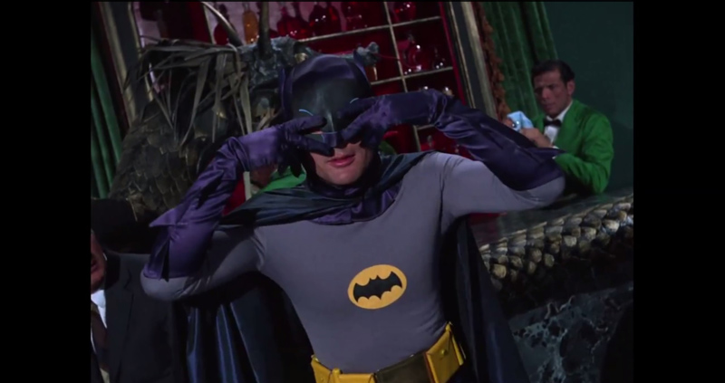
Batman ’66 Meets The Man From U.N.C.L.E. #2
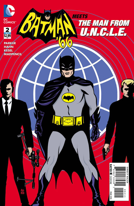
DC Comics Writer Jeff Parker, Penciller David Hahn, Inker Karl Kesel & David Hahn, Colorist Madpencil, Letterer Wes Abbott
The first issue got off to a bit of a shaky start with a bit too much set up for the series than dragged down the story but the second issue bounces back and starts getting to the meat of the story. Parker still stumbles a bit with the exposition at the start of the issue but finally gets going once our heroes meet. The team up actually works pretty well considering that the two shows are so different. Parker does a nice job of balancing the two universes and still keeps the things that they are known for. He finally gets things going and once that happened this issue it looks like he might have a nice little story going for the series. The only thing that I found odd in the story was the inclusion of the Scarecrow and Poison Ivy considering that they were never on the Batman television series and yet most of the villains are from the TV show and not the comics. This seems like an odd choice for the story by Parker considering it’s based on the television show and not the comics. Hahn’s art is a little on the basic and sparse side but on the other hand he does a nice job on the characters faces to make them look pretty close to their actor counterparts. Is this book worth your time and money? After a slow start this issue make a turn in the right direction and was a much more fun read than the first issue. The book is starting to find its groove and while it’s not as good so far as the Batman ’66 series was it’s a nice nostalgia trip to the two shows. If you’re a fan of either show your probably going to like it. If you’re a casual fan it might not be your cup of tea.
Huck #3
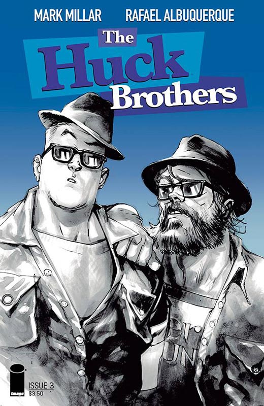
Image Comics Writer Mark Millar, Artist Rafael Albuquerque, Colorist Dave McCaig, Letterer Nate Piekos
The first two issues of this Superman homage/clone was nice and fun but never really quite had the bite or thing that made it different. That really starts to change this issue and it ends on a really great cliffhanger. Millar for me has been more miss than hit with his current crop of books but I think that what is really working in the favor of the book is the low-key approach to it. Millar wisely doesn’t try to make the story bigger than it needs to be. The best way to describe the book is that it’s very charming and innocent. While you could say that it’s a bit on the sappy side and you would be right but in this case it all flows together nicely. I will say that as much as I like it, it’s not really breaking any ground with originality either and this is where the ending of the third issue comes into play. It will be interesting to see where Millar takes the book in the next issue. As always Albuquerque’s art is where the book really shines. He is a bit lax on the backgrounds but more than makes up with it in the characters expressions and emotions. He really captures the subtle moments in the story and really makes the book work so well. Is this book worth your time and money? I’m hoping that with the next issue we see a nice direction change in the book. While I have enjoyed the series so far it hasn’t taken too many chances and is a bit on the safe side. It’s been good but not great so far but I still have hope for it with the direction it’s going. Still worth checking out.
Batman/Teenage Mutant Ninja Turtles #2
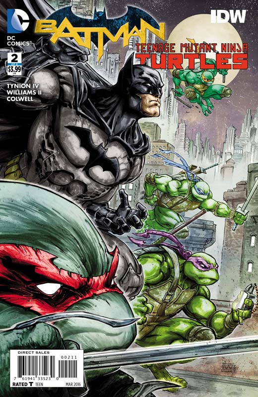
DC Comics/IDW Writer James Tynion IV, Artist Freddie Williams II, Colorist Jeremy Colwell, Letterer Tomi Varga
One of the more odd comic company crossovers continues to be one that is working surprisingly well with Tynion keeping the pace of the story moving along nicely. He explains in this issue how the Turtles came to land in Gotham. While the story is pretty thin as with most crossovers he does his best to make it fun along the way. Sure there are standard tropes to the story but Tynion gives the story some nice twist and turns and keeps it from getting too silly. I have to give him credit for capturing the feel and tone of the two universes and blending them together that you believe the story. Williams artwork continues to make this book really shine with some fantastic artwork that is way above average for a crossover book like this. He really brings this book to life with his artwork that really captures the script and delivers a great looking book. Is this book worth your time and money? While pretty basic like most company crossovers are, Tynion and Williams give the book a nice breezy pace and keep the book fun and simple. Sure the story is going to be pretty basic but in the end it works well and worth the price of admission.
Snow Blind #2
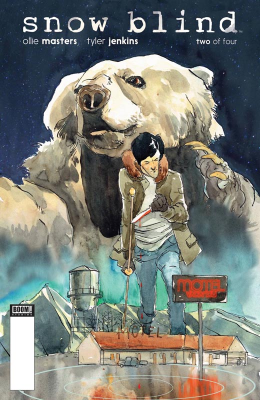
Boom! Studios Writer Ollie Masters, Artist & Colorist Tyler Jenkins, Letterer Colin Bell
Masters has crafted a nice little mystery story with Snow Blind with the second issue really building on the first issue and upping the game and taking the story in a very pleasing direction. One of the things that I enjoyed about the book is the pacing that Masters is doing with the story. He really is unfolding the story very nicely and this second issue takes some great twist and turns that not only catch you off guard but gets you deeper into the mystery. One of the keys to the story is the way that he writes Teddy where he was a bit of an ass in the first issue but Masters did that for a reason and you see that in this issue. Jenkins artwork brings a nice gritty reality to the story and gives the book the mood that is making it work so well. There are so many subtle detail to the script that he is able to capture very well with his art. He is also a really impressive colorist and does a very good job of choosing colors to express the emotional tone that the story needs. Is this book worth your time and money? I liked the first issue but loved this issue. It’s one of those stories that really unfolds quite well and really surprises you and it really gets you just a great ending that leaves you wanting more. This is a really solid book that is becoming quite the surprise read. RECOMMENDED!
Superman: American Alien #3
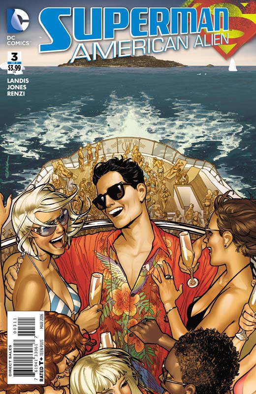
DC Comics Writer Max Landis, Artist Joelle Jones, Colorist Rico Renzi, Letterer John Workman, Backup Story Artist Mark Buckingham, Colorist Jose Villarrubia
I love the idea of this series and this issue is the best so far. Landis comes up with a great story idea with this issue have a young Clark Kent be mistaken for a young Bruce Wayne and then the fun really gets going. What I loved about this story is that Clark does the things that any normal teenage boy would do and while it’s not how he would act in Smallville let’s just say that he is not in Kansas anymore. Sure Landis plays fast and loose with Clark in this issue but that is why it works so well. The point of this series is that they are what if type stories where anything could and should happen. Any normal boy with raging hormones would do the same thing in the situation and that is what I loved about this story. The scene with Deathstroke trying to kill him is priceless and is a real highlight of the issue. Jones artwork is simply beautiful and really captures the carefree style of the story. Her style is a throwback to the illustrators of the 1960’s and fits the story perfectly. It is the best looking issue so far and the previous two issues looked really good. Is this book worth your time and money. Landis has really impressed me with this done in one format of imaginary tales of a young Superman that is really outside the box thinking of the character and is delivering some of the best Superman stories in years. Some will be thrown off by the format or the tone but it’s one of the freshest takes on the Man of Steel and I for one am loving it. There is also a bonus one page Mister Mzyzptlk story illustrated brilliantly by Buckingham that is a welcome bonus cherry on the top of this wonderful issue. VERY RECOMMENDED!



0 Comments