Criminal: Tenth Anniversary Special Edition Magazine
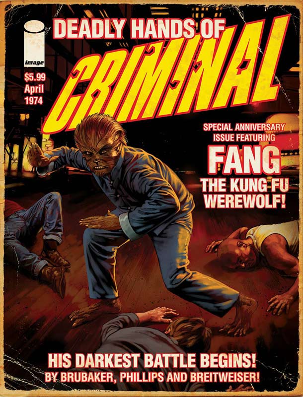
Image Comics Writer Ed Brubaker, Artists and Design Sean Phillips & Elizabeth Breitweiser
In a throwback to the old Warren and Marvel magazine comics Brubaker and Phillips along with Breitweiser celebrate the 10th Anniversary of Criminal with a special treat for both new and old readers. Brubaker story is a nice homage to the period in both the main story and the comic within a comic story that gives the book a great feel with both. He keeps the story simple and focused with a very subtle reveal at the end. One nice touch is keeping the focus on Tracy and by telling the story from his point of view gives it a great texture and it draws the reader into the story perfectly. What is really impressive is how Brubaker captures the tone of the 1970’s in the story that gives it a very different feel than a comic based in the present and of course the Fang, The Kung Fu Werewolf is a sheer delight to read and really completes the overall package. Teeg and Tracy Lawless are always great stories and telling an early tale with them was a great idea. Phillips handles both art styles and his 1970’s comic is the really special treat of the book. The magazine size version of the book is the way to go because it’s formatted for that and allows you to see the great detail that Phillips has put into both stories. He really infuses the story with such great noir mood that is one of the key elements to why the series is still as fresh today as when it started 10 years ago. Is this book worth your time and money? Any new Criminal story is always welcome and doing this nostalgia trip back to the 1970’s might be one of their best single stories yet. Even if you’re not familiar with Teeg and Tracy Lawless the story is told in such a way that even new readers are able to enjoy the story without having read any of the previous ones. Phillips really nails the comic artwork part of the story beyond his usual great art that graces the book. This was a book that is exceptionally satisfying in every way. The only problem I had been that you really crave more stories in the criminal universe but have to be satisfied with this great one shot for now. HIGHLY RECOMMENDED!
Black Eyed Kids #1
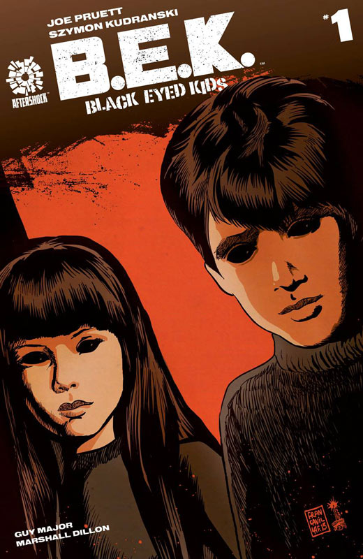
Aftershock Comics Writer Joe Pruett, Artist Szymon Kudranski, Colorist Guy Major, Letterer Marshall Dillon
I was pleasantly surprised by B.E.K. first issue outing and is off to a solid start. Pruett does a great job of capturing the mood with the script. It’s very difficult to do a thriller/horror comic and have it come off well. There are more question than answers in this first issue but with the mood that is set moves the story along nicely for a set up. The only slight flaw is that there are no characters for the reader to latch onto very well. While he does set up Michael to be a main character, he really doesn’t do much int he story to really interact with the reader. The key if the book is going to work is going to be the second issues story to really entice the reader to stay with it in the long run. I felt that this issue is more of a forward to the story than a first chapter but that is not knocking the book because it does pull you in very nicely with its moody effect. Kudranski’s art really delivers the mood quota for the story. While there are a few times where the characters are a little on the stiff side but overall he delivers a very pleasant and creepy artwork that captures the tone of Pruett’s script. Is this book worth your time and money? At $1.99 for the first issue is a great way to get people to try out your book and Aftershock has made a bold move with it starting this months book off. I was really sucked into the story with both Pruett’s script and Kudranski delivering a nice moody beginning to the story. While there are noticable shades of Village of the Damned going on here that is not necessarily a bad thing. It works well with not revealing too much but delivering a solid start to the series that hopefully they can build upon in the next issue. RECOMMENDED!
Joyride #1
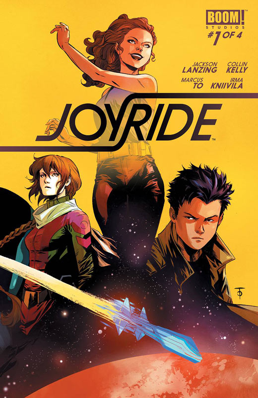
Boom! Studios Writers Jackson Lanzing & Collin Kelly, Artist Marcus To, Colorist Irma Kniivila, Letterer Jim Campbell
I will be the first to admit that has my local comic shop not offer this book at half price this week I might have skipped it, but I actually was quite fond of this story and it was a very pleasant read. Lanzing and Kelly’s script while not wholly original has a very charming quality to it. Most of the story is quite honestly something that you have read many times before but there is something that they bring to the story that just works for some reason. I think that it’s Uma’s wide-eyed wonderment of escaping the restraints of Earth and seeking adventure that gives it that charm. There is nothing that is going to surprise you here but it ends up working fairly well. To’s artwork has a nice clean style that helps the story along nicely. One thing that he does quite well is the characters facial expressions that really captures the wide eyes innocent of the kids and the adventure of it all. Is this book worth your time and money. While I did enjoy the book I could say that it might be worth waiting for the trade of the completed series. While I enjoyed the first issue, it didn’t blow me away either. It’s one of those books that was a pleasant read but I don’t know if it’s going to be worth the $16 for all four issues. I will say it’s worth a throw but am hesitant on a full recommendation.
Dept. H #1
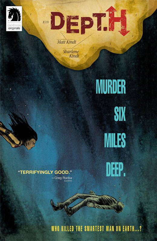
Dark Horse Comics Writer and Artist Matt Kindt, Colorist Sharlene Kindt, Letterer Marie Enger
Matt Kindt really knows how to start a new series. His newest is Dept. H and he nails everything that a first issue should do. Set up a great story, set up your cast of characters, give some background to the main character, give your readers a really good reason to come back for more. You would think that these elements would be easy to do and for Kindt they are so, it makes you wonder why most comics don’t get it right. One thing that he really nails is the tone and mood of the story. While on the surface it’ a basic murder mystery but he infuses it with such emotion and a reason to care about Mia that is the key to the story working so well. He balances the exposition of the story so well that you never feel that any of the story is wasted or forced. It has such a natural flow that really makes for a very enjoyable read. I am a big fan of Kindt’s art style and he really captures the claustrophobic atmosphere of being at the bottom of the ocean. There is a certain uneasiness that he conveys in the art that really gets under your skin and makes it very tense and creepy. There is so much detail that he put into his art that makes reading it so special and satisfying. Sharlene’s color work is well worth noting here. She really brings out the tone of the story with keeping the color palate with the tone of the story and art and love that the type of paper used on the book gives it a more tactile feel that adds to the experience of reading the book. Is this book worth your time and money? If you have never read a Matt Kindt book then this is your chance to get in on the ground floor of a book that is going to be very special. This is a rare book that fires on all cylinders and leaves you craving more and yet is very satisfying at the same time. There is emotional depth and mystery to the story that has such a natural unfolding pace that makes this a must buy book for the week. There is a lot to look forward to in this book and can’t wait to see what surprises that Kindt has in store for us. HIGHEST RECOMMENDATION!
Superman American Alien #6
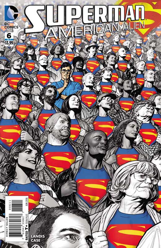
DC Comics Writer Max Landis, Artist Jonathan Case, Letterer John Workman
On the eve of DC’s Rebirth one of the best Superman books in years continues to impress with each new issue. Landis continues to mine great stories of done in one that are telling what you could call side stories in the Superman mythology that have really captured what Superman can be. What makes each one so special is that he never tries to write each story as some cosmic epic. What is making this series so special is that Landis is keeping it simple with strong character driven stories that I really wish that more comic book writers would take that route. He really captures the “human” emotions that Clark is going through to become the superhero that we know. While he maybe the strongest of the DC superheroes what Landis does here is give him the core values that make him who he becomes. He will make mistakes and he will become emotional but that is what grounds him and gives him the core values that make him Superman. This issues day in the life with Pete and Kenny that is a wonderful subtle story that is so relatable that is why it works so well that it would still work as a non Superman story and that is it’s best asset. Case’s artwork is a perfect blend of simple and yet very detailed artwork that is one of the best looking to date. He has such a great retro style that really fits the tone of Landis’s story this issue. There is a lot that a less seasoned artist might not think to do here but Case hits all of the right beats to the story and gives it a very warm and comforting quality while reading it. Is this book worth your time and money? Writing a Superman story is hard but writing a great one is even harder but Landis continues to deliver warm and impressive one each and every issue of this series. There is so much to like here that it’s hard to come up with different praises for each issue. Case’s art really drove this issues story home and made it such a warm and touching story and yet handled the Abin Sur action scene with as much ease as the conversations. This is what a great Superman story can be. HIGHLY RECOMMENDED!
Howard The Duck #6

Marvel Comics Writers Chip Zdarsky with Ryan North, Penciler Joe Quinones, Inkers Joe Rivera, Marc Deering, & Quinones, Colorists Quinones and Jordan Gibson, Letterer Travis Lanham
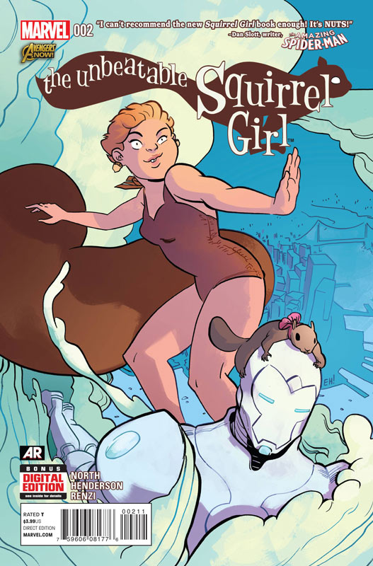
The second part of the crossover with The Unbeatable Squirrel Girl #6 keeps this wild event going and a nice satisfying conclusion to it all. While I have not been the biggest fan of this revival of Howard the Duck I have to hand it to Zdarsky for keeping the tone of this second part in line with Squirrel Girl and that is maybe why this version of Howard is working so well. The thing that is making this crossover so fun is that it’s silly fun and that is the biggest charm of the whole thing. Yea it’s really dumb stupid fun and that is why it works. There are so few book that seem to have silly fun anymore and while North gets it in Squirrel Girl every month, that is one ingredient that Zdarsky seems to miss in the regular Howard issues. Hopefully he can spin the book out better from this crossover. Quinones and company on the art keep the ball rolling with capturing all of the chaos of the battle and give the book the visual boost to match the silly story. Is this book worth your time and money? If you’re a Squirrel Girl fan you can breathe a sigh of relief that the good news is that this feels a lot more like her regular book than Howard the Duck and in this case it’s really for the better. Looks it’s just goofy fun here so go with it and have a good time.



0 Comments