DC Rebirth is back this week along with some new indy books that made for a nice mix of comic books this week.
Flintstones #3
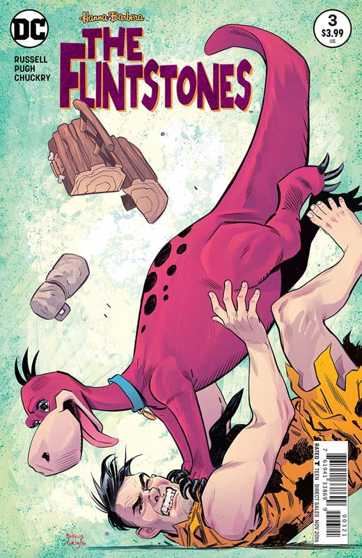
DC Comics Writer Mark Russell, Artist Steve Pugh, Colorist Chris Chuckry, Letterer Dave Sharpe
I’m one of those people who really hates reboots and re-imagined movies, television and comic books that say that they want to honor the original inspiration but nearly all of the time they tend to fuck it all up. I was excited and skeptical of the DC re-imagined Hanna-Barbera comics but when the creative teams were announced I held out hope. Russell has not only done the new Flintstones proud but has created a comic that not only feels like the original show but has nearly surpassed it. Now before you get all upset with that let me explain. The original show was a standard sitcom that while was a seminal animated series and comedy it could only go so deep for the time. Russell has infused the comic with not only great satire but has created a world that has more depth and scope that could have never been done on the show. He also respects the show by not changing what already worked so well in the first place. It still feels like the Bedrock that we all love but is telling such great stories that it’s becoming a real must read comic every month. This issue introduces the Great Gazoo and you never see it coming. He also fills the story with great pop culture references both old and new that work if you get it but those who are not familiar with it won’t hinder their enjoyment of the story. I keep finding myself more amused with each passing issue and the done in one story is a wise choice for the book but, Russell does plant ongoing story elements for continuing readers. The icing on the cake for the book is Pugh who not only bring Bedrock to life visually but delivers the subtle emotions that the script requires with such ease that make the book such a joy to read. He really puts so much detail into each panel that you savor each one to see what has to bring to the story.
Is this book worth your time and money? There was a lot of guff given to this book when DC announced it but as much as I am liking Future Quest, The Flintstones may be the one that gets me more excited now. Each issue continues to impress and has you wondering where Russell and Pugh are going to take the story next. While DC Rebirth is getting all of the attention lately, it’s the Flintstones that is the must read book every month from DC now. HIGHEST RECOMMENDATION!
Alters #1
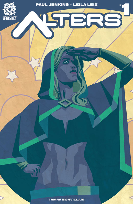
Aftershock Comics Writer Paul Jenkins, Artist Leila Leiz, Colorist Tamra Bonvillain, Letterer Ryane Hill
This is one of those books that has a fair idea but it just buried underneath itself. The biggest problem with Jenkins script is that the first issue really never goes anywhere. It tries to set things up but is never focused enough to care about what is going on. While I’m very much for diversity in comics from both a creators standpoint and comic stories the whole transgender element of the book felt very tacked on and disingenuous. While I liked the idea of Charlie being transgender it never felt to have much of a point in the overall story. That element of the story worked it just that the structure of all of the other story elements didn’t support it. I ended up just being bored by the book. Leiz artwork sadly has an inconsistent look in the book. There are times where the art is nice but there are times where there is not a lot of detail and stiffness to it and felt not polished enough for the book.
Is this book worth your time and money? The biggest problem with the book is that it really has no idea what it wants to be. The script is all over the place and has little focus that I found it hard to keep reading it. With it being so haphazardly thrown together that you simply don’t care about anything or anyone in the book. The art is not consistent and sadly amateurish at times. While I applaud Aftershock with publishing a book with a transgender superhero the book is simply not good. SKIP IT!
Cyborg #1
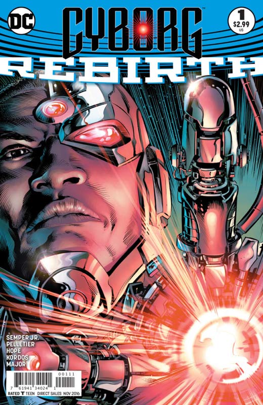
DC Comics Writer John Semper Jr., Penciller Paul Pelletier, Inkers Sandra Hope & Tony Kordos, Colorist Guy Major, Letterer Rob Leigh
Cyborg has always struggled with a solo book and sadly this version misses the mark too. Semper Jr’s story is superhero writing 101 that is so by the book that you are so unsurprised by anything in the book. It regurgitates his origin again and is simply bland and boring. While you would hope that this is not an indication of where the book is going after this then there is simply no point in going any further with it. You simply do not care about anyone or anything that happens in this issue. Semper Jr. relies on standard and tired story elements that doesn’t infuse any life or characterization into the story and is just a beat em up fest that simply underwhelms. The only bright side to the book is Pelletier’s artwork that is quite nice but can only do so much with the by the numbers story that he was dealt with.
Is this book worth your time and money? While not a train wreck the book gets off to a bad start and if this story is any indication of whats in store then there is not much hope for this book. I wish that this book was better for a great character. I grew up with Cyborg during the New Teen Titans Wolfman & Perez era and he certainly deserves better than this book delivered. SKIP IT!
Night Dominion #1
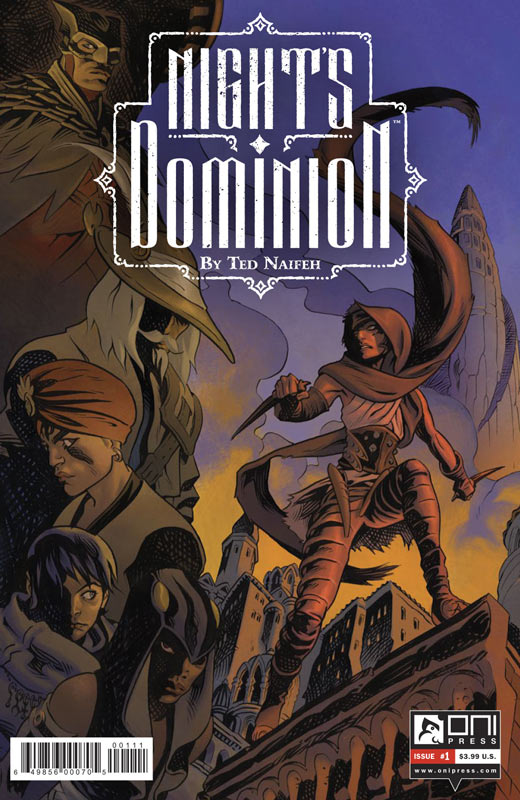
Oni Press Writer & Artist Ted Naifeh, Letterer Aditya Bidikar
I’m torn by this book because I overall it didn’t do much for me but there were some interesting ideas presented in the story. The problem was that the story throws a lot into the mix but it ends up not really going anywhere. It sets the stage for the series but as I read the book I never felt emotionally attached to any of the main characters. The story was also a bit disjointed and there were times where you’re not quite sure what is going on and while I get that you don’t want to reveal everything too early you shouldn’t feel confused by it either. I did like Naifeh’s art on the book that gave it a great moody feeling that did help things along.
Is this book worth your time and money? I was not overwhelmed by the first issue but it might be worth coming back for a second issue to see if it goes anywhere. There were some interesting elements there but the disjointed story negated a lot of it. It was an overall mixed bag that could go either way for you.
Everafter #1
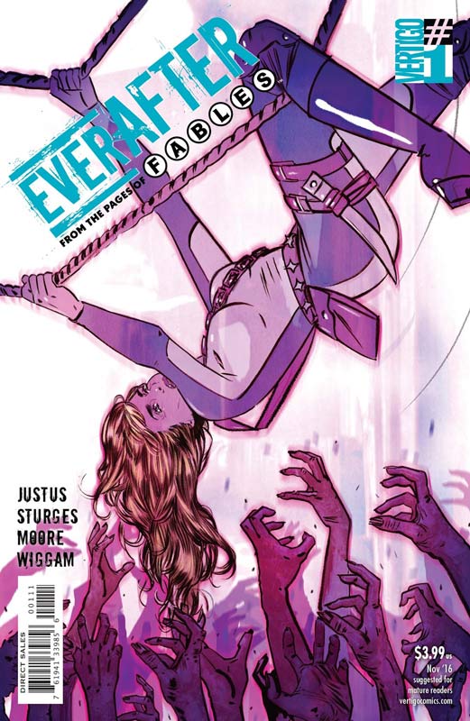
Vertigo Comics Writers Dave Justus & Matthew Sturges, Artist Travis Moore, Colorist Michael Wiggam, Letterer Todd Klein
I was a huge fan of Fables and while I was sad to see the book end it went out on a high note. So I was very skeptical of this spin-off book that Willingham had no involvement in. So what is the verdict? Well Justus and Sturges script does start off pretty rough because your dropped into an ongoing scene and not quite sure what to make of it in the beginning. Thankfully it starts to pick up as the story goes along and really hits a nice stride by the end of the issue. While I’m not sure that we needed this Fables spin-off book and it’s a little rocky in this first issue I do think that there are some good elements here. The Mission Impossible story elements are intriguing but I’m just not sure how long that could really last but time will tell on that end. Moore’s artwork is very nice here and really captures all of the elements of the story and the Fables world. He puts a very good amount of detail into the art and the opening sequence of the book is very impressive.
Is this book worth your time and money? I was not super overwhelmed by the first issue but have to give that the final scenes are really strong and will get me back for a second issue. I still wonder about the long-term of the book but am willing to see where they take it. The artwork on the book is a big plus and gives the book a strong footing on that end. Hopefully the story hits the ground running on the second issue.
Skybourne #1
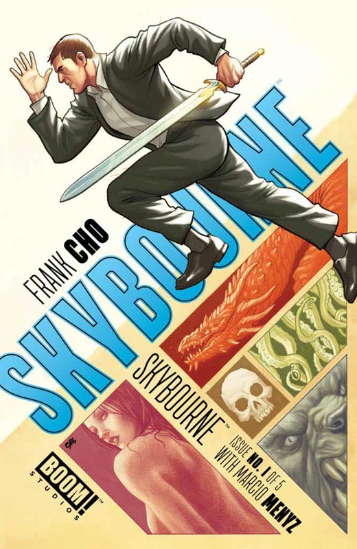
Boom! Studios Writer & Artist Frank Cho, Colorist Marcio Menyz, Letterer Ed Dukeshire
Cho is quite well-known for his outrageous cheese cake girl artwork and you might find it very ironic that there is virtually none in this first issue of his book. I did find the story interesting but it’s pretty basic. It’s one of those books that is not going to knock your socks off but you will probably find it simply fun. The script is pretty basic with nothing too shocking here but I will give Cho that there were a few elements like the Excalibur sword that was a neat idea. He is pretty much doing his version of Wonder Woman here and its silly fun. Of course his art is the real star here. This is a really great looking book (no surprise there) and helps move along the story nicely.
Is this book worth your time and money? Honestly the book is pretty basic but for some reason I found it to be fun and charming. It’s certainly not high art or anything and the story is pretty basic but you could certainly read a lot worse than this. The artwork is the reason to buy the book and the story isn’t embarrassing. If you’re a fan of Cho then it’s worth a try.
Supergirl #1
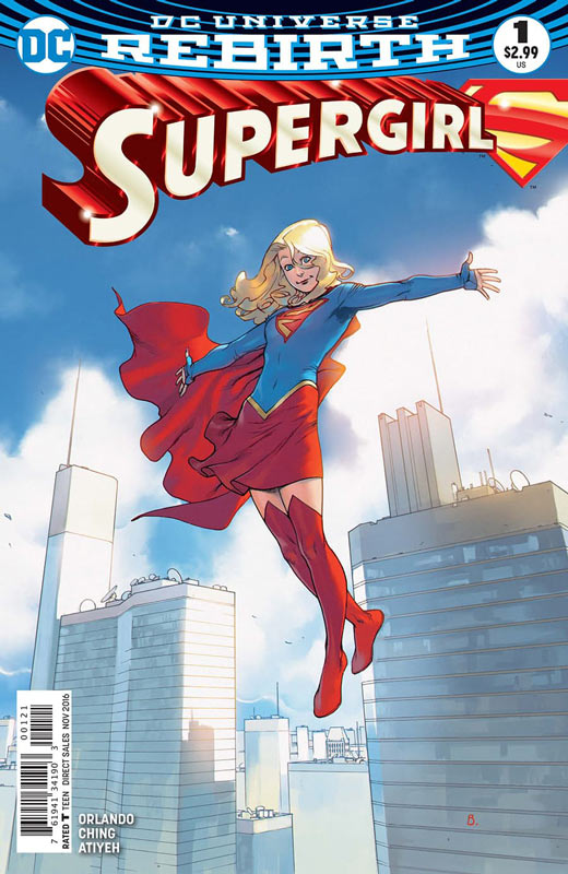
DC Comics Writer Steve Orlando, Artist Brian Ching, Colorist Michael Atiyeh, Letterer Steve Wands
I like the Supergirl rebirth #0 but Orlando really hits the ground running on this first issue. What he really nails here is the day-to-day things that Kara has to deal with living on earth and that is where this book really shines. Orlando playing here as the outcast is a nice angle and is one of the better takes on the character. I actually liked that there was very little action in this first issue and instead Orlando focuses on the dramatic story elements to make the story. He has made here a more down to earth and relatable with these elements. I simply found the book to be a very enjoyable read. I was really impressed with Ching’s artwork on the book and has a nice unique style that really fits the tone of Orlando’s script. It has a nice natural flow that is very pleasing and really make the book stand out.
Is this book worth your time and money? Orlando and Ching have delivered a fun little book here. I think the thing that I like the most about it was that it doesn’t try to be big and loud. It simply finds a good balance of solid story telling with wonderful artwork that delivers and enjoyable read that will have you coming back for more. Well worth checking out. RECOMMENDED!
Kill or Be Killed #2
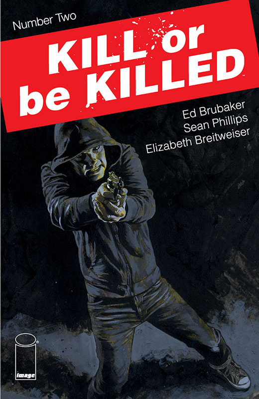
Image Comics Writer Ed Brubaker, Artist Sean Phillips, Colorist Elizabeth Breitweiser
I was very impressed with the first issue of this book and quite honestly was simply blown away with this second issue. What I loved about the story that Brubaker is unfolding here is that you think that it’s just going to be a Dirty Harry/Death Wish story but he infuses it with so much more depth than just a gun wielding vigilante. He gave the story some great unexpected twist and turns that is always keeping the readers on their toes. There is so much depth to the story here that is simply a real joy to read and take it all in. Phillips delivers his usual high quality artwork that captures all of the subtle elements of Brubakers story perfectly. He never overplay the art and this is a book that is a perfect marriage of the two.
Is this book worth your time and money. Comics don’t really get better than this. It’s the perfect blend of crime/noir/suspense all wrapped up in a perfect package. Brubaker and Phillips are firing on all cylinders perfectly here and I can’t wait to see where they take this story. HIGHEST RECOMMENDATION!


0 Comments