Wonder Woman #10
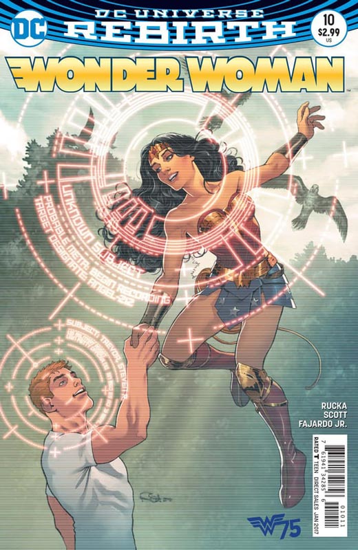
DC Comics Writer Greg Rucka, Artist Nicola Scott, Colorist Romulo Fajardo Jr., Letterer Jodi Wynne
I don’t know if it the recent political events or that we simply need a superhero to make us feel better but this fourth part of the year one story actually gave me goose bumps while I read this issue. This issue really captures the essence of Wonder Woman and what it really means to be a superhero. Rucka’s script really delivers this issue and while the story is straight forward but as always he simply makes it feel original and fresh. It’s one of the best paced mainstream comics that I have read in a long time. Rucka is creating one of the best Wonder Woman runs and this issue is a real triumph. The script is only one part of the comic and this is where Scott’s beautiful artwork comes in. She brings Rucka’s script to life with both power and softness that is breathtaking. She captures every subtle emotion of the story and really draws you into the story. Her artwork is one of the main reasons for the goose bumps.
Is this book worth your time and money. What better way to give Wonder Woman a great 75th Birthday present than this issue. There are few times where I have been left speechless after reading a comic and while it could have been a timing thing, it certainly was a welcomed and thoroughly enjoyable comic. Wonder Woman is a very inspirational character and this issue is the proof. HIGHEST RECOMMENDATION!
Violent Love #1
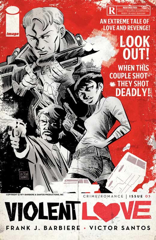
Image Comics Writer Frank J. Barbiere, Artist Victor Santos
Violent Love is a crime noir drama that on the surface is a take on the Bonnie and Clyde tale but with a different spin. Barbiere set the series up well in this first issue with the main players and a nice back story along the way. I liked that he went for the time period of the late 1960’s that is a great period to mine stories from. What I liked about this first issue was the pacing that is sometimes hard to do with a first issue. There is a lot of exposition to get through but he keeps it from weighing down the stories pace and flow. Santos artwork brings a great raw style that gives the book a great gritty feel. When you do a book like this the artwork has to really click with the script and Santos delivers on every page and panel here. His use of layouts give the book a look that is unique and fresh that makes it feel different from other comics in the same vein.
Is this book worth your time and money? This book is off to a good start and Barbiere sets up things nicely for the second issue. It’s a well paced first issue with great artwork by Santos makes this a good read this week and well worth checking out.
Mother Panic #1
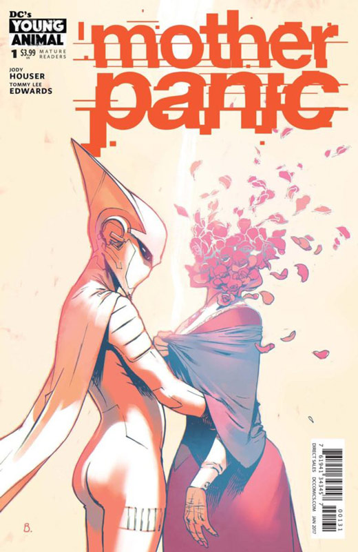
DC’s Young Animal Writer Jodi Houser, Artist Tommy Lee Edwards, Letterer John Workman
The last of the Young Animal line lands this week and is a little rough on the first issue but shows promise. Houser throws a lot of things into this first issue but that is one of the problems with it at the same time. While reading the issue it felt a bit disjointed. I never felt much of a connection to the characters in the story but I will give her that the set up to the story has me intrigued. The best thing is that the book does not come off as a Batman clone considering that it takes place in Gotham and that was a very good thing. Edwards was a very good choice for the artwork with his gritty style that fits the tone of the book quite well. He really helps the book along and captures the subtle nuances that Houser script calls for. A big plus for this book is Workman’s letting on the book that is not just lettering but perfectly blends with the art seamlessly that you rarely see.
Is this book worth your time and money? This is one of those books that I liked but didn’t quite love. However it does show another side of Gotham that seems familiar but is all its own. I think that Houser’s story is a slow burn that will come together over the next few issues. The Edwards and Workman combo really save the first issue here with their wonderful work on the book. In the end the book is worth checking out but it’s a little bumpy to start.
Betty & Veronica #2
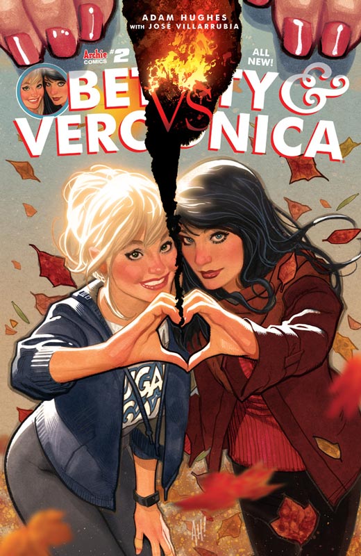
Archie Comics Writer and Artist Adam Hughes, Colorist Jose Villarrubia, Letterer Jack Morelli
Well it only took four months for the second issue of this book to come out and I’m fairly impressed that it only took that long. Hughes is not known for his stunning speed so there in lies the problems that this book is going to have. The second issue is not as strong as the first but it works for the overall story arc that he is doing. The story is a middle part for sure but there is still fun to be had with the book. He does a very nice job with the Betty Vs Veronica feud this issue and captures the humor of it all nicely. As always his artwork is the real seller here and as with the first issue the artwork is gorgeous. He is such a perfect fit for this book that it’s well worth the wait to see it. The biggest issue is the color tone that Villarrubia chose for this issue. The colors are so toned down that you would think that the book was misprinted but the pin-ups and the ads look fine so I guess it just an odd artistic choice.
Is this book worth your time and money? At this rate it will probably take a year for the story to be finished so for the vast majority of people you should just wait for the trade edition of this because trying to read this when it comes out is a real challenge. With that being said I still enjoyed the book for what it is. It’s a light and fun look at Riverdale with stunning artwork. You know what you’re getting with it.
Batman/Teenage Mutant Ninja Turtles Adventures #1
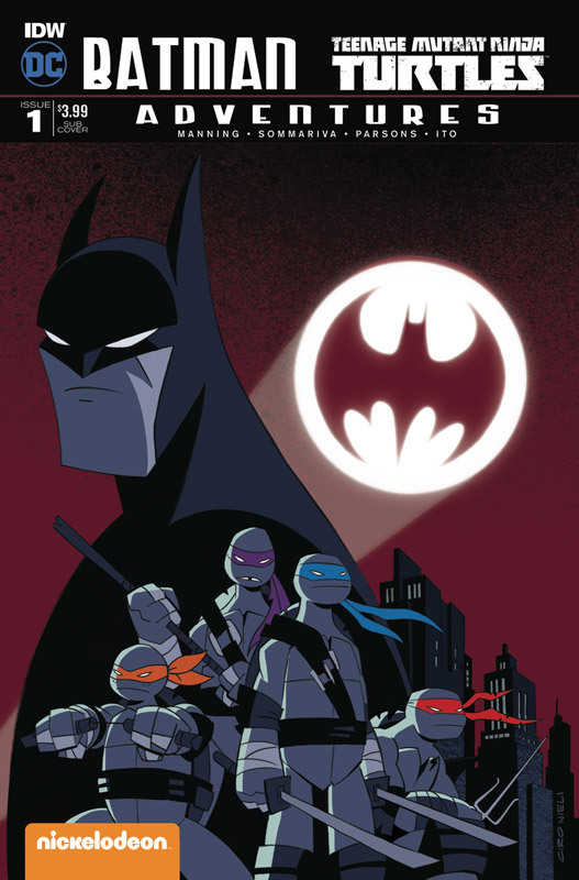
IDW/DC Comics Writer Matthew K. Manning, Penciller Jon Sommariva, Inker Sean Parsons, Colorist Leonardo Ito, Letterer Shawn Lee
This is an interesting crossover that follows the recent Batman/TMNT crossover for the regular comic incarnations. This book is based on the animated versions of the characters. Manning wisely dispenses with the whole explaining why the characters are connected via a portal and keeps it simple that way. It’s just goes with that they are and gets on with it. He also keeps the tone of each show but has fun mixing the two together. There is a fair amount of set up in this first issue but Manning strikes a nice balance with some good old fashion comic book action to keep it moving along nicely. Sommariva and Parsons do a very nice job of keeping the original animation style for each show but adapt it quite nicely here in comic form. They have a lot of fun with the stretch and squish aspect of animation and bring that to the comic with some wild visuals. The Clayface sequence is very visually impressive in this issue.
Is this book worth your time and money? This is a simple and fun book that on the surface might seem like just a kiddie title but there is a lot of fun for adult readers. Manning doesn’t make the book a deep reading experience but just keeps it fun and light just like their animated counterparts. The art is a lot of fun and the nail the look of them very well. Well worth getting and a lot of fun.
Namesake #1
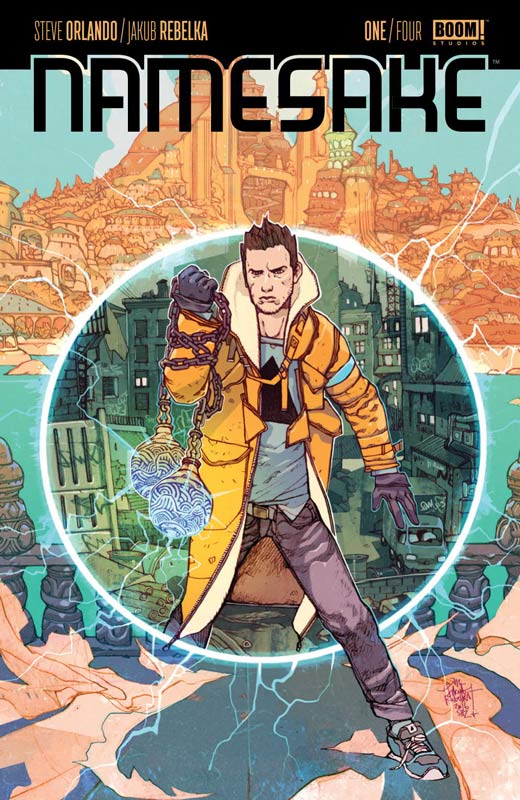
Boom Studios Writer Steve Orlando, Artist Jakub Rebelka, Letterer Thomas Mauer
This is a book with a lot of ideas but unfortunately the story is simply a real mess here. The biggest problem is that Orlando throws a lot of ideas out but the story never connects and is very disjointed. There were many times where I simply was board reading it. Another problem was with a lot of the made up names of things simply got annoying after a while and took me out of the story. At the end of the issue you are left with a confusing mess that give no reason to come back for more. I will give Rebelka’s art a nod because while there are some inconsistencies he tries really hard to make the script work visually but he simply can’t save this mess.
Is this book worth your time and money? Orlando is better than this mess and there simply is nothing here to waste your money and time on. SKIP IT!
Triggerman #2
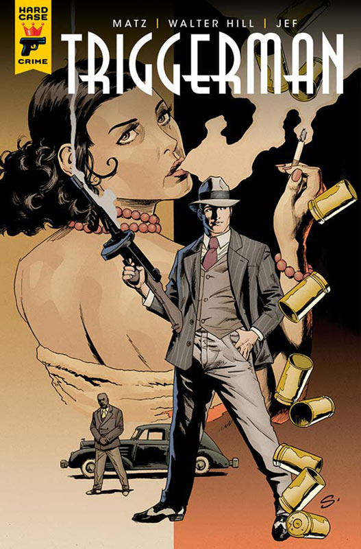
Titan Comics Original Story Walter Hill, Adaption Matz, Artist Jef, Translation Edward Gauvin
I like the first issue of this book and thankfully the second issue did not disappoint. Matz keeps the momentum of the first issue going here and build greatly upon it. We get to see why Roy was picked for the job and while it’s ugly at times it does make for a great story. What impresses me about the book is that it’s a really dense story and yet Matz keeps it flowing so well. The dialog is very rich and gives you a great feel for the period. Jef’s artwork continues to impress and captures the feel of the period and really puts you into it quite well. This is a great looking book.
Is this book worth your time and money? I’m a big fan of noir stories and this one has really captured my attention. Great story and solid art is making this a great read and well worth getting.
Doom Patrol #3
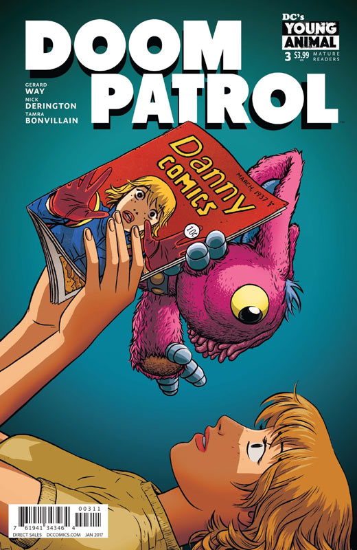
DC’s Young Animal Writer Gerard Way, Artist Nick Derington, Colorist Tamra Bonvillain, Letterer Todd Klein
This incarnation of Doom Patrol is moving along nicely but while I’m enjoying it, there is a slow burn ot the story that is hampered a bit as a monthly book. This issue we start to find out some of the mysteries that Way has set the stage for and starting to come together. I still wish that he would get out of Morrison’s shadow on the book and strike more out on his own and there is a bit of that this issue but there the book still seems like an impression of the Morrison version than an original take. Derington continues to impress with his artwork on the book and I really loved the style that when it goes into comic book shop mode in the story. There is a lot of fun art in that section of the book.
Is this book worth your time and money? The book is still worth checking out but for me hasn’t quite taken off like I would have liked. Way needs to stop trying to write like Morrison because he need to find his own voice on the book. I do like the direction that this issue went and hopefully he can build on that.


0 Comments