I’m a bit under the weather this week so I will try to get to as many reviews before I pass out so please bear with me if some things sound a little strange.
Thanos #1
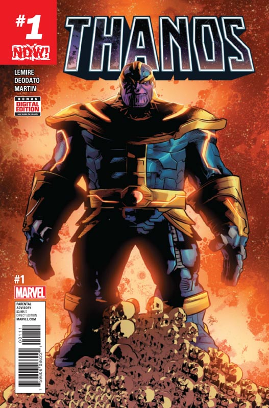
Marvel Comics Writer Jeff Lemire, Artist Mike Deodato, Colorist Frank Martin, Letterer Clayton Cowles
Thanos has mostly been written by Jim Starlin over the years but I was intrigued with the idea of Lemire’s take on the character. This first issue is pretty much a set up story so not as strong of a first issue as I would have liked but he does plant some interesting seeds in the story. There is a lot of exposition to get through on this first issue and it’s a bit dry at times and there is nothing that I didn’t expect from this book that was a little disappointing. I’m a big fan of Lemire’s work but when he does books for the big two they are never quite as good as his creator owned books. Deodato’s artwork on the book is very nice and visually gives the book a big boost and helps move things along with the lack of major excitement in the book.
Is this book worth your time and money? While this first issue wasn’t bad it did just kind of sit there in the end. There are some interesting ideas that Lemire sets up in the story but I don’t know if there is enough for me to come back to the second issue. Deodato’s art is a plus for the book but it just didn’t overwhelm me that much.
Slam! #1
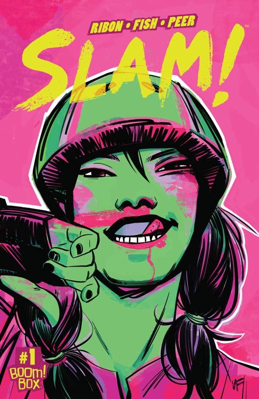
Boom! Box Writer Pamela Ribon, Artist Veronica Fish, Colorist Brittany Peer, Letterer Jim Campbell
Boom Studios Boom Box imprint has been a mixed bag but the thing that I like about the imprint is that it is giving creators an outlet to tell more personal and non mainstream ideas. I have to say that Slam! not only is done by female creators (this is a VERY good thing), but it really knocked my socks off. I have to give credit to Ribon for starting the series off with a really strong first issue that does a great job of introducing the characters but striking a great balance between exposition and moving the story along at a great pace. She makes things flow so effortlessly and captures the subtle emotions of the girls to make the story not only a great read but very relatable. I am a firm believer that no matter what your gender, race, etc is that a good story works with everyone and Ribon proves it here very well. While I have never been to a roller derby before after reading this book I feel that I have been. When you have a great script like this you really need an artist that can bring it to life perfectly and this is where Fish steps in. Fish caught my attention on her solid run on the new Archie series that was perfect for her style. What she brings to this book truly impressed me. She captured both the action of the derby but the very subtle emotional beats of the script that really blends both her art and Ribon’s script together perfectly.
Is this book worth your time and money? One way to describe this book is charming and that seems good but it’s so much more than that. Ribon and Fish not only get this book off to a great start but by the time I got to the end of the issue I was excited to see where they are going to take the book. So many books get off to a slow start but Slam! is a book that is simply fun to read, and that doesn’t happen that often in comics today. It’s a book that makes you smile and glad that you read it. I simply loved this book and can’t wait to see the next issue. HIGHEST RECOMMENDATION!
Grand Passion #1
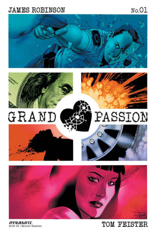
Dynamite Entertainment Writer James Robinson, Artist Tom Feister, Colorist David Curiel, Letterer Simon Bowland
Robinson has written both good and bad comics over the years and his newest land a bit in the middle. I really liked the idea that the story sets out in the first issue but it ends up missing something that I can’t quite put my finger on. He does a good job of setting up both the story and the characters in this first issue. It’s a mix of pulp action and a romantic novel with a dash of Bonnie and Clyde that flows together pretty well surprisingly. The story shows promise but there is not a big hook in Robinson’s script in this first issue that I would have like to seen. Feister’s art is a bit of a mixed bag. Overall it’s pretty good but there are some inconsistent art in the issue but nothing fatal. I will give him that he does a great job on the facial expressions that really helped with the book.
Is this book worth your time and money? I was not overwhelmed with this book, I will say that there is a reason to give the second issue a try. There is some good ground work here and hopefully the second issue puts the book on a stronger path. It’s worth checking out.
Ether #1
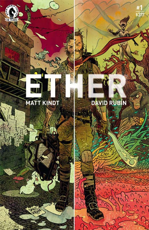
Dark Horse Comics Writer Matt Kindt, Artist and Letterer David Rubin
This is one of those books that at first you’re not quite sure what to make of it in the first few pages but as the story unfolds you are really sucked into this world that Kindt and Rubin have created. Kindt blends a lot of genres together here and really flow together nicely. There is a lot to set up in this first issue and Kindt is a writer who knows how to deliver exposition that never drags the story down. He actually makes you enjoy the set up to the story. What impressed me is that he has crafted a unique and fascinating world that is not only fresh but very inviting. He also keeps it light and fun along the way that really added a great deal to the book. Rubin really brings this story to life with his beautiful artwork that mixes both realistic, fantasy and cartoony art style that really makes this book standout. The level of detail that he infuses the art with is quite amazing and his layouts are simply breathtaking. I really have to point out his great color work on the book that really makes this book pop.
Is this book worth your time and money? This is really a great book that gets off to an amazing start. It’s a perfect marriage of story and art that Kindt and Rubin have created here. It’s a book that will have you impatiently waiting for the second issue. This is a really enjoyable book that really knocked my socks off. HIGHEST RECOMMENDATION!
Cave Carson Has A Cybernetic Eye #2
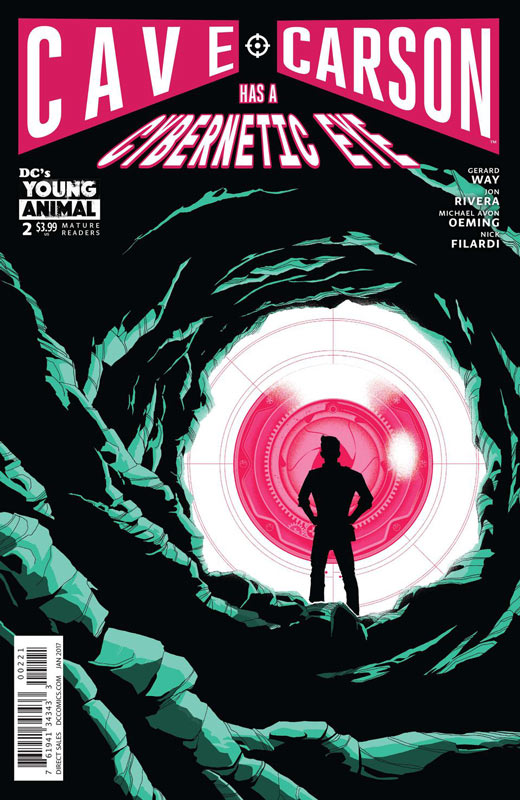
DC’s Young Animal Writers Gerard Way & Jon Rivera, Artist Michael Avon Oeming, Colorist Nick Filardi, Letterer Clem Robins
I really enjoyed the first issue of this book and the second issue lands quite nicely. What I really love is that it’s a throwback to the adventure comics of the 1960’s where science fiction was exciting and fresh but at the same time simple and fun. Way and Rivera have really captured this and yet updated it nicely without losing the charm of the era. While a lot of the story elements are pretty basic Way and Rivera give them a nice spin here and simply have fun with it. I love the nostalgia aspect of the book and they are not afraid to embrace it here. They have created a grand adventure here and this issue shows that the first issue was no fluke. Very few modern artist could have pulled this book off and thankfully Oeming is one of those few. He gets the visual tone and feel that the book requires and delivers some of his best artwork to date. The layouts for the artwork are stunning and he really gives this book a truly epic feel and yet the delicate dramatic moments are just as impressive and is a perfect blend.
Is this book worth your time and money? While the other Young Animal books get a lot of the lime light I think that this is the must read book of the line. It never overplay the story and doesn’t try to be more than it is. One of the thing that the other books in the line are slightly struggling with is that they are trying too hard sometimes and this is where Cave Carson soars. It never tries to be more than it needs to be. I think that Rivera is bringing that to the scripts here compared to Way’s solo Doom Patrol writing. Having Oeming artwork on the book simply seals the deal on this book. I’m loving this book and HIGHLY RECOMMENDED IT!



0 Comments