With Free Comic Book Day coming up tomorrow there are quite a few new regular comics that your might want to pick up along with your free comics. If you do go to your local comic book store for Free Comic Book Day make sure that you buy some other things from them because they do actually have to pay for the free comics so help support them for giving you some free comics. Now on to the reviews.
The Flintstones #11
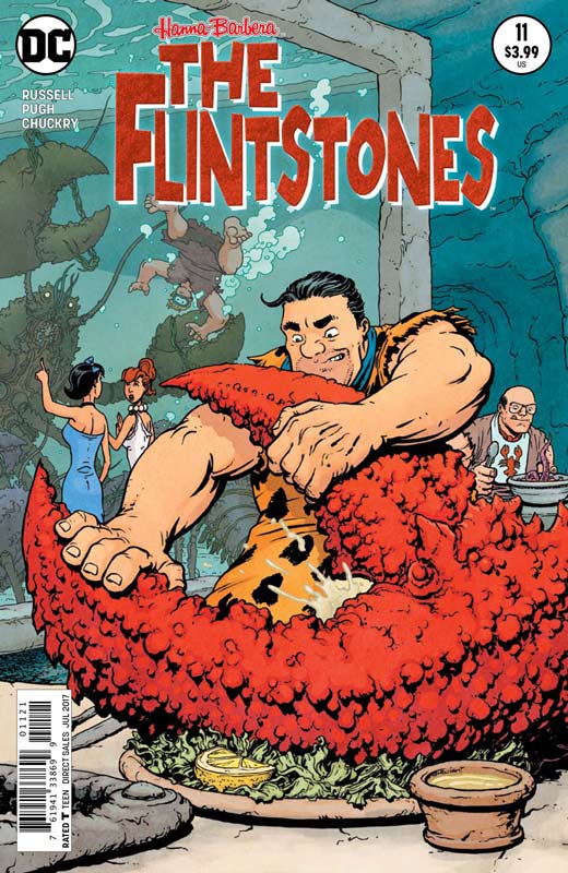
DC Comics Writer Mark Russell, Artist Steve Pugh, Colorist Chris Chuckry, Letterer David Sharpe
This is the one book that I truly look forward to each and every month and it’s going to be really rough with the next issue being the last one. This is the one comic that does so many thing right and yet each issue brings something new and exciting to each story. This issue continues Russell spot on social commentary mixed with humor and fun. There is a lot to love in this issue with two great storylines that blend together perfectly. The one thing that I really loved this issue was the encroaching richer neighbors moving into the area and changing the normalcy of it to make it fit them. But the best part of both stories is the friendships that the book does so well. It’s the characters that makes this book so wonderful and this story has a great sentimental moments that really deliver the heart and soul of this book. It was also nice to se Dino come back into the book for some wonderful comic relief that really pays off at the end. The other element that Russell does so well each issue is that each issue is self-contained but there are threads of storylines that continue through that makes issues filled with little easter eggs for regular readers but still very open to new readers to pick up any issue. A great script will only take you so far and this is where artist extraordinaire Pugh comes in. He truly takes this book to the next level with the gorgeous artwork. A lot of artists would not bring their A game to a licensed book like this but not Pugh. He really delivers some of the best art not only at DC but a lot of comics currently out there. The level of detail he puts into each and every panel along with the emotions make each issue a real treasure.
Is this book worth your time and money? The hardest part of reviewing this book every issue is that it gets harder and harder to come up with new ways to praise it. Few comics deliver this high of quality each and every issue and is a book that truly deserves to have a much bigger audiences. This is a book that has been praised but yet still selling in low numbers. I can only hope that people are waiting for the trades of the book. If you’re looking for one of the highest quality comics being published right now then you don’t need to look any further. HIGHEST RECOMMENDATION!
Eternal Empire #1
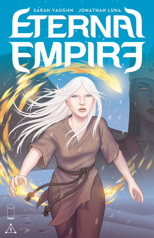
Image Comics Writers Sarah Vaughn & Jonathan Luna, Artist, Colorist & Letterer Jonathan Luna
I was a huge fan of Luna and Vaughn’s Alex + Ada that was an incredible comic that if you didn’t read I highly recommend you check it out. Their new comic gets off to a solid start in this first issue. This first issue is a set up issue where it seems like there is no much happening but it much more subtle than most comics are willing to take. What I love about the story is that you don’t know the name of “snow hair” and yet you become emotionally attached very quickly with her that is impressive. The oppressive overtones in the story are ironically quite timely and add an interesting tone to it that has a greater impact currently. Vaughn and Luna take a nice slow burn approach to the story that gives it a nice touch that I liked very much. Luna’s artwork fits perfectly into the mood and feel of the story and does a great job of capturing the emotions of the story that are sometimes hard to look at with the intensity of the story. His use of color in this book is quite impressive because there is a lot of times where he gives the art a filtered look that sets a great visual tone to the story. Good stuff here.
Is this book worth your time and money? As a fan of their last book Alex + Ada there was a lot riding on this book for me and I’m glad to say that I liked what this first issue delivers. There is a lot of set up here in this first issue but does deliver a great set up to the series and leaves you wanting more. If you’re looking for a good fantasy comics then you should really check this book out. RECOMMENDED!
Guardians of the Galaxy: Mother Entropy #1
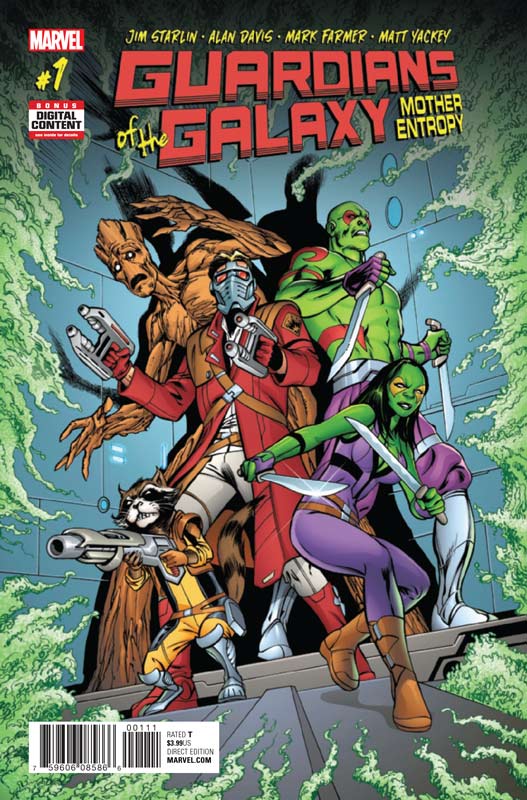
Marvel Comics Writer Jim Starlin, Penciller Alan Davis, Inker Mark Farmer, Colorist Matt Yackey, Letterer Cory Petit
With seemingly a ton of new Guardian of the Galaxy book hitting the stand to take advantage of the new movie hitting theaters this weekend there is one that had me excited. OK Starlin and Davis could adapt the phone book and I would be all over it. The good news is that they deliver a fun and great looking book that makes it a winner this week. Starlin brings his usual cosmic flair to the story but he really nails the humor that he is not necessarily known for that made the story a nice pleasant surprise. He captures each of the characters quirks and little idiosyncratic elements made the story a fun little read. He also wisely keeps the story simple that not only makes it fun for regular readers but easy for new readers to step right into. Davis and Farmer deliver their usual top-notch artwork here and what is most impressive is the emotions and the expressions on the characters faces are truly priceless and add greatly to the fun of the book.
Is this book worth your time and money? With all of the Guardian books flooding the shelves this is a great choice because its only five issues so there is not an ongoing series that could drag on but with this self-contained story its easy to get into and a whole heck of a lot of fun. Solid story with awesome artwork makes this a winner. RECOMMENDED!
Swordquest #0
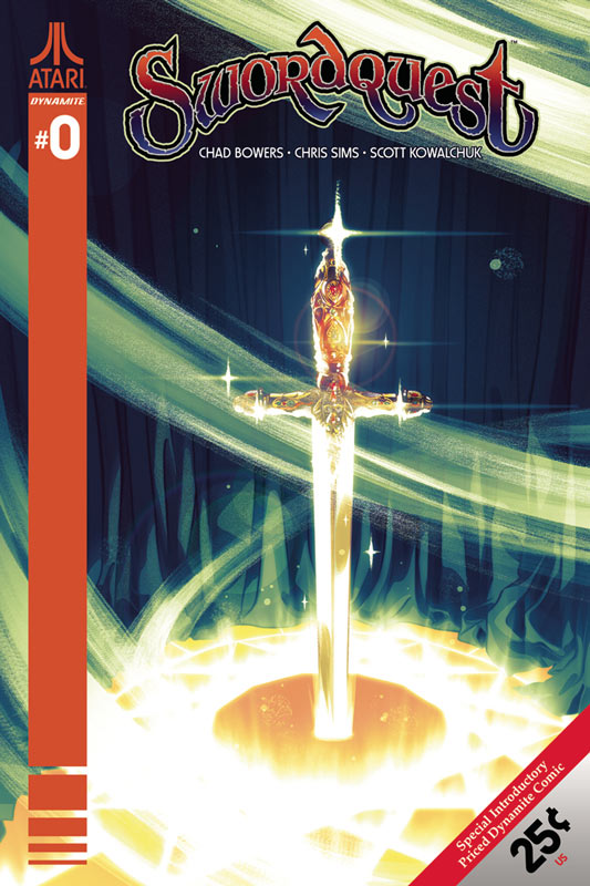
Dynamite Entertainment Writers Chad Bowers and Chris Sims, Artist & Colorist Ghostwriter X, Color Flats Karl Fan, Letterer Josh Krach
I remember the Atari Swordquest mini comics that came in the games with great little stories by Roy Thomas, Gerry Conway and George Perez and while they were pretty simple they were really high quality. So the bar was set pretty high with me and this new take on the story. It ends up being a little mixed bag with the book but there is some promising elements. The story is actually pretty good and does a good job of setting up the concept of both the story and how it ties into the original Atari game and comics. While the story is only 14 pages long it’s really a set up for the regular series that starts next month. Bowers and Sims seem to capture both the comic and videogame elements and blend them together into an interesting idea here. It’s a nice bridge from the past to the present. Where the book struggles is the artwork by Ghostwriter X that is kind of on the stiff side and had an odd flat look at times. While the art is not terrible it doesn’t really inspire either. Hopefully this was some early work and that he might settle in the regular series. Again the artwork is not bad just not up to par for me.
Is this book worth your time and money? Look the book is only 25¢ so there is not a huge investment here. While it’s only 14 pages it does a pretty decent job of getting the story off to a decent start. The artwork is a sticking point for me and wishing that it could have been better but it not the deal breaker on the book. If you’re a fan of the original Atari games and comics then you might want to give the book a shot. For new readers I’m unsure if it goes beyond the original audience.
Predator Hunters #1
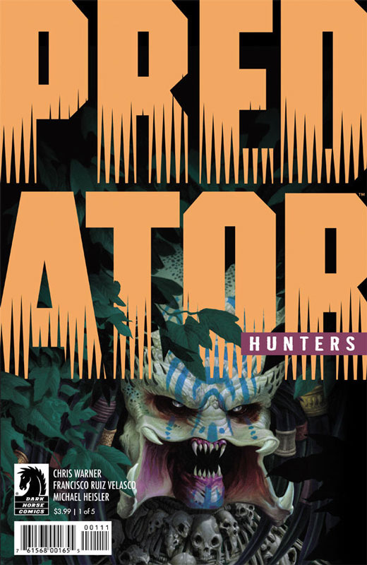
Dark Horse Comics Writer Chris Warner, Artist Francisco Ruiz Velasco, Letterer Michael Heisler
Last week we got a new Aliens comic and now we get a new Predator one and it fares a bit better than the latter. Warner a veteran Predator writer brings elements and characters from previous stories and blends them into this new series. The good news is that if you have not read the previous ones than Warner brings things up to speed so you’re not missing anything. The side effect to this make this first issue filled to the brim with exposition that does make the first issue drag just a bit. He does try to move things along with some nice action that does help move things along. The one thing that benefits the book is that at least in this first issue, it doesn’t feel like a been there and done that Predator story. Instead of them hunting the story is that they are going to be the hunted. It’s a nice twist that hopefully will play out well but time will tell. The art by Velasco is nice and does the job while not flashy it does the job and delivers the story well. The one thing that he does well is that he fits a good amount of detail into the art that really helps the look of the book.
Is this book worth your time and money? The first issue is decent but on the other hand is not overwhelming. There is a decent idea here and the second issue is probably worth a look. I’m kind of in the middle on this one, but if you’re a fan of Predator then you’ll probably like it. If you’re looking to be amazed then you will be disappointed.
Bane Conquest #1
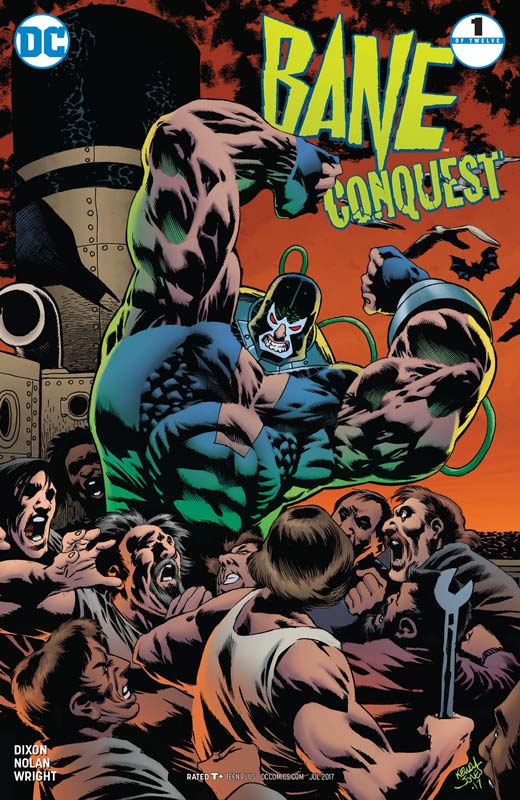
DC Comics Writer Chuck Dixon, Artist Graham Nolan, Colorist Gregory Wright, Letterer Carlos M. Mangual
It’s like the 1990’s all over again with this book and that could be both a good and bad thing. This first issue gets off to a bit of a middling start. Dixon script has its moments but at least in this first issue there wasn’t a lot of compelling elements that you would hope to see in a first issue. The story goes through the motions of setting things up and is not totally devoid of ideas but when I was finished with the book I was simply board and am not very compelled to read the second issue. Dixon is a good writer but its sad to say that this book kind of just sits there. On the plus side Nolan does a great job on the artwork and does his best to help move the story along and he nearly saves the book but in the end great art can’t really save a mediocre story.
Is this book worth your time and money? I wanted to like this book but it was simply boring and I really find it hard to believe that the story is going to run 12 issues. After reading this issue I simply can’t imagine that there is 11 more stories to tell after reading this. It’s a real shame that Nolan’s artwork is the only reason for me that saved this book from being a total loss. Again it’s not a train wreck but it’s simply just boring. SKIP IT!
Pestilence #1
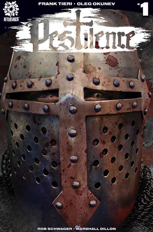
Aftershock Comics Writer Frank Tieri, Artist Oleg Okunev, Colorist Rob Schwager, Letterer Marshall Dillon
With the floodgate of zombie everything now, it really hard to tell an original take on the whole zombie fiesta but I have to give Tieri that he came up with a very nice twist on it here. One of the things that he does to get the book off to a solid start is that he sets the story up first and the zombies don’t even show up until the end of the issue. That was a very wise choice. I like the whole crusades element of the story and that gives the book a strong framework to build upon. While there is lots of blood and violence in the story it actually feels quite natural for the book. There were a few times where Tieri got a little carried away with the dialog that does drag a few times in the issue but doesn’t drag it down too much, just noticeable at times. The artwork by Okunev is quite good here but there were many times where there were simply no backgrounds that is a pet peeve of mine. Other than that he put quite nicely detail into the characters and does give the book a great scope. Overall it’s a nice looking book that does a nice job of capturing the script
Is this book worth your time and money? I was pleasantly surprised by this book and is an interesting concept and am intrigued to see where Tieri and Okunev take the story in the next few issues. The thing that really impressed me is that the whole zombie thing is not the main crux of the story and that is where it works so well. I’ll check out the next few issue to see if they follow through with the set up here. It’s well worth checking out.
The Damned: Ill-Gotten #1
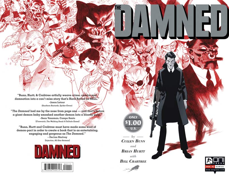
Oni Press Writer Cullen Bunn, Artist Brian Hurtt, Colorist Bill Crabtree, Letterer Crank!
This new series is a sequel to the original Damned mini series and is now a regular series. The good news is that if you have not read the mini series you will not be lost in reading this one. Bunn gives new readers the whole gist of the premiss within this story and weaves it in very well. Set in the prohibition era gives the book a great feel and tone that really adds to the charm of it. Period comics often struggle to blend the elements together well but Bunn does a great job with this book. What helps is that Eddie is both likable and a bit of an ass at the same time and that allows a lot of leeway to play him in many different directions. Then throw in the mob are demons adds to the uniqueness of the book. Bunn does a great job with the script in that it makes the reader feel the period but also makes it relevent to todays readers. The story oozes crime noir and that is what makes it such a fun read and Bunn makes sure that all of the elements fall perfectly into place. On a comic like this you need an artist that can really capture the era and bring it to life and this is where Hurtt’s gorgeous artwork comes into play. His art has a bit of a cartoony style but that really plays well into the look of the book and this is where the demons come into play. Hurtt is able to give the book a great visual feel where all of the weird story elements simply blend together perfectly and that is why he is a perfect artist for the book. Where the book shies is the lovely color work by Crabtreen that not only complements Hurtt’s line work but give the book a great noir feel with his use of muted colors and using full color sparingly for certain sequences to stand out.
Is this book worth your time and money. Not only is this book a keeper but the first issue is only a buck that makes it a great way to get into the series for those on a budget. Oni is putting its money where it’s mouth is on this book with the pricing. Solid story and artwork not only make this book a fun read but a real steal at only a dollar. RECOMMENDED!
Batman #22
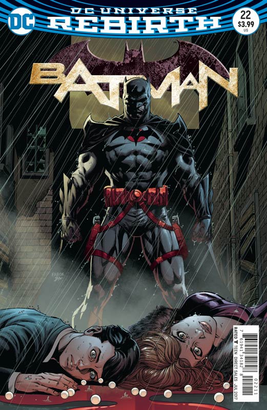
DC Comics Story Joshua Williamson & Tom King, Writer Joshua Williamson, Artist Jason Fabok, Colorist Brad Anderson, Letterer Deron Bennett
The button storyline continues and it seems with each issue the story loses its focus more and more. The problem with this chapter is that there is not a lot in the script that drives the story forward. The last chapter in the Flash did deliver something to the overall story but this issue of Batman really seems to tread water. Williamson script seems to just go through the motions and ends up being a real by the numbers affair here. The story seems to lack a lot of weight and I breezed through the story quickly and didn’t leave a huge impression. At this point it seems as if the story is being dragged out and it’s really hurting the overall impact. Fabok turns in a nice job on the artwork. and thankfully gets away from the nine panel “homage” to Watchman that plagued his first issue of the story. Even with the middling story Fabok does a grand job on the artwork and does his best to move things along visually and does help the book as best he can but he can only do so much.
Is this book worth your time and money? I really wanted to like this storyline but it really is a ship sinking fast here. It’s not that the story is terrible or unreadable but simply not a lot is happening here. Were at part three of the story with this issue and there hasn’t been a lot that has happened so far and with only one more issue in the story I can’t hold much hope that it’s going to be brilliant or anything. This has been a huge disappointment instead of a train wreck. I guess I’ll stick it out at this point but can’t really recommend this sad mess.
Savage Things #3
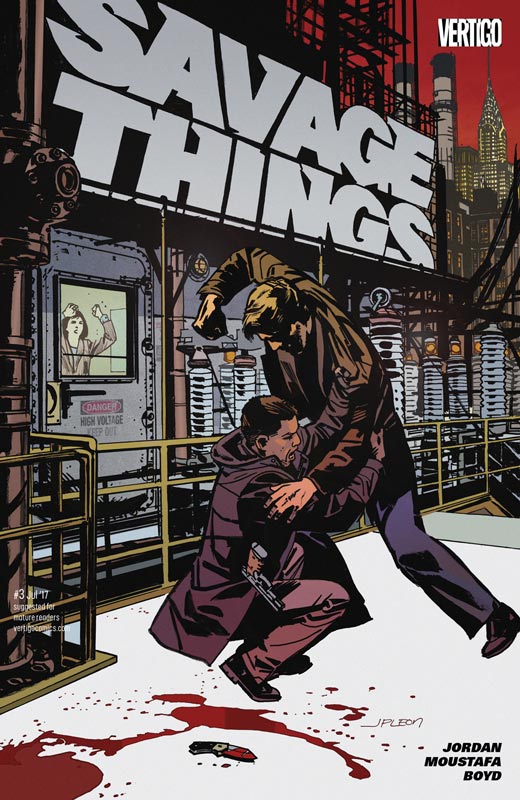
Vertigo Comics Writer Justin Jordan, Artist Ibrahim Moustafa, Colorist Jordan Boyd, Letterer Josh Reed
This book is coming along nicely with the third issue. Jordan is doing a nice job on pealing back the story as current events are unfolding giving the story both exposition and forward momentum at the same time and is working quite well. The other thing that he is doing well is unfolding the story at a nice pace that lets the story and events really sink in as you read the book. This issue continues to push the grey area that the story sets up and has some really nice action thrown in for good measure. Jordan doesn’t pull any punches on any level of the book that is making it a bloody fun time but never uses story elements to the extreme or for shock value. Every element is well thought out and has a good reason in the story. Moustafa continues to impress with his artwork with clean line work that delivers every overt and subtle detail in the artwork with a spot on work. Where he really shines is the characters emotions and facial expressions that really capture the script and give the book a great gritty look that delivers the impact of it all perfectly.
Is this book worth your time and money? I’m really digging this book and while the violence is pretty intense, every element is very carefully thought out in both the story and the art. Some would find the whole affair over the top and overtly graphic but it’s actually not and that is what is making it work so well. Sure there is a ton of violence in the book but that is not the point of the story and this issue really hits that home. This book is a solid buy and continues to impress.
Extremity #3
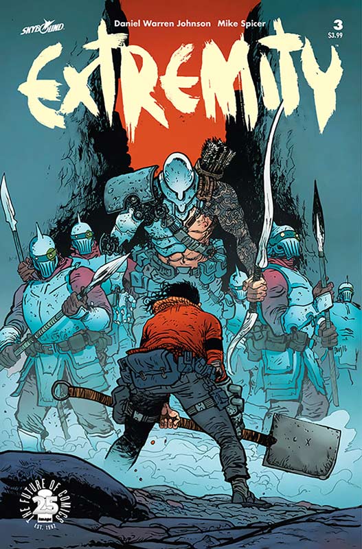
Image Comics Writer and Artist Daniel Warren Johnson, Colorist Mike Spicer, Letterer Russ Wooton
What is really wonderful about this book is the epic scope that Johnson is taking with this story and yet it’s small and personal at the same time that is making it such great read. While the story shows the horrors of war, I love that Johnson takes the time to see the toll that it takes on the characters. This is where the book really shines is that the more low-key moments in the book is where the story delivers its real impact. But he also understands that the large epic of war needs to be delivered as well to make all of the elements come together for a strong story. What I take away from each issue is the emotions of the story that really strike a chord with the reader. It’s rare for a book like this for a writer/artist to deliver such high quality on both ends and this is where the book really excels. The level of detail that Johnson puts into each and every panel delivers on every level. What is most impressive is the smaller dramatic scenes that is where the artwork shines. Sure the epic battle in this issue is stunning but he really captures the essence of the characters in the smaller dramatic moments of the story that is where the art really hits the mark. Spicer’s color work on the book really complements Johnson’s line work and brings the artwork to life and uses each color in a very carefully chosen way that delivers the impact of the artwork.
Is this book worth your time and money? This book continues to tell an epic story with great emotional impact because it never loses sight of the emotions that make a story great. While the battles are beautiful it’s the characters that are making this such a great story and you want to join them on this journey of discovering themselves. RECOMMENDED!


0 Comments