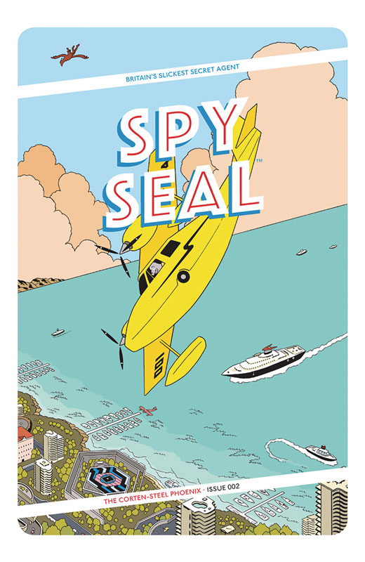
Spy Seal #2
Image Comics Writer/Artist/Letterer Rich Tommaso
I was quite taken with the first issue of Spy Seal and Tommaso does a great job on the second issue that keeps the great momentum building from the set up. The story starts off with Malcolm’s first assignment and gives it a grand chase that is a real visual treat that sets a great tone for the book. While there are obvious nods to Bond and other famous spy characters, Tommaso makes sure that this story feels and looks original and fresh. While the action in the book is great its the dramatic moments and the characters that make this book such a fun and great read. One thing that I love about the book is the European flavor that he infuses both the story and visuals that give it an underground feel that you rarely see in mainstream comics. It reminds me of Love and Rockets in that it has a fresh approach to traditional comics. With a solid story the treat for me is Tommaso’s art that has a depth to the surface cartoony style that is a visual feast with both his line art and color work. The point on expressions that he gives the characters really gives the book a charming quality. One real standout in this issue is when Malcolm gets knocked out and has an amazing dream sequence that was simply stunning to look at.
Is this book worth your time and money? Tommaso has crafted a grand spy adventure that hits all of the elements perfectly and blends them into a very entertaining comic book. Part of what makes the book so good is that he keeps things simple but its the subtle details and the charters that really make this book shine. If you’re looking for a fun a different comic that is a solid read and visually entertaining then you should really give this book a try. I love it and HIGHLY RECOMMEND IT!
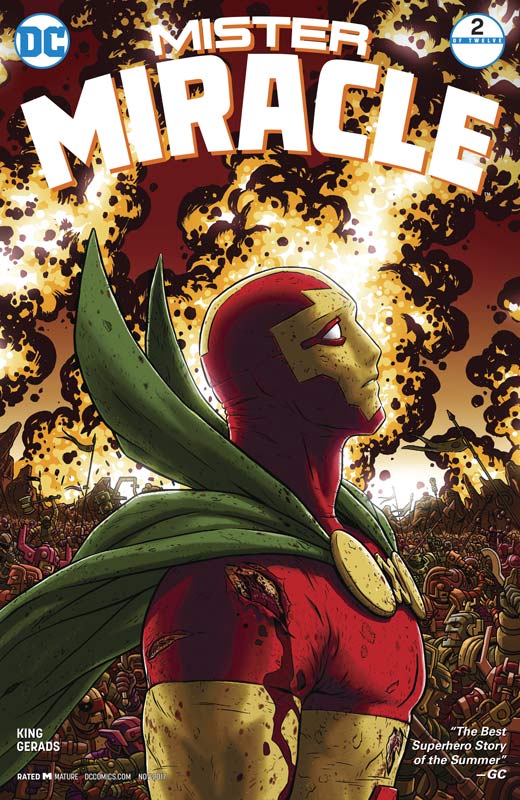
Mister Miracle #2
DC Comics Writer Tom King, Artist & Colorist Mitch Gerads, Letterer Clayton Cowles
While the Kirby 100 month of celebration may have ended DC is not resting on that and continue to re-imagine his great creations. Mister Miracle first issue was amazing and the second issue proves that was no fluke. King has taken a great character and instead of going the typical superhero route with the story he takes a step back and looks at it from a slightly different angle to tell the story. He doesn’t change what made the Fourth World characters great in the first place but he takes a more subtle and deeper character development to the story that digs deep into the emotional core of them and the Fourth World. He is slowly unfolding and peeling back what makes Scott and Barda who and what they are and then throws them into a war with Darkseid and his crew that both exciting and low-key at the same time. King finds a way to strip things down and then distill them until finding a way to put it back together is a story that is familiar and yet new and fresh at the same time. He has been doing that over in the Batman book for some time now but here with the wide birth of Kirby’s Fourth World is like being a kid in a candy story. There is so many things to choose from and yet he takes the time to pick and choose the best. What makes this book work so well is with Gerads bringing all of this to life with his stunning artwork. He takes the nine panel layout and takes comic book art to a whole other level. While inspired by Kirby he makes this book his own with boldness and yet at the same time a very subtle dramatic tone that fits King’s script like a glove. Where some artist would go big and bold with this Gerads take the smarter less is more approach here and delivers some of his best work to date,
Is this book worth your time and money? King and Gerads are firing on all cylinders here and has brought Kirby’s Fourth world to a whole new generation of comic book readers with their fresh take but never forgetting where the roots of it come from. What is most impressive is the amount of story and art that are in each issue of this book and were only at the second chapter. While the story is dense it never feels slow or forced but flows with such each thanks to Gerads spot on artwork. If the book is this good so far then it’s going to be a grand ride indeed! HIGHEST RECOMMENDATION!
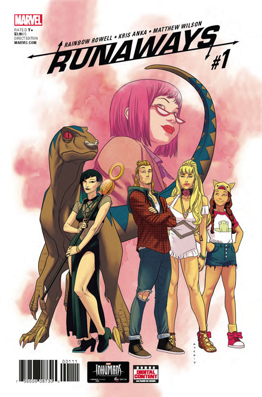
Runaways #1
Marvel Comics Writer Rainbow Rowell, Artist Kris Anka, Colorist Matthew Wilson, Letterer Joe Caramagna
Marvel brings back Brian K. Vaughan’s impressive Runaways of course to capitalize on the upcoming television series based on the book but misses the mark for new readers. Rowell known for her popular YA books takes here first stab at comics and unfortunately is not able to capture the medium well. It’s not that the book is bad but if you have never read Runaways before then you’re not going to have a clue of what is going on here. Her mistake is assuming that everyone knows who is who and what has previously taken place. This seems to be a problem sometimes for book authors who take on comics for the first time. For every Brad Meltzer there is a Ta-Nehisi Coates and now Rowell. Unlike a book the reader has the entire story in front of them but with a monthly comic you have to capture the reader in twenty or so pages and get off on the right footing. Rowell drops you into the middle of the story and while she get the essence of the characters down, new readers will have no idea who they are or what is going on. After reading the first issue I didn’t really feel a need to come back for a second issue. There wasn’t anything compelling in the story because there is simply no set up for it. She presents characters but very little story to grab onto. Anka’s artwork is OK but lacks the detail and the visual punch that might have helped the book take up the slack of the empty story. His artwork ends up being pretty middling and the lack of backgrounds didn’t help either.
Is this book worth your time and money? While it’s not terrible it certainly not off to a great start. If you’re a familiar reader of the characters you might like this but if you have never read Runaways then this book is a very sad disappointment. Rowell makes the fatal mistake of telling a first issue story that is not very compelling and gives little reason to come back for more. The plain and flat artwork by Anka doesn’t help at all. This was a major failure to reboot a good book. SKIP IT!
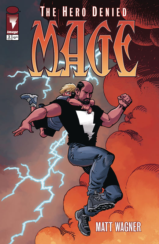
Mage: The Hero Denied #2
Image Comics Writer and Artist Matt Wagner, Colorist Brennan Wagner, Letterer Dave Lanphear
The first issue of this final story arc was just a taste of what was to come and this second issue gets to the meat of the story. Wagner did a great job of setting things up in the first issue and really build very nicely here and opens up the scope of the story. What makes this story interesting is that the stakes have changed for Kevin who now has a family and the threats of darkness change the game considerably. This also gives the story a far different tone but just as the second arc did from the first one. What is making this book so good is that the long gap between the last story arc has actually benefitted this one. I would have of course to have had is a lot sooner but considering that Wagner wasn’t ready to tell this final chapter and you can start to see why in this second issue. The way that Mage has unfolded over the years is Wagner’s need for the story to be told at certain periods of his life and now with the amount of time this has passed you can feel that in this story. Mage has always been a mix of Arthurian legend and personal experiences and that is really showing in this book. While I love Wagner the writer, it’s when he is Wagner the artist/writer that always has impressed me. There is something different about when he writes for his artwork than someone else. Of course in his Mage books you really see it but if you look at books like his Trinity story at DC from 2003 you will see it there too. He has a great way with the mystical aspects of the story but what I love about his art is the low-key dramatic moments that he simply captures the emotional core of the story with the artwork. His son Brennan continues to bring his A game to the color work on the book and gives his dad a run for the money with the previous chapters that he colored himself.
Is this book worth your time and money? I was very impressed with this second issue of the story and am even more excited for this story. If your new to Mage I highly recommend picking up the first two-story arcs to get up to speed before diving into this one, but if you are up to speed this story is the one that has so far been well worth the wait. VERY RECOMMENDED!
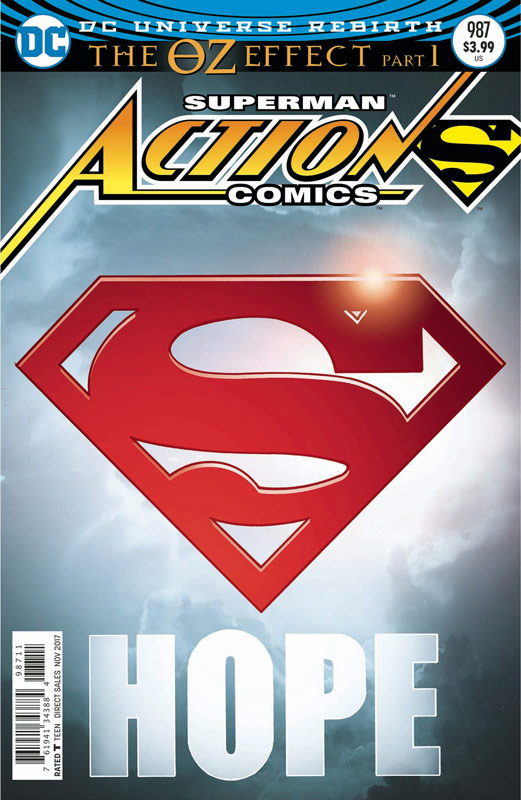
Action Comics #987
DC Comics Writer Dan Jurgens, Penciller Viktor Bogdanovic, Inkers Jonathan Glapion, Jay Leisten & Bogdonovic, Colorist Mike Spicer, Letterer Rob Leigh
I wasn’t overwhelmed with the Superman core titles with the Rebirth launch because they felt too stuck in the 1990’s with too much sameness and nostalgia, but I was willing to try this new story arc to see if there had been any changes. The answer is both yes and no. While I will give Jurgens that this first chapter is off to a good start, it still had that feeling of that I have read this type of story too much. The set up is just a little too much been there and done that to it. The problem with a long-term set up is that when the big reveal is done here it seems forced and overcooked. The problem with Jurgens script is that it’s an overstuffed event that simply doesn’t unfold naturally. This is superhero writing 101 where there is nothing in the story that is original or fresh. Jergens is a decent writer but beyond his old Booster Gold days, he pretty much follows the basics and churns out solid if uninspired superhero scripts. The huge plus for this book is the stunning artwork by Bogdanovic that is one of the best Superman artist I have seen in a while. His artwork has a slightly cartoony style to it but that works quite well with the facial expressions of the characters. His artwork has a lot of great detail to it and is able to capture both the large actions scenes and subtle dramatic moments with ease. I just wish that the story was as gorgeous as the art.
Is this book worth your time and money? Well it’s not bad but the bigger issue is that its simply standard superhero fair here. If you’re looking for a decent Superman story that will hit all of the beats and will not be super surprising in the end then that is what you’re getting here. I have read better and much worse but with the anticipation leading up to this storyline, I was pretty underwhelmed here. Not bad but not that great either.
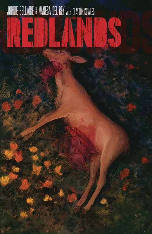
Redlands #2
Image Comics Writer and Colorist Jordie Bellaire, Artist Vanesa R. Del Rey, Letter Clayton Cowles
What is really interesting about this book so far is that the first issue and the second are almost two different books and that makes it strange and intriguing at the same time and that may not be a bad thing. The first issue was more of a prelude to this issue that starts to build the story. Bellaire script does set things up here but there were some story tropes that seemed a bit to cliché and does have me slightly worried. What bothered me was that the typical men are asshats seemed far too easy and simply lazy compared to the rest of the story. While I am all for more stronger female characters if you just flip the cliché around it comes off just as bad as women written as objects. The scene with principal Cody is simply cliché and grind the story to a halt. Bellaire is a great writer but I hope that this is not a sign of where the book is going to go. The rest of the story is intriguing and sets up some good ideas here. Thankfully this doesn’t drag the book down too much and ends up being more of a speed bump that distracts but doesn’t end up killing it. She does give the second issue a strong ending and a great set up to the next issue. Del Rey’s artwork delivers a great gritty and moody feel that makes this book stand out. While there is some disturbing stuff here, she does a perfect job of not over playing it. She is really driving this book with her artwork that is bringing this story to life.
Is this book worth your time and money? Bellaire is a very good storyteller and I hope that the issue I had with a few story elements in this second issue do not become a problem. The good news that beyond that hiccup in the story this second outing is still quite good and builds nicely from the first issue. Del Rey continues to impress with her artwork and delivers a visually creepy look that is giving this book a solid footing. Still worth reading and will keep it on the pull list.



0 Comments