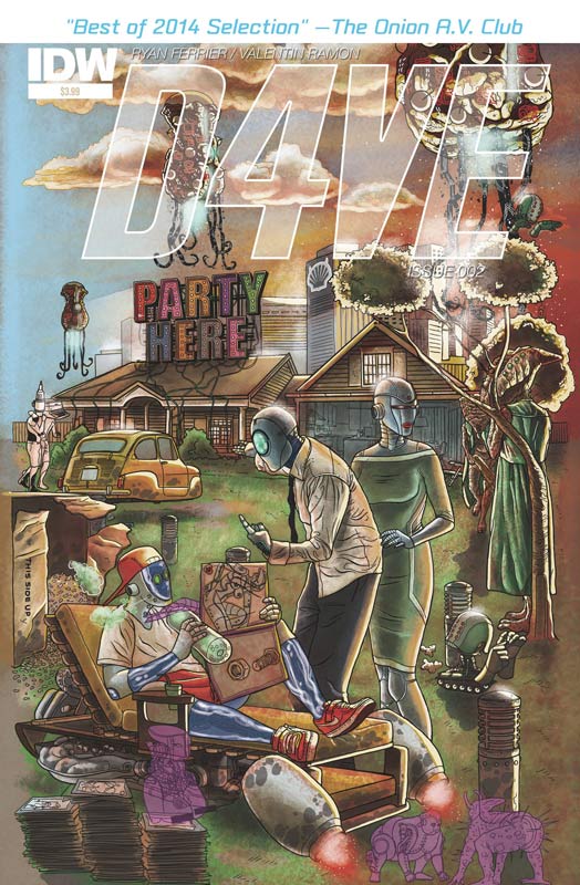
D4VE #2
IDW Writer & Letterer Ryan Ferrier, Artist & Colorist Valentin Ramon
I was very impressed by the first issue of this book and hoped that the second issue kept the momentum going. The second issue does a nice job of keeping the story very interesting and is setting up a lot of the plot developments that should pay off as the series progresses. Ferrier does a great job of balancing the mundane life of D4VE and setting up the alien invasion that is about to break loose. I’m really digging how D4VE is such an average guy and yet he is a robot and it really blows your mind that the robots have turned into the thing that they hated. Ramon artwork continues to impress. It’s amazing how he is able to get so much emotion into the robots that have no facial features. I really loved the way that he handled D4VE’s daydreaming scene.
Is this book worth your time and money? I am still in love with this book and while the second issue has a fair amount of exposition going on it never feels as if anything is not there for a reason. The story is flowing along at a really nice pace and setting up some really fun stuff. The humor of the book is really refreshing. This book is well worth checking out. RECOMMENDED!
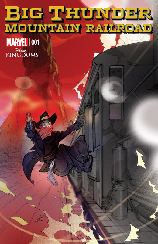
Big Thunder Mountain Railroad #1
Marvel Comics Writer Dennis Hopeless, Artist Tigh Walker, Colorist Jean-Francois Beaulieu, Letterer Joe Caramagna
This is the third Disney Kingdom comic from Marvel the others being Seeker of the Weird and Figment, and while I was not a huge fan of Seekers of the Weird I did really enjoy Figment. With Figment you had a character to work with Big Thunder you only have a location so that is what Hopeless sets the story around. The story is an old school western but has a female lead Abigail that is not one to listen to her father much. The first issue sets up the scenario to the book and does a fair job but there was nothing that was new to the idea. Hopeless does keep the pacing going in the story so that was a plus. Walker’s artwork reminded me of a lot of 80’s style books in that it’s solid but not overly visually inspiring either. He does a nice job with the detail of the town and the mine scenes are well done.
Is this book worth your time and money? The book was a decent read but wasn’t super compelling either. The problem is that there are some good ideas in the book but there wasn’t that great hook that really made you want to read the second issue. In the end it was kind of average.
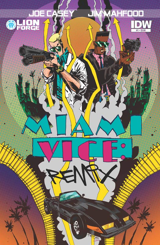
Miami Vice Remix #1
Lion Forge Comics/IDW Writer Joe Casey, Artist & Letterer Jim Mahfood, Colorist Justin Stewart
I guess this book came out a few weeks back but IDW has been having some shipping issues and my store just got it this week. Based on the 1984 television series, this series is a re-imagining of the series with a more “edgy” feel than the original show. The main reason that I wanted to get the book was I am a fan of Mahfood art and while I really liked what he did on the book, I was less impressed with the script by Casey. I felt the main problem with the book was that Casey tried way too hard to make the book super edgy yet it felt trapped in itself at the same time. I found to be more silly and self-centered than edgy. Mahfood is an artist that people either like or hate I happen to be on the like side and did find that his style did work for the story. I just didn’t care for the story of the book.
Is this book worth your time and money? If you are going to have a book based on a property then maybe it should feel like the property. If you renamed this book Frank and Charley it would still be the same. The thing is that it never felt like Miami Vice. So what is the point of the book? I don’t really know or care to find out. While the book is not terrible or bad but it wasn’t all that much either. I would skip it.
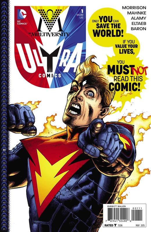
Multiversity: Ultra Comics #1
DC Comics Writer Grant Morrison, Penciller Doug Mahnke, Inkers Christian Alamy, Mark Irwin, Keith Champagne, & Jamie Mendoza, Colorist Gabe Eltaeb & David Baron, Letterer Steve Wands
Morrison’s Multiversity continues with one of the strangest and yet very compelling chapters in the story so far. Morrison really plays on the story structure of this book and puts the reader into the story itself. The story starts off as a classic by the numbers superhero book and quickly draws the reader into the story itself. He also does a great job on playing things in different ways. Good maybe bad and right might be wrong. He even has “comments” from the internet along with the story that really make this one of the wildest stories to date in the Multiversity. The art by Mahnke and the four inkers is really makes this issue shine. He is the perfect artist to pull the story off. He draws the book like a mainstream superhero comic but there are so many subtle details that he uses to capture the emotions that are needed to pull the whole thing off.
Is this book worth your time and money? I really loved this chapter of the Multiversity but there are some that are going to find the story a bit too odd. The thing that works so well with this chapter is the breaking of the fourth dimension with the reader being a part of the story. Morrison weaves a very intriguing story and add in Mahnke’s stunning art and you have another great chapter in the Multiversity Universe. VERY RECOMMENDED!
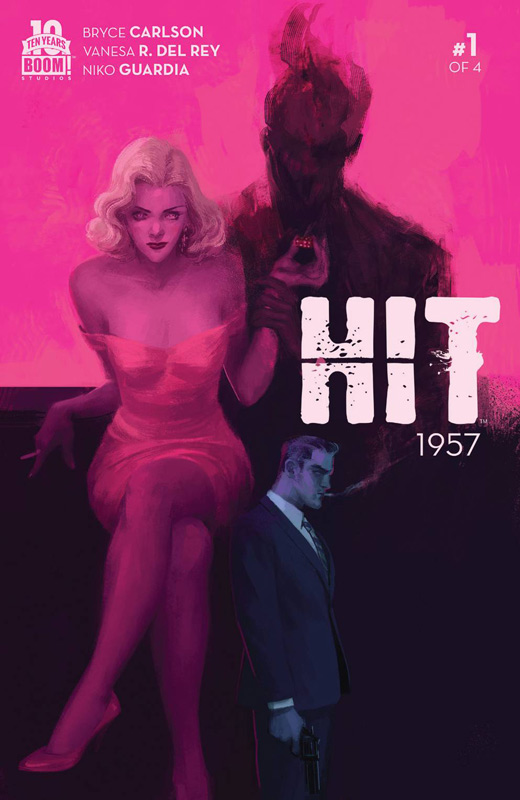
Hit 1957 #1
Boom! Studios Writer Bryce Carlson, Artist Vanesa R. Del Ray, Colorist Niko Guardia, Letterer Ed Dukeshire
Hit 1957 starts off with a lot of promise but ends up in a mess on the way to the end of the issue. Carlson starts the book off really well with the opening scene and then squandered it all in just a few pages. The problem is that the story is so disjointed and incoherent at times that it’s a real pain to read. The story jumps around so much that you really don’t know or care what is going on. There are sadly so many rookie mistakes with this book that I am really surprised that Boom! let this one through. There are some decent ideas in the book but every time that it gets good it trails off the track and you lose interest in the story. The only saving grace of the book is Del Ray’s artwork that is sadly overpowered by the color work of Niko. There are way too many times where Niko make the artwork unrecognizable because the color covers all of the detail in the art and a lot of the times becomes a dark mess. This is some of the worst color work that I have seen in a while. I get what he is trying to do by making it look noir but it needed to be much more subtle and not drown the line art.
Is this book worth your time and money. Nope! The story is tired and boring and it really such a mess because it jumps all over the place. Carlson doesn’t bring anything new to the genre either. The color work on the book is terrible and ruins Del Ray’s artwork that is the one thing that the book had going for it. Don’t bother with this one.
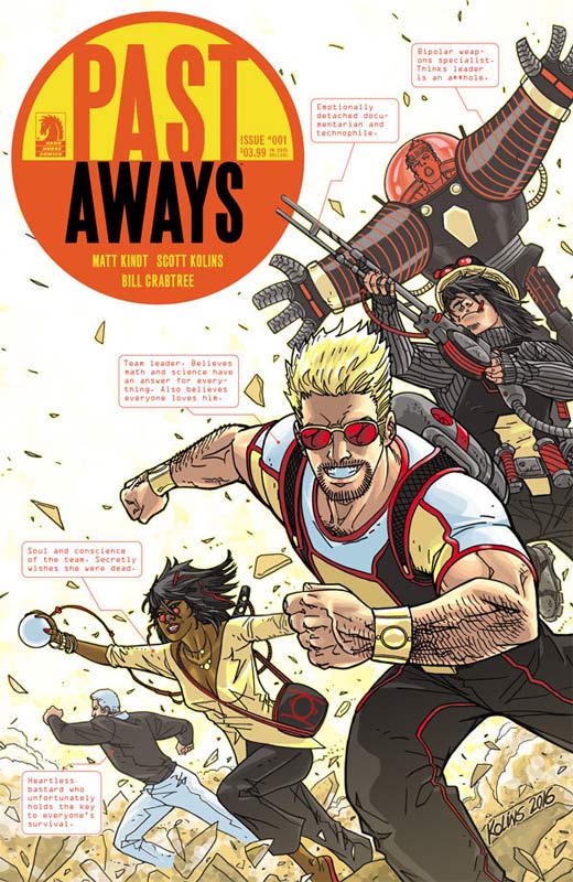
Past Aways #1
Dark Horse Comics Writer Matt Kindt, Artist Scott Kolins, Colorist Bill Crabtree, Letterer Rob Leigh
There is a lot to like in this first issue of Past Aways but there is also a lot of exposition in setting up the world that it’s a tad shaky but certainly not fatal thankfully. The best way to describe the book is like Challengers of the Unknown with a wicked sense of humor. Kindt sets up a lot with this first issue story and there are a lot more questions than answers. While I am not a 100% sold on the book I did like what I read. Kindt does a great job of introducing the team and while they are all not fleshed out quite yet. But that’s OK because the team has fallen apart and it works well that they are not all happy-go-lucky in the story. Kolins art is good but there were a few panels that were a little off but nothing overall fatal. Nothing flashy but it fits the story well.
Is this book worth your time and money? The first issue didn’t blow my mind but there is a lot of promise for the book. The story sets up some really interesting ideas. While there were a few bumps in the story, there was something that really grabs you with it. The key is going to be the second issue. The book could be a sleeper hit if Kindt delivers the story in the next issue or two.
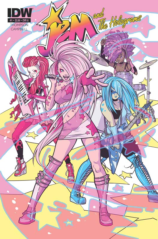
Jem and the Holograms #1
IDW Writer Kelly Thompson, Artist Ross (Sophie) Campbell, Colorist M. Victoria Robado, Letterer Robbie Robbins
I know nothing about Jem other than there were toys and an animated series done back in 1985 and has a cult following. One of the guys at my local comic shop said I should check the book out because of Campbell’s art. So I flipped through it and it looked pretty decent and so I gave the book a swing. And surprise it was pretty darn good. I will be honest that the book is not going to blow your mind or anything but the reason that it works so well is that Thompson has infused great characters that you care about into a simple story that works very well for what it is. She keeps the story light but focused and does a nice job of introducing each band member and gives you a little back story to them. Campbell’s artwork is really nice on the book. There is an obvious influence of manga/anime art there are also other influences that make her art unique and very pleasant. There are a few times where the backgrounds were a bit on the skimpy side but she really does a nice job of making the book very visually appealing but capturing the emotions of the story very well also.
Is this book worth your time and money? While the book maybe targeted to the female audience it certainly a lot better than I though it would be. In fact I was pretty impressed with the first issue that I will give the book a few more issue and see where Thompson and Campbell take it. While not earth shattering it has a good story and very nice art that makes it a book that is well worth checking out. RECOMMENDED!


0 Comments