The last week of the month brings the last batch of #1 Convergence titles to the shelves and it’s been more misses than hits for the books. So as the previous weeks the reviews for the Convergence books will be shorter than the regular reviews so I can fit them all in.
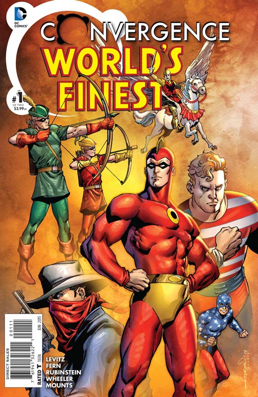
Convergence: Worlds Finest #1
Writer Paul Levitz, Penciller Jim Fern, Inker Joe Rubinstein, Cartoon Art Shannon Wheeler, Colorist Paul Mounts, Letterer Tom Napolitano
This is one of the better Convergence titles this week and thanks to Levitz who understands the golden age characters is very well suited for this title. He wisely doesn’t waste time with the dome story that has plagued so many of the titles and get to the emotional toll that it takes on the heroes and by telling the story from the cartoonists point of view helped the story immensely. Fern and Rubinstein’s artwork is a real standout among the Convergence titles and they really capture the emotional impact of the story that was very heartfelt in this book. This is a solid story with great art make this one of the few RECOMMENDED Convergence titles.
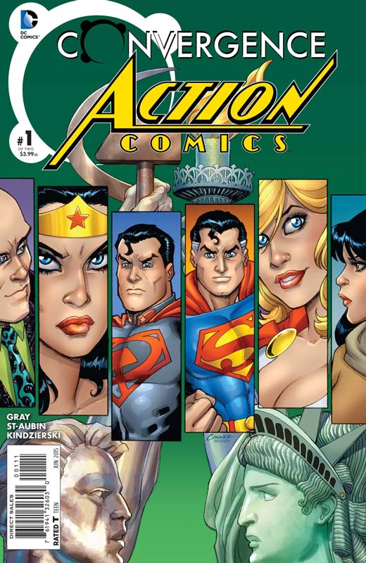
Convergence: Action Comics #1
Writer Justin Gray, Artist Claude St-Aubin, Colorist Lovern Kindzierski, Letterer Steve Wands
This is one of those iffy Convergence books this week. Gray’s story is fairly well told but I think that the problem in the end is that it’s not very engaging. It ends up being a paint by numbers affair where the heroes struggle with the loss of their powers and have to live normal lives, Yea it’s a boring as it sounds. The artwork by St. Aubin is good but can’t salvage the average story. Not one of the bad ones just not very memorable.
Convergence: Booster Gold #1
Writer Dan Jurgens, Penciller Alvaro Martinez, Inker Raul Fernandez, Colorist Chris Sotomayor, Letterer Corey Breen
I find it very weird that Jurgens who created Booster Gold has such a hard time writing the character that we all fell in love with when the original series came out in the 1980’s. As with other titles he has written lately he seems to really overstuffed the story with so much exposition and continuity that after reading it your left pretty baffled with it. The story is just average and not very engrossing. Martinez and Fernandez deliver nice but not overly inspiring artwork that does a nice job on the book. Maybe someday the real Booster Gold will come back. Sadly this is not the comeback that I had hoped for. SKIP IT.
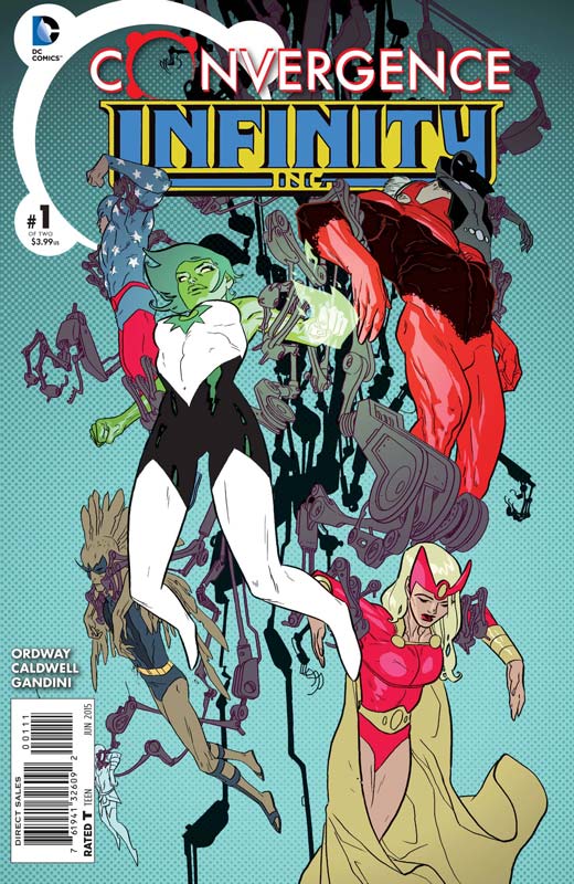
Convergence: Infinity Inc. #1
Writer Jerry Ordway, Artist Ben Caldwell, Colorist Veronica Gandini, Letterer Rob Leigh
I fondly remember the original Infinity Inc. book drawn by Ordway and now he is the writer of this story. He is very familiar with the characters but unfortunately he gets caught in the average story net that most of the Convergence books have suffered from. While the story is decent it really spends too much time on too many characters and you end up not being very satisfied with the exposition that the script is bogged down by. I was very fond of Caldwell’s artwork that is very distinctive and gave the book a very different look that I really liked from the standard superhero fare that a lot of the Convergence books. The only reason that the book gets a marginal recommendation for is that the characters from the other dome are the Hex series that was Jonah Hex book from the 1980’s that had him set in the future instead of the past. The next issue could be fun.
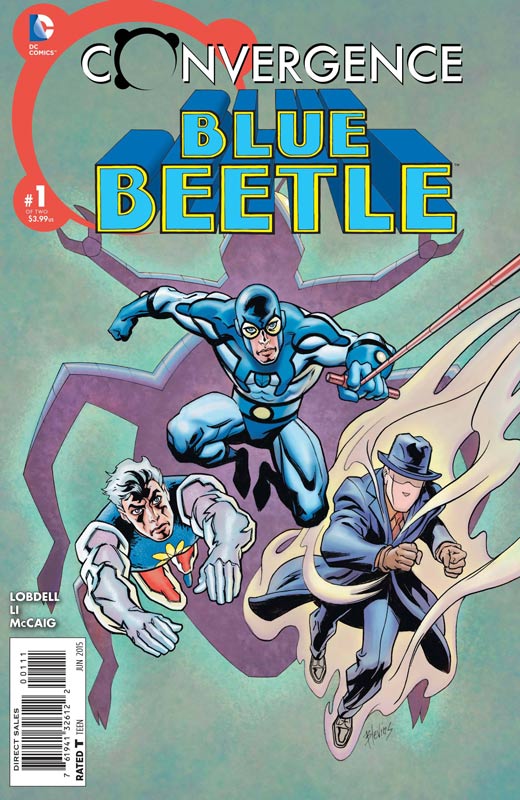
Convergence: Blue Beetle #1
Writer Scott Lobdell, Artist Yishan Li, Colorist Dave McCaig, Letterer Dave Temofonte
Sadly another average book that has a lot of potential because of the Charlton Comics characters have sadly been under utilized by DC. Lobdell story mostly site there and while the Question steals most of the book it really pales in comparison to Greg Rucka’s Question book a few weeks back. Overall the story sits there and doesn’t really do much either way. Li’s art is decent but suffers from a bad case of missing backgrounds but nothing terrible. SKIP IT!
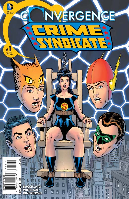
Convergence: Crime Syndicate #1
Writer Brian Buccellato, Artist Phil Winslade, Colorist Lovern Kindzierski, Letterer Rob Leigh
The Crime Syndicate from Earth-3 has always been a fun idea of an opposite version of the JLA that are villains instead of heroes. The good news for this book is that Buccellato uses the dome zapping powers to craft a good old fashion jail break story and you know what, it was a lot of fun. He doesn’t waste his story on the dome and how everyone is coping with it. Just get on with the story and thankfully Buccellato does. Winslade is the perfect artist for this book because his style fits the old school style that the story tells. He wonderfully captures both the action and the dramatic scenes in the story. This is a really fun story that cuts to the chase and that is why it works well. RECOMMENDED!
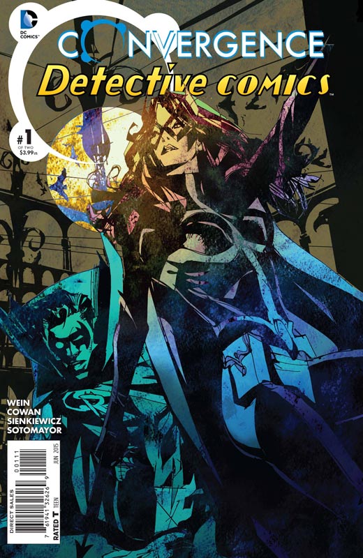
Convergence: Detective Comics #1
Writer Len Wein, Penciller Denys Cowan, Inker Bill Sienkiewicz, Colorists Chris Sotomayor & Felix Serrano, Letterer Travis Lanham
Wein wrote last weeks stunning Swamp Thing book but this one is sadly not nearly as good as that was. The story starts off pretty good but ultimately doesn’t really go anywhere which is a shame because I really enjoyed Cowan and Sienkiewicz’s artwork on the book. The story has some good ideas but after you have read the story it’s pretty forgettable. The real shame is that the artwork nearly saves the average story with the mixing of Cowan and Sienkiewicz style make for a really moody and beautiful book. Sadly that can’t be the sole reason to buy the book. SKIP IT.
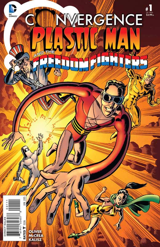
Convergence: Plastic Man and the Freedom Fighters #1
Writer Simon Oliver, Artist John McCrea, Colorist John Kalisz. Letterer Saida Temofonte
This is going to be one of the more decisive Convergence books. I thought Oliver really went outside the box with the concept for the story. While there are a lot of basic superhero tropes to the story having the Nazis win the war and occupy New York is a very bold move. It made for a very different story and a very interesting play on history. McCrea’s artwork fit the tone of the story and brought a real grit to the story that it really needed. This book is one of the more surprising book of the Convergence fiesta. RECOMMENDED!
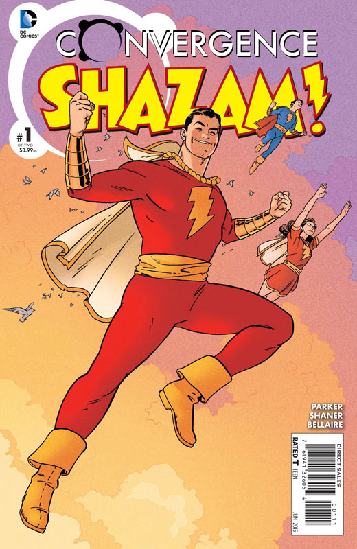
Convergence: SHAZAM!
Writer Jeff Parker, Artist Evan “Doc” Shaner, Colorist Jordie Bellaire, Letterer Said Temofonte
There has only been one Convergence book that was a must read and that was Swamp Thing. I had really hoped that there would be more that would possibly be on the must buy pile because a lot of these books are based on the 1980’s DC Universe that I grew up and was a great period at DC Comics. There is now one other book that is a must read and that is SHAZAM! Captain Marvel (aka SHAZAM) has alway been a great character and recently made for one of the best Multiversity books and now is one of two great Convergence books. Parker nails the Captain Marvel universe and perfectly captures the tone of the original creator C.C. Beck that mixes classic super-heroics with a nice touch of fun. The key to the story working so well is that Parker gets it. He gets what made Captain Marvel so much fun and special and delivers a great story that skips the drama under the dome that has killed so many Convergence books. Having a great story is one thing but getting the right artist to draw the book and capture that fine line between cartoony and realistic. Shaner not only fits the bill but even exceeded my expectations for the book. You can see the love that Shaner has put into the artwork but also keeps the original Beck look intact. I was really impressed with how he balanced the whole look of the world. This is a must buy on both of the issues because I can’t really see them dropping the ball on the second issue. HIGHEST RECOMMENDATION!
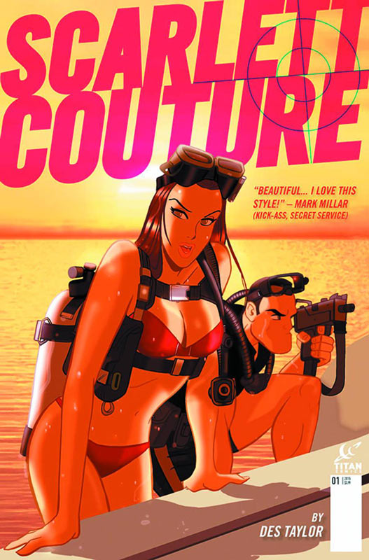
Scarlett Couture #1
Titan Comics Writer & Artist Des Taylor
Titan Comics has been releasing some really interesting comics and trying to mix things up with creators from the UK that are new to the US audience. The thing that attracted me to the book is Taylor’s art style that is a mix of animation and retro pop art that really stands out in the book. Sadly I just wish that the story was a fresh as his artwork. I will give that I really applaud him for having a female lead that is not the damsel in distress and is not scantily clad while fighting. The story in the first issue sadly falls into the been there and done that. There are two major issues in that he doesn’t do a great job of character development to Scarlett and the story is far too basic to really care about anything. On the art side of the book it’s a very nice looking book but there were a few times I noticed too many “camera” tricks with the digital artwork that pulled me out of the visual look of the book. The photo back grounds and the focus shots just didn’t sit well with me.
Is this book worth your time and money? As disappointed as I was with the first issue there is some potential with the book. It’s possible that the second issue could move the story along better and get away from this averages set up exposition that drags the first issue down. While I can’t give it a recommendation I will give the second issue a show to see if Taylor can turn the book around.
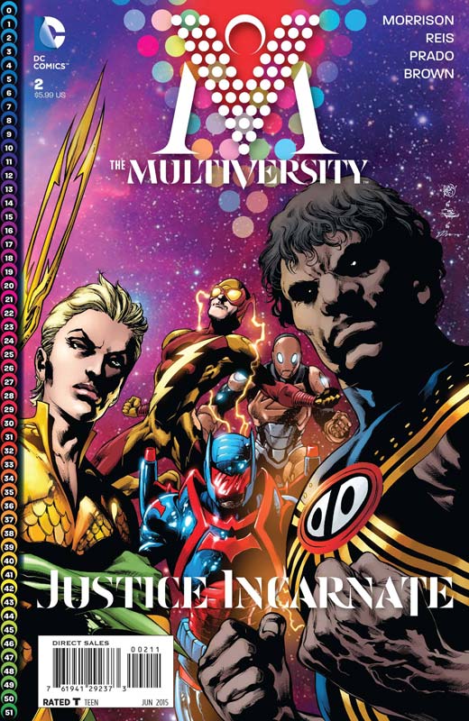
Multiversity #2
Writer Grant Morrison, Penciller Ivan Reis, Inkers Joe Prado, Eber Ferreira, & Jaime Mendoza, Colorists Dan Brown, Jason Wright, & Blond, Letterer Todd Klein
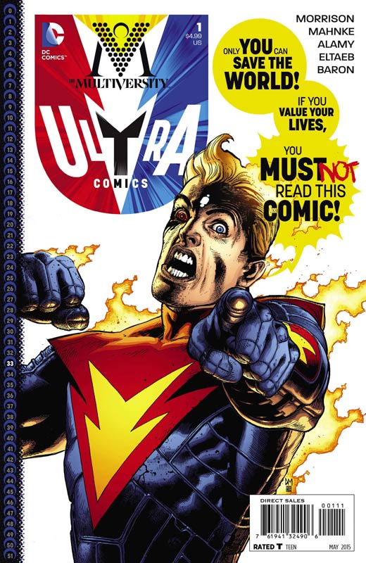
Well you can’t blame Morrison for pulling out all of the stops for the final chapter of his epic retelling of the DC Multiverse. It may not be the ending that you either wanted or expected but it is quite spectacular. There is a lot of information to digest with the book and I really enjoyed it, I have no doubt that when you read the entire story in one sitting again it will really gel together quite well. Morrison’s stories are deep and complex and always work better when you read them as a whole but I will say that after taking my time to read this final chapter it is a very satisfying conclusion and really comes full circle. I really have to give props to Reis and the inkers and colorist for the monumental task of drawing nearly the entire Multiversity cast on nearly every page. There is so much going on that most artist would be committed to the insane asylum after drawing this book. Reis artwork is all that more impressive because he has to drive this dense and complex story to visually help the reader and he pulls it all off amazingly well. Is this book going to please everyone, No but that is what I loved about it. There are so many DC universes and characters that it’s impossible to contain all of it in one epic story. And while the story is not perfect it is and was a great ride with a few mild bumps along the way.
Is this book worth your time and money? There really is no simple answer to that question. I did really enjoy this ending and while there were expected and unexpected story elements, but in the end how else could you attempt to pull it all together in the end? While it may not be perfect it was for me satisfying and I enjoyed it. An epic story with amazing artwork that you may or may not be satisfied with. At the very least you have admire Morrison for taking the concept on and for me delivering an epic story that puts almost every “event” to shame. RECOMMENDED!
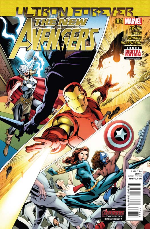
The New Avengers #1 (Ultron Forever Part 2)
Marvel Comics Writer Al Ewing, Penciller Alan Davis, Inker Mark Farmer, Colorist Rachelle Rosenberg, Letter Travis Lanham
For some reason Marvel has decided to put this story out as 3 different #1 issues so that nobody would be confused when they went to pick up part 2 & 3. Who the F%$K decides to do this?!?!? Mini rant now over.
Sole reason for buying this story is for the amazing Davis artwork. As I noted with part one the story was actually pretty good and had a solid cliffhanger. While the story is not the most epic thing that you are going to ever read I have to give credit to Ewing that he is telling a really fun story and definitely using Davis artwork to its fullest potential. This second part of the story is the big action part and Ewing has a lot of fun with the multiple story lines going on. With that being said this book is worth the $4.99 cover price alone for Davis’s stunning artwork in the book. He really gets to do some really spectacular action scenes in this second part of the story. The visual of the Hulk having two head was simply priceless.
Is this book worth your time and money? This story is a really fun read and even with the basic plot elements it’s a pretty decent read. The main reason to buy this book is the lush Davis artwork that has him drawing some of the best Marvel characters. I’m loving it! RECOMMENDED!
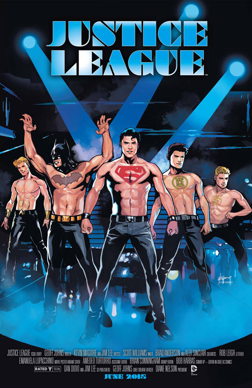
Justice League #40
DC Comics Writer Geoff Johns, Artists Kevin Maguire/Phil Jimenez/Dan Jurgens/Jerry Ordway/Scott Kolins/Jason Fabok/Jim Lee/Scott Williams, Colorists Brad Anderson & Alex Sinclair, Letterer Rob Leigh
The Prolog to the summer “event” fiesta Darkseid War gets off to a decent start due to the huge talented artist that are doing the art on the book. I’m not the biggest Johns fan but I will give him that at least the lead up to the story is fairly interesting. There is a ton of exposition to get through on this issue so there in not a lot of satisfaction when you come to the end of the issue because it’s just a lead in. Johns has some interesting story elements that he introduces in the story and does a nice job of handling the Kirby Fourth World characters that feel fairly right for a change. The huge plus for the issue is the parade of stunning artists that are drawing different parts of the story. This is simply a great looking book.
Is this book worth your time and money? It’s way too early to call to see if this event is going to be any good. While the Prolog is off to a nice start it could go either way at this point. If you are a fan of the Fourth World Kirby Universe then you might want to give the book a spin.
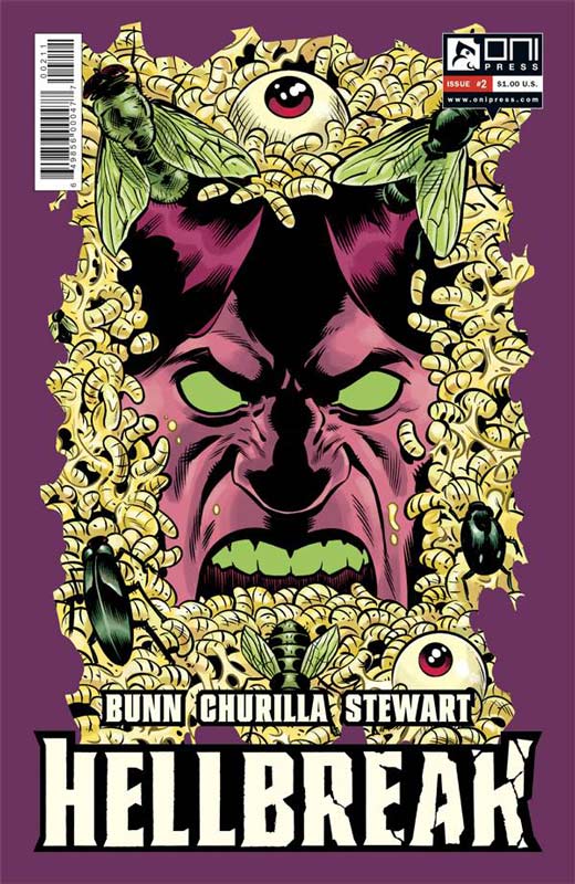
Hellbreak #2
Oni Press Writer Cullen Bunn, Artist Brian Churilla, Colorist Dave Stewart, Letterer Crank!
I really enjoyed the first issue of Hellbreak and was looking forward to the second issue. Sadly it’s a little bumpy but is still going in a good direction. Bunn’s story seems too much of an extension of the first issue. You could have missed the first issue of the book and pretty much still get the gist of the story from this issue. Bunn’s story treads water and doesn’t really add a lot of new stuff story wise. Thankfully there are some new story elements but not a good continuation from the first issue for me. Churilla’s artwork brings a nice mood to the story and fits nicely to the story.
Is this book worth your time and money? While the second issue was a letdown I do still have faith in the book. I just felt that the story didn’t continue as well as I had hoped for this second issue. The next issue is going to be a breaking point if the story is not progressing as well as I would like it to.



0 Comments