With this weeks new comics being a slightly smaller week than usual I will try to play catchup with some of last weeks releases that I was unable to get to. So lets start with this weeks books first.
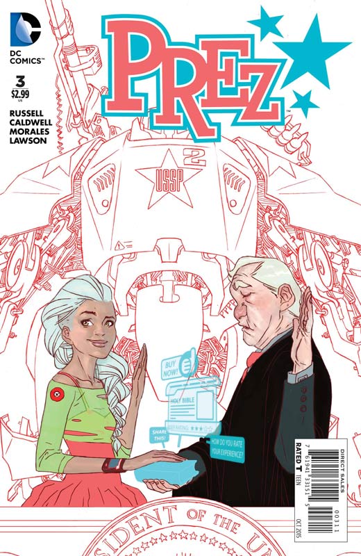
Prez #3
DC Comics Writer Mark Russell, Penciller Ben Caldwell, Inker Mark Morales, Colorist Jeremy Lawson, Letterer Travis Lanham
This is the one of the best comics that is being published now that you are not reading. I have yet to figure out why this book is not selling that well. If it were an Image Comic it would be burning up social media and be the talk of the industry. This comic continues to be the smartest, wittiest, and most biting satire of current culture that is the freshest and pitch perfect every issue. Russell script is impressive because he is able to juggle so many elements of the story and while it’s very socially relevant it’s just as entertaining and a really fun read. The first two issue really set up this issue where we start to see Beth come into her own now that she has been elected president. There is also the Washington insiders that do not like her being elected and are starting to form plans to derail her. Russell is pacing the book perfectly and keeping it right on track. Caldwell and Morales bring a wonderful visual spark to the book. They do a wonderful job of bringing the craziness of the story to life in such an effortlessly way with the artwork that makes this a great looking book to go along with the story. I have been raving about this book from day one and it just keeps getting better with each issue. If you are not reading this book then you are missing out on what mainstream comics can be. There are so many mediocre comics that sell a lot more than this book and that is the real shame. DC should be applauded for publishing this book. It’s a real shame that the zombies comic book readers continue to eat up the bland comics instead of taking a chance. Please give this great book a try! HIGHEST RECOMMENDATION!
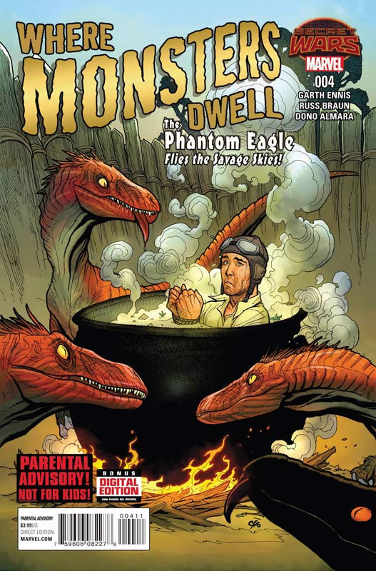
Where Monsters Dwell #4
Marvel Comics Writer Garth Ennis, Artist Russ Braun, Colorist Dono Sanchez Almara Letterer Bob Steen
One of the few Secret War spinoff books that is worth your time. Ennis has a great knack for mixing humor with dramatic elements and this book is one of the funnest that he has written. The thing that I love most about the book is that he keeps the story simple and on point. Karl is such an ass but that is why you love the buffoon so much. This issue does give him that if you piss him off he will make you pay at any cost. Ennis also make him the luckiest son of a bitch too. This book should be super offensive but he balances everything out so perfectly that it just really works. There are so many times that he should be dead and that is the beautiful irony of the story. Braun continues to impress with his artwork on the book. He has such a great throwback style to artist from the golden age of comics and it really makes Ennis story come to life. His character facial expressions are priceless and the detail that he puts into the world and the monsters is simply outstanding. I would love to see him on a regular book. This book has nothing to do with Secret Wars and that is the main reason that it’s better than the book that is supposedly comes from. RECOMMENDED!
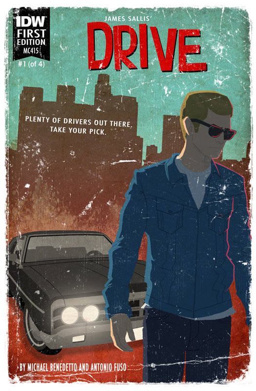
Drive #1
IDW Writer Michael Benedetto (Based on the novel by James Sallis), Penciller Antonio Fuso, Inker Emilio Lecce, Colorist Jason Lewis, Letterer Frank Cvetkovic
This adaptation is going to be love or hate relationship. If you have read the novel and or seen the film adaption then you are going to have a skewed view of the book. If you take it at face value it’s not a bad book but while it’s a very good story the first issue was just OK for me. Benedetto sets up the series but the script never quite leaps off the page. The story seems a bit on the flat side. There have been quite a few crime/noir comics lately and Drive kind of falls in the middle of the road. I will give the story has a nice set up to the second issue and I’ll probably give the second issue a chance. On the art side of the book Fuso and Lecce visually give the story a nice look but there were a number of times where the art felt a bit on the stiff side. With a story like this the art should give the reader a mood and while there are some glimpses of it, in the end it falls a little short. The book has some potential and there is enough here to give the second issue a shot but it should have worked a little better than it did.
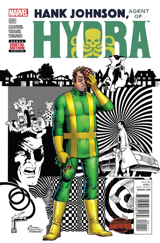
Hank Johnson, Agent of Hydra #1
Marvel Comics Writer Davis Mandel, Artist Michael Walsh, Colorist Matthew Wilson, Letterer Clayton Cowles
HBO’s Veep show-runner Mandel writes one of the funniest comics to come out of Marvel in quite a while. I was very impressed with the way that he handled the story. A lot of writers would have gone for the low brow humor but Mandel take the smart approach of subtle satire that makes this book a real winner. He plays the script straight while making very smart elements of the humor happen very naturally within it. Playing Hank straight and letting the wild situations happen around him is why the story works so well and because Hank is an average Joe type of person the reader can identify with him and the situations perfectly. There are also a lot of time where the humor is borderline parody and that really adds that more charm to the story. Mandel is a self-professed comic book nerd and this book certainly gives him a lot of street cred with his first book. The other key to the book working so well is Walsh’s artwork. First tip of the hat is to using Steranko’s classic first three pages from Nick Fury Agent of Shield #1 (1968) to set up the story is a stroke of genius and really sets the visual tone of the story. He also wisely keeps the artwork straight instead of the instinct to go for a more cartoony approach that would not get the satire of the script across. His art is also a throwback to the classic “Marvel House Style” that fits the theme of the story to a T. I would love to see more Hank Johnson stories in the future and hopefully the book does well enough that Marvel could do a book like this at least once a year. This is another example of the oddball Secret Wars books making up for a lot of average to bad tie-in titles from the Secret Wars mess. This book nearly makes the whole train wreck worth it. HIGHLY RECOMMENDED!
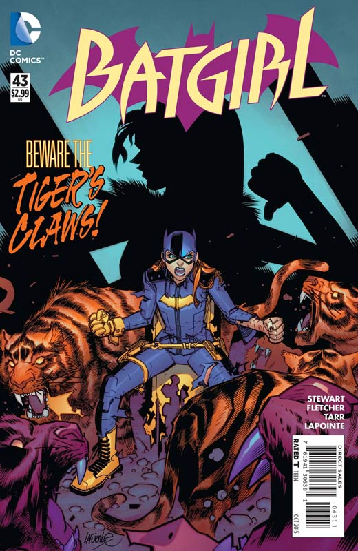
Batgirl #43
DC Comics Writers Brenden Fletcher & Cameron Stewart, Artist Babs Tarr, Inker Juan Castro (pgs 17-19), Colorist Serge Lapointe, Letterer Steve Wands
Batgirl continues to be one of the strongest and freshest looks at Batgirl and for that matter most of the Batman Universe. Fletcher and Stewart continue to make each issue accessible to new readers but keep the momentum of the ongoing story. They also bring back a slightly obscure Batgirl villain Velvet Tiger and make her debut in this incarnation a better character than she has been in the past. I am really enjoying how they are using the supporting cast of the book have a strong influence on both Barbra and the overall story. It’s making for a better story each month and give the book a much more down to earth point of view that makes the story much more satisfying. Fletcher and Stewart do a great job with the mystery elements of the story and while they are pretty straight forward it never overwhelmed the story that could have sunk it. Tarr’s artwork is one of the main reasons that the book is working. Her fresh style and approach to both the dramatic and action elements in the story makes this book a real joy to read and see. They give the story a nice cliffhanger for the next part and make it worth looking forward to next issue. Another solid issue of Batgirl. RECOMMENDED!
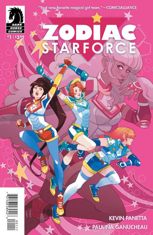
Zodiac Starforce #1
Dark Horse Comics Writer Kevin Panetta Artist & Letterer Paulina Ganucheau, Color Assists Savanna Ganucheau
I wanted to like this book but it just didn’t pull it all together. Panetta story ends up being pretty basic and average and never really goes beyond recycling story tropes and bringing nothing new and fresh to the genre. He really tries to introduce the cast but they never feel fully formed and come off as two-dimensional. It’s one of those books that after you read it you really don’t remember much about it. It’s a lot of been there and done that. The big problem is that it seems to play to a certain audience and doesn’t want or care to bring any new readers to the party. The other problem is that there is not a lot of story here. It’s mostly weak plot ideas poorly strung together to get to the end of the issue. What little story that is there is pretty confusing and you feel as if this is a sequel to a book that you have never read. The only thing that does work is Ganucheau’s very nice artwork and her style really fits the idea of the story, but even that only went so far. Though visually impressive the book simply is a real mess of average and recycled ideas that sadly is not that good. It’s a real shame because there needs to be more female friendly comics but I just wish that it was worth reading. SKIP IT!
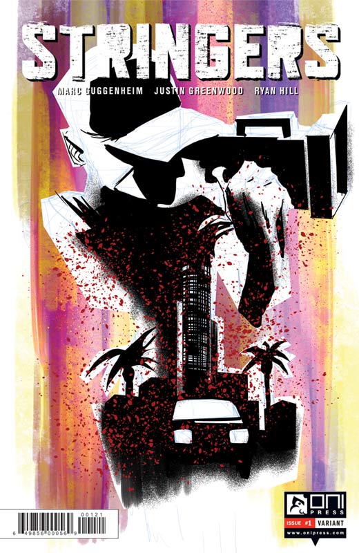
Stringers #1
Oni Press, Writer Marc Guggenheim, Artist Justin Greenwood, Colorist Ryan Hill, Letterer Crank!
This is one of those books that has a lot of promise but the first issue falls a bit on the short side. Guggenheim sets up a lot of ideas and the premiss of the book is a good idea. I just felt that the first issue didn’t set it up as well as it should have. The story hit the ground full tilt into the action and while it seems to have been a good for a movie or television pilot but in a comic it doesn’t quite work as well because you are only getting part of the story in this first issue and it never wholly satisfies you. I will give him that there are some really good ideas in the issue and it’s certainly not a terrible read but you can tell that it was originally not planned as a comic. Greenwood’s artwork gives the story a nice look but there are noticeable times where the artwork lacks some detail and the backgrounds are more miss than hit. Overall the artwork does a decent job of conveying the story but nothing flashy. There is some good idea in the book and I would give the second issue a chance because there are some really good story elements but Guggenheim is really going to need to deliver the goods in the next issue.
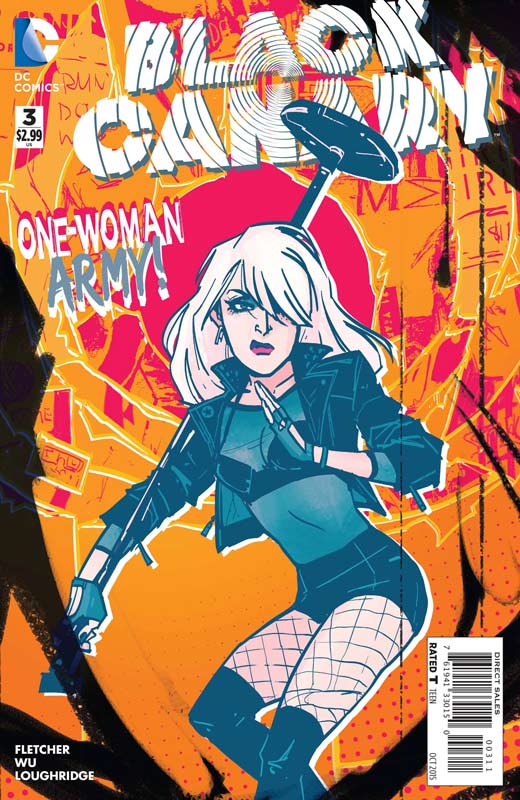
Black Canary #3
DC Comics Writer Brenden Fletcher, Artist Annie Wu, Colorist Lee Loughridge, Letterer Steve Wands
I like the first issue of this new series but the second issue was a bit bumpy but thankfully the third issue gets the book back on track and on much more solid footing. Fletcher does a better job on the story here with a nice balance of action and revealing more of the mystery of how Black Canary came to be the singer in the band. He still is nicely revealing the underlying mystery of Ditto and how she is connected to Canary. He is really nailing the pacing of the first story arc and this is becoming a very enjoyable book. Wu give the book a great visceral feel with her artwork that give the book a nice distinctive look and feel with her artwork. She really does a great job of telling the story visually when there is little dialog and that is a very impressive skill. As long as Fletcher keep the momentum of this issue going this is a book to watch. Worth buying!
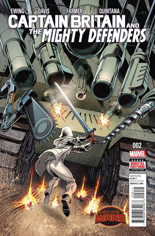
Captain Britain and the Mighty Defenders #2
Marvel Comics Writer Al Ewing, Penciller Alan Davis, Inker Mark Farmer, Colorist Wil Quintana, Letterer Travis Lanham
While the story by Ewing is pleasing but is also a bit middling the reason to buy this book is for Davis’s artwork alone. While the story is not bad it is like a lot of the Secret War tie-in book that are just simple What If? stories that after reading it won’t leave much of an impression on you. Ewing goes through the basic motions of the story that hit all of the typical story tropes and is fairly satisfying on that level but never excels at being more than that either. He obviously read to many Judge Dredd stories before writing this. This is where Davis and Farmer save the day on this book. They literally make this book better than it should be. it’s the usually gorgeous art that Davis brings to the table every time. It’s just a shame that it’s wasted on an average story like this. For me it’s worth the cover price to see any Davis artwork grace a book. I just wish that there was a better story that could live up to the artwork.
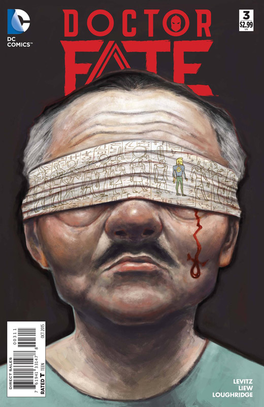
Doctor Fate #2
DC Comics Writer Paul Levitz, Artist Sonny Liew, Colorist Lee Loughridge, Letterer Nick Napolitano
Doctor Fate is going to be one of those titles that is going rub people the wrong way. A lot of readers are not going to get the pace that the book is taking. Levitz is taking a real old school story approach to and most modern readers are not going to either get it or like it. Levitz is unfolding the story at a pace that you rarely see in mainstream comics. It’s ironic that if this was an independent publisher and not a DC “Superhero” comic people would probably not judge it in the same way. There is a lot more to the story than action and while he does bring a good amount to this issue there is a greater story in Khalid learning to be Doctor Fate, and that story is unfolding nicely for me. Liew artwork is giving the book a great visual feel that is unusual for mainstream superhero book but that is why it works so well. He gave the book a bold look that fits with the mythical undertones of the story. This is a great looking book. While I will agree that Levitz style is taking it’s time and while that isn’t bothering me, he should have balanced that a little better for the mainstream audience. The key is going to be the next few issues to pull it all together to see where he is heading with the story. The book is not going to be for everyone but if you are more of an old school reader you should give the book a try.


0 Comments