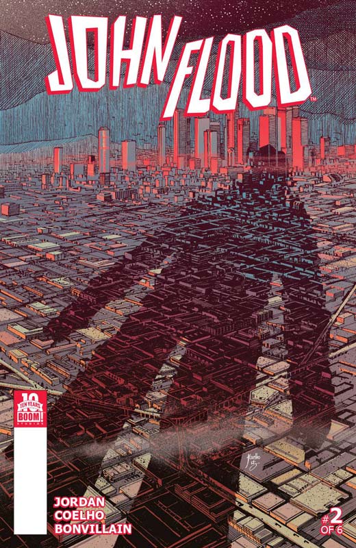
John Flood #2
Boom! Studios Writer Justin Jordan, Artist Jorge Coelho, Colorist Tamra Bonvillain, Letterer Ed Dukeshire
John Flood is turning into quite the intriguing book. The second issue starts off in a strange way from issue one but at the end of the issue it all makes sense. I love the idea that Jordan takes the long way around from point A to point B and the journey seems rather strange but he does a wonderful job of making the journey very worthwhile. He also reveals more of how John Flood sees the world in a Rain Man sort of way. Jordan script is very impressive of how he keeps everything on track when it seems to be straying off the main path. Coelho’s artwork is very impressive and give the story a big visual boost. I love his subtle detail in both the characters and the bigger picture. He really helps the reader keep track of the story and his layouts keep the flow of the story on track. I am really loving this story and the second issue is even better than the first because now we see where Jordan and Coelho are taking the story. While on the surface it’s a standard detective type story but they have put a really nice spin on the concept and it makes for a really good read. RECOMMENDED!
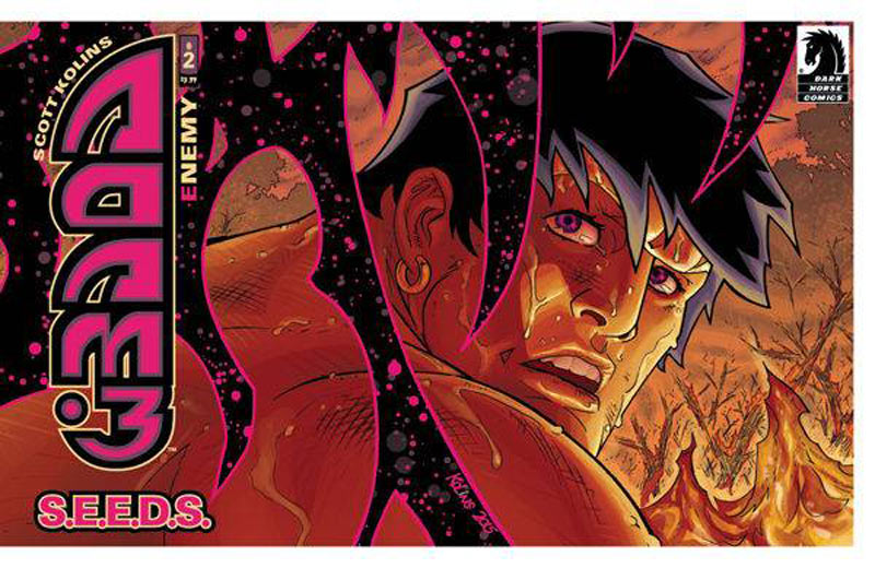
Adam 3 #2
Dark Horse Comics Writer and Artist Scott Kollins, Letterer Michael Heisler
The first issue of Adam 3 got off to a fun start and while its pretty much an homage to Tarzan the second issue keeps the ball rolling with the story and adds some more mystery elements to story. While the second issue was a little less exciting than the first it’s does introduce a nice twists into the story. He has now introduce the villain into the garden of Eden and we are still not sure who is watching the events unfold. Of course Kollins artwork is the real star here and continues to be a big draw to the book. While this book is not going to blow you away the thing that I like is that Kollins is telling an old fashion adventure story that you don’t see much anymore in comics. He is adding some other elements to freshen up the formula but at its core it’s pretty basic but still fun to read and enjoy.
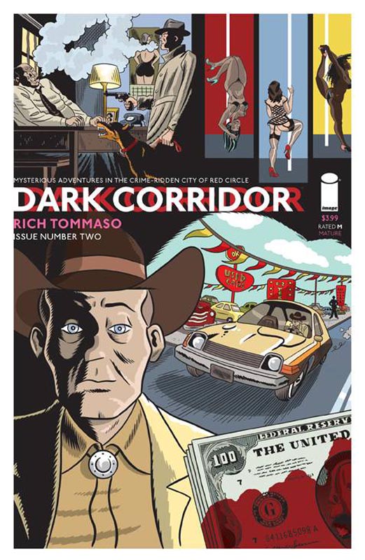
Dark Corridor #2
Image Comics Writer & Artist Rich Tommaso
I was very impressed with the debut issue of this book and is becoming one of my must read books now. Doing a noir comic is not only a rare sight but even rarer to get right. Tommaso has done both and make the book both a pleasure to read and to visually devour. This issue brings us two more stories from Red Circle City and he also ties elements from stories in the first issue into this issue but they still stand on their own. This is a great idea that allows new readers to jump right into the issue but it rewards readers of the previous issue with character and situations that carry over. That is a very impressive feat to do and make it work. I love the way that Tommaso doesn’t present characters as either good or bad but they tend to fall in a very grey area that lets the reader decide it. This book is not going to be for everyone and some are going to be turned off by the tone and elements. I for one am very impressed with the stories that Tommaso is telling and love the whole undertones that some readers may fail to miss. If you love noir or crime novels then this book is a real treat for you. RECOMMENDED!
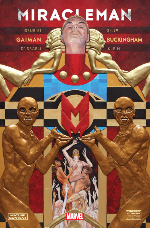
Miracleman By Gaiman and Buckingham #1
Marvel Comics Writer Neil Gaiman, Artist Mark Buckingham, Colorist D’Israeli, Letterer Todd Klein
This is the one that fans have waited for from the mid 1990’s. We will finally see the whole Gaiman and Buckingham story. The story was originally published by Eclipse Comics and the first part The Golden Age story was finished and the Silver Age story was started but only two were printed before Eclipse went bankrupt and the final chapter the Dark Age was never completed. They were planned as six issue stories and while it’s unknown how many issue that Gaiman and Buckingham are going to do past the initial Eclipse issues. Marvel is now renumbering the book to entice both old and new readers to start his story arc. So the big question is if you have not been reading the previous Miracleman will you be able to pick up this book and like and or understand it? Well no and yes. There is a synopsis of the events that lead up to this story but if you have never read Miracleman before this it’s not probably the best place to start. For regular readers this is the final chapters for the original run and does it still hold up today? This was Gaiman’s first major comic work and has all of the things that made him such a great writer later on can be seen here. This issue is setting up the Golden Age story from the events leading up to this issue and we get to see the first glimpse of Miracleman as a god and how people see and interact with him. Gaiman sets up the story very well and I love the perspective that he tells the story from. It gives the story a very etherial feeling that you don’t expect from a superhero comic and yet it’s still very superhero tropes at the same time. This was also one some of Buckingham’s first major work in comics and you can see that even back then his art could tell both the grand scale and the very subtle parts of Gaiman’s story with such ease. It will be very interesting to see how he is able to match his new artwork with a style from 20 plus years ago in the new chapters. But until it’s great to see his beautiful artwork from the past finally see a nice printing. While it’s great that Marvel is reprinting this run it still suffers from the cash grab of the Alan Moore run in that the story is only 24 pages with the 2 page retrieval story. The other 18 pages are concept, script and original art pages that fill out the issue and while that is nice it’s not worth the $4.99 cover price considering it’s padded out to make the page count higher. All of that will be reprinted in the hardcover collection so buy according to knowing that. So the question remains does it hold up today as it did over 20 years ago? I think it does and maybe resonates even better today. Readers today have become somewhat more savvy and are maybe more ready for this story. In the end it’s a glimpse into the past and yet it’s a glimpse into a future that we will finally get to finish this amazing story. VERY RECOMMENDED!
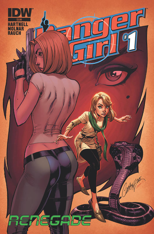
Danger Girl: Renegade #1
IDW Writer Andy Hartnell, Artist Stephen Molnar, Colorist John Rauch, Letterer Neil Uyetake
I have never read a Danger Girl comic and if this new series is any indication of it I haven’t missed anything. I will give Hartnell that he does a good job of bringing new readers up to speed on the origin of Abby Chase and why she is on the run but, beyond that the story is bland a basic. The problem with the story is that it ends up just sitting there and nothing really happens. The story is 20 pages and 4 of those are back story. Hartnell never seems to give any of the non back story any weight and the characters just seem to go through the motions to get to the end of the issue. Molnar’s art is nice but pretty basic. There are a few good visual moments but the artwork is pretty average stuff. The problem is that the book never really excels at anything and by the end of the issue I didn’t care about anyone or anything. For that matter to even read the second issue. SKIP IT!
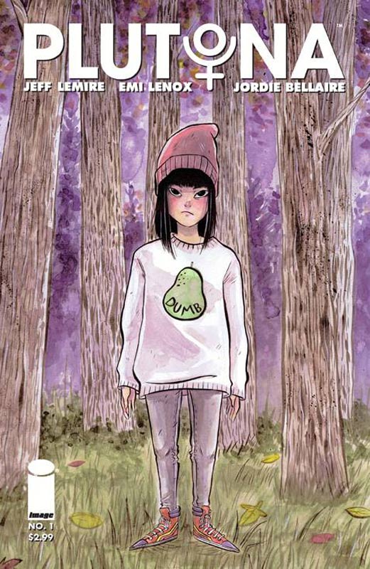
Plutona #1
Image Comics Writer Jeff Lemire, Artist & Story Emi Lenox Colorist Jordie Bellaire, Letterer Steve Wands
The best way to describe this book is a cross between Goonies, Twin Peaks and Stand By Me but yet it feels very fresh and exciting. Lemire and Lenox spend the first issue doing a wonderful job of introducing the kids and the idea that superheroes exists in this world. Having the kids not all being friends adds a nice realistic touch that made the story feel a lot more organic and allows them to interact in non traditional ways. While a lot of the typical tropes are in the basic structure the story never felt forced. The other nice touch is the two page Last Plutona story written and drawn by Lemire and seems to lead up to the kids finding her at the end of the first issue. Lenox’s artwork has a simple look to it but give the book the visual feel that the story needs. I like that she give the story a very natural feel with the art and gives each of the kids a nice touch with their clothes, body type and emotions that really give the reader a chance to get to know them. There is a lot of set up in this issue and the only problem that I had with it was that it was over way too quickly and I wanted to read the second issue now. That is a rare feat to crave the next issue of a comic and Lemire and Lenox have achieved it with this wonderful new series. VERY RECOMMENDED!
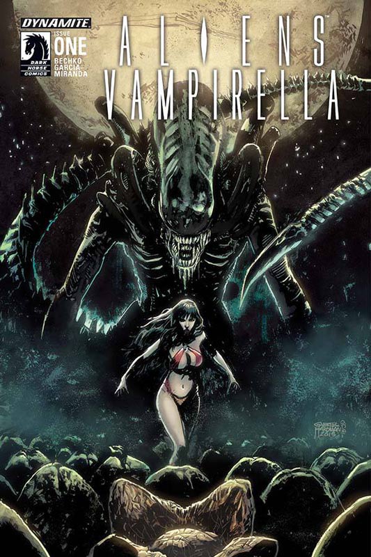
Aliens/Vampirella #1
Dynamite/Dark Horse Comics Writer Corinna Bechko, Artist Javier Garcia-Miranda, Colorist Inlight Studios, Letterer Simon Bowland
Well I guess that the Aliens comic franchise crossover has finally hit rock bottom with this book. After the fun of Archie VS. Predator this book comes limping into comic shops and is pretty bad. Bechko’s biggest flaw with the script is that he spend the entire issue telling us the same story that we have seen and read in every Alien story and how they discover them. I get that you have to set things up but just rehashing the same concept over 20 pages is inexcusable. The other problem is having Vampirella in the story seems more like an afterthought than a key element of the story. If you can’t come up with something better than this first issue then I doubt that it’s really going to get better as the series goes along. The artwork by Garcia-Miranda is average but there are many times where the characters are too stiff and the action is not well laid out. The art is not bad it’s just doesn’t leave any sort of impression on you either. The best way to say this is move along there is nothing to see here. SKIP IT!


0 Comments