I’m finally back with new comic book reviews. Because there are so many some will be very brief so we can get to as many as I can. This weeks new comic book reviews will be up on the site Friday and things will should be getting back to normal until San Diego Comic Con in two weeks (YIKES!)
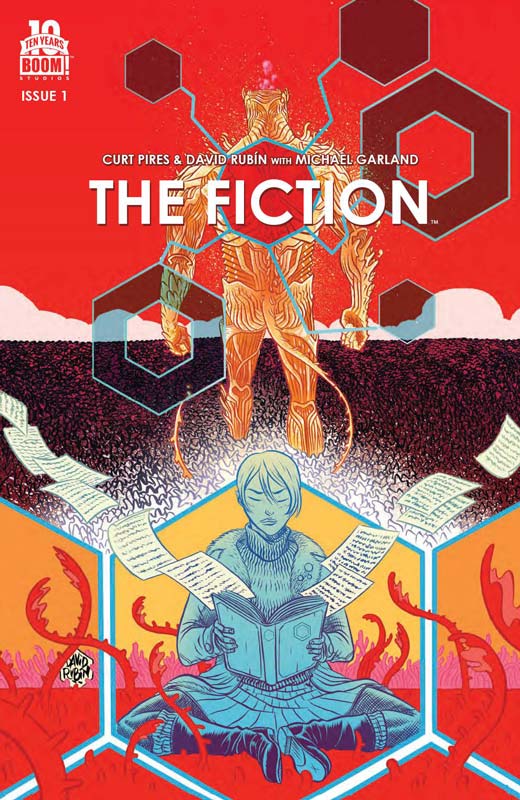
The Fiction #1
Boom! Studios Writer Curt Pires, Artist David Rubin, Colorist Michael Garland, Letter Colin Bell
On the surface The Fiction is a bit of this and a bit of that, meaning that the concept of the book is very familiar but I will give Pires that he infuses just enough originality into it that make for a very pleasant read. The first issues story gets off to a solid start and give the readers enough to want to come back for the second issue. The thing that I liked about the story is that Pires spends a very good amount of time introducing the characters and setting up the concept for the story. While there is a lot of exposition going on I never felt board or overwhelmed with it. I was very impressed with Rubin’s artwork on the book and really makes the story stand out. He put a lot of detail into the characters and the back grounds and this really makes this book standout from the usual crowd of average artists. He is able to capture both the dramatic and the epic story moments that the book needed to work so well.
Is this book worth your time and money? I rather enjoyed this first issue and I’m eager to read the second issue to see where it will go. The only reservation that I might have is that because the concept if familiar it could fall into the trap of averageness but hopefully that will not happen. RECOMMENDED!
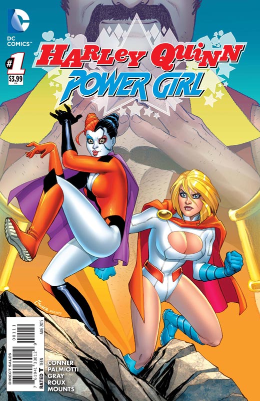
Harley Quinn and Power Girl #1
DC Comics Writers Amanda Conner, Jimmy Palmiotti & Justin Grey, Artist Stephane Roux, Colorist Paul Mounts, Letterer John J. Hill
Conner and Palmiotti are back on another new book and this time Grey joins the fun. The story is a off shoot of a storyline in the regular Harley Quinn book but there is a nice recap of those events that will get you up to speed on the story. While I was disappointed in their recent Starfire book, this one falls somewhere between the regular Harley book and Starfire. The story while it was enjoyable never quite took the leap to be a great read. The humor was mostly in the right place and the action hit most of the beats but overall the story left me a bit underwhelmed. It’s not a bad book but just seemed to miss the mark a little. The story is fun and light and pretty simple and if you are a fan of the regular Harley book then you will probably like this one. Roux does a very nice job on the artwork for the book and has a great balance of the goofy and the superhero that the book runs a fine line throughout and a solid-looking book.
Is this book worth your time and money? Kind of no and yes. I guess that I expected more from this book than there is. It seems to do everything right but I just feel that the book doesn’t quite gel like it was supposed to. Fans of Harley and Power Girl are probably going to like it and it has the potential to be a decent book but from this first issue I’m not sure that this is going to happen.
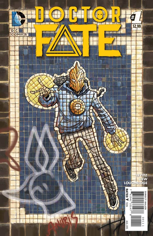
Doctor Fate #1
DC Comics Writer Paul Levitz, Artist Sonny Liew, Colorist Lee Loughridge, Letterer Nick J Napolitano
Doctor Fate has been one of those great DC characters that has been sadly underused at DC. There is a lot of potential to the character and it seems that Levitz and Liew may have found a formula that might work for a regular series. With that being said the first issue does suffer from the exposition problem in the fact that there is a lot going on but it’s a bit on the slower unfolding side. This is tough for a mainstream audience today because when I read the book I can see that Levitz is setting things up for the future and that might take a few issues to see the bigger picture. I will say that I am very familiar with Doctor Fate and that could influence my thoughts about this book. Levitz is an old school writer and understands that setting up a character can take a little time and there is a lot to set up here. Liew’s artwork brings a fresh look to the book and gives it a style that makes it really stand out from the standard superhero comics. Loughridge’s color work really brings Liew’s artwork alive and makes this one of the best looking new DC series.
Is this book worth your time and money? If you are willing to give the book a few issues to flesh out the story then it appears that this book could be a real winner. The first issue suffers from the first issue-itis but has the potential to be a strong book.
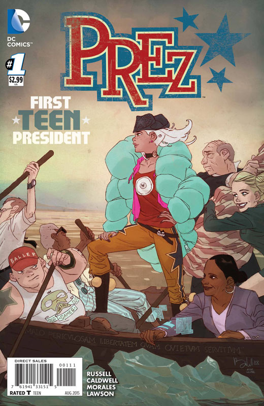
Prez #1
DC Comics Writer Mark Russell, Penciller Ben Caldwell, Inker Mark Morales, Colorist Jeremy Lawson, Letterer Travis Lanham
Of all of the new relaunch DC comics Prez is going to be the most decisive of them all. The book mixes politics, satire, humor and Twitter and shakes it all up and the results are simply one of the most original comics from DC in a long time. Russell takes no prisoners with this story and is willing to go in any direction that the book needs to. While there is a lot of crazy stuff that goes on in the story Russell wisely keeps Beth in the center of the book. He never treats her as just a stupid teen ager and while she may not be the smartest person he make sure that her heart is in the right place. He also sets up the storyline very well for future issues. When you have a snappy script you really need the perfect artist to bring the visuals of the book to life. Caldwell and Morales hit a home run in the art department. Caldwell is able to tread that fine line between cartoony and dramatic art that the story needs to work so well. He takes a very outside the box approach to the overall look of the book to match the wild story. This is a fantastic looking book.
Is this book worth your time and money? I was looking forward to this book and it really blew me away. I was very impressed that Russell was willing to take this book into very dark humor and political satire territory. I like the fact that there is a lot of room for this book to grow and that there seem to be nothing that is off-limits for the story. With gorgeous artwork by Caldwell make this a real winner. HIGHLY RECOMMENDED!
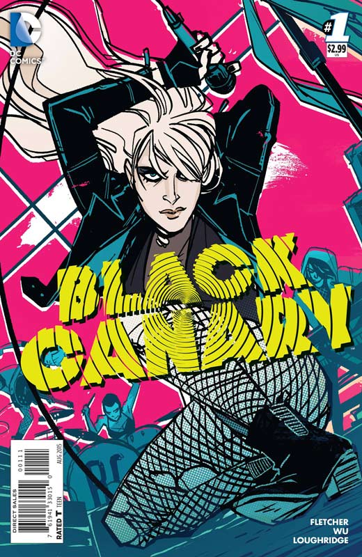
Black Canary #1
DC Comics Writer Brenden Fletcher, Artist Annie Wu, Colorist Lee Loughrodge, Letterer Steve Wands
Readers familiar with the current team on Batgirl and Gotham Academy will recognize the writing style of Fletcher right away on Black Canary and that is not a bad thing. Story wise Fletcher brings a similar style to Black Canary and I think that it fits her very well. First he doesn’t try to reinvent the wheel here. He doesn’t giver her new powers or give her a new costume. It’s still classic Black Canary but he has given her a new setting and were not quite sure why she is in a band and hiding from her past. This first issue is a nice set up but be for warned that there is not a lot of action in this first issue and I actually found that quite refreshing. Fletcher does keep some things close to his vest story wise but there is a lot of nice set up for things to come in future issues. Wu’s art is a very pop art type style that is perfect for Fletcher’s take on the story. She uses bold line work and great layouts for the book. While there are times where there are few backgrounds she is using it to tell the story with the art instead of just leaving it black due to lack of time or effort. She really brings a bold fresh look to the book. Again Loughrodge does a fantastic job with the color work that really complements Wu’s artwork and blends the whole thing together quite well.
Is this book worth your time and money? I quite enjoyed this book and thought that it was a very nice set up to the series. There is a nice mystery surrounding the story and the idea of putting her in a band is kind of genus. The book is off to a nice start. RECOMMENDED!
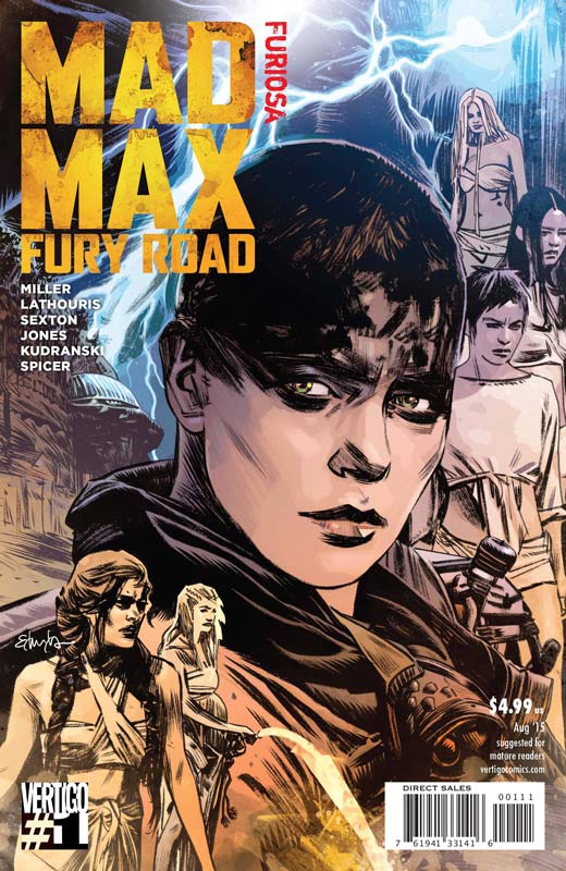
Mad Max Fury Road: Furiosa #1
Vertigo Story George Miller, Script Nico Lathouris & Mark Sexton, Artists Mark Sexton/Tristan Jones/Szymon Kudranski, Colorist Michael Spicer, Letterer Clem Robbins
If you are a fan of the new Mad Max film then this companion book that tells the back story set up to the film is simply perfect. The story is very much alluded to in the movie and it’s nice to se Miller and Vertigo team up to add these stories to the mythology of the film. As with the previous one shot Nux & Immortan Joe this book give more back story to how Furiosa got the driving gig in the movie and how she got the girls out. While I would have liked to see more of her back story with her kidnapping and her arm this still makes a satisfying if somewhat all to brief story. Hopefully there will be more of her back story in the upcoming regular Mad Max series in a few months. Good story and nice artwork make this a must buy for fans of the film.
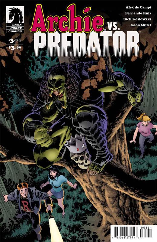
Archie VS. Predator #3
Dark Horse Comics Writer Alex de Campi, Penciller Fernando Ruiz, Inker Rich Koslowski, Colorist Jason Millet, Letterer John Workman
The blood bath in Riverdale continues and the body count get even higher in the third issue. de Campi keeps the story rolling along and while there is not a lot of back story in this issue it’s still quite fun. I do wish that the mythology of the blade was told by now it’s still fun to read. Honesty this is not deep reading or changing the game. It’s just straight up mayhem. Ruiz and Koslowski keep the Archie art style that is perfect for this wild ride. This book is not about deep meaning it’s simple about mayhem and body count and on that level the book delivers in spades. RECOMMENDED!
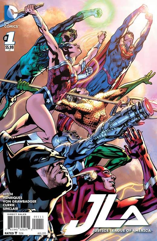
Justice League of America #1
DC Comics Writer and Penciller Bryan Hitch, Inker Daniel Henriques with Wade Von Grawbadger and Andrew Currie, Colorist Alex Sinclair, Letterer Chris Eliopoulos
There is no doubt that Hitch is a very good artist but when it comes to writing well…… While the story is not a train wreck it’s definitely over bloated and not very well thought out. You almost fee as if you are reading a story that has already started but you are just joining along. He tries to write an epic story and that is maybe where he stumbles along the way. He gets caught up in telling this grand story that he kind of forgets to actually develop the story for it to follow a normal narrative and in the end it’s a bit all over the place and you are left with not caring too much about the whole thing. One the art side of the book there are a lot of inconsistency to the artwork. It’s hard to tell if the problem is on Hitch’s end or the three inkers on the book. From the layouts I would point to Hitch who might have over extended himself on the project.
Is this book worth your time and money? While the book is not terrible but it’s not very good either. There is no doubt that Hitch is an excellent artist but not every artist is a great writer and in this case it probably would have been a good idea to bring in a writer to add some coherency to the book. SKIP IT!
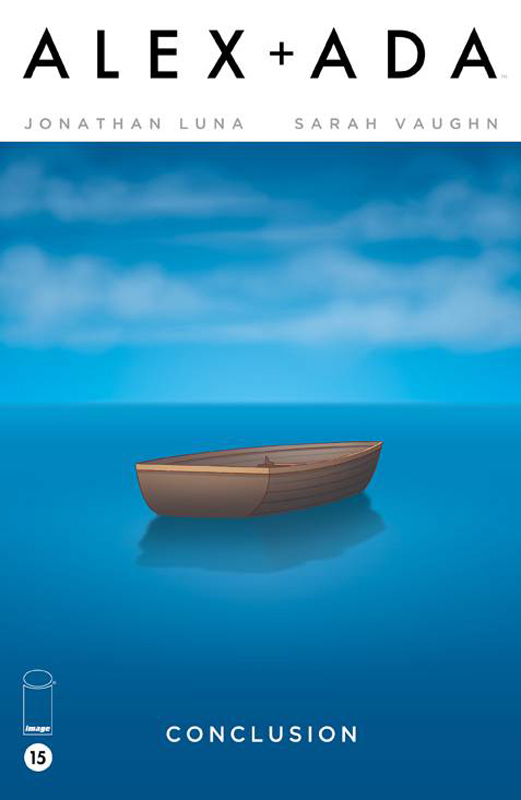
Alex + Ada #15
Image Comics Writers Jonathan Luna and Sarah Vaughn, Artist/Colorist/Letterer Jonathan Luna
SImply put this was a stunning and very satisfying ending to one of the best books of the year, Luna and Vaughn weaved a wonderful story that went in many directions but in the end was one of the most touching stories in comics. This is one of those books that people will be talking about for a long time to come. If for some insane reason that you didn’t listen to me and buy this book then when the trade collections come out this a no brainer must buy book. HIGHEST RECOMMENDATION!
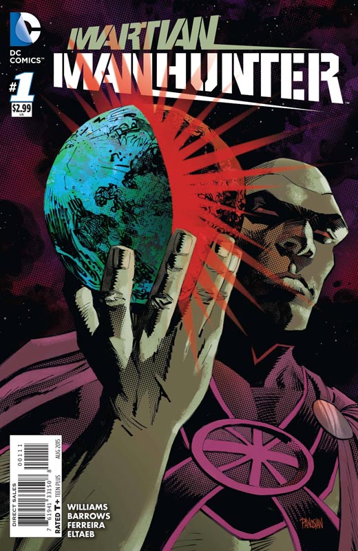
Martian Manhunter #1
DC Comics Writer Rob Williams, Penciller Eddy Barrows, Inker Eber Ferreira, Colorist Gabe Eltaeb, Letterer Tom Napolitano
I was a big fan of Williams The Royals series over at Vertigo and thought he was an interesting choice for this book. He definitely takes a different approach to the superhero genre. He also does a nice job of remembering that he is an alien to earth and uses that to his advantage story wise. Williams goes into dark storytelling with this book and the tone might not sit well with the standard superhero crowd. He does a lot of set up with the story for future issues in this first issue so there is a fair amount of exposition going on. On the art side Barrows and Ferreira do a nice job with the visuals on the book and are able to do the bright superhero stuff but also do a nice job on the darker tones of the book. While the first issue didn’t knock my socks off it intrigued me enough to give the book a few issues to see where they are going to take it.
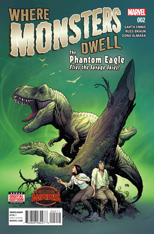
Where Monsters Dwell #2
Marvel Comics Writer Garth Ennis, Artist Russ Braun, Colorist Dono Sanchez Almara, Letterer Rob Steen
This is becoming my favorite Marvel book now and I am super sad that it’s only going to be a mini series. Ennis and Braun have created a not only fun book but filled it with classic serial adventure with all of the best ingredients. Action, beautiful women, dinosaurs, mayhem, and a leading man who a real ass. Ennis does a wonderful job of keeping all of those elements together wonderfully and making sure the books pace keeps moving forward nicely. Braun’s artwork is simply some of the best modern pulp artwork that is around today. This is a gorgeous looking book and he has a great knack for being able to do the dramatic moments and the huge action scenes with such ease that it makes this Ennis’s story work so well. If this is the only good thing that comes out of the whole Secret Wars fiasco at Marvel now then it will be all worth it for this wonderful book. HIGHEST RECOMMENDATION!
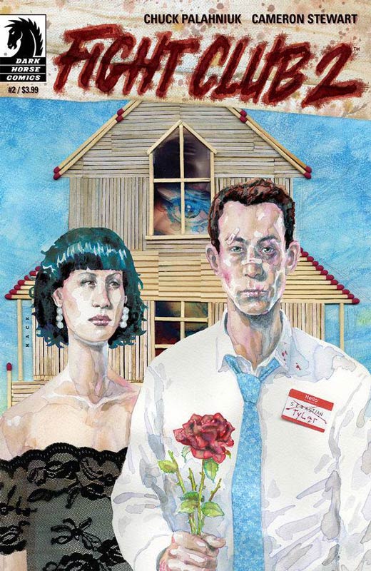
Fight Club 2 #2
Dark Horse Comics Writer Chuck Palahniuk, Artist Cameron Stewart, Colorist Dave Stewart, Letterer Nate Plekos
While some might have been disappointed with the first issue of this book I was very happy with the direction that the book is heading and you really get to see where Palahniuk is going with it. He is really starting to bring out the secrets that these characters have deep down in their souls and how trying to live a normal life is impossible. Stewart continues to impress with his artwork on the book. I’m really loving how he is playing with the layouts of the book and letting the artwork and the story take risk with the look of the book. This is one of those book that is tough as a monthly read and will be better when it’s collected but if you are like me in devouring each new issue when it comes out. RECOMMENDED!
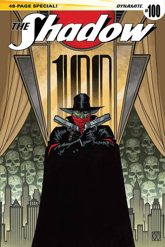
The Shadow #100
Dynamite Writers Francesco Francavilla/Victor Gischler/Howard Chaykin/Michael Uslan/Matt Wagner, Artist Francesco Francavilla/Stephen B. Scott/Howard Chaykin/Giovanni Timpano/Matt Wagner, Colorist Salvatore Aiala Studios/Jesus Aburto/Marco Lesko/Brennan Wagner, Letterers Rob Steen/Ken Bruzenak
Celebrating 100 issues of The Shadow with an all-star line up of creators. As with most books like this with multiple creators and stories there is something for everyone. I actually enjoyed all of the stories and there are a few that were real standouts. The Francavilla Laughing Corpse was a wonderful story and art combination that was one of my favorites. The other favorite was the Uslan and Timpano nod to Batman story that was nice to read. This book is not going to convert anyone to read The Shadow but if you like him then this book is a nice treat of talent and a great character.
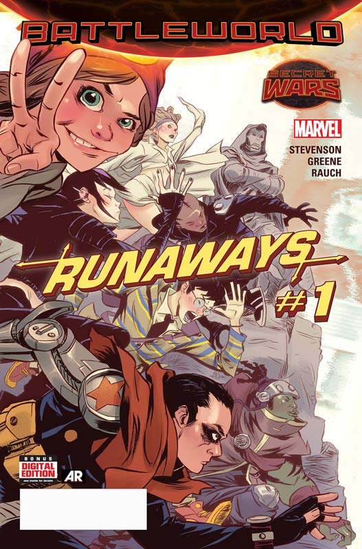
Runaways #1
Marvel Comics Writer Noelle Stevenson, Artist Sanford Greene, Colorist John Rauch, Letterer Clayton Cowles
I’m a big fan of Stevenson’s Lumberjanes book so I had high hopes for this incarnation of the Runaways. The book was nice but it didn’t leave a huge impression or a reason to come back for more. I will say that she does an excellent job of introducing all of the characters by having them in detention and having them all get to know each other. While that was good the overall story tended to drag along and ultimately the story didn’t really go anywhere. It suffered for being just an average read and that is the biggest problem. The artwork by Green is rather disappointing and very inconsistent. There are times where the artwork is very good-looking but there are far too many panels that look rushed and have a very noticeable lack of detail that was very distracting while reading the book. In the end I think the biggest problem that I had with the book was that it was really disappointing. SKIP IT!
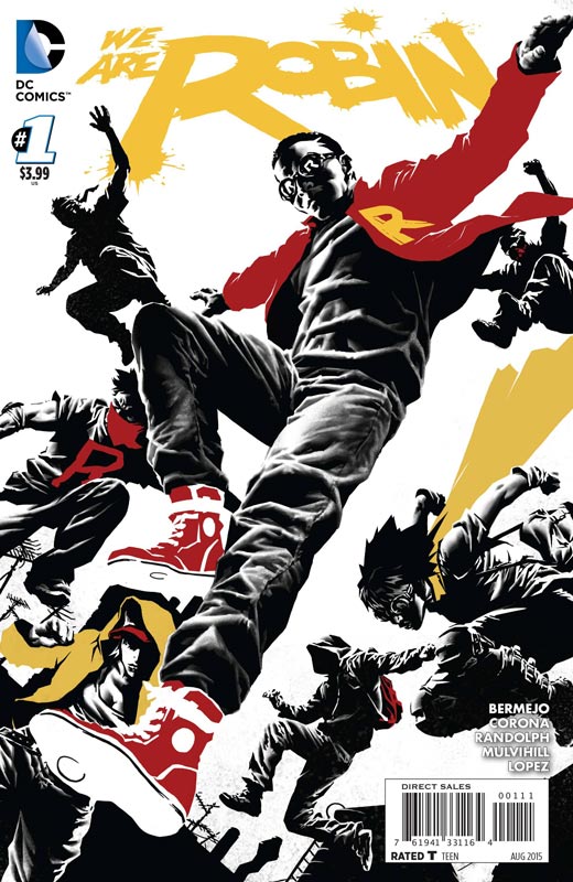
We Are Robin #1
DC Comics Writer Lee Bermejo, Artist Jorge Corona, Breakdowns Rob Haynes, Colorist Trish Mulvihill, Letterer Jared K. Fletcher
This is a book that take place after the event in the Batman Endgame storyline that I had not read but the book does thankfully stand on its own. Bermejo is more known as an artist but his Vertigo book Suiciders has proven that he is becoming a good writer. The good news is that he is two for two with this book. There was just something about the story that worked quite well for me. He did a very good job of getting the character of Duke Thomas across to readers so that you were able to understand what he was going through and the reader was attracted to him. The first issue has a nice set up of the group and we get a glimpse of where the story is heading. While the story is not earth shattering I was very taken by the book. Corona has a nice clean art that worked well for the story. I did like his slightly exaggerated characters that made for a different looking book. In the end I will stick around for a few issues to see if the trajectory of the book continues to be enjoyable.
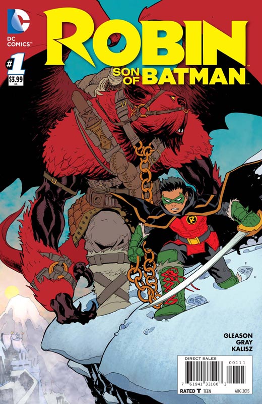
Robin Son of Batman #1
DC Comics Writer and Penciller Patrick Gleason, Inker Mick Gray, Colorist John Kalisz, Letterer Tom Napolitano
Here we have the other new Robin book that really misses the mark. Gleason’s flaw in the story is that he does not account for new readers on the book. The story seems to be an ongoing part of a story that if you had not been reading it you feel that you rally don’t quite know what is going on. Gleason does give some of the back story to it but overall for new readers this one is a real head scratcher. The story is also a bit all over the place with lots of time jumps that don’t really do it any favors either. On the plus side Gleason and Grey’s artwork is very good and the one good thing that the book has going for it. Visually this is a great book but with the story very unfriendly towards new readers makes this one a miss. It’s not terrible but I didn’t really care about anything after reading it. SKIP IT!
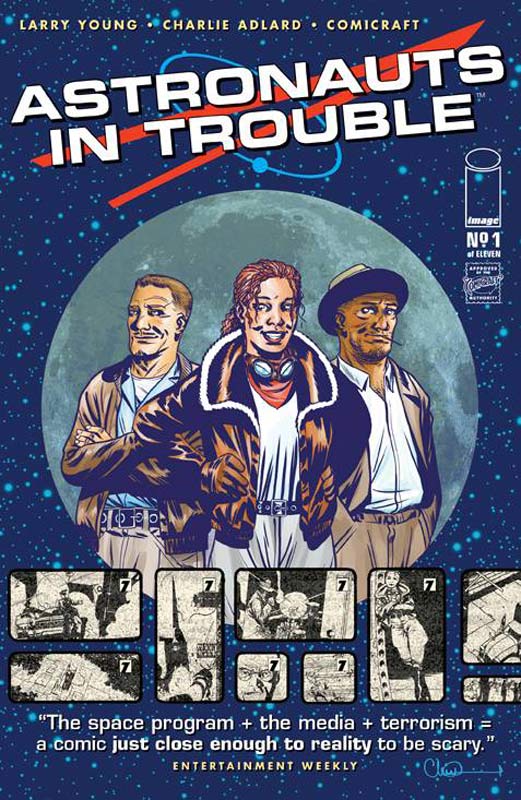
Astronauts In Trouble #1
Image Comics Writer Larry Young, Artist Charlie Adlard, Letterer Kyler Tanowitz
This is one of those books that I really tried to like but unfortunately Young’s story is just a mess. I get having a mystery but the introduction to the cast is really sloppy and there are too many times where there is just too much dialog that bogs down the pacing of the book. Things happen in the book but none of it seems to connect very well. I was really challenged to read this book. The only thing that I did like about this book was Adlard’s art but it was too little and too late to save this train wreck. It’s a real shame because I think that there are some interesting ideas because of the period that the book is set in but it’s too bad that the story is pretty much unreadable. SKIP IT!
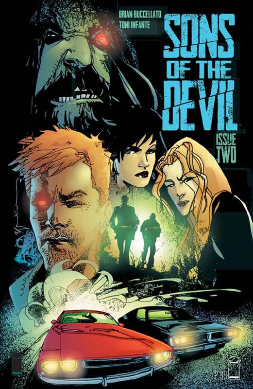
Sons of the Devil #2
Image Comics Writer Brian Buccellato, Artist/Colorist Toni Ingante, Color Assistant Mado Pena, Letterer Troy Peteri
Buccellato cult drama story continues to intrigue but I will say that he is treading a fine line with this second issue. While I do like the story I had wished that there was just a bit more information for the readers in the second issue. I can see that he is pacing the mystery out but I’m a tad worried that he is holding it back a little too much. Still the book is very interesting and I like the direction that the book is heading so far. Ingante’s art really captures the mood of Buccellato’s story and gives the book a great flavor and mood that really brings the story alive. He really keeps the story moving along very nicely. So far I’m intrigued with the book but the next few issues are going to be critical for the long-term of the book. Mysteries are good but if they are drug out too long you will lose the faith of the readers.



0 Comments