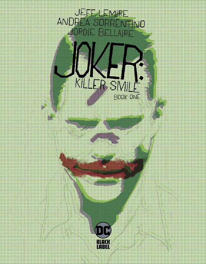
Joker Killer Smile #1
DC Black Label Writer Jeff Lemire, Artist Andrea Sorrentino, Colorist Jordie Bellaire, Letterer Steve Wands
I have been waiting for this book form the day it was announced because I’m a huge fan of their Gideon Falls Image comic that is one of the best horror comics around currently so I was surprised that they were doing this comic. Lemire is one of the best writers out there and this book doesn’t disappoint with it solid first outing here. What is always tricky about a Joker story is that you have to set up the other characters that are going to be the focus of the story. Lemire has done that here with some nice subtle clues here and there with role reversals for Ben and it makes you wonder who is diagnosing who. One of the things that Lemire does best is slowly peel the layers of the story back so that you have a chance to let it all soak in while your reading it and by the time you get to the end of the issue you’re hooked into the story quite nicely. Sorrentino has been delivering some of his best artwork lately but he has taken it to a whole new level here. What I found most impressive was the subtle changes in the styles of art that he uses here to tell different parts of the story but it works on a more sub conscious level that is not overdone so that you notice it. One of my favorite parts was the children’s storybook pages that were cute and terrifying at the same time. The one thing that really drives this story home is the emotions that Sorrentino for the characters that captures the story so well here. I must praise Bellaire’s color work on this book that adds so mush to Sorrentino’s line work that is simply spot on.
Is this comic worth you’re time and money? First if you’re not reading Gideon Falls then you must start that book as soon as you finish this one. Now that you have done that where does this one fall. On the surface there are some minor similarities to the Harleen Black Label series because they both deal with the psychology of the Joker but that is where the comparison ends. This story is one that slowly creeps up on you and then you’re hooked because of the way that Lemire and Sorrentino build the story slowly and by the time you are done with this first issue you will be hooked like I was. I can’t wait to see where they take it from here. HIGHLY RECOMMENDED!

SFSX #2
Image Comics Writer Tina Horn, Artist Michael Dowling, Colorist Chris O’Halloran, Letterer Steve Wands
I was quite impressed with the first issue of this comic and this second outing build on the first issue very well here. There is a lot to take in after the events of the first issue and we not only see what Avory is going to do to try and get Nick out of the pleasure center. There are still a lot of questions about what this world is about and while Horn does reveal some things she still keeps thing close to the vest. I did like how we get to see some of Avory’s past and how she came to meet Margaret and surprise we get to see what has happened to here and it’s far worse than we could have imagined. One of the best assets that this book has is how Horn deals frankly with sex and all that goes with it but she never forgets the emotions that come with it and that is why this story is so intriguing because you care about the characters. Dowling artwork continues to shine here with the spot on way that he captures the emotions of the story with wonderful facial expressions that Horn puts into the script. There is a lot of story that is in this issue and he keeps it moving along nicely with the visuals.
Is this comic worth you’re time and money? I’m quite impressed with this comic and Horn and Dowling are keeping the story on track perfectly. There is a lot to take in this issue with the set up to break out Nick and Margaret and unfolding of the story in both the present and the past. This one looks to be a keeper. RECOMMENDED!
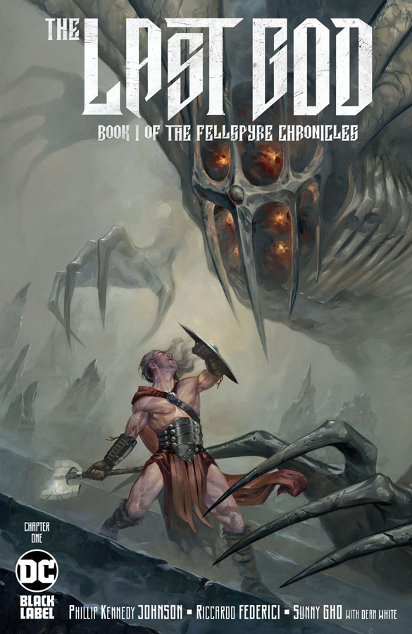
The Last God #1
DC Black Label Writer Phillip Kennedy Johnson, Artist Riccardo Federici, Colorist Sunny Gho with Dean White, Letterer Tom Napolitano
Mythology comics are a tough nut to crack and the ones that are really good are pretty rare so how does this one stack up? It gets off to a bit of a rough start because this first issue is a bit on the dry side with this first issue being exposition heavy. The basic premise of the story has a Greek Gods structure but Johnson makes it his own being that there are familiar story tropes here but doesn’t feel too similar. The problem is that this first issue story is linear but it also feels a little disjointed at the same time. It’s like there is a lot going on here and there is a lot of explanation but at the same time you feel lost at times too. It’s one of those comics that you are not quite sure what to make of it after reading it. The one thing that this book does get right is the gorgeous artwork by Federici that gives this book a great look and feel visually, but pretty artwork can only do so much with a story that needed some more fine tuning.
Is this comic worth you’re time and money? The book is not a total loss but the story just doesn’t grab you like I thought that it should. It’s not that you don’t understand what is going on but it’s just that the exposition just makes it a pretty boring read in some ways. I am willing to give the book a few more issues because there is a lot to like here but it never quite grabs you like a first issue should. The artwork alone is worth giving it another chance.
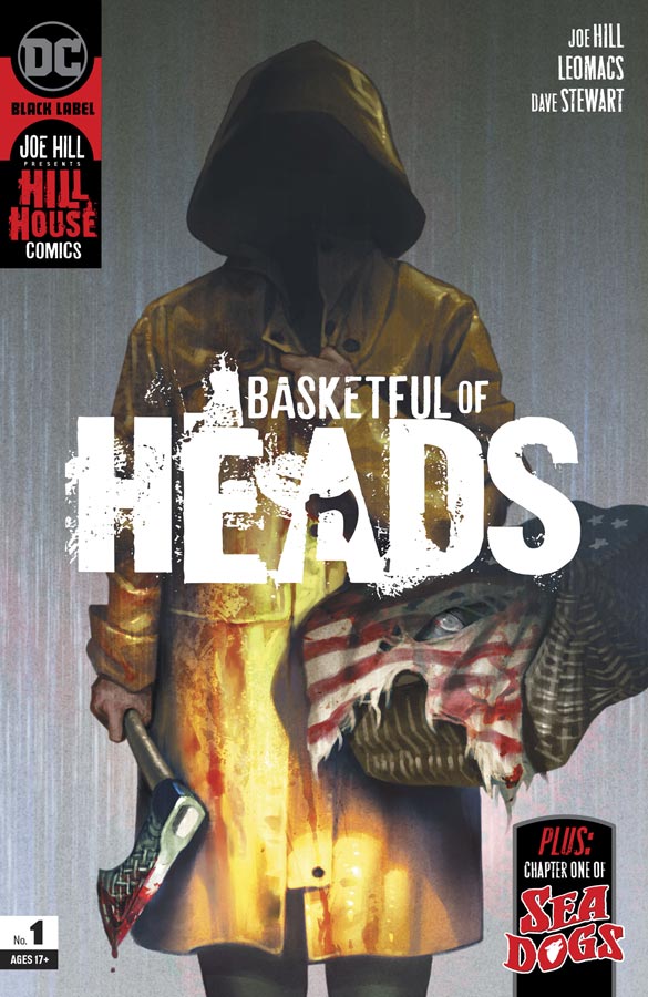
Basket Full of Heads #1
DC Black Label/Hill House Comics Writer Joe Hill, Artist Leomacs, Colorist Dave Stewart, Letterer Deron Bennett, Back-Up Story Artist Dan McDaid, Colorist John Kalisz, Letterer Wes Abbott
There is no doubt that this comic is a throwback to the 60’s and 70’s DC horror comics like House of Mystery and House of Secrets in not only the storytelling but the artwork as well. While at first it doesn’t seem that Hill’s story grabs you but by the time you get to the end of the issue you are quite intrigued with what he has set up here with this first issue. The story washes over you and does a great job of fleshing out the characters in a way that you get to know them and while there is still a lot to find out about them and this small town and the underlying mysteries. I really was impressed with Leomacs artwork here that has that old school visual vibe to it that complements Hill’s script so well. From the first page to the last stunning panel this is a great visual treat that captures the subtle mystery and horror of Hill’s script. The Sea Dogs back-up story is a nice touch and the story will continue through out the Hill House titles. The set is good for only having four pages to work with but I’m curious to see where it gos McDaid artwork is really creepy and adds a great deal to the feel of the story.
Is this comic worth you’re time and money? I was hoping that this would be a good rebirth of the horror genre that DC was so good with back in the day and I’m glad to say at least this first book is off to a great start and I loved that it didn’t have to rely on cheap gore to tell the story. Even if you are not a big horror fan this one is well worth checking out. RECOMMENDED!
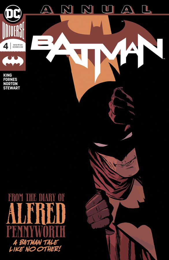
Batman Annual #4
DC Comics Writer Tom King, Artists Jorge Fornes & Mike Norton, Colorist Dave Stewart, Letterer Clayton Cowles
With the recent fate of Alfred this is a great bittersweet story of how Batman does what he does every day and how he sees the man and the myth that he has become. One of the reasons that King’s run on Batman has been so good is that he never overplays the story he just lets it unfold and that is what makes this story so great. As with life there are big days and there are small days and this story captures them all. While on the surface this story might not have the immediate impact as say the Killer Joke does but in a lot of ways it does but in a much more subtle way. The story washes over you and by the time you get to the end when you just have a panel for each day the story really gets to you emotionally. Fornes and Norton greatly captures the feel and tone of Kings script and in a lot of ways the story is for the most part silent so you need artists that are able to capture the action, drama and the emotions in a single panel and they both do it quite masterfully. The other wonderful touch is that there are a lot of great visual references including a nice homage to Steve DItko among others. The other feather in the cap that this comic has is Stewart’s greta color work that complements Fornes and Norton’s line work beautifully.
Is this comic worth you’re time and money? Are their too many Batbooks being published by DC? Very much so but every once in a while one of those little stories breaks through and you get something very special and this is one of the best. What makes it so great is that it doesn’t try to be a big event story but just a simple personal story and that is why it is so great. One of the best of the year for sure. HIGHEST RECOMMENDATION!
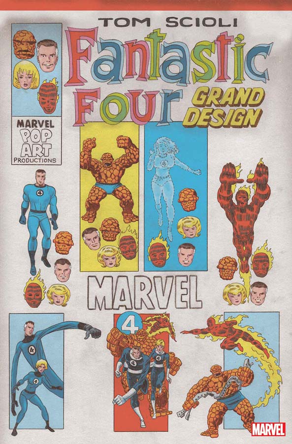
Fantastic Four Grand Design #1
Marvel Comics Writer and Artist Tom Scioli
Picking up where Ed Piskor left off Scioli brings the retro homage to the Fantastic Four but unfortunately with mixed results. The biggest problem with the book is that he simply tries to cram too much into the book that some parts of the history is over done and some are under cooked. This is not to say that the book is not a nice nostalgia trip down memory lane but when you have a page that has 23 panels that are the size of a postage stamp it’s simply too much after a while. If the book had been done in a larger format (that will probably be done when this is collected) it might have been easier to digest but being a regular comic format it’s just too overwhelming to read. The artwork is really nice here but again with the size of the book and the small panels it sadly just all blends together and so much of the detail is lost because its just too much to look at.
Is this comic worth you’re time and money? I really wanted to like this book because I love the Fantastic Four but unfortunately there are too many issues that keep it from coming together as well as it should have. If the book is collected in a larger format after this I would say that is the version you should check out but with what we have here is just far too messy to recommend.
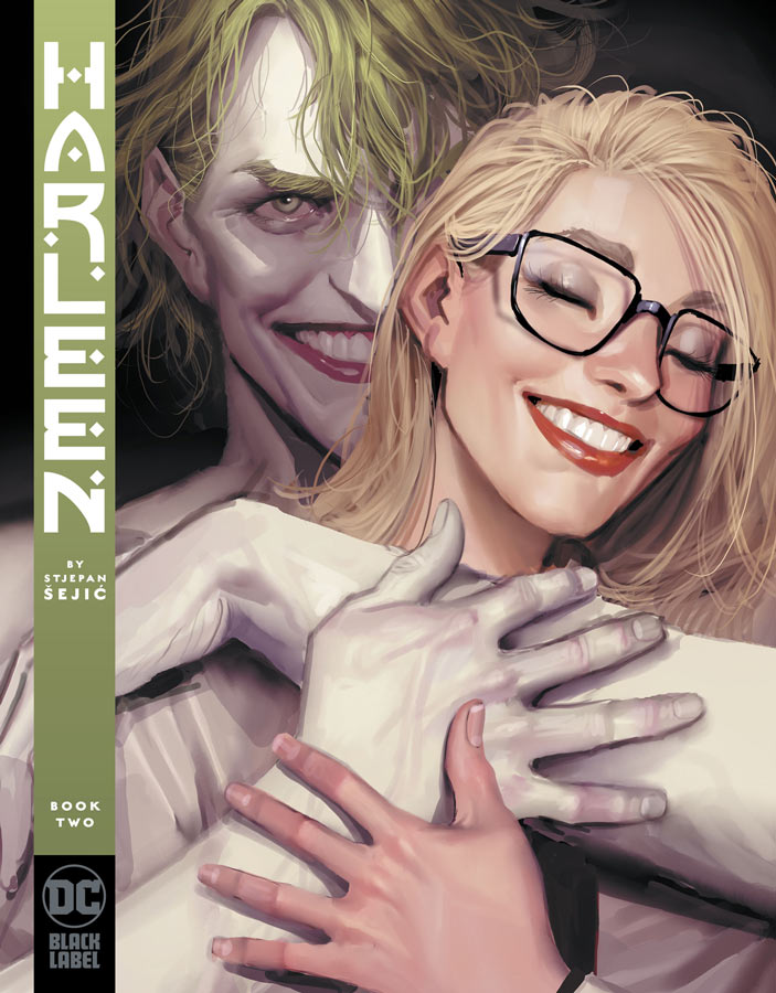
Harleen #2
DC Comics Black Label Writer and Artist Stjepan Šejić, Letterer Gabriela Downie
The second chapter of the re-imagined Harley Quinn origin continues to intrigue with it look at not only Harley but the psychology of the criminal mind but how it affects those on the outside. While the story has some cliches to it I still find it enjoyable. The one thing that Šejić does well here is flesh out the characters and lets the story breath very nicely. He doesn’t rush things but just lets the story unfold and wash over you. It was nice this issue to see some of the other Batman rogues in the story if only for a few pages but it added to the story nicely. One of the best is the origin of Two-Face that is done very well here and added to the story greatly. The big draw for this series is Šejić’s gorgeous artwork that brings this story together so well. It the facial expressions and the emotions that is making this story work so well. He is able to capture the small subtle details that adds to the story greatly.
Is this comic worth you’re time and money? I’m enjoying what Šejić is doing with this book and while it’s not the greatest comic that you will have read, it is very enjoyable and sometimes that is just what a comic needs to be. It’s entertaining and gorgeous to look at and that makes it worth buying.
Sandman Universe Presents Hellblazer #1
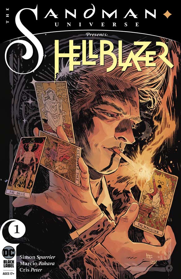
DC Black Label Writer Simon Spurrier, Artist Marcio Takara, Colorist Cris Peter, Letterer Aditya Bidikar
DC is rebooting Constantine yet again and the special one shot sets the stage for the new series that starts in November. The character has really struggled over the years with more reboots than I can remember but few of those have worked out. Spurrier has set things up for the new series fairly well here and covers a lot of the history of what has come before but sets things up for a new path for John. While I like what I read in the end this is just a set up story that does that job but it didn’t grab me as mush as I would have liked. Spurrier hits all of the beats of the story but the one thing that is missing a good reason to read the new series. Sure reincarnating John is an interesting idea and will give the first issue a try but in a lot of ways it feels like a lot of the same that we have seen before here. I hope that he proves me wrong but we will have to wait and see on that one. Takara’s artwork fits the bill nicely here. Dark and moody visuals really help the story along and gave it more punch that was a big plus. He does a heck of a job on the demons that is always a huge plus for a Hellblazer story.
Is this comic worth you’re time and money? While I didn’t necessarily love this one shot, it does however set things up for the series. The bigger question is where do newer readers stand with this one and I would say that if you like Constantine this is a good place to start but for long time readers who have went through far too many reboots it’s too early to call on that one. This one is good but not great.





0 Comments