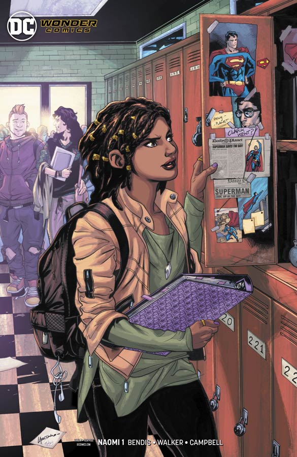
Naomi #1
DC/Wonder Comics Writers Brian Michael Bendis & David F. Walker, Artist Jamal Campbell, Letterer Josh Reed
The second book in the new Wonder Comics line from DC really gets off to a great start in this first issue. What I liked about this first issue was that Bendis and Walker do a lot of great set up work here but keep it from being dragged down by exposition that plagues a lot of first issues. The story has a great freshness to it even though it has a familiar feel and a lot of that comes from the script that has the characters feel natural with their actions and dialogue. While the book is aimed at a more young adult audience, I never found that to be a problem because the story has such a great charm to it that it will win you over like it did me. Campbell’s artwork really makes this comic shine with not only his great line work but his color work really adds great depth to the artwork. The most impressive thing is the way he is able to capture the emotions in the characters facial expressions is an absolute joy and adds so much to the emotional core of the book.
Is this book worth your time and money? This comic really caught me off guard because it just has a wonderfully natural charm and emotions to it that made it such a pleasure to read. And then throw in the gorgeous artwork and you have a real winner here. Bendis and Walker also give the first issue a nice little cliffhanger that give you a good reason to come back for the second issue that gets you excited about this comic. This is a big win for this new Wonder Comics line. VERY RECOMMENDED!

Guardians of the Galaxy #1
Marvel Comics Writer Donny Cates, Artist Geoff Shaw, Colorist Marte Gracia, Letterer Cory Petit
One of my biggest problems with Marvel is whenever they reboot a title they never seem to realize that a new reader who is not familiar with the last 12 reboots or yet another Infinity something or other starring Thanos of a title that all of the previous continuity is clueless to them. This is the case with this new reboot of Guardians of the Galaxy. It’s not that its unreadable but there are so many plot threads from the past that any new reader is going to simply wander around as they are reading this first issue and find it pretty boring because they are totally lost. Lets be honest here that nearly every outside of comics reader who is even remotely know who the Guardian’s are only know the movies and they are really going to be lost here. Cates script also feel like it’s stuck in a crossover time warp of a story that is old and stale. A bad thing happens, then a bunch of heroes get together, the main team has broken up for some reason or another, then bad thing happens to group of heroes and get hooked up with broken up team and start a whole new team to go after new bad guys. Yep that is all that happens here and you’ve read it a million times and it doesn’t get any better here. The script stumbles over cliche after cliche and there is simply nothing here that will give you a reason to come back for more. Shaw’s artwork on the book is decent but is just another Jim Lee knock off clone that is disappointing that his style doesn’t really stand out from the average. It’s not to say that the artwork is bad but just feels like a house style that doesn’t bring much new or exciting visually to the book.
Is this book worth your time and money? If yo have been reading this title or the latest Infinity storyline then your probably going to love this book but if you like me trying to see if this new series (that really isn’t new just slapped a #1 on the cover) your going to be so lost that you don’t even need to bother picking this one up. Beyond that its not new reader friendly at all, Cates script is so basic and cliche that there is nothing new here either. SKIP IT!
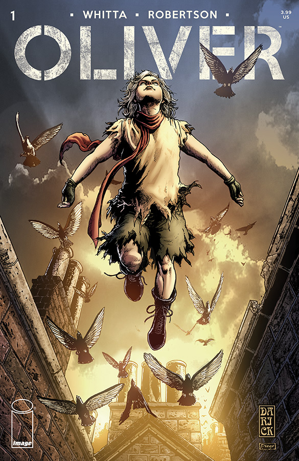
Oliver #1
Image Comics Writer Gary Whitta, Artist Darick Robertson, Colorist Diego Rodriguez, Letterer Simon Bowland
In a new take on an old story Whitta uses the Oliver Twist story loosely here and turns it into a dystopian future that makes for a decent read but isn’t overwhelmingly compelling. The problem with Whitta’s story here is that it really doesn’t bring much new to the table here. It goes though the motions of the story but by the time that you get to the end of this first issue there is not mush that will compel you to come back for a second outing. Part of the problem is that taking a bunch of other cliches and then throwing them all together doesn’t really work here and to make matter worse is that having Robertson’s gorgeous artwork on the book makes it all that much more disappointing. Robertson’s artwork actually make you forget that the story is pretty boring and unoriginal here and that is a great testament to his art skills. It jus such a shame that his talent is wasted on such a mediocre comic.
Is this book worth your time and money? I really wanted to like this book because of Robertson’s beautiful artwork but I simply recommend a comic that the only thing worth buying it for is the artwork. I really wish that Whitta’s script had more going for it but while he may turn it around later there is just not enough here in this first issue. SKIP IT!
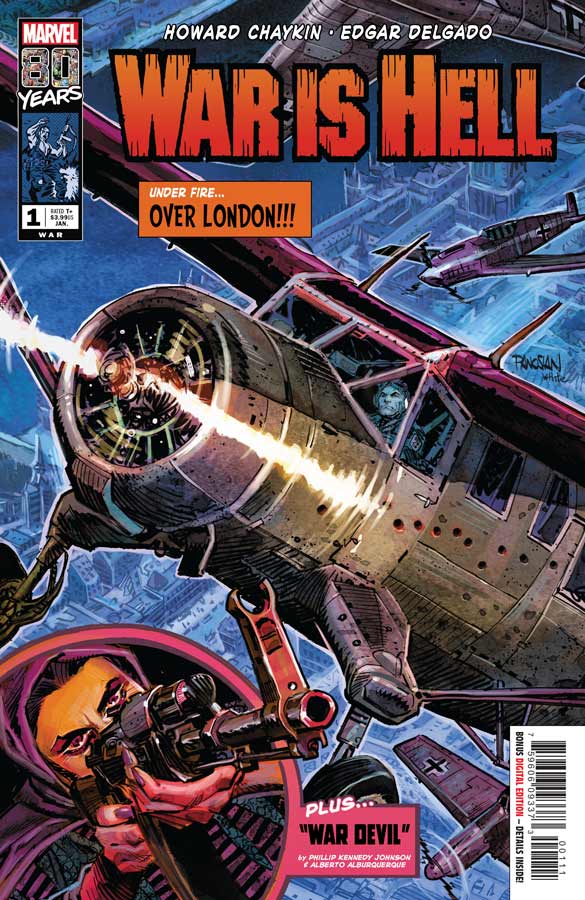
War is Hell #1
Marvel Comics Writers Howard Chaykin/Phillip Kennedy Johnson, Artist Howard Chaykin/Alberto Alburquerque, Colorists Edgar Delgado/Andres Mossa, Letterer Ken Bruzenak
To celebrate Marvel Comics 80th Anniversary they are doing special one shot tittles that each will have a theme like romance, westerns, horror and war stories like War is Hell. These books have two short stories in them and then a history and cover gallery afterwards. First up is Chaykin’s story that is a basic Twilight Zone structure that does a nice job of setting the story up then gives it a nice twist at the end to make it ironic. He is a big War Comics fan so this book is right up his alley in both story and artwork and his art is really spot on here but he always delivers great art so this is a win for this book. The second story by Johnson and Alburquerque gives a new twist on the Chupacabra story that works well in the short story formula. It gives the story a nice supernatural twist but still keeps its footing the the war genre. Alburquerque’s artwork is quite nice here and captures it well.
Is this book worth your time and money? If your a fan of the war genre or of the creative teams then your probably going to like this book. If your looking for a quick and nice little read this also fits the bill here also. Neither story is deep but they are both satisfying.
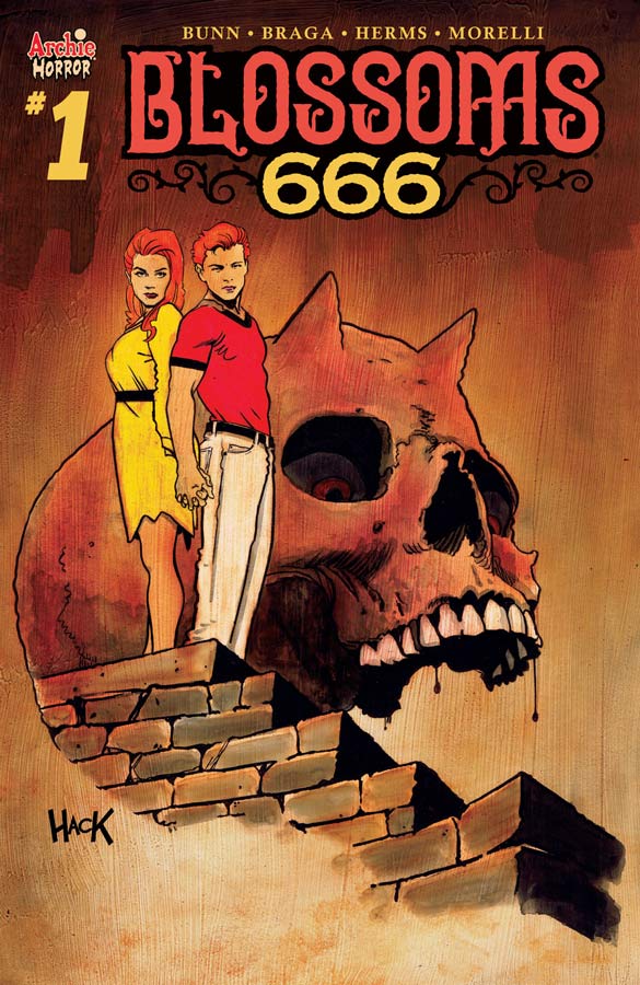
Blossoms 666 #1
Archie Comics Writer Cullen Bunn, Artist Laura Braga, Colorist Matt Herms, Letterer Jack Morelli
The Archie Horror Universe gets a new title that brings the Cheryl and Jason Blossom to the party and the book gets off to a fairly decent start. Bunn is in familiar horror territory here and does a good job of setting things up with this first issue. While I would have wished that he had come up with a bit more of an original story here it does lay the groundwork for the story. The problem is that these newest crop of Archie horror titles seem to be treading water in the sense that they are not really setting themselves apart from each other like Afterlife with Archie and the Chilling Adventurers of Sabrina did in the beginning. On the other hand you are getting what most people seem to want from these comics and if thats what you want then thats what you get. The big plus for this book is Braga’s wonderful artwork on the book that really gives it a nice boost. She gives it a sort of supermodel art style that is an improvement over a lot of the Archie comics currently going. Where she really helps this book along is the subtle emotional facial expressions that does help sell this story.
Is this book worth your time and money? I liked this first issue but didn’t quite love it. I wish that Bunn had tired to do a less cliche story for this first outing and while there are good moments in the story there were just not enough to excite me to buy the second issue. I will say that Braga’s artwork nearly saves this one from floundering and might be enough to give it a second chance so in the end it’s a real mixed bag on this one.

Crypt of Shadows #1
Marvel Comics Writer Al Ewing, Artist Garry Brown/Stephen Green/Djibril Morissette-Phan, Colorist Chris O’Halloran, Letterer Travis Lanham
The second of the Marvel genre one shots take us to the horror genre and is a bit weaker than the War one. Ewing take a bit different approach to this one while each story stands on it’s own they do all connect at the end that I will not spoil. I think that the biggest problem was that the stories were neither scary or creepy and that is usually a requirement for a horror comic. The other is that the whole rabid dog motif is not that exciting and doesn’t really work that well here. I did like the artists contributions to the comic but they really can save this boring horror story. The other huge disappointment in this was the cover gallery in the back that didn’t even include Tomb of Dracula that was a defining horror comic at Marvel and that made this just sad at the end.
Is this book worth your time and money? If you have a horror comic it should be scary or at the very least creepy but Ewing really drops the ball here with so-so stories that just miss the mark and that is very disappointing. I love horror comics but this one is horrifyingly bad. SKIP IT!
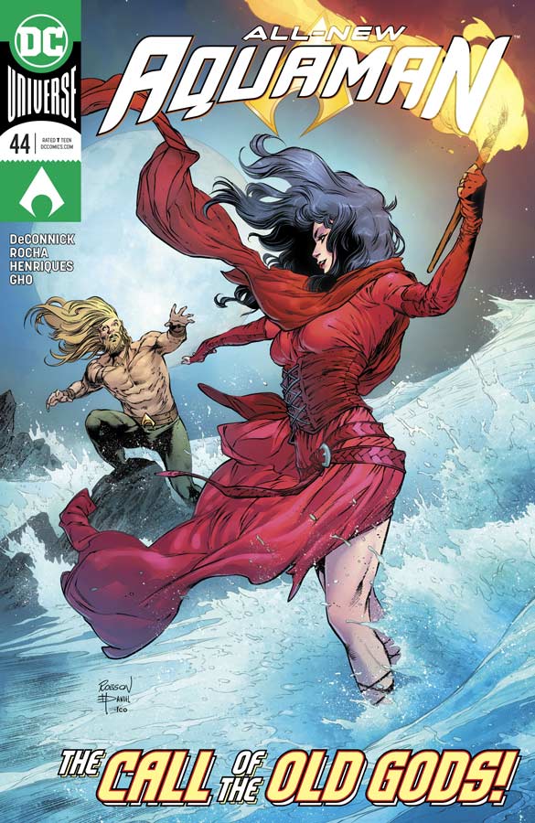
Aquaman #44
DC Comics Writer Kelly Sue DeConnick, Penciller Robson Rocha, Inker Daniel Henriques, Colorist Sunny Cho, Letterer Clayton Cowles
In her second outing DeConnick continues to impress with her take on Aquaman and what I am finding fascinating about this story so far is that she is not trying to reinvent him but literally take the fish out of water. While this story is not necessarily original she is putting a unique spin on it and giving it a fresh take that is very good so far. The other great asset that the story has going for it is how the story is unfolding at a nice pace. So many writers try to cram so much story into an issue that sounds great but there is no time to let the story wash over you and let you take it in but thankfully DeConnick has done that here and the book is really benefiting from it. The other story element of Arthur losing his memory is quite intriguing in that its allowing him to interact with new characters in a different way than you normally get to see. Rocha’s artwork on this book is really stunning and he brings a great emotional core to the story that is right in line with DeConnick’s unfolding story. His characters facial expressions really help sell the emotions of the script and many times there is no dialog but the story comes across so well in the artwork and that is a sign of a great collaboration.
Is this book worth your time and money? With only two chapters of this first story arc so far DeConnick and Rocha have really impressed me in a very short time. There is so much that they get right that the only complaint that I have is that we have to wait a month for the next chapter and that is something that you want the reader to want. This comic is really impressing me and I hope that they are able to keep this up in the long term. RECOMMEDNED!

Grumble #3
Albatross Funnybooks Writer Rafer Roberts, Artist Mike Norton, Colorist Marissa Louise, Letterer Crank!
Grumble continues to be the little book that could. I will be the first to admit that it’s not going to be the greatest comic book that you have ever read but what it is delivering is a fun and charming story that just hits the right sweet spot. Roberts keeps things moving along here and keeps bringing different fantasy elements to the story while keeping its semi noirish undertones too. Sure this is a simple detective type story but that is what makes it fun. Nortoon continues to deliver some very nice artwork here and his mixing of the human and fantasy world with the characters is simply spot on and really adds to the fun of this book.
Is this book worth your time and money? What this book may make up in originality certainly makes up with fun and charm and that is why it works so well. Snappy script and nice artwork make for a entertaining read and that is why I’m liking this comic.
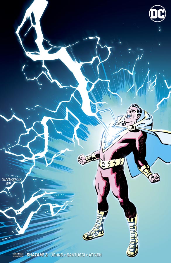
Shazam! #2
DC Comics Writer Geoff Johns, Artist Marco Santucci, Colorist Mike Atiyeh, Letterer Rob Leigh
The second issue of Shazam is more world building and setting up the story and that makes this one a good but still building issue. Johns is creating an interesting world not only with Billy but the other kids and it’s still too early to call just where its going to land. The one nice thing in this issue is that we see more of Doctor Sivana and Mister Mind are introduced here and of course building their villainy plots that Johns is building here. The amusement park was a lot of fun here but I did wish that there was a bit more bite to the story here and while it’s fun it didnt move things along as well as I would have liked but the next issue is really going to have to bring a bit more to the table. Santucci’s artwork is very nice here and it seems odd that the second issue already has a fill in artist. This is not to say that Santucci is less than Eaglesham in fact quite the contrary in that he very much holds his own here and the amusement park scenes are spectacular and the level of detail that he puts into the artwork is quite impressive and would be fine if was the regular artist on the book. He really stepped up to the plate here.
Is this book worth your time and money? I still like this book but I do worry that Johns sometimes has issues with moving the story forward and while this is only the second issue and he is building things here, I will give him a pass and see where he take the story over the next few issues. It’s still very enjoyable and is a nice take on the Captain Marvel mythology. I really enjoyed Santucci’s artwork here and hope that he is able to fill in or take over the book if needed. I will still say that its worth buying still because it was an enjoyable read and I’m intrigued to see where Johns is going to take it.
Freedom Fighters #2

DC Comics Writer Robert Venditti, Penciller Eddy Barrows, Inker Eber Ferreira, Colorist Adriano Lucas, Letterer Deron Bennett
After an uncomfortable start (on purpose) Venditti hits the ground running and gets the action going that does give this story a nice counter point to the somber first issue. He does a nice job on introducing each of the heroes and what their powers are in a giant robot battle that is always a good idea. While it doesn’t move the plot along that much it does however give the story a needed action shot that adds greatly to the mix. The one thing that I like here was that Venditti make sure that he adds hope to the story and that makes the story move very well form the first chapter. Barrows continues to knock it out of the park with his artwork that shows that he is more than capable of handling the big action scene because the first issue showed off his great dramatic abilities. He brings great detail to each panel of the action but makes sure not to forget the emotions of the characters that help drive the story home.
Is this book worth your time and money? I really digging this book and Venditti and Barrows are a nice team on this book. This second issue keeps things moving along but gives some really nice action to show that the story is very much a classic WWII superhero story but with a twist that is making for a good read. I cant wait to see where the story goes next.



0 Comments