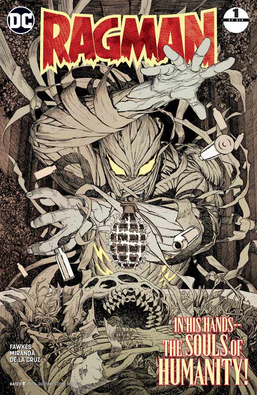
Ragman #1
DC Comics Writer Ray Fawkes, Artist Inaki Miranda, Colorist Eva De La Cruz, Letterer Josh Reed
I’m probably one of the only reviewers of this book that actually remembers the original Ragman from the 1970’s by Robert Kanigher and Joe Kubert that was a very unique concept and with Kubert’s bold visual style really brought the character to life. Fawkes uses a lots of the original origin elements with this new version of Ragman with many nods and winks to the original series. While he does make some minor changes to the origin it remains fairly in-tacked. The first issue does have a few issues most notably the story is very exposition heavy and is a pretty thick read. It also suffers from a sort of basic comic book story telling layout to the issue that doesn’t really get you super excited about the story. It’s not that the first issue is bad but the story ends up being kind of bland. For new readers this first issue is not a super great start for the book but there is some promise to it if Fawkes is able to get the book off on a better footing with the second issue. On the plus side Miranda’a artwork on the book does help move it along visually and while I’m not totally sold on his visual interpretation of Ragman anyone that has to follow Joe Kubert is going to have some very big shoes to fill. I am glad that Miranda has made this incarnation of Ragman his own and it works very well for this story. His style gives the book a really nice edge and he does some very nice layouts to the art that get the last act of this first issue some great footing.
Is this book worth your time and money? I like it but felt there was something missing from this first issue. It never quite grabs you and gets you into the story. Fawkes dense script has a lot going on here and while I get that he had to explain a lot here I just hope that with that out-of-the-way he hits the ground running with the second issue. Miranda visuals really help save this first issue with a gritty and wonderful style that adds great mood to the book. It’s a bit of a mixed bag but if you’re looking for something different you might want to check it out.
Family Trade #1
Image Comics Writers Justin Jordan & Nikki Ryan, Artist Morgan Beem, Letterer Rachel Deering
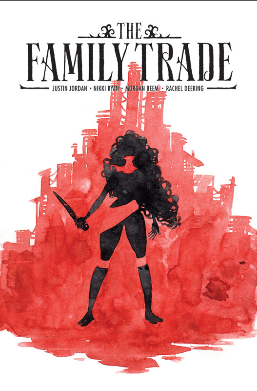
Family Trade is one of those comics that take a tried and true story and gives it a bit of a new spin. Jordan and Ryan mix spy and dystopian genres here and gets the first issue off to a good start. While the story is a bit light on exposition it does give you enough information that you get a good sense of the set up and where the story is heading. While they wisely keep the mystery under wraps there is enough to keep readers interests in coming back for a second issue. The one really good thing in this first issue is the pacing of the story that has a nice mix of action that balances things out nicely here. They way that they blended in the back story here was very impressive and kept the first issue from dragging that is a challenge for any writer. I loved Beem’s artwork on the book that has a nice style that adds greatly to the story. The really impressive aspect of his artwork is his color work that is really spot on and complements the line art greatly. During the flashback scenes using sepia tone color was just brilliant. His artwork has a nice European style that fits the story like a glove and gives the reader a better feel to the story because of it.
Is this book worth your time and money? This first issue may not blow you away but it will give you a solid first outing and a good reason to come back for a second issue. Jordan and Ryan have set up an interesting story here and with Beem’s gorgeous artwork makes this a comic that is well worth checking out.
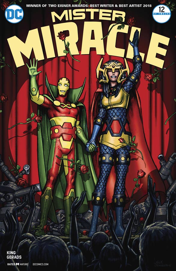
Mister Miracle #3
DC Comics Writer Tom King, Artist & Colorist Mitch Gerads, Letterer Clayton Cowles
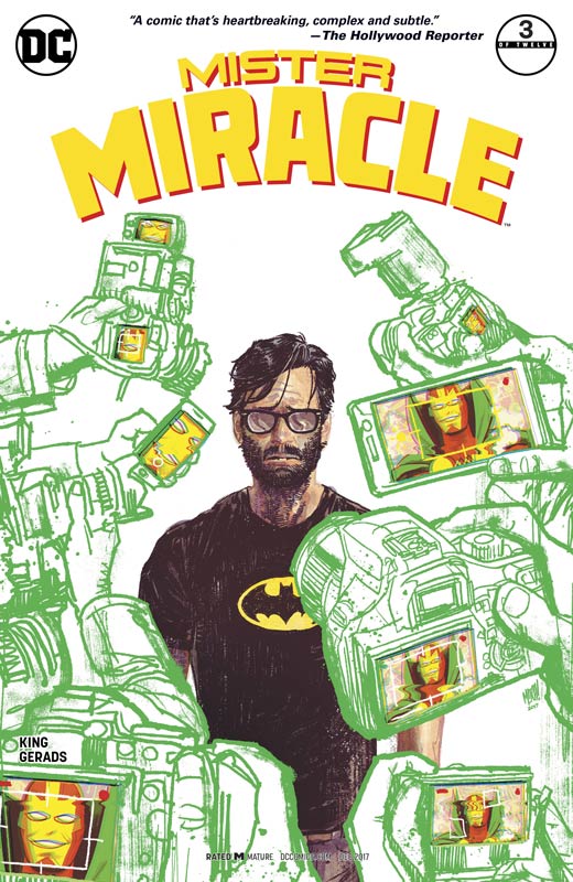
I had really high expectations going into this book that were twofold. One it’s Kirby, Nuff Said, and secondly King and Gerads have set a very high bar for themselves with their past work. That makes this book all that more satisfying that is not only an amazing story but exceeds expectations that rarely happens in comics today. The way that is tells the story of the human emotions of a god is quite brilliant and gives the story heart and soul that is tough to do in the superhero genre. This issue is quite heartbreaking with the scene with Forager and Scott that is what this book is all about. King strips everything down in that scene and distills it into raw emotions that really hit you hard to the core. The wonderful pacing of the story so far is another impressive feat. It is allowing the story to wash over you slowly and allows you to take it all in without rushing through the story. What I love about this book is the small little details that King infuses into the story like the celebrity selfie and Scott and Barda’s relationship that is the real core of the story. Where the book shines is the collaboration with Gerads artwork. This is one rare comics that the writer and artist is so perfectly in sync with each other that the story and artwork blend together seamlessly and is able to deliver in the perfect sweet spot. Gerads nine panel layouts for this book gives the book a feel that is very structured yet free-flowing at the same time. His use of panels with subtle differences make you pay much more attention to the very small details that gives the book that extra special element. This book is a visual stunner and bold and fresh and impressive.
Is this book worth your time and money? King and Gerads has taken the foundation of Kirby’s Fourth World and given it new life while staying true to the spirit of the original. There have been many comics over the years based on the New Gods mythology but none have been this bold and fresh both in story and visuals. This is a book that you can’t wait for a trade. It’s a comic that both satisfies and gives you withdraws at the same time knowing that you have to wait a month to devour the next issue. The first two issues were great but this issue really solidifies the book in a way that simply blew me away. King and Gerads are delivering the best comic book of the year and we’re only at issue three. HIGHEST RECOMMENDATION!
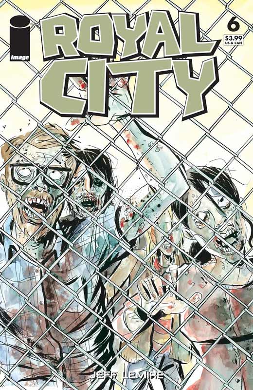
Royal City #6
Image Comics Writer/Artist/Colorist Jeff Lemire, Letterer Steve Wands
Royal City is back and with this second story arc goes to the past to reveal the layers of both the town and the family. What I loved about this story is how Lemire captures teenage life so perfectly that anyone can relate to. It’s rare in comics to capture the spirit of being a teenager but Lemire has not only perfectly captured it here but made it fit into the story so effortlessly that it becomes second nature when you reading it. You don’t actually notice all of the subtle elements that make it work so well until you go back and re-read it to catch all of the little details in the story. It’s interesting reading this issue because we know them as adults and where there are currently but to see these memories from the past and how then connect to the current story is quite facilitating and made for a great read. This issue also gives more insight to Tommy and while we still don’t know the whole story we start to see the ground work starting here. I love Lemire’s artwork and this book is some of his best to date. It’s such a simple and very detailed work that captures the emotions of the story perfectly. It gives you such a connection with the story that is making this book so enjoyable. His color work has always been great but Royal City is perfect because he captures real life with it here and it really gives the book a down to earth natural feel that is very pleasing.
Is this book worth your time and money? This has been a must read comic book from day one and this second story arc is even better than the first but for very different reasons. The idea of looking at the past when you know the future is a fascinating idea and take this story in a whole new direction that is very impressive. I simply cant wait to see where he takes the story from here. HIGHLY RECOMMENDED!
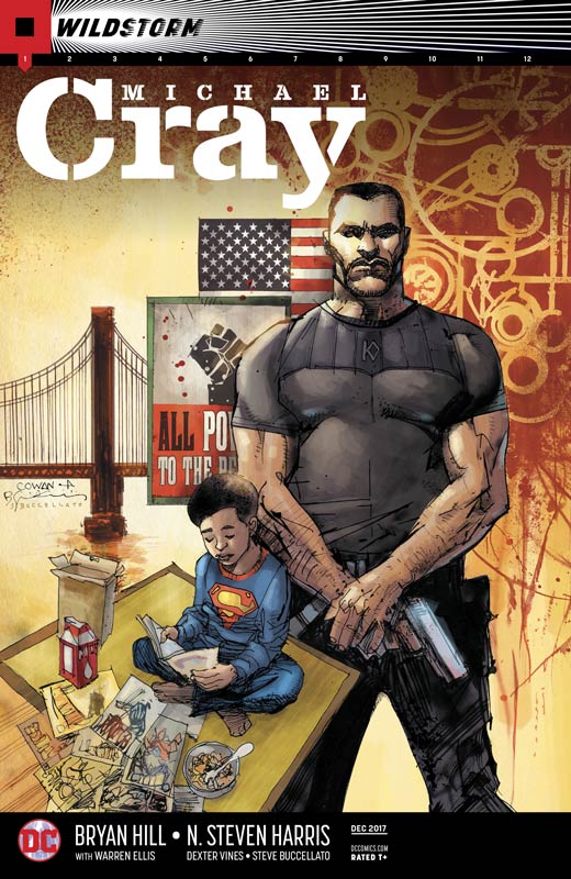
Michael Cray #1
DC Comics Writer Bryan Hill, Penciller N. Steven Harris, Inker Dexter Vines, Colorist Steve Buccellato
A spinoff from the Ellis Wildstorm reboot, Michael Cray gets off to a so-so start here. While there are parts of Hill’s story that are good, overall it never quite takes off like I would have liked. I think the biggest problem with the story is that you don’t really care as much as you should about Cray. While Hill does a nice job of setting him up for new readers, it never fully gels together as well as it should. The Green Arrow aspect of the story is both a blessing and a curse because it sets him up as a bad guy but we know that he isn’t and I’m sure that will be addressed in the story line, it just didn’t feel right in this first issue for some reason. The overall story ends up being a fairly bland affair and isn’t really compelling to read a second issue. Harris and Vines artwork is decent but fairly uninspired. It gets the job done but is not very memorable and is a little stiff and flat. It’s a real change because The Wildstorm series has been very good so far and this spinoff is a pretty big miss.
Is this book worth your time and money? This book is not terrible but simply just average in both story and artwork. There are moments where you think that they book is going to go somewhere but ultimately it just sits there and is not very memorable. If your reading The Wildstorm then there is really no need to get this book because it didn’t really add anything to that story and does not stand on its own very well. SKIP IT!
Gotham City Garage #1
DC Comics Writers Collin Kelly & Jackson Lanzing, Artist Brian Ching, Colorist Kelly Fitzpatrick, Letterer Wes Abbott
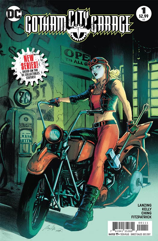
Another DC comic based on another medium like the Bombshell statues or Injustice video game. Gotham City Garage is based on the DC Direct statue line and is a pretty average affair. Kelly and Lanzing script is a pretty by the numbers affair here and while the story was pleasant to read it doesn’t really break any new ground here. The basic story is that these are sort of Elseworld type characters and they are familiar and yet different from their comic book roots. The problem with the story is that it stumbles over all of the dystopian clichés that you have read a million times before and Kelly and Lanzing don’t even try to bring anything new to the table here. The script is a by the numbers affair and mixes basic story tropes up in a blender and spits them out here. When your reading the book the whole time it feels like deja vu and it is because you read this story a million times before. The only thing this book has going for it is Ching’s artwork that is good but there are a number of times where it feels rough and unfinished. The backgrounds are a bit on the sparse side too that didn’t help it either. Overall the art does try to help the basic story along but Ching can only do so much here.
Is this book worth your time and money? The concept of the book is not terrible but the mediocre execution of the story really sinks this book. The story is boring and the art is decent but neither is very compelling and is not worth buying this book. SKIP IT!
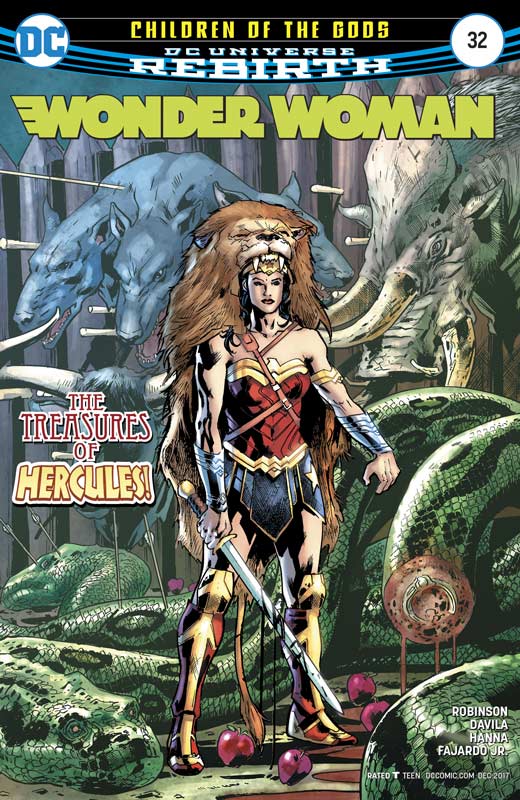
Wonder Woman #32
DC Comics Writer James Robinson, Penciller Sergio Davila, Inkers Scott Hanna & Mark Morales, Colorist Romulo Fajardo Jr., Letterer Saida Temofonte
This second chapter of Robinson’s run is moving along but I’m not quite sure that I’m totally feeling it. I think that the story is lacking a mythological feel that has been lost since Rucka’s run on the book. The problem that I’m having is that the story feel a bit too much like a standard superhero story and while that works a lot of the time but for Wonder Woman she has a lot more depth than most standard superheroes. The irony is that the story is about Hercules but it never quite feels epic or steeped in mythology. It feel very by the numbers and I will give it that there are some shining moments in the story like when Diana is reading his letter when she takes flight, but the overall connecting story is a little hit and miss. I will admit that I know nothing about her “brother” Jason so I’m in the dark with that part of the story so I will give Robinson a few more issues to see where it goes but it’s starting to be on thin ice. The big plus on the book is the very nice artwork by Davila, Hanna and Morales that does a great job on the visuals and helps move the story along. The art does give the book an epic feel that was missing from the previous team post Rucka. But the artwork can only go so far and there is still the wait and see where Robinson story is going.
Is this book worth your time and money? The jury is still out on this one and while the book is not terrible, Robinson hasn’t convinced me to be a long-term reader at this point. The story has it’s moments but is missing a big compelling hook to keep me going for more than a few more issues. I was a hug fan of Rucka’s run on the book and so were a lot of other readers. Robinson is a good writer so that is why I’m giving him some time to see where he is going with the book. But this second issue didn’t bowl me over so it’s getting iffy on the book.
Eternal Empire #5
Image Comics Writers Sarah Vaughn & Jonathan Luna, Artist/Colorist/Letterer Jonathan Luna
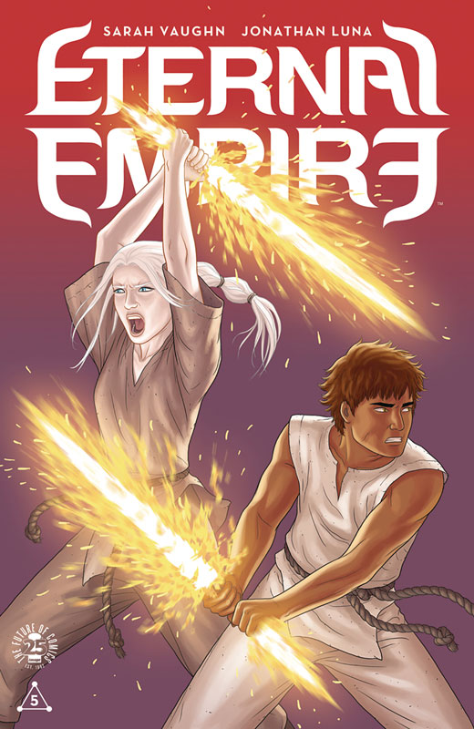
This issue is the end of the first story arc and there is a lot to take in by the end of the issue. I know some readers have struggled with this book because of the deliberate slow burn pacing of this story but there is a lot to like here if you take the time to let the story digest and simmer. I will admit that I haven’t fallen in love with this story as much as I did with Alex + Ada but they are two completely different tones and reveals. The scope of this story is so much bigger and without giving anything away the ending of this issue changes the course of the story going forward. The one thing that is clear is that this story is more of a story that will work better in one sitting compared to the monthly installments. Vaughn and Luna are crafting a story that is both large in scope but is very intimate at the same time. This is making a comic that has to take a slower pace to give the story room to breath. It’s also a story that has an innocence to it because the reader is on the same journey as the two learn about their powers and yet still have to deal with the oppression that they have lived under and that for them and the other slaves, leaving is not that simple. This issue takes that on and the results are quite surprising. As always Luna’s artwork perfectly captures his and Vaughn’s script and they blend their talents to a spot on presentation. Some of my favorite visual moments from Luna are the times where there is no spoken dialog but the story comes through with his artwork that delivers the script so well.
Is this book worth your time and money? If you have stuck with the book so far you can see in this issue things start to come together and the pieces of the puzzle are falling into place. You can really see why the story is paced the way it is with the ending of this first story arc. Vaughn and Luna are crafting a nice fantasy story here that has a lot to tell and there are more questions raised in this ending that change the direction of the story. I am enjoying this book so far and can’t wait to see where they take it after the break for a few months from this first story arc.


0 Comments