After last weeks massive flood of comics this week is a lot less crazy in terms of the number of reviews. There are a few new titles but a lot of returning ones to see if they are still worth picking up.
The Lost Boys #1
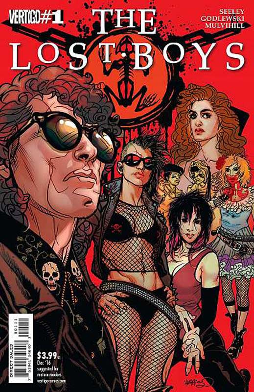
Vertigo Comics Writer Tim Seeley, Artist Scott Godlewski, Colorist Trish Mulvihill, Letterer Clem Robins
I am a huge fan of the film The Lost Boys and was blown away when it first came out and have seen it so many times at this point it’s burned into my brain. There had been awful direct to home video sequels and previous comic versions but none ever came close to capturing the magic that the original film had. So I came into this series with a lot of expectations and it both hits and misses the mark. I think that one of the problems with Seeley’s script is that this first issue spends so much time on the exposition of the story that he forgot to put some forward motion to it. The entire issue seems to tread water and while I get that you need to set things up for the overall story, the first issue needs to give you a reason to come back for the second issue. He also seems to spend too much time on reintroducing the cast and while I get that theory I really doubt that someone who has never seen the film will be picking up this comic by accident. 99.9% of the buyers of this book are fans of the film and know it by heart. The one saving grace of the book is Godlweski’s artwork that captures the essence and look of the actors but doesn’t make them look exactly like them. That is not a bad thing because it allows him a lot of leeway with the artwork and I think that it allowed him to not focus on just that. He gives the book the visual feel and energy of the film that I wish that the script never quite captures. Visually I really liked the book.
Is this book worth your time and money? This one is a really tough call because it’s not a terrible read but the script is just bogged down and plods along to get to the set up for the next issue. I just found the script to be a bit on the boring side. While I do think that there is hope for the book it’s sadly off to a very rocky start. On the plus side Godlewski’s art nearly saves the book from being a total loss and I am willing to give the book at least one more issue but it better make a 100 degree turnaround to keep it on the reading list. This book is on very thin ice!
Kill or be Killed #3
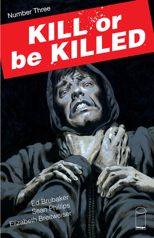
Image Comics Writer Ed Brubaker, Artists Sean Phillips, Colorist Elizabeth Breitweiser
One of the best comics just keeps getting better each issue. Brubaker is doing a great job of unfolding this story and this issue adds so much depth to it that make this book such a must read. This issue he digs deeper into Dylan’s aftermath of his killing in the last issue and makes it feel so real while you are reading it. Brubaker never plays things in black and white terms he presents the story from a very grey point of view and the way that he writes Dylan as such an everyman character that make the reader feel for his situation and even wonder if the whole thing is real or not. He also never overplay anything so that the story has a very natural flow that by the end of the issue you satisfied and yet desperately wanting more. By the end of this issue we are not totally sure the way things are going to go for Dylan and I doubt that it will be much easier as his choices comes along in the story. Phillips artwork is not only powerful but incredibly subtle that the story needs to work. This issue is about the drama and emotions of what has happened and he delivers it on every level with the art. This is where a truly great artist shines with the more intimate moments in a story and not the over the top elements that most comics suffer from.
Is this book worth your time and money? This issue was a real turning point for the book because there is a lot of drama and emotion and at the same time the story is unfolding at a slow burn that you need to keep the reader both interested and on their toes. Brubaker and Phillips deliver both and even exceed them. There was so much depth to this issue that I really had to let the book digest with me after I read it to take it all in. This book is simply a great read and a must read comic. HIGHEST RECOMMENDATION!
Doom Patrol #2

DC’s Young Animal Writer Gerard Way, Artist Nick Derington, Colorist Tamra Bonvillain, Letterer Todd Klein
The first issue got off to a bit of a rough start for me with Way’s script trying way to hard to emulate Morrison’s run of Doom Patrol and it came off as confusing and a little heavy-handed. Thankfully this second issue get the book back on track story wise. I don’t have a problem with outside the box story telling that some writers take but Way seemed to be trying way too hard in the first issue to make the script bold and weird that he lost sight of the structure of it. This second issue does have moments that are a little out there he does keep this issue narrative of the story much tighter. He also is mixing both original Doom Patrol Drake story elements along with the Morrison run that is making for some interesting ideas with the story. I am still blown away by Derington’s artwork on the book. He brings a great style to the book that is very impressive. He goes wild with the action scenes in the story and yet captures the very subtle dramatic moments with such ease that makes for a really wonderful reading pleasure.
Is this book worth your time and money? After reading this second issue I have a lot more confidence in this book. Way tried to throw too much into the first issue and lost the core of the story but thankfully he steers the ship back on course. I love the wild and weird elements of a story but you still have to ground it and this issue has a better foundation. Derington continues to make this book shine with his artwork and is a great reason to buy this book. I am looking forward to the next issue and am breathing a sigh of relief. RECOMMENDED!
Briggs Land #3
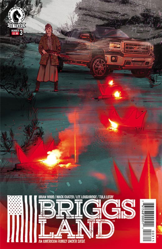
Dark Horse Comics Writer Brian Wood, Artist Mack Chater, Colorist Lee Loughridge, Letterer Nate Piekos
There has been a lot to like about this book so far but this third issue keeps the story moving along nicely and Wood adds some nice twist to the story that is not only pleasing but quite surprising. He is starting to unfold the back story elements to why Grace has made her decision to take over the Briggs compound and what she hope to accomplish. We also see her take charge but in a very well thought out way that keeps the reader guessing what direction the story could go. This first story arc is a nice set up to the series and there is a lot more dramatic elements that are yet to be discovered. Wood sets all of the players and elements in place with this arc and gives you a reason to come back for more. I love how he keeps the story focused on Grace just wanting to make things better for all of the residents of Briggs and it’s future. As good as the story is it’s Chater’s artwork that takes this book to another level. It’s always hard to deliver subtle dramatic emotion in artwork but he really brings Woods script to life with such great detail that makes the story flow so well.
Is this book worth your time and money? Wood and Chater are delivering a very impressive comic that not only is entertaining but is also thought-provoking. I can see why AMC is developing the book into a television show because of the well thought out story and it’s characters. That is not to say that it doesn’t work well as a comic book because is does and there are elements that they infuse into the story that works well in this art form. HIGHLY RECOMMENDED!
Supergirl #2
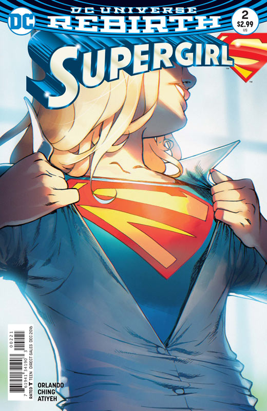
DC Comics Writer Steve Orlando, Artist Brian Ching, Colorist Mike Atiyeh, Letterer Steve Wnads
The first issue of this new Supergirl title got off do a decent start but sadly misses the mark here. Orlando seems to lose focus with the story and it really gets lost in itself. I think that there are some decent ideas here but the fact that the book lost its focus so soon is very troubling. It just seems to fall into the superhero gutter of just throwing things at the wall and seeing what will stick to it. It’s a real shame because with the Supergirl television show there are a lot of new readers looking to read a Supergirl comic and sadly this is just not cutting it. I know Orlando is a good writer because his recent Midnighter series was very good and the Midnighter and Apollo series is also a winner. I do really like Ching’s artwork on the book with his unique style on the book. It’s a very good-looking book that he tries to save it but good art can’t save a mediocre story.
Is this book worth your time and money? I really want to like this book and while the artwork is top-notch the story is simply just not there. Orlando doesn’t seem to have a solid plan for the book and with the book really stumbling in this second issue I have sadly lost faith in it. SKIP IT!
Reborn #1
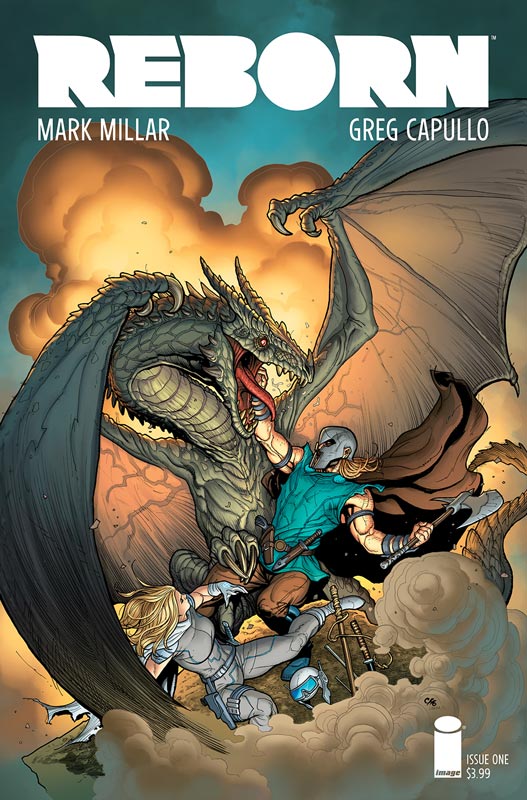
Image Comics Writer Mark Millar, Penciller Greg Capullo, Inker Jonathan Glapion, Colorist Fco Plascencia, Letterer Nate Piekos
Miller tends to be a mixed bag for me and lately his books have not blown me away. While Reborn didn’t blow me away, I didn’t hate it either. I will give Millar credit for coming up with an interesting concept for the afterlife. While a lot of afterlife stories have a more religious aspect to them, Millar goes the science fiction route and that made for a fun spin on the concept. While the first issues story is mostly exposition it did move along pretty nicely and the set up for the series has some promise to it. It’s more concept than execution so the second issue is going to make or break this book. The big plus for the book is Capullo’s artwork on the book that gives the story the visual scope that it needs to work and he really delivers that here. He also perfectly captures the delicate drama in the story that sets everything up. He really helps this first issue out immensely.
Is this book worth your time and money? There are some good ideas here but the first issue won’t blow you away but has promise. It’s too early to make that call yet but I felt that the book was a good read with very nice art but not that memorable in the end. This one could go either way and the second issue will make or break this book.
Wonder Woman #8
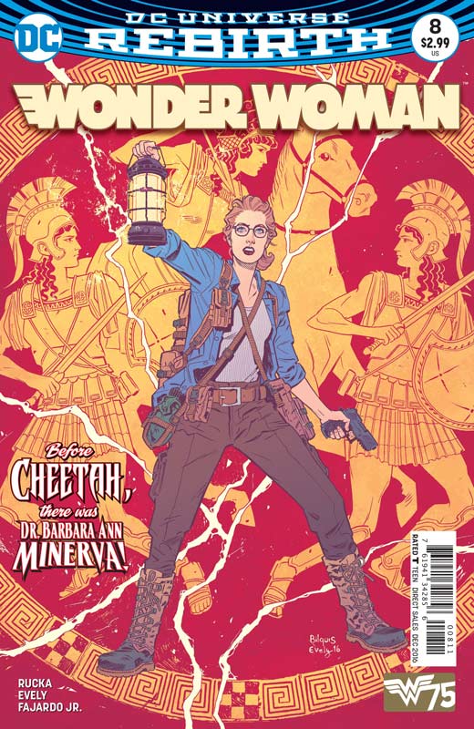
DC Comics Writer Greg Rucka, Artist Bilquis Evely, Colorist Romulo Fajardo Jr., Letterer Jodi Wynne
This may be a fill-in issue but what a great fill-in it is. This is a nice little story about Barbra Ann Minerva who becomes Cheetah give some great background to her past. Honestly this is such a good story that I would love to see a mini series based around her character before she became Cheetah. What makes any good hero or villain is their story and Rucka give this story the same amount of care and development that he is delivering with Wonder Woman. This is simply why this book continues to be a must read because of the time and care for every tiny detail that make you care about the characters in the story. What makes this story so interesting is that I don’t believe that her back story has been told in such as this. This story is not simply a fill-in it really adds to the flavor of the book and gives you more to care about when Cheetah story continues in the current storyline. Evely’s art is a real marvel here. She has to come into a book that sports amazing artwork by Liam Sharp and Nicola Scott and she simply knocked it out of the park. Rarely does a fill-in story have such great artwork but this is not the case here. She captures every little detail that Rucka’s script needs and gives the book the high standard that it has been delivering each issue. She really knocked my socks off and I was very impressed with her artwork.
Is this book worth your time and money? I was a little worried with this fill-in issue but Rucka and Evely have delivered not just a fill-in story but a damn fine story that adds to the mythology of this book. I loved this story and was just as good as the regular stories. I would love to see Evely do more artwork on this book because she is a talent that is one to watch. HIGHLY RECOMMENDED!


0 Comments