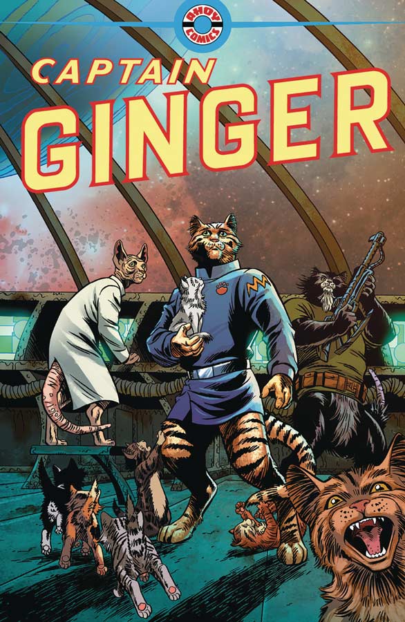
Captain Ginger #1
Ahoy Comics Writer Stewart Moore, Penciller June Brigman, Inker Roy Richardson, Colorist Veronica Gandini, Letterer Richard Starkings, Back-Up Story Writer Grant Morrison, Artist Phil Hester, Writer & Artist Shannon Wheeler
So far the new Ahoy Comics line has been a mixed bag and I had hoped that Captain Ginger would be a win but it ends up missing the mark a bit. Moore’s script is not bad but the problem is that its pretty pedestrian and doesn’t really stand out much. It follows a fairly basic story trope of science fiction and leadership but instead of humans they are a crew of cats instead. While there is humor that comes from the switch it never really goes beyond the novelty aspect of the story and doesn’t bring much new to the genre. The story doesn’t really shed much light on the why and what happened to the humans and why cats have become the dominant species and while I understand Moore not wanting to give away too much this early there is not much of anything to explain what is going on here. The only bright spot for this book is Brigman’s artwork that is really great looking and she does some great facial expressions with the cat crew and delivers the visual jokes perfectly. Unfortunately there is little that she is able to do here with the mediocre story that she is given.
Is this book worth your time and money? Captain Ginger is not a terrible comic but its biggest flaw is that it’s not very compelling. The story is basic with little to care about and there is not a huge reason that Moore does here to make you want to come back to the second issue. The only bright spot here is Brigman’s artwork that is really nice but not enough to save this book. There are some decent ideas here but it never really comes together in the end. SKIP IT!
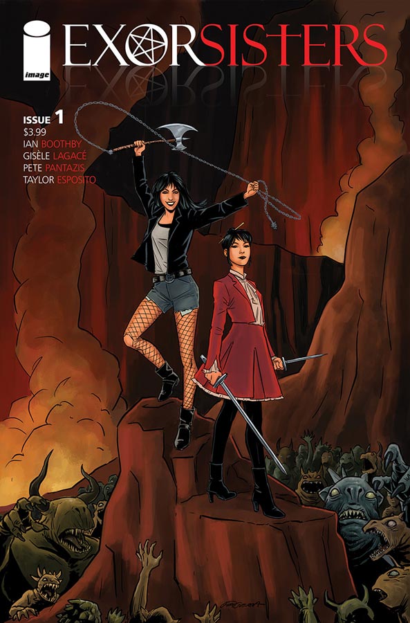
Exorsisters #1
Image Comics Ian Boothby, Artist Gisele Lagace, Colorist Pete Pantazis, Letterer Tony Esposito
I almost didn’t pick this book up this week because flipping though it didn’t really pop out but it was a small week so I gave it a chance and was pleasantly surprised. Now this comic didn’t blow me away but it did make for an enjoyable read this week. It’s kind of a mix of Scooby-Doo meets Archie but does bring some twists to the genre. Boothby who has written for The Simpson’s comics for years brings a sly humor and fun to this book that gave it a nice charm to read. He also doesn’t over play the story in the sense that it’s doesn’t try to be more than it is. He also keeps the story simple and to the point that helps it move along nicely while your reading it. The only minor complaint that I had was that was that it’s not very clear what the names of the sisters and we only find out one of their names in passing and at the end. While that might have been intentional, it did however keep me from connecting beyond the surface and that was for me a bit of a flaw in the story. Lagace’s artwork on the surface is not super flashy but for this book her cartoony style lends itself nicely to Boothby’s script. She does a very nice job of capturing the visual humor that the story needs and makes the book look fun and sharp.
Is this book worth you time and money? I found this book to be a fun distraction and it won me over with it’s charm and wit and that is why it works. It keeps it simple and to the point and gives you enough reason to come back for a second issue. It may not blow you away but its worth checking out.
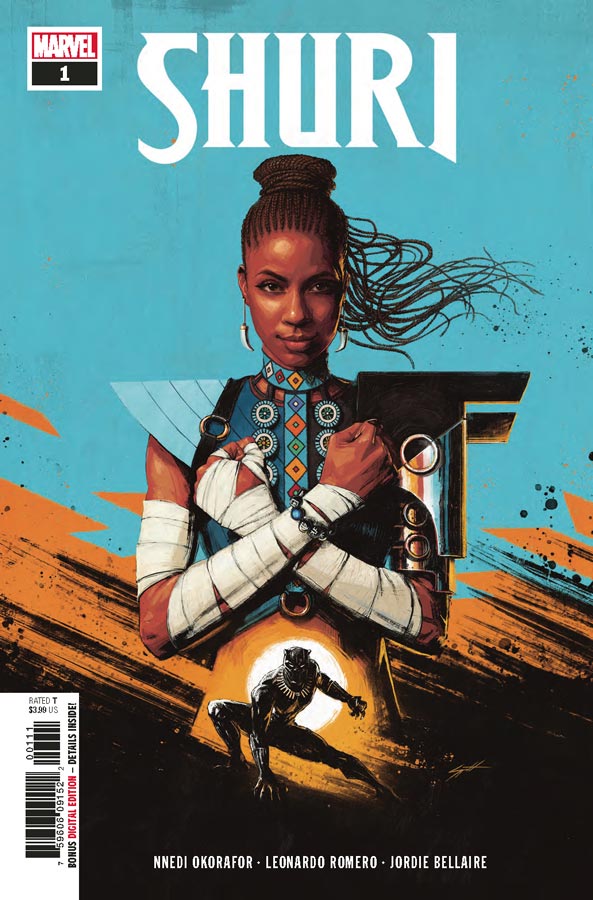
Shuri #1
Marvel Comics Writer Nnedi Okorafor, Artist Leonardo Romero, Colorist Jordie Bellaire, Letterer Joe Sabino
With the huge success of the Black Panther film and the huge surprise of his sister Shuri (played brilliantly by actress Letitia Wright) it was a wise decision at Marvel to give her series of her own. Novelist Okorafor breaks the curse of other novelist that tend to stumble when they try to write comics because they tend to structure them like novels with chapters that you just keep reading instead of a chapter that occurs monthly. She also understands how to let the artist fill in the words visually with their artwork. While there were a few times that the dialog was a little thick, it never overwhelmed the story or the pacing that tend to happen a lot in first issues with exposition. In fact she handles the exposition quite well in this first outing and made for a nice read. She captures the spirit of the character nicely here and keeps her spunky charm first and foremost. I’m a fan of Romero’s artwork on the recent Captain America run with Mark Waid and he brings a lot of that same wonderful energy to this book. While his line work on the surface may look simple but he give the book a bold style that really helps carry the emotions of Okorafor script. When you add Bellaire’s gorgeous color work to the mix you have a great looking book here.
Is this book worth your time and money? This book was a real surprise for me because of the mediocre quality of comics from Marvel lately but this one works nicely because Okorafor and Romero simply deliver a solid first outing for a minor character and keeps it simple and to the point and that’s why it works. I liked this first issue and am intrigued to see where they take it from here.
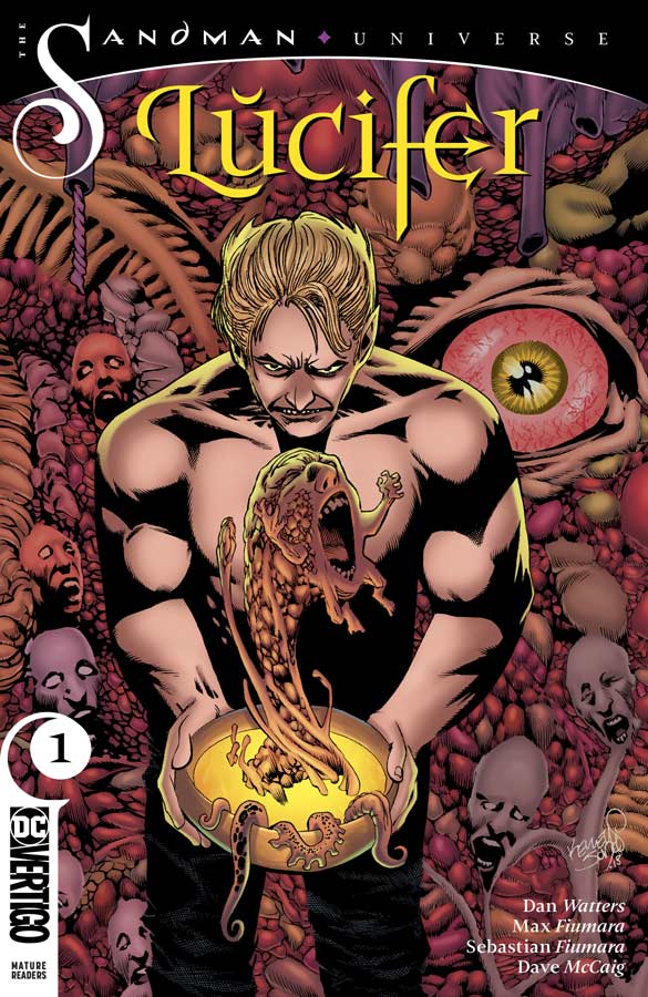
Lucifer #1
Vertigo Comics Writer Dan Watters, Artists Max Fiumara & Sebastian Fiumara, Colorist Dave McCaig, Letterer Steve Wands
I had really high hopes for the relaunch of the Sandman Universe from Vertigo Comics but so far it’s been a huge disappointment with Lucifer being a missed opportunity. The biggest flaw is that Watters must assume that readers have an idea of who Lucifer is from the previous series because if you haven’t read them your going to be totally lost here and even for seasoned readers this first issue was a bit of a slog to get through. The biggest problem with this first issue is that the structure of the story is all over the place with the story going back and forth and not really explaining much of anything in either one of them. I think Watters flaw was over thinking this first issue and instead of inviting both new and old readers to the characters he instead will leave most readers clueless as to what is going on and in the end most will not bother with a return visit. The shame is that Watters does introduce some good ideas here but the story is so all over the place and with little back story for new readers to grasp what and who the cast is, it’s a truly missed opportunity here. The only thing that saved this from being a total disaster was Max and Sebastian’s artwork on the book that visually is perfect for the book but with the missed opportunity of the script makes it all that much more disappointing that their artwork will probably fall on deaf ears.
Is this book worth your time and money? Easily the weakest entry in the Sandman Universe so far and that is a shame because Lucifer is a great character but you would be hard pressed to tell that from reading this. The real shame is that I absolutely love Max and Sebastian’s artwork on the book but with the mess of the script, its hard to go with just that. Even for the seasoned readers of Lucifer there is not much here to recommend. SKIP IT!
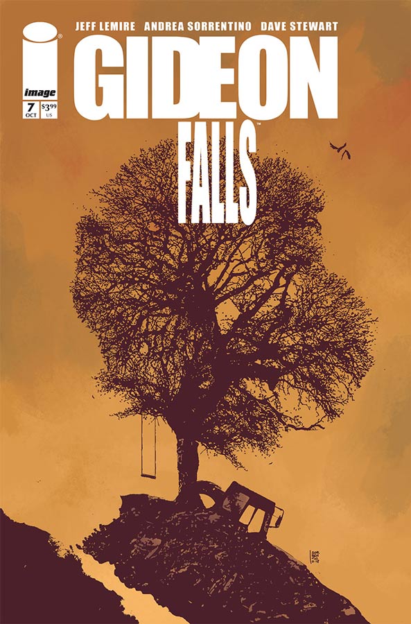
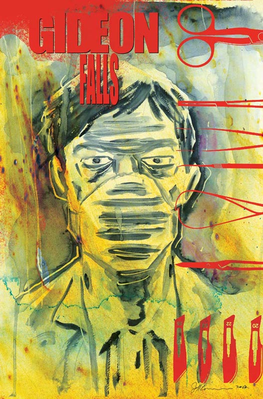
Gideon Falls #7
Image Comics Writer Jeff Lemire, Artist Andrea Sorrentino, Colorist Dave Stewart, Letterer Steve Wands
One of the best comics of the year is back and Lemire and Sorrentino build greatly from the shocking cliffhanger of issue #6. There is still a lot to take in from the first story arc but Lemire does keep the momentum going greatly here and continues to build both the scope and the unnerving feelings that this book excels at. One of the best assets the story has is how there is so much crammed into each issue because while it may seem like a quick read, you really have to take your time to let both the story and artwork wash over you. There are so many subtle elements of both that I love to go back and re-read each issue to look for little clues that can easily be missed if you’re not careful when you read this book. The way that Lemire balances both the Norton and Father Fred storylines and how they are separate but tied very close together is one of the great things about this story and its the blending of them that keeps you on the edge of your seat each issue. The cliffhanger in this issue was one of the best ones yet. How many time can you say how great Sorrentino’s artwork on this book is. This issue has one of my favorite moments so far with the flashback of Danny and Clara as children and how he used a different style of art to differentiate it from the main story and that is what makes him the perfect artist for this book. He also gives this book such a great mood with every panel that just oozes with emotions that makes this book a real winner.
Is this book worth your time and money? This book simply gets better each issue and this one is one of the best so far and that is saying a lot because the first six issues were amazing. Lemire and Sorrentino are delivering a truly must read comic book and this issue is a great kick off to the second arc of the story. HIGHLY RECOMMENDED!
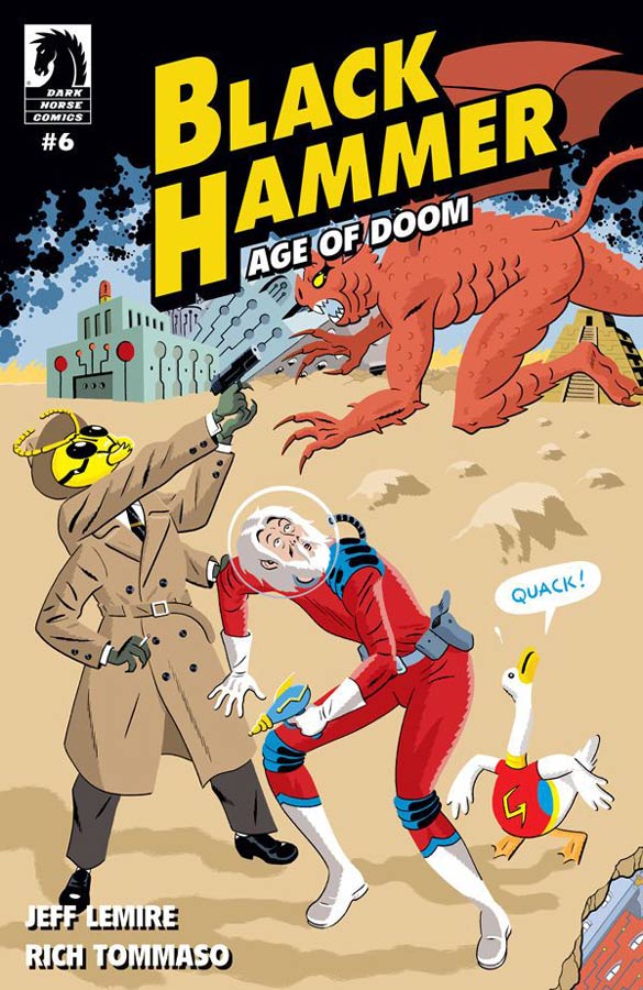
Black Hammer: Age Of Doom #6
Dark Horse Comics Writer Jeff Lemire, Artist/Colorist/Letterer Rich Tommaso
As a fan of both Black Hammer and Tommaso’s artwork it was very exciting to hear that he was going to be drawing two issues of my favorite comic and neither are a disappointment. While this ongoing story arc in the book is not necessarily designed for Tommaso but it does fit his style of artwork and gives the story a great look and feel for this particular story. The story does have a nice throwback feel for the golden age of comics and that is why it works so well for Tommaso’s artwork. Lemire script is both a side story and continues the main story at the same time. That has been a strong footing for this book and it’s spin offs because it allows the book to ebb and flow as needed and still continues to move the story forward. It also allows Randall to get more story time and continues to run a fine line between reality and fiction and your never quite sure if its real or his imagination. Lemire defiantly tailors the script to Tommaso’s art style and that is the real win for this issue.
Is this book worth your time and money? While I miss regular artist Dean Ormston, I’m glad that Tommaso is drawing this book because he’s a wonderful artist and fits greatly with the book. This is another winner for Lemire who continues to impress and intrigue with each new issue of the Black Hammer saga and is always a must read each month. HIGHLY RECOMMENDED!



0 Comments