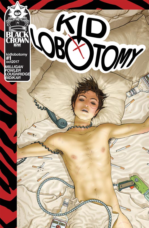
Kid Lobotomy #1
Black Crown/IDW Writer Peter Milligan, Artist Tess Fowler, Colorist Lee Loughridge, Letterer Aditya Bidikar
The first comic from Shelly Bond’s new Black Crown imprint at IDW gets the new line off to a solid start. Milligan has always had a knack for getting a new series started and he has done a great job here of setting things up. While this first issue is pretty much exposition, he does a nice job of moving things along while setting up and introducing the cast. There is a lot to take in with the story and while it definitely veers towards the weird Twilight Zone area it lays some interesting ground work for the series. Sure the first issue is a little dry but he makes sure that you get to know the characters that a lot of writer gloss over in a first issue. The key is that you give the reader a good reason to come back for a second issue and Milligan has delivered on that with this book. While you may not be sure of where all of the pieces are going to fall into place that is actually a good thing in this books case. The way that he blends and bends reality is a real plus for the book and keeps the readers on their toes. I was not familiar with Fowler’s art prior to this book but she is perfectly matched with Milligan’s script and brings this world to life very nicely. One of the things that I like about her artwork is her ability to capture the small little nuances in the characters facial expressions. With the story being about the grey area she really delivers the goods here. She is a talent to watch for sure.
Is this book worth your time and money? There was a lot riding on this book for me after the Black Crown panel at SDCC and have to say that Milligan, Fowler and Bond have delivered on their promise to bring a new voice to comics. Mixing the old and new talent is a brilliant idea and Milligan and Fowler work perfectly well together here. The book show a lot of promise and it will be interesting to see where they take this concept. The didn’t necessary blow me away but I did like the set up and that makes it an easy RECOMMENDATION!
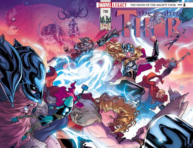
Thor #700
Marvel Comics Writer Jason Aaron, Artists Walter Simonson & Matthew Wilson, Russell Dauterman & Wilson, Daniel Acuna, James Harren & Dave Stewart, Becky Cloonan & Stewart, Das Pastoras, Chris Burnham & Ivy Svorcina, Andrew MacLean & Stewart, Jill Thompson, Mike Del Mundo, and Olivier Coipel & Stewart, Letterer Joe Sabino,
I’m a sucker for comics that celebrate the history of the character or series so while I was not a huge fan of Aaron’s recent Thor run I was willing to give the book another chance to see if things had improved. Well sadly they haven’t and if you’re not a current Thor reader or familiar with his past this book is going to make no sense to you. One thing when you have a big anniversary issue with a lot of guest artists you usually take the route of telling a basic story with chapters that will highlight each artist. Well Aaron kind of did that but there is no overall story to connect any of the short stories and it reads like a jumbled mess. This has been the problem with Marvel lately and this new Legacy isn’t solving the problem. I had hopes that this would be a good jumping on point for readers because I do love the Marvel characters but lately the talent pool has been pretty bad and they just seem to be doubling down on the same bad hand. Now before everyone jumps all over me, I have no problem with a female Thor or pretty much anyone being him including a frog, but you need to have a story and characters that you actually care about and Aaron seems to be missing the mark here. It’s one thing to have multiple stories in an Anniversary issue like this but with nothing connecting them it just jumps from one story to another and is confusing and gets to be a real slog after a while. The only saving grace to the book is the great artwork by all of the artist involved. I will say that I was excited to see Simonson doing Thor again but this is a real bait and switch because he only does one page and it’s pretty much a pin-up that is gorgeous but a real missed opportunity for fans of his run. This is a great book to look at but pretty much unreadable.
Is this book worth your time and money? As with most of the Marvel Legacy books so far another disappointing comic and it seems that Marvel has really lost its way. I really hoped that this issue would be a great gateway for both new and lapsed readers to jump back on Thor but sadly this is not the case. Confusing, disjointed and with no reason to come back for more this is a real letdown. Arron really dropped the ball here and while the artists all deserve a round of applause, they can’t really save this train wreck. SKIP IT!
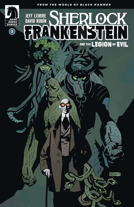
Sherlock Frankenstein and the Legion of Evil #1
Dark Horse Comics Writer Jeff Lemire, Artist/Colorist/Letterer David Rubin, Flats Kike J. Diaz
Spinning from the pages of the Black Hammer series, this mini series tell the side story of Lucy Weber trying to find out what happened to her dad The Black Hammer aka Joe Weber. If you have been reading the regular Black Hammer comic (and shame on you if you’re not) this story leads from the events in the past few issues with the Lucy storyline. If you’re a new reader to the Black Hammer Universe there is still good news for you. Lemire has set things up in this story that while you may not know all of the smaller details to this side story, you will not be lost and surprisingly stands on its own quite well. Lemire gives this story a bit of a different tone that’s the regular series and but still fits into the universe perfectly. The story plays more like a murder mystery and adventure that gives the story a very charming and warmth that you simply fall in love with from beginning to the end and has great twist and turns along the way. Lemire gives the story a great sense of wonder and awe that gives the book a grand scope and yet it’s incredibly interment. I can’t imagine a better artist on the book than Rubin who did an amazing job on the recent Either series and has filled in on the regular Black Hammer series also. The level of detail that he infuses into the book gives the story great weight that really brings this world to life. One of the most impressive art in the book is when Lucy enters the prison and the way that he lays out the art is simply mind-blowing and makes you notice all of the subtle details that is in Lemire’s script and while that scene is the wow factor of the issue, it’s the heartbreaking scene with Lucy and Eugene Remblay that will nearly have you in tears. It’s a very emotional scene that hits the core of the story and Rubin captures it so beautifully with care that few artists could have captured as well as he did.
Is this book worth your time and money? I’m a huge fan of the Black Hammer series and as great as that book is, this side story is a real delight and by telling this story on the side was a brilliant move or Lemire’s side because it’s allowing this story to breath and unfold on it’s own and gives the world of Black Hammer so much more depth as a whole that makes me love this and the main book so much more. With Rubin’s perfect artwork to bring this story to life is one of those rare comics that will have you going back to re-read the book again and again. HIGHEST RECOMMENDATION!
Spy Seal #3
Image Comics Writer/Artist/Colorist/Letterer Rich Tommaso
This is one of those comics that just keeps getting better and more fun with each issue. Tommaso continues to give a new and fun spin of the spy genre and this issue is packed to the brim with action and adventure that will leave you exhausted by the end of the issue because there is so much packed into every panel of the book. One of the best things going for the story is that Tommaso keeps things simple and straight forward but does a great job of keeping the mystery of the story to unfold at a very satisfying pace. With only one more issue to go with this first story arc the book is really keeping me on the edge of my seat to see where is all lands by the end of this first story. Tommaso has captured the European flavor of the story in both the script and his artwork that is a real treat for comic fans in the US. His simple and yet super detailed artwork is where this book really shines. His perfect blend of line work and color palate that he uses makes this book a real visual treat and gives the comic a real charm.
Is this book worth your time and money? What I love about Spy Seal is that it doesn’t try to be more than it is. Tommaso tells a straight forward story that is a real pleasure to read and has a unique and grand visual style that stands out in the me too current comic world. This book has been a great ride so far and if you’re not reading this comic then your really missing out on something special. RECOMMENDED!
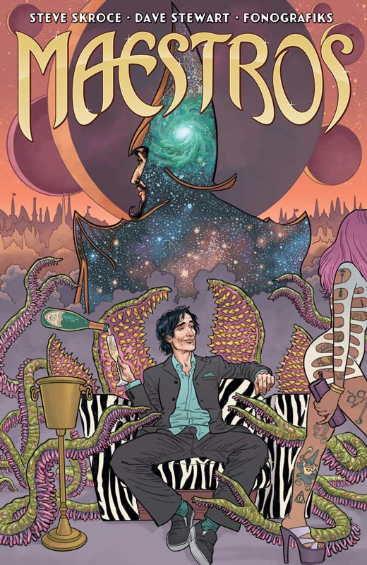
Maestros #1
Image Comics Writer and Artist Steve Skroce, Colorist Dave Stewart. Letterer Fonografiks
Maestros is not for the faint of heart but that is what makes it so great. Skroce doesn’t pull any punches with both the story and the visuals on this book. On the surface the basic story here has been told a thousand times but Skroce has found a great spin on the story and given it a fresh way to deliver it here. He finds a great balance of story elements here and makes for a really great ride with the story. One element that was a real surprise is the humor in the script that both enhances and temper the action and drama and gives all of those elements into a wonderful read. Your really riveted while reading this book that is a heck of a lot of fun. It reminds me a lot like Preacher where there are so many things thrown into the story that it works because they all fit so perfectly well together. Not only is Skroce a great writer but his artwork is gorgeous and the level of detail that he fits into every square inch of the book is a great visual feast. Few artists can make the visual impact of a story like Skroce does here and he even makes the violence look beautiful. This is one of those rare comics that will knock your socks off with both its story and artwork that are perfectly in sync.
Is this book worth your time and money? Simply put this book is awesome and impressive. At first it’s the visuals that suck you in but it’s the story that will win you over. There are few first issues that impress me but Skroce not only impressed but exceeded with every element of this book and the wait for the next issue is going to be super tough because the book is that good. HIGHEST RECOMMENDATION!
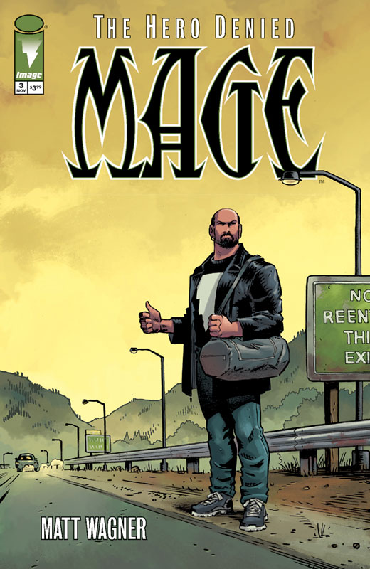
Mage: The Hero Denied #3
Image Comics Writer and Artist Matt Wagner, Colorist Brennan Wagner, Letterer Dave Lanphear
What Wagner has always done well with the Mage books is the long game that he tells with the story and it’s all of the little details that will add up to the whole of the story and this final chapter is no exception. One thing that has been a strong element to the Mage mythology is its sense of family that has been the heart and soul of Mage and this story solidifies this with Kevin being the father and husband. You also have the villain with her family at the opposite end of the spectrum and yet they both have a strong sense of family but wrapped in a good versus evil motif that maybe a simple story trope but none the less effective here. Kevin has always dreaded the day that the attack from the fairy realms would catch up with him but he will do anything to protect his family and that is where the story really shines is with it’s heart. IT the little things in the story that is a big reason that I love this book so much. Wagner’s artwork has grown so much from the first series and this final story arc is a visual culmination of all that has come before. Where it really shines is the subtle dramatic moments in the story where he artwork need to convey those little moments with a soft touch and this is where Wagner’s artwork works so well.
Is this book worth your time and money? I am really loving this final story and the way that it’s unfolding. Wagner is not rushing the story and that is one of the reasons that it’s working so well and just when you think that you know what going to happen Wagner throws in a curve ball to catch you off guard in a very good way. RECOMMEND!
The Incredible Hulk #709
Marvel Comics Writer Greg Pak, Penciller Greg Land, Inker Jay Leisten, Colorist Frank D’Armata, Letterer Cory Petit
After the train wreck of Thor this week I wasn’t expecting much out of the Hulk this week but going back to the Planet Hulk story turned out to be a very good idea. For me Hulk stories are gauged by the brilliant Peter David run on the book that lasted for 12 years. Pak’s writing on the Hulk has never blown me away but I will give him credit for the Planet Hulk story that was surprisingly good. So while this first issue of the return to that story is decent but it does make you wonder if it was wise going back to the well on this one. As with any sequel to a good storyline has the downside of diminishing returns and while it’s too early to tell with this first issue, there seems to possibly head in that direction. Pak’s script sets things up here fairly well but it does fall into the by the numbers game in the sense that there is not much fresh and new with the story. There is nothing that you don’t expect from it and simply no surprises with it. It’s not bad but is a little on the formula and bland side. On the plus side it’s a pretty good jumping on point for new readers although Pak didn’t do much to fill them in with the original storyline and I assume that he figured that you had either read the story or saw the animated feature based on the story. I was really hoping that with the Legacy re-branding that this would be a new direction with the book but as we have sadly seen there is still the been there and done that with going back to what worked well the first time so it should work well again. On the plus side for the book Land and Leisten’s artwork gives the book a great visual punch that does it’s best to make this book pop even with the so-so story. It’s a great looking book that does help it along while your reading it and tends to make you forget that you have pretty much read this story before and that is pretty impressive and show how good Land is as an artist.
Is this book worth your time and money? At the very least this was readable and looked really good but re-treading an old story is not any sort of fresh start to a re-branding effort. While it’s a good read Pak doesn’t really bring much new to the story that has been told before and it did feel a bit like rearranging the deck chairs on the Titanic. The one saving grace was Land’s always great artwork that as good as it is, seems to be wasted on a sequel story that I can’t imagine that most people were clamoring for. Not bad nor good just kind of middling in the end.




0 Comments