Lots to get to this week with some surprises with new comic book series and a few returning. Lots to get to so read on my friends!
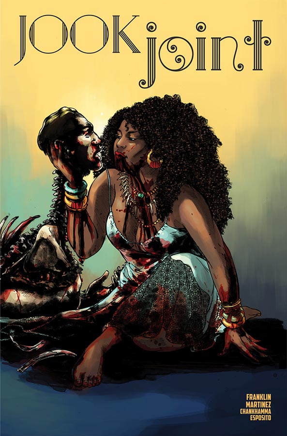
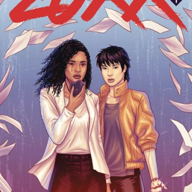
Jook Joint #1
Image Comics Writer Tee Franklin, Artist Alitha E. Martinez, Colorist Shari Chankhamma, Letterer Taylor Esposito
Jook Joint is from the writer of the amazing Bingo Love and was excited to see what she would do with an ongoing comic and there is a lot to digest here with this book. There are many themes that she takes here but the biggest one is domestic violence and sexual assault that is going to be tough for some readers to digest and I applaud at the first page of the book has a warning about the subject matter. She does however incorporate a supernatural horror angle to the story that tempers it quite well but still there are many shocking scenes and story elements that could make you uncomfortable but that is an intentional part of the story that is part of the overall story. There is a lot we have yet to learn about the Book Joint and its owner Mahalia but she does a nice job of setting both her and the elements of the story up well in this first issue. There are more questions than answers by the end of this first issue you will understand how the story is going and it sets things up very well. I liked Martinez’s artwork but there were a few time throughout where there were some inconsistencies with the perspectives and detail that were a bit disappointing but not totally fatal. Hopefully she will be able to grow and get better as the series goes along. Overall she handles the script fairly well and is able to capture the emotions of the story.
Is this book worth your time and money? This book is not going to be for everyone and the subject matter is very tricky but Franklin handles it very well in both tone and taste and is able to make this story a more cathartic reading experience for some but touch raw nerves for others. I enjoyed this first issue and will see how the second issue moves the story along. It’s a bold comic and that was very nice to see.
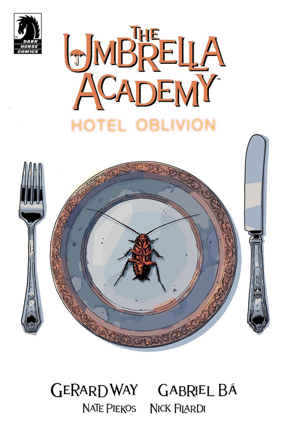
The Umbrella Academy: Hotel Oblivion #1
Dark Horse Comics Writer Gerard Way, Artist Gabriel Ba, Colorist Nick Filardi, Letterer Nate Piekos
After nearly a five-year hiatus The Umbrella Academy is back but even long time readers might want to go back and get refreshed before diving into this new story. I even was a bit lost reading this first issue and while Way does try to give a bit of back story to the charters this is certainly not a great jumping on point for new readers. With that out-of-the-way taking this first issue on face value it was nice but certainly not overwhelming. It does what a first issue should do and that is where it stumbles a little because there is nothing that you really don’t see coming. It’s also a bit disjointed that has sometimes plagued Way as a writer where he tries to go out too far sometimes in a script and tends to wander off the path with the journey. The one thing that is strongly consistent is Ba’s wonderful artwork that graces the book and he delivers some really outstanding work here. He perfectly captures that wildness of the story and really infuses life into the cast. It was a great visual treat at the very least.
Is this book worth your time and money? This is a really hard book to recommend because its part of a continuing story from the previous books and while this is a new storyline the fact that it’s been so long from the last outing both old and new readers are probably going to be pretty confused. While it was great to see the book back and obviously getting readers ready for the television adaption next year on Netflix but sadly this is not the best place to start for new readers. I did like the story and the artwork by Ba is gorgeous but this book is really more for the seasoned readers of the series and for new readers are better off picking up the first collection than this.
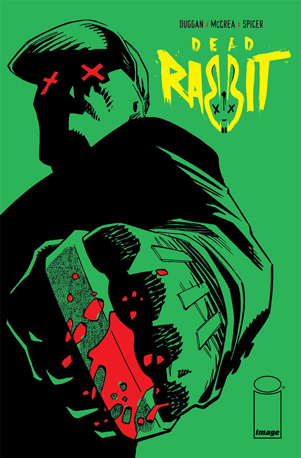
Dead Rabbit #1
Image Comics Writer Gerry Duggan, Artist John McCrea, Colorist Mike Spicer, Letterer Joe Sabino
In some ways this is a story that you have read many times before but I will give Duggan that he puts a nice spin on it and makes it pretty exciting. What I think works well here is the way that he sets up Martin and his dual life and how the past and present collide together. The other smart thing that Duggan does here is throw in some nice social commentary that adds a nice flavor to the story and gives it an ironic charm that I didn’t expect. While overall the story wont blow you away it does however aim for the middle and hits that target quite well-meaning that it doesn’t try to be more than it is and on that level it was enjoyable. McCrea is a perfect artist for this book and where he really shines is the smaller dramatic moments in the story that make the action scenes work all that much better. He captures the tone and look that Duggan script has and captures the pace perfectly. McCrea’s artwork is the big win for this book.
Is this book worth your time and money? While I found the book enjoyable, it didn’t really blow me away but there was something about the story that captured my fancy while reading it and made for a fun read. It doesn’t really break any new ground and there are many overtones of other vigilante comic characters that feel very familiar. McCrea’s artwork is where this book really comes to life and is the reason that I will give the second issue a try. I liked it but just didn’t love it enough for a strong recommendation but if you want a vigilante comic book you could do a lot worse than this.
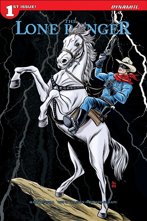
The Lone Ranger #1
Dynamite Entertainment Writer Mark Russell, Artist & Colorist Bob Q, Letterer Hassan Otsmane-Elhaou
Honestly I have been burned by so many mediocre Lone Ranger comics from Dynamite that had this book not been written by Russel it would have been a hard pass for me on this one for sure. I’m glad that I didn’t pass this one because Russell has once again weaved his writing magic and made for a very entertaining read with this first outing. What he does first and foremost is not try to reinvent the wheel here and simple takes all of the classic tropes that made the Lone Ranger such a great character and simply hits the ground running with this story. He does include a very brief flashback to explain his origin for the younger crowd that probably wont be buying this comic anyways but for the two or three that stumble in it will help get them up to speed. What Russel has done here is spin a classic western yarn that hits all of the classic beats of good vs evil and the rich land owners are the bad guys (both here and mostly in real life). What was a nice touch was the split between the Lone Ranger and Tonto and how it will fit into the story from here. Sure the story didn’t blow me away but it wasn’t trying to either and that’s why it works so well because it simply tells a solid story that is entertaining. The biggest surprise of this book is Bob Q’s artwork that was a HUGE improvement over his recent Dynamite work. I have to imagine that it was the story that compelled him to deliver the goods here. One of my complaints with his work is that he tends to be inconsistent and he uses color far too often as background instead of artwork but here he find a nice balance and really turns in a surprisingly good look that enhances Russell’s script nicely.
Is this book worth your time and money? If you’re a fan of The Lone Ranger then this book is for you but if you’re not familiar with the characters then this is a good start because the one thing that Russell brings to this book is the charm and fun that has made the character endure for so many years. He hits all of the right bests with this story and Bob Q delivers his best artwork to date. I really enjoyed this and while its very nostalgia filled fun, I think that everyone would enjoy it too. RECOMMENDED!
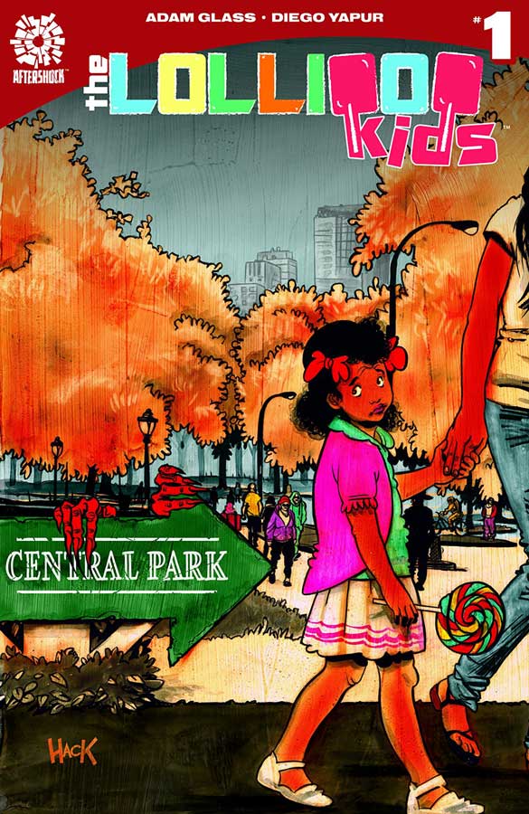
The Lollipop Kids #1
Aftershock Comics Story Adam Glass & Aidan Glass, Writer Adam Glass, Artist Deigo Yapur, Colorist DC Alonso, Letterer Sal Cipriano
Generally when a writer is inspired by one of their children to inspire an idea for a comic the results are usually what you would expect them to be and this is sadly the case for the Lollipop Kids. Now this is not to say that the book is terrible because I have read a lot worse from better writers but the biggest problem with the book is the all to basic structures of the story and there is nothing that you wont see coming from a mile away. It’s like writing a comic on the only ones that you have read as a kid and expect to write something original and yet the ability to come up with something original is simply not within your gasp and that is what reading this book was like. Even with the basic tropes of the premise Adam should have at the very least tried to give the structure of the story something different but that is where he failed this story because he is too close to the origins of this book. The only saving grace of this book was Yapur’s artwork that does its best to as the very least try to visually give the book a lift but there is only so much you are able to do with a story that is simply too basic to inspire you. He really does his best and the book is quite nice looking but sadly wasted on this basic story.
Is this book worth your time and money? I will say for a younger reader this book might really be perfect for them because of the age of the main characters would be relatable and the basic story structure would make it an easy read for them. For anyone over the age of 12 or have read more than 10 to 20 comics in their life this book is simply too basic with far better comics to choose from. SKIP IT!
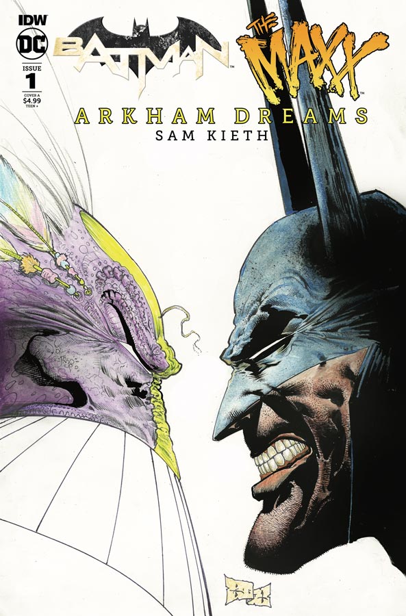
Batman/The Maxx: Arkham Dreams #1
IDW/DC Comics Writer and Artist Sam Keith, Colorist Ronda Pattison, Letterer Shawn Lee
If you have never read The Maxx or read a pure Sam Keith book and are buying this because of Batman then you’re in the wrong place because Keith always delivers one hell of a wild ride with his comics and this one is no exception. While this book is way more mainstream than the original Maxx series was, it still pretty far out there compared to most mainstream Batman crossovers and that is what makes this book so good is that Keith is wiling to take risks with both the story and the artwork on the book. Visually is where this book shines because Keith is an artist that is also a good writer so knowing what the story is going to be allows him to go in directions that if he was just the artist on the book. This allows the scope of the story to be visually driven with free rein to let the artwork lead the story and the story to fill out the overall tone and dialogue of the story. What I have always loved about Keith’s storytelling is that he is not afraid to go deep into the psychology of the story and that is where this story work very well in. Visually the book is a wonderful treat and I have always admired his ability to go back and forth between cartoony style and more traditional one that allows him to go in many directions at once and yet have it all flow visually together perfectly.
Is this book worth your time and money? If you’re looking for a traditional Batman crossover here then your going to be sorely disappointed but if you’re looking for a very outside the box one then you have definitely come to the right place. I’m a fan of Keith’s work and sure that is the reason I bought this book but I think if your willing to expand your comfort zone then give this book a try. VERY RECOMMENDED!
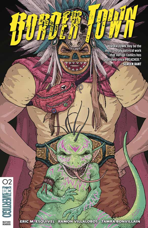
Border Town #2
Vertigo Comics Writer Eric M. Esquivel, Artist Ramon Villalobos, Colorist Tamra Bonvillain, Deron Bennett
The first issue of Border Town really blew me away but I have to give Esquivel and Villalobos that the first issue was no fluke. Not only do they build incredibly well here in this second issue, it’s in some ways better than the first and that is really saying a lot. What Esquivel has done in this second issue is build out greatly from the introduction of the characters and finds a great balance of exposition while still moving the story forward. The one thing that I’m glad he did here in this second issue was tell us a bit more about Quinteh and why he wears the Lucha Libre mask but still leaves a good amount of mystery that should payoff down the line. He also gives more back story about the Nightmare Realm of Mictlan and its inhabitants and mythology that is quite intriguing and exciting. Esquivel continues to dive deeper into social commentary and smart and sharp satirical elements that deliver a truly wonderful reading experience that will have you on the edge of your seat wanting more by the end of this issue. The blending of cultures, history and friendship is where the heart of this book lies with its strong and diverse characters that never feels forced but has a very natural flow. He also captures teen angst quite well here and is relatable to any age and that is the mark of a strong writer. It’s one thing to have a great story like this but you must have an artist that can bring it all to life and Villalobos continues to blow me away with his artwork on this comic. The level of detail that he puts into every line is amazing and that he is able to capture the most subtle emotions without making them feel obvious is impressive. Bonvillain continues to impress with her color work on this comic that shows how color can complement the line work and yet never overpowers it. Her use of color is what comics can and should be colored and other colorist should learn from her how color works in comics. With the southwest setting of the story allows her to use the color to paint the feel of the town and capture the subtle lighting of the area. She is another reason this comic is working so perfectly because the whole comic is a well oiled machine and each contributor hit their respective marks spot on.
Is this book worth your time and money? I can’t praise this book enough and its rare that an entire creative team is perfectly in sync. From start to finish this comic is an absolute pleasure to read and has you craving more at the end of the issue. This book is a comic that is a truly must read. HIGHEST RECOMMENDATION!



0 Comments