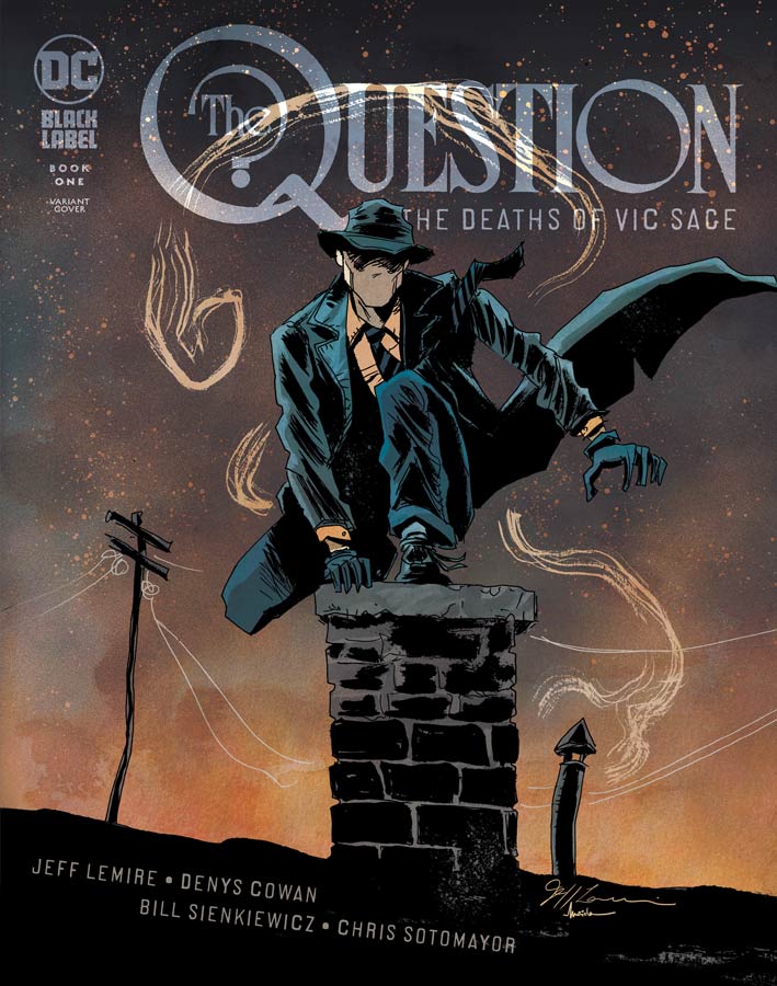
Question: The Deaths of Vic Sage #1
DC Black Label Writer Jeff Lemire, Penciller Denys Cowan, Inker Bill Sienkiewicz, Colorist Chris Sotomayor, Letterer Willie Schubert
After a far too long hiatus the Question is back with the original Vic Sage story. Lemire story was very inspired by the Dennis O’Neil run from the late 1980’s with Cowan that brought back the social commentary to the story and it fits in someways far too well to the current climate of the world. Lemire script does a great job of re-introducing the character to a new audience but does it in a way that doesn’t drag down the story with exposition. The story is very well crafted for a first issue that sets up the story but still leaves a lot of mystery to unfold as the series goes along. He also captures the moral compass of Sage and is conflicted as to how far he should take things along with his willingness to follow through no matter what the cost. We are teased with his history of how he became the Question and that is quite intriguing to see how that part comes into play in this story. Lemire also pays homage to the creator of The Question Steve Ditko by capturing what he built with the original Charlton stories. It’s great to have Cowan back with his stunning artwork that was a great hallmark of the 1980’s series and has recently been collaborating with Sienkiewicz inking his work that brings these two brilliant artists together again is one of the great strengths of this comic. It’s one of the rare times in comics where their artistic collaboration has gotten stronger over the years. Both have a bold and strong visual approach to comics but together they mesh so well even though they are very different and that adds greatly to this story. The other great thing about this book is being under the Black Label allows for the larger format that adds greatly to the scope of the story because they have more room to play with in the layouts and the look and feel of the artwork. The other great thing that is more of a subliminal thing is that they both still pencil and ink on paper and it gives this book and story more of a gritty tactile feel that seeps into you as you read it. I must praise Sotomayor’s color work on the book that is quite impressive because of the muted color pallet that is a lot but he uses it to his advantage by using brighter colors when needed so it gives each that visual push or subtle look when appropriate.
Is this comic worth you’re time and money? What has always made the Question such a great character is his morel ambiguity and that he sees the world as shades of grey and just just black or white and right or wrong and Lemire has done a great job of capturing that very well here. While this is a great extension of the O’Neil run on the book it strikes out on its own but makes sure that it’s true to not only that but the original Steve Ditko creation of the characters.
He very much makes this story his own and with the collaboration with Cowan and Sienkiewicz they are like a well oiled machine that just clicks perfectly together and that what makes it not only a great read but a real treat. Comics really don’t get much better than this and with three more issue to go this is just the beginning. HIGHLY RECOMMENDED!

Heartbeat #1
Boom! Studios Writer and Artist Maria Llovet, Letterer AndWorld Design
Hot off her work on Faithless Llovet both writes and draws this very fascinating new comic that gets off to a very solid start. What is interesting about the story is that you’re dropped in the middle of it and yet as many questions that you have about what is going on with Eva you are fascinated with what the hell is going on with her. What is pretty amazing about this first issue is that not a lot is happening on the surface but there is a lot of the story bubbling up underneath it if you let the story soak in. On thing that is going to a bit tough for some readers is the non linear approach that Llovet has taken here. At first I was puzzled a bit but as it sunk in I understood why she chose the structure of the story was to catch you off guard when you get to the final part of the issue. It’s one of those comics that starts in the middle and unfolds from there and it will be very interesting to see what unfolds in the next issue. I loved her artwork on Faithless but she really blew me away here and really impressed me that much more. On the surface the styles are very different but each one fit the style of the story. In Heartbeats it needed to be more detailed and clean and it greatly enhances the story. I also liked her color choices for the book and how she used it to enhance the emotions of the story.
Is this comic worth you’re time and money? This is going to be a tough read for some because of the non linear approach that Llovet is taking with the story. You will have to remember that this is only the first chapter and have to see it as just a small part of the puzzle that will come into focus as the story progresses along. What will draw you to this comic is of course her gorgeous artwork and that alone is the price of admission here. I really enjoyed this first issue and intrigued to see where she is going to take it from here.
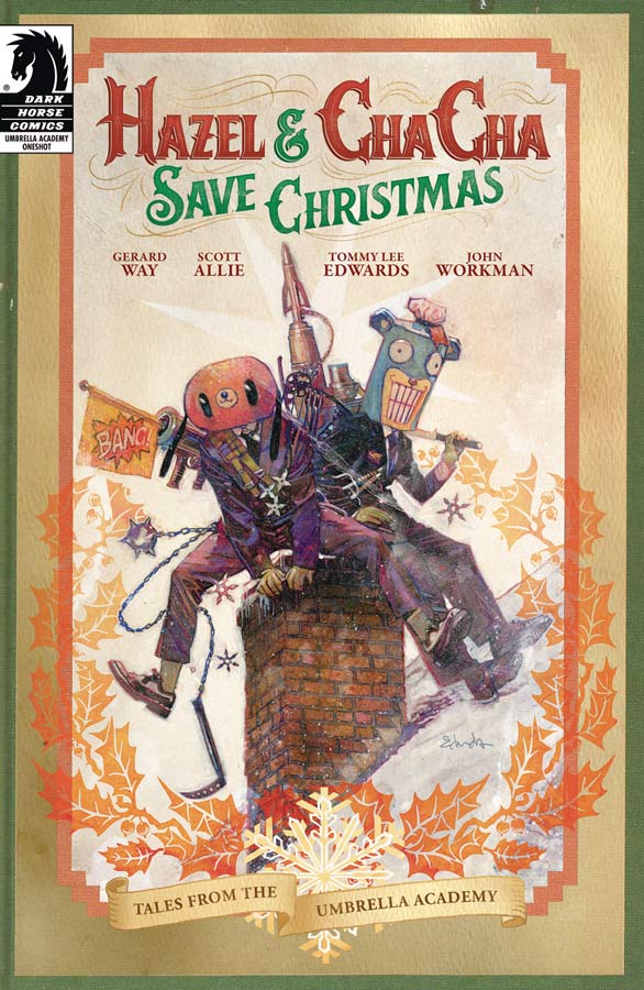
Hanzel & Cha Cha Save Christmas: Tales from the Umbrella Academy #1
Dark Horse Comics Writers Gerard Way & Scott Allie, Artist Tommy Lee Edwards, Letterer John Workman
I liked the idea of having a side story with Hanzel and Cha Cha and throwing in a Christmas theme seemed like a really good idea. Unfortunately the story never quite comes together. One of the issues is that the story is very disjointed and never takes full advantage of the themes of the holidays. Way and Allie throw a lot of ideas into the script but that is one of the problems is that there ends up being too many plot points and they don’t gel together very well. Even at the end of the story there is a point about Hazel giving a present to herself that seems rather odd and seems like a sloppy use of time travel. Sadly the only thing that this book does really well is Edwards great artwork that is pretty much wasted here and that is a huge disappointment. He really brings his A game to this book and it really is gorgeous to look at but with the disjointed script there is little that he can do to save this mess and that is a real shame.
Is this comic worth you’re time and money? It’s not the worst comic that you will read this week but with a great concept that the story had it should have been a lot better. It’s the script that really sinks this one. SKIP IT!
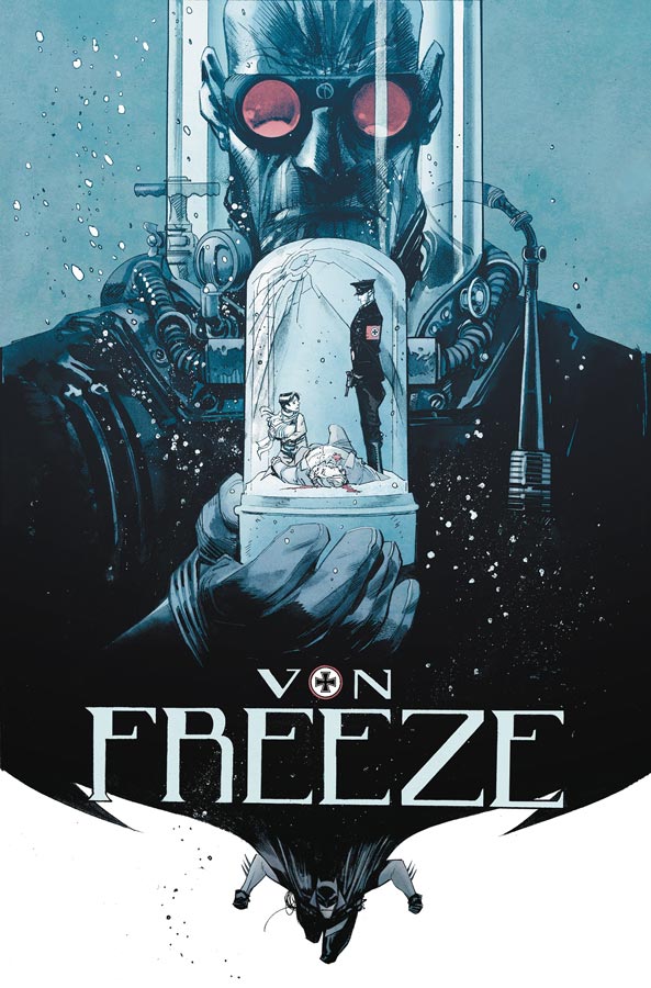
Batman White Knight Presents: Von Freeze #1
DC Black Label Writer Sean Murphy, Artist Klaus Janson, Colorist Matt Hollingsworth, Letterer AndWorld Design
I have been really loving Murphy second series of the White Knight because it’s so different than the first one and not just a rehash of the first. This special is truly something special. In the afterwards Murphy says that this story takes place in the first series between issues six and seven and is to be thought of a deleted scene between those chapters and I’m truly glad that he has delivered this story. First this is a very though story to tell and read because of the subject matter of Germany and the horrible atrocity that occurred and yet as tough as the story is to read it’s also a story of hope and redemption. Murphy shows that most great comic book villains are tragic characters and are not just simple cliche of villains. By telling this story he gives a different side of Victor Von Freeze than we have seen before. It reminded me of the great Batman the Animated Series episode Heart of Ice that brought great emotion to the character and Murphy does the same here but cuts much deeper to you’re soul than that was able to achieve. The best thing about this story is that you can’t change the past but you can certainly learn from it and that is why this story is so beautiful. It really shows off Murphy writing abilities that have always been really good but is even more impressive that he was able to bring such deep and strong emotions to this story. Getting Janson to draw this story is truly fate and I can’t imagine another artist that could have captured all of the emotions of the story as well as he has done here. While most famous as the inker for Frank Miller he is very much an artist in his own right. Being such a seasoned artist he was able to deliver all of the emotions of the script and than takes it to a whole other level here. You can see how much care he put into each and every panel of this book and it really affects you. There are parts of this story that are truly horrifying but Janson never overplays both that or the subtle moments in the story but just hits every beat perfectly.
Is this comic worth you’re time and money? If you are worried that you haven’t read either the first White Knight series or the current one then don’t be put off by that. This story stands very much on its own but does greatly enhance what Murphy has done with the first series. This is one of those rare mainstream comic stories that you can call a page turner. From the first page to the last you will take this emotional rollercoaster ride and it will stick with you long after you are finished. Both story and artwork are perfect and shows what can be done with a mainstream super hero story. It doesn’t get much better than this. HIGHEST RECOMMENDATION!



0 Comments