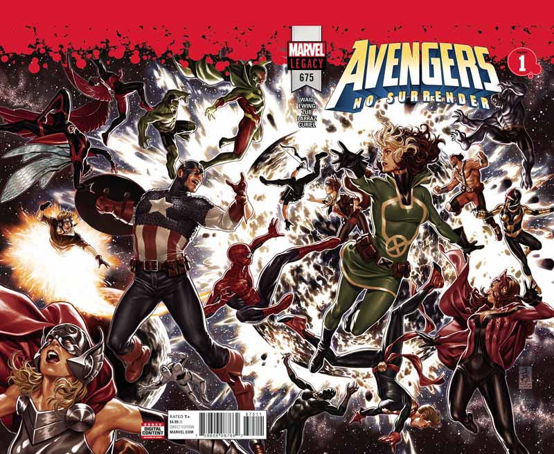
Avengers #675
Marvel Comics Writers Mark Waid, Al Ewing & Jim Zub, Artist Pepe Larraz, Colorist David Curiel, Letterer Cory Petit
Another in a long line of Marvel Non Event comics that I had hoped would be marginally good. While the book is not a total train wreck, it doesn’t really inspire me to read it beyond this disappointing opening chapter. What has seemed to happen with both Marvel (and somewhat to DC) is the circling of the wagons with these event series to get readers to try to buy more books than they normally would. The problem is that I honesty can’t think of an event book that has been worth reading. It’s amazing that it took three writers to come up with this story where nothing really happens. There is the whole thing of everyone being introduced over and over then we get to the last few pages where they all end up together because of this earth shattering crisis and then there is a mystery character that shows up on the last page with the “To Be Continued” and the problem is that there is simply no real meat to the story or what it’s really about just a bloated 30 pages of little story and over dramatic comic drama. I had hoped that maybe Waid might bring a bit of hope to this book but even he nor Ewing or Zub seem inclined to do anything remotely original here. The “story” is a by the numbers affair you’ve read a million times with the same results, a bland and boring crossover that nobody really asked for. The only plus to this book was Larraz’s artwork that was pretty decent confiding the huge cast of characters he had to draw. It’s a nice looking book that is the only high point to the book.
Is this book worth your time and money? Thankfully the book is not the Secret Empire craptacular train wreck but the bigger issue is that it’s simply a standard by the number event book that has a mediocre story that isn’t very compelling or gives you a reason to even want to come back for more. Simply put there is little for lapsed or new Marvel readers and these event comics are simply not helping motivate readers to fall for them anymore. I have read worse but this is an easy pass this week. SKIP IT!
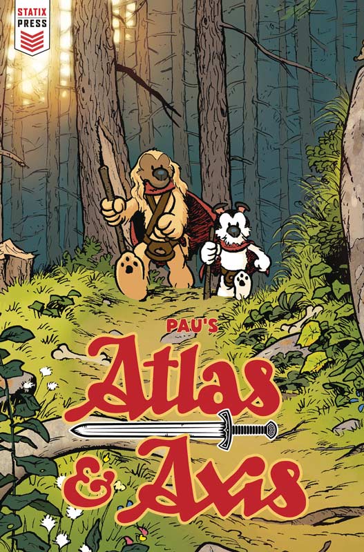
Atlas & Axis #1
Static Press/Titan Comics Writer and Artist Pau
Titan Comics new imprint of comic that are translating foreign comics and graphic novels into English for the first time brings Atlas & Axis a wonderful all ages comic to America for the first time in English and is a beautiful and fun comic that will sure to please readers. The obvious comparison of the story is going to be Jeff Smith’s Bone and that is a huge complement to this book. What makes this book such a winner is the depth of the story that Pau has crafted here. While it’s an all ages comic there are some more mature themes that it might be better for ages 8 to 10 and up. There is nothing offensive but there are some tense moments with action and death that might not sit well with very young readers. This first chapter sets up both the world and the cast quite well here and unfolds the story at a nice pace that is both simple and deep at the same time. It’s also smart and has some very nice sly humor to give it a nice balance and keeps it from becoming too heavy. It’s on thing to have a great story to tell but what made me fall in love with the book was Pau’s gorgeous artwork on the book. Not only does it have a great funny animal look but has a great European flavor to the style that makes you savor every panel in the book. Not only is his line art wonderful but the color detail that he infuses into the artwork is some of the best in comics and gives it a lush look that makes this book such a pleasure to look at.
Is this book worth your time and money? This book really blew me away with its spot on story and artwork that makes it such a fun little read. I’m a sucker for a good funny animal book but Pau delivers so much in such a way that it really sticks with you long after you’re done reading the book. It’s also one of those rare comics that transports you to another world with the story and artwork that leaves you wanting more. After reading this first issue I can see why Stan Sakai is a big fan of this book and you will be too. HIGHLY RECOMMENDED!
The Archies #4
Archie Comics Writers Alex Segura and Matthew Rosenberg, Artist Joe Eisma, Colorist Matt Herms, Letterer Jack Morelli
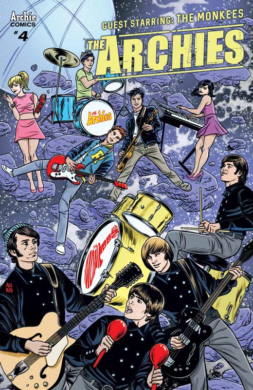
This spinoff book from both the regular Archie comic and the influence of the Riverdale television series has been a fun little book with the Archie gang’s band but this issue was a really special treat with the guest starring of the Monkees. The blending of these two pop culture icons of the 1960’s with the Monkees (1966) television series and the Archies animated series (1968) is a real no brainer. Segura and Rosenberg make the smart choice of setting the story in the classic Archie style as a dream story that plants it firmly back in the period. I will be honest the story is pretty basic here with the whole mystery kidnapping and battle of the bands tropes but that is what gives it the charm to just be simple and fun. The big win for this book is Eisma’s artwork because he is able to flow from the current Archie style and seamlessly slips back to the old school Archie style that perfectly captures the period that the story takes place in. He also makes sure that he captures all of the visual gags that are a trademark of the original Archie series. It was a wise choice not to try to make the Monkees look like the actors but fit them visually in the Archie style that always works well for these crossovers.
Is this book worth your time and money? If you’re a fan of Archie and remember the Monkees this book is a nostalgic trip through time and Segura and Rosenberg captures it all in a simple and fun story that is sure to please. If you’re a new more Riverdale reader I think that it’s still a solidly fun read that you will enjoy and get a kick out of this old school adventure. I had a blast reading it and is an easy RECOMMENDATION!
Royal City #9
Image Comics Writer and Artist Jeff Lemire, Letterer Steve Wands
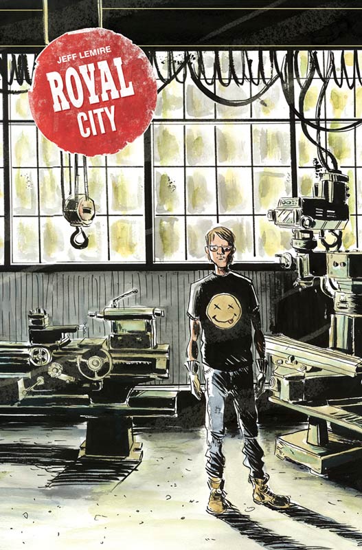
As a big fan of this book every single issue, it’s great to see how Lemire is unfolding this story arc from the past and how it will give a whole new look on the first story arc. What is most impressive with what Lemire is doing with this book is that the first story arc that was set in the present was really good but there were a lot of questions. Instead of simply answering them with this story arc set in the past is that he fills in a lot of the story but doesn’t necessarily give you answers but gives you clues to what and who the characters are and why the past is a key to both the present and the future. This issue deals more with the family than Tommy but it still revolves around the mystery of him and what happen with his death. It also reveals the pitfalls of a small town and how a factory drove certain aspect of it during this period of time. As always Lemire’s artwork is perfect for this type of character driven story. It’s all about the subtle little nuances in his artwork that gives this book a feeling of washing over you as you read it. Along with his perfect color choices that give his line art such a great visual feel that pulls it all together.
Is this book worth your time and money? This book is one that just keeps getting better and better each issue but at such a wonderful unfolding pace that delivers a deep feeling that keeps you coming back for more each issue. It’s the deep story that makes this book such a must read each issue. It really doesn’t get better than this in comics today and is alway a must read book every month. HIGHLY RECOMMENDED!
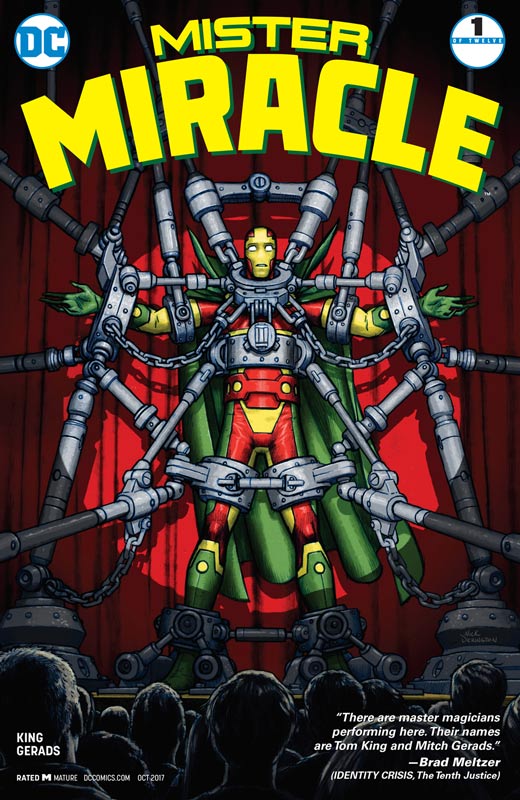
Mister Miracle #6
DC Comics Writer Tom King, Artist and Colorist Mitch Gerads, Letterer Clayton Cowles
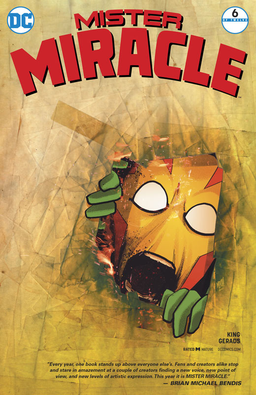
Who knew that writing a story about redesigning your condo would be the most exciting comic book read of all time. What is making the comic the must read book is that King is telling the story on many levels and with not only the script but how both he and Gerads are in perfect sync with both the story and artwork. This issue plays on two levels at the same time and your simply blown away how it works. In a way the story that King is telling is a grand epic tale but they way that he and Gerads present it in such a low-key way is what makes it so unique. It’s both a straight forward superhero story but also a small intimate character driven story. What blows me away with Gerads artwork on the book is how is able to use the nine panel layout in each issue a different way to never make you notice it. He’s alway seeing how far he can push the boundaries of the book visually and each issue he seems to alway find a new way to do it. This is a comic book for the ages and we still have six more issue to go.
Is this book worth your time and money? How to review a book that just gets better each issue and your running out of ways to praise it? This is the dilemma I have each month with this book. Simply put King and Gerads are firing on all cylinders with this one and if you’re not reading this comic then your missing out on a book that is simply redefining what comic books can and should be. They have taken comics to a whole other level with this one. HIGHEST RECOMMENDATION!
Eternal Empire #6
Image Comics Writers Sara Vaughn and Jonathan Luna, Artist/Colorist/Letterer Jonathan Luna
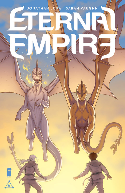
This issue is where the book really kicks into gear and for those who sadly gave up on the book are missing out on this one. The first story arc was simply setting things up for this second arc and I saw what Vaughn and Luna were doing and just waited for the story to unfold. One of the best things about this story is the time that they let the story unfold that sadly for a lot of comic readers today were unwilling to let it happen. So many comics take the least path of resistance with storytelling and what I love with Vaughn and Luna that they let the story breath and give the characters a journey and mystery to unfold. When you read this issue all of the subtle moments in the first five issue come flooding back and you see where they were leading the story and it starts to come together. Luna really gets to open up with the visual scope of the book this issue and yet he still keeps the intimacy and innocence of the story perfectly in place. It the way that he draws the characters in his books that he is able to perfectly capture the emotions and subtle details of the story that makes this book such a treat.
Is this book worth your time and money? It’s a shame that readers and reviews didn’t give this book a chance to unfold because with this issue the pieces of the story are falling into place and you really needed the first arc to get you to this point in the story. I understand that the pacing of the story is not the quickest but with this issue you see why they took that route and it makes perfect sense now. If you haven’t been reading this book then you should give it a try because there is a lot more to come and I’m intrigued to see where they take the story from here.
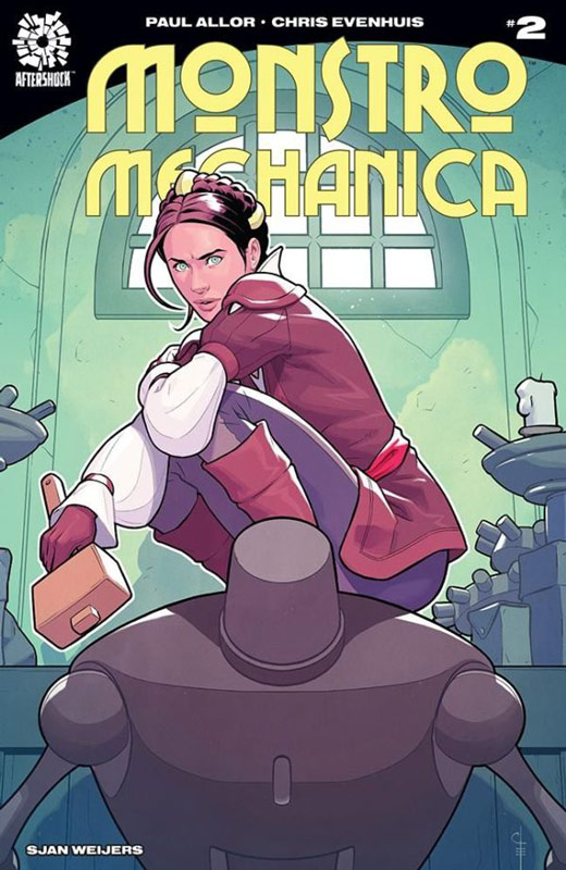
Monstro Mechanica #2
Aftershock Comics Writer Paul Allor, Artist Chris Evenhuis, Colorist Sean Weijers, Letterer Paul Allor
After a great start in the first issue of this book, this second issue is a little more slower paced but does a good job of moving the story forward while developing the characters. Allor does a nice job here with mixing action with exposition and keeping things moving along nicely. What is working in the books favor is how he is taking historical elements and weaving in fantasy ones but still making sure that it feels right for the period. What I have found most interesting is that the story is more about Isabel than De Vinci and that is what I am really enjoying about the story. Allor is setting things up nicely for the story arc with this issue and gives readers a good reason to come back again. Evenhuis’s artwork continues to shine on this book and is able to capture the characters quite well in the book. One of his really strong artistic abilities is to draw human characters very well and adds greatly to this book working so well. The scene with Isabel and the robot mimicking her is simply priceless and shows the strength of Evenhuis artwork.
Is this book worth your time and money? While the book won’t blow you away, it does however make for a fun little read. Allor and Evenhuis are telling a very interesting twist on history and so far its working quite well. There is enough here in this second outing to keep me coming back for a few more issue to see where the book is going to go and is still worth checking out.






0 Comments