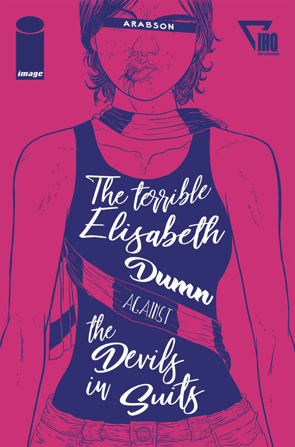
The Terrible Elizabeth Dumn Against the Devils in Suits
Image Comics/IHQ Studios Writer and Artist Arabson, Adaptation James Robinson, Colorist Anderson Cabral
This new English adaption of Brazil’s Arabson is a real treat and a bargain in this weeks new comics. There has been a great rush for American comic companies to bring foreign comics to readers here and Image has snagged a really good one for it. What makes this book so great is that Arabson tell a simple tale of making a deal with the devil and then trying to change the game after it’s started. But what he does with that story is what makes it so exciting and seem fresh and new. He found a very cleaver way of adding many more layers and twists to it that you never see coming and he gives all of the characters such great depth and souls that even though the story is only 68 pages, it’s filled to the brim with so many great details both big and small but what it does do is take you on an amazing ride while your reading it. What made the story so good is Elizabeth is such a strong female character and she brings so much excitement to this tale and then Arabson brings in Leroy as a great partner and by the end of the story your never quite sure where it’s all going to end up. Not only is the story great but the art is amazing and has a wonderful European flavor but also a Brazilian flavor that you rarely see in American comics much. I loved that he plays with the layouts, the perspectives and facial expressions that is both bold as it is beautiful. This comic visually attacks you at some points and really keeps you on the edge of your seat many times. Another great win for this comic is the great color work by Cabral that wonderfully complements Arabson’s line work and adds greatly to the visual and emotional impact of the story.
Is this book worth your time and money? At 62 pages and oversized at 11 X 17 this is an absolute steal at six bucks. There is so much bang for your buck not only in the size and page count but the story and artwork are so engrossing that you simply crave more when your done reading this book. Arabson is a force to be reckoned with and brings a great new voice to comics. It’s also a comic that really sticks with you long after you are done and that is why it’s so great. HIGHEST RECOMMENDATION!
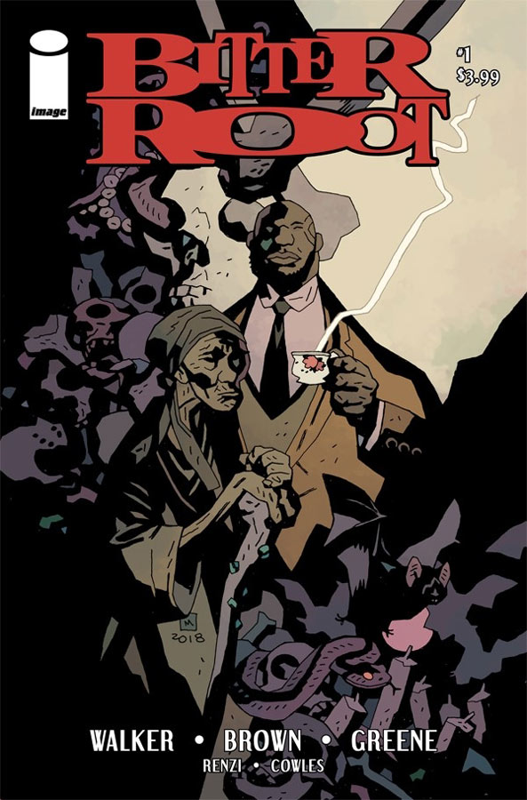
Bitter Root #1
Image Comics Writers David F. Walker & Chuck Brown, Artist Sanford Greene, Colorists Rico Renzi & Sanford Greene, Letterer Clayton Cowles
It tough when you do a comic and mix together a number of genres and a lot of the times this tends to overwhelm or over bloat the script but I have to give props to Walker and Brown who give all of the elements that they throw into Bitter Root actually flow together quite well here. What I liked about this book is that they got this first issue off to a really good start with a nice balance of story and exposition that had a really nice flow to it that is always a challenge in a first issue. While the story has a lot of great mix of superheroes, magic and monsters they also touch on social commentary. While the story is set in the past (1924) the issues that they address are as relevant today as they were then. The one thing that they don’t do here is over play these elements they simply weave them into the story and it gives it a deeper edge than an average comic does. The comic has a surprisingly amount of fun to it to and is able to not take itself too seriously from time to time. They do a decent job of introducing the cast but there is still a fair amount of story elements to be revealed as the story goes along. One of the best assets this comic has going for it is Greene’s wonderful artwork that gives this story a great kinetic energy and he is not afraid to go outside the box with the layouts and the visuals that makes is a visual feast. The one thing that was an interesting choice was the color design by Greene and Renzi that didn’t sell me right away but they defiantly go for some really bold choices here but it did make the comic really pop.
Is this book worth your time and money? I really liked this first issue and the story is quite intriguing. It will be interesting to see where they take the story from here. There is no doubt that there is a lot more to come but this first issues foundation is very solid. The story will defiantly keep your interest and they give you a good reason to come back for a second issue. Greene really makes this book stand out visually and gives it a look that really complements the script. I enjoyed this book and can’t wait to see where they take it from here. RECOMMENDED!
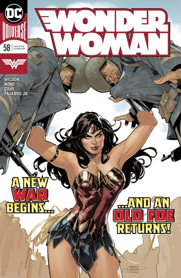
Wonder Woman #58
DC Comics Writer G. Willow Wilson, Penciller Cory Nord, Inker Mick Gray, Colorist Romulo Fajardo Jr., Letterer Pat Brosseau
Sadly the post Greg Rucka rebirth run of Wonder Woman has been less than stellar but I hoped that brining Wilson on board to steer the ship into better stories was going to be a very big task. While this first issue wont blow you away because she is setting the foundation here for her run there is a lot to like here and with a sigh of relief it appears that they book is back on track. She does a nice job here of continuing the previous story elements but makes it easy for new readers to slide comfortably into this new storyline. What I liked that she got about Wonder Woman right away was the mythology aspect of her character. Sure she’s a super hero but its her ties to classic greek mythology that sets her apart from the rest and she dives deeply into that here in her first outing. She also makes sure that we don’t forget about Steve and Etta and the social commentary that is another core aspect to the book. While it may seem that there is not much going on here on the surface but what I have loved about Wilson’s writing is that she slides a lot of subtle things into the story here and there that payoff handsomely down the road and if you have ever read her Vertigo Comic Air you know exactly what I’m saying with that here where you can see the seeds that she is planting. I really loved Nord’s artwork here and he is best known for his recent stint on the Conan comics over at Dark Horse and he bring a nice visual flair to the book. He brings a nice moody style to the book that nicely complements Wilson’s script. His clean line work here gives the book a bold and refreshing take on Wonder Woman and makes this new start quite refreshing.
Is this book worth your time and money? You can see that Wilson is going for the long game here and while this first issue won’t knock your socks off, it’s not supposed to either. So many comics try to do too much in their first outing and don’t take the time to build them out, but that is exactly what she is doing here and it’s going to be a few more issues to see what and where she is going. With that being said there is a lot to like here in this first chapter and with the wonderful Nord artwork it looks like the Amazonian Princess is getting back to a comic that is worth putting back on your reading list.
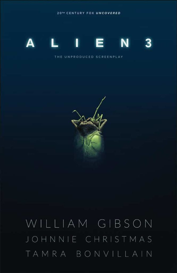
William Gibson’s Alien 3 #1
Dark Horse Comics Story William Gibson, Writer & Artist Johnnie Christmas, Colorist Tamra Bonvillain, Letterer Nate Piekos
The original Gibson script for Alien 3 has become legendary because it was supposedly too intense for the studio heads at Fox but they did take some ideas from it for the version of the film that was finally made. If you have seen any version of the Alien 3 film then be prepared that at least in this first issue this is all new story and not related to it yet. This first chapter is a bit on the slow side but as with most scripts there is a lot of exposition to get out-of-the-way and you will see that here. Christmas does a good job of bringing the script in better line with the visual aspect of comics and while some of the early dialog scenes drone on a bit, once the story get going the pacing gets better. It’s really hard to tell where the story is going to go from this first chapter and there is a lot more to come so while the set up follows the basic pattern set up in the films, it will be interesting to see where this story will differ from the final movie as it goes along. Visually Christmas does a decent job with the artwork. It’s a little hard to tell at points where the visuals will go because there is a lot of dialog heavy scenes here and there is very little room for the artwork to stand out much in a lot of this first issue. But the times where there is mood he delivers some nice creepy feeling artwork.
Is this book worth your time and money? The question here is for a casual fan of the Alien films will this be a comic to buy? At this point with only one issue its very difficult to tell. Once the story gets going in the next few issue will determine where the dividing line might be. So if you’re not a huge fan of Alien then this may not be the comic for you but the next issue is going to be key to see how Christmas is able to adapt and this script and make for a more exciting comic. It’s too early to tell on this one.
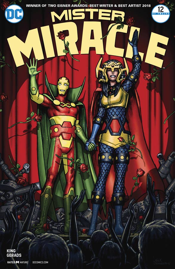
Mister Miracle #12
DC Comics Writer Tom King, Artist & Colorist Mitch Gerads, Letterer Clayton Cowles
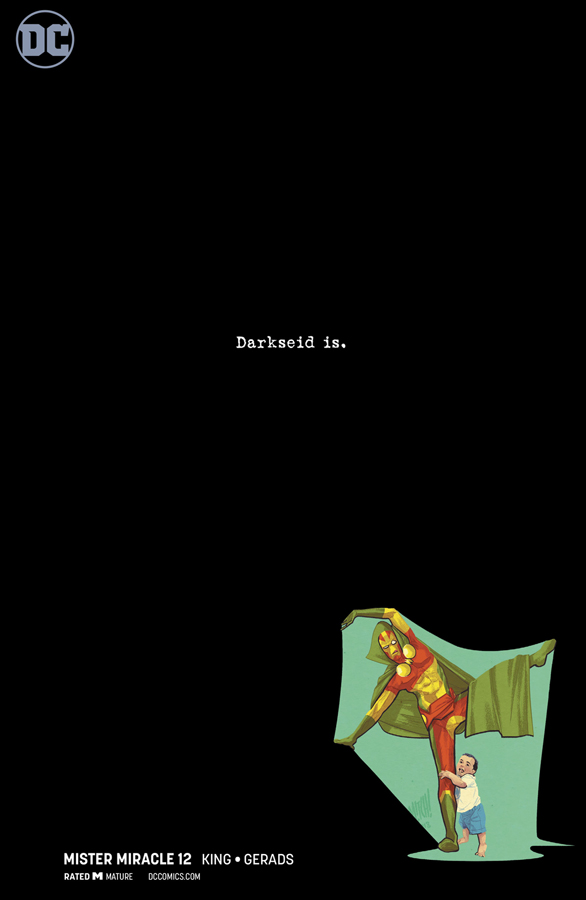
After a bit of a delay in getting this series out we finally come to the last chapter of this story and it closes as it opens and that is that there is no big blowout or revelation but simply a touching and moving ending to a great story that pulls it all together with style and class to a very natural conclusion. This story was never about action and superheroes but about the heart and soul of the characters. What has been most impressive about this story is how subtle and touching that it has been. In a way it has been a slice of life type story that told a grand superhero story but from a point of view that has never been attempted. In a way each issue King tell a story that almost takes place in-between pages or issues and this final chapter wraps it all up in a nice way that ends but in real life the story will go on but this part of Barda and Scott’s story is finished but is never really over because they will get up the next day and the story will continue as with us all. Rarely is the human side of comics touched upon as they have ben told here and that is what King has delivered so well here. This final story is bittersweet because Scott and Barda’s past comes back as “ghost” but they are really memories of the ones that we love and sometime hate to love. I’m still blown away with Gerads use of the nine panel format for this book and how he has been able to fill each panel to the brim with laughter, tears and every other emotion you could every feel and yet his best asset is that the art is so grounded in heart and soul that has made this book so special. It was always the little touches that he put into this book and some of his best is in this final issue.
Is this book worth your time and money? The question at this point is simply why haven’t you been reading this book? It has been one of the most thrilling and heartfelt comics to come out of the superhero genre in quite a while but has also been a fitting tribute to Kirby who created these amazing characters so long ago. He would have been so proud of what King and Gerads have done here because they made this book all their own but never changed what made them stand the test of time. It have been one hell of a ride and this final chapter was a beautiful ending to an amazing comic. HIGHEST RECOMMENDATION!
Murder Falcon #2
Image Comics Writer/Artist/Letterer Daniel Warren Johnson, Colorist Mike Spicer, Letterer Rus Wooton
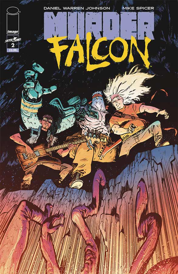
The first issue of this book was a real hoot but this second one took this whole goofy concept to a whole new level of insanity and I loved every minute of it. The concept of this book is honestly a bit on the silly side but that is why it works so well in that sure it’s kind of stupid but at its very core it has heart and charm and that is why it works so well. This second outing starts to get the band back together and we get to see Johann back in the mix and he brings some great comic relief to the story. He does what we would all do in this story is that it’s fucked up and totally insane but freaking cool and lets go for it. Johnson has a great way of blending the story and artwork into one perfect fusion that really sets this book apart from the pack. He is also not afraid to take risks with both the story and the artwork that pulls it all together. One of the main reasons why this book is working so well is that Johnson ground the book firmly with the strong characters that you are emotionally attached to and that allows for all of the crazy things that he bring to the story work because you care about the characters. Visually this book simply will blow your mind and I love how he lets the artwork follow it’s own path and captures the scope of this epic story.
Is this book worth your time and money? This book is simply one of the wildest, strangest, stupidest comics I have ever read and its a total blast. Warren has found a way to capture lighting in a bottle here with the way he is able to balance all of these elements together is quite impressive and I cant wait to see where he takes it from here. I love this book and is a wonderful surprise. HIGHLY RECOMMENDED!
Electric Warriors #1
DC Comics Writer Steve Orlando, Artist Travel Foreman, Colorist Hi- Fi, Letterer Travis Lanham
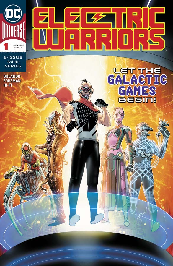
When I first heard about this tittle I remember the DC comic Electric Warrior by Doug Moench and Jim Baikie but after reading this first issue of this book, it has nothing to do with that original series. Orlando throws a lot of things at the reader in this first issue and while I never felt too lost, I do feel that his exposition did drag this opening issue down a bit more than I would have liked. I get that there is a bigger story that he is telling here but I felt that it kept me from contacting with the main characters because he spends too much time on the story and not enough on caring about the individual characters. This story is definitely grounded in the DC Universe but as for what the time frame of this future lies in is a bit unclear but the last page of this issue does reveal and interesting hero from the Justice League. Orlando’s script seems cramped and rushed and while there are some good ideas in this first issue, it didn’t grab me as well as I would have liked. On the plus side the books artwork is quite gorgeous and extremely well executed by Foreman who does his best to try to make sense of the disjointed story and he does his best to visually help move the story along. Foreman’s art is the real high point on this one.
Is this book worth your time and money? The book is not a total train wreck but Orlando’s script is kind of all over the place and while there are some good ideas and the artwork is really good, there is just not enough to bother getting the second issue. It’s a shame because there are a few bright spots her but not enough to buy into this one. SKIP IT!



1 Comment
For me, the great success of MISTER MIRACLE by Tom King and Mitch Gerads is Big Barda! Barda is now a mom nesting in L.A. who had almost killed Darkseid with her bare hands, who did kill Granny Goodness, and who would have killed Orion if Scot hadn’t pulled her off of him. I mean, that’s genius creativity to keep Barda bada** but building her inner life at the same time 😀