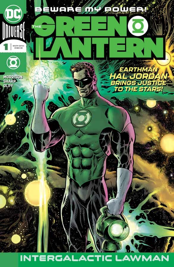
The Green Lantern #1
DC Comics Writer Grant Morrison, Artist Liam Sharp, Colorist Steve Oliff, Letterer Tom Orzechowski
After a long absence Morrison gets back in the superhero saddle and tackles the Green Lantern Universe and gets things off nicely in this first outing. What I found most intriguing about this book was that he was a bit more mainstream with the writing than I had expected but in a lot of ways it was just as out there as he can sometimes be but blended it all so well together that made for a wild ride indeed. The one thing that I loved that he did with the book is really take it back to basics and not only brings a great classic feel and tone to Hal Jordan but tones downs a bit of the dramatic space opera of the Green Lantern Corps and makes them much more relatable than it has been in the past. That is not to say that he is changing things but instead infusing the book with strong characterization and humor that is so often forgotten in the mainstream today. You can have both and Morrison proves it here in this first issues story. We also get to see a more vulnerable Hal Jordan that makes him much more relatable to the reader. As with any Morrison story there is a grand epicness to it and he nicely does this with book endings that between the Hal story in the middle that gave the book a wonderful flow while reading it. In some ways the story won’t blow you away but Morrison is not going for that here, instead he is building things out at a good pace that really allows the story to breath and hit all of the right beats. In a good comic book a solid story will only get you so far and you need an artist to bring it all to life and I honestly can think of anyone better than Sharp to bring this book alive. Having recently delivered a brilliant run on Wonder Woman and most recently his epic Brave and the Bold mini series, he fits this book like a power ring fits a Lantern, perfectly. He is able to not only capture the big and wild epic space opera elements but he can bring heft and heart to the dramatic moments that is a testament to a good artist. And lets be really honest here his artwork of a giant hamster destroying a city is pretty freaking amazing as it is hilarious. Not only is he the perfect artist but adding seasoned veterans like Oliff on colors and Orzechowski on letters is simply icing on the cake for this book. They add wonderful touches to the book and make this a great complete package of a comic that you rarely see in most mainstream comics today.
Is this book worth your time and money? I guess the big question is does it live up to the hype with the heavy hitting talents involved and that answer is yes. The bigger thing is that they not only gets things off well in this first issue but give you a solid reason to come back for more by just giving you a taste of what is to come. Morrison writing can be a little prickly for some but this is a pretty straight forward story but still has all of the elements that only Morrison can deliver. Sharp really brings his A game here and delivers some of his best work to date and that is saying a lot because his Brave and the Bold artwork was simply stunning. Throw in Oliff and Orzechowski and you have a perfect team firing on all cylinders. VERY RECOMMENDED!
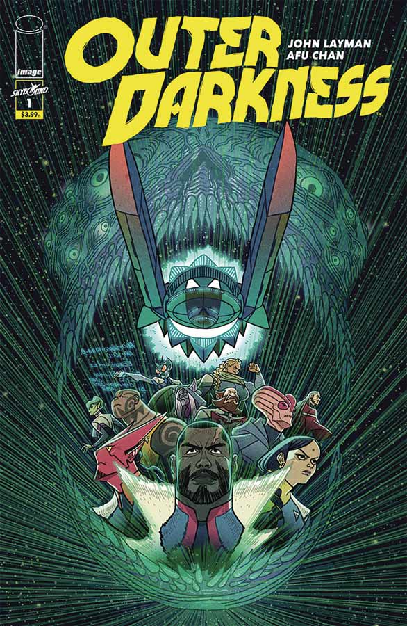
Outer Darkness #1
Image Comics Writer John Layman, Artist Afu Chan, Letterer Par Brosseau
At first I wasn’t too keep on this book and it’s not that it started out bad but the opening story seemed a bit on the too familiar side. Layman best know for his run on Chew does have many aces up his sleeves and as the story moves along it really grew on me and while there are familiar tropes that he uses he gives them some nice fresh spins and twist that by the end of this first issue it had some nice charm and intriguing ideas. This first issue is pretty much exposition and is a little slow but does some nice characterization that helps you along. There is not too much revealed in this first issue and that kept it from leaping off the page here but Layman gives you enough reason by the end of this first issue to at least give the book a second outing. Chan’s artwork has a bit of a cartoony style that works well here especially in the more humorous moments in the story and brings a nice visual feel to the book that benefits it quite well. One thing that was quite nice in the artwork was the big epic space scenes that are quite impressive and it gives the book a nice grand scope. Chan also is able to capture the smaller dramatic parts as well and complements Layman’s script nicely.
Is this book worth your time and money? While I wasn’t blown away by this first issue, I did like the ideas that Layman introduces and the book shows promise. I think that the next couple of issue are going to be key for the long-term on this one. I hope that he can make it feel more like its own story and avoid being cliché that so many space opera comics tend to fall into. With nice artwork from Chan makes this a book worth a swing to see if you might like it if your into space opera drama.
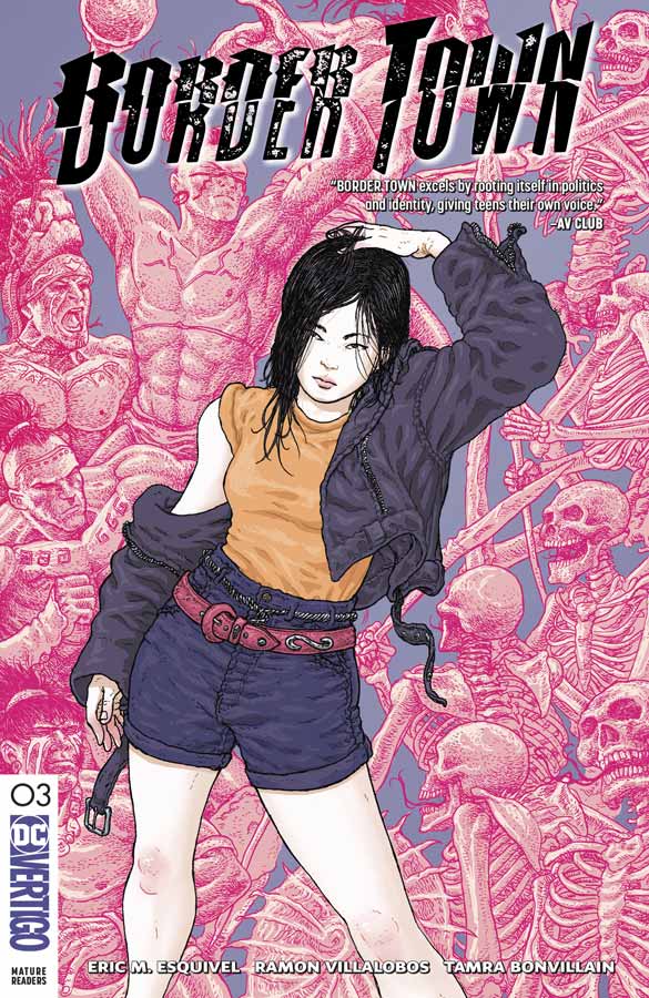
Border Town #3
Vertigo Comics Writer Eric M. Esquivel, Artist Ramon Villalobos, Colorist Tamra Bonvillain, Letterer Deron Bennett
This third issue of this book is crucial to the story because the first two set things up and now we are starting to see where Esquivel is starting to go with things and peeling back the layers of both the mythology and diving deeper into the main cast with this issue focusing on Aimi. I like how he is building not only this world but really grounding the cast and giving the readers a reason to care because there is a lot of crazy shit going on here but by giving the readers characters to connect to in the story makes you care about them and gives you a higher investment into the story. One thing that has really impressed me is how Esquivel is able to go back and forth between the present and the past and blend them together so well. That is very difficult to pull off in a monthly comic but he is able to do it here with ease that is quite impressive. The other thing that is making this comic work so well is that the main cast of kids simply feel right with their dialogue and emotions that makes them feel so real that you become emotionally attached to them and now your totally invested in what Esquivel is delivering in this book. The story is also getting pretty weird and that is a good thing because I’ve never really seen a story like this told before and while there are some basic tropes in the story, Esquivel is telling something fresh and exciting here and yet not shying away from going dark or deep with this. The cliffhanger this issue is truly messed up and with each twist in the story like this you are always kept on your toes and never know what to expect and that is what makes this book so exciting every issue. It’s Villalobos that is making this book really pop with his stunning artwork that captures all of the wild elements that Esquivel throws at him and handles it with ease. My favorite part he did in this issue is actually one of the smaller moment when the teacher is doing roll call and the expressions on the kids face are on the money and that is why this book is working on every level. He brings a vibrant look and feel to the book that is simply blowing me away each issue. I have to mention that Bonvillain’s gorgeous color work on the book really complements Villalobos’s line art and gives it a wonderful feeling from the color that shows the power of what color can bring to a comic book.
Is this book worth your time and money? Esquivel and Villalobos are delivering something unique here in comics that is both fresh and exciting. With both story and art that shows what the comics medium can deliver that others can’t. There is so much going on with this book and were only in the third issue. They not only deliver the goods each issue so far but continue to give you a reason to get excited for the next part of the story. The only complaint that I have is that I have to wait a month for the next issue and that is very hard with this book. HIGHEST RECOMMENDATION!
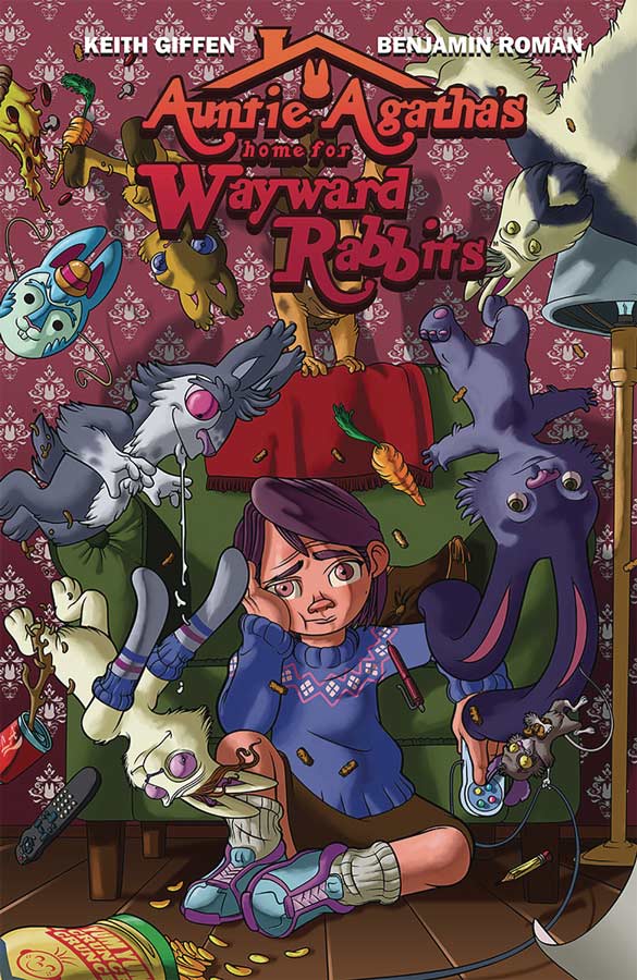
Auntie Agatha’s Home for Wayward Rabbits #1
Image Comics Writer Keith Giffen, Artist Benjamin Roman, Colorist Bryan Valenza
It’s been a while since I have seen a comic from Giffen and was excited to see what he was going to do with this book and it’s a bit of a mixed bag. On the plus side the book is likable right out of the gate but the problem is that nothing really happens in this first issue. There is a lot of dialog and exposition but by the end of this first issue you really haven’t found much out about the characters or for that matter what the story is about. You don’t even learn the girl’s name (BTW Julie) for 16 pages into the story and that is a huge flaw in the story. You could say that it’s not a huge problem but when your reading a story you should get to know the character in the opening chapter not just feel like you ease dropping into a story that has already started. Giffen usually has tighter more focused scripts but that is sadly not the case here. Beyond the girl there is no explanation of anything here and in the end while the story is pleasant really didn’t have much of a point. The only thing that saved this mess from being a total write off was Roman’s wonderful artwork that gave the meandering story great charm and almost made me forget that the story was going nowhere. Visually it has a great storybook look and feel because Roman instills heart into the visuals as best he can here and that is a mark of a good artist.
Is this book worth your time and money? It’s not that this comic is bad but it simply does nothing in this first issue except for show that a girl lives in a house with her aunt and she has talking rabbits in the backyard and that’s it. While I understand Giffen might not want to give too much away in this first issue but he completely fails on giving the reader anything tangible in the story. The saddest part of this book is Roman’s wonderful artwork is completely wasted here on a story that has charm but is totally boring and that is why the book fails. SKIP IT!



0 Comments