Quite a big week for new comic books. Some new comics makes the lists and a few continuing series are back to see if they are still worth reading.
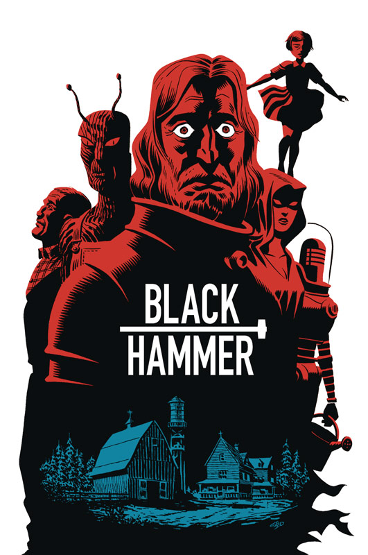
Black Hammer Giant-Sized Annual #1

Dark Horse Comics Writer Jeff Lemire, Artists Nate Powell, Matt Kindt, Dustin Nguyen, Ray Fawkes, Emi Lenox, Michael Allred, Colorists Dave Stewart and Sharlene Kindt, Letterer Todd Klein
I have been a big fan of this book and this oversized annual is a fun little side story with an all-star line up of artists for the event. While the story does stand on its own from the ongoing story in the regular book, I wish that it had been a little more new reader friendlier. While that is certainly not a knock on the book but it might have been a way to get more new readers onto the book. That being said Lemire crafts a fun little side stories here that gives each of the main character a nice little story that is framed by a strange eyeball creature that is traveling through time. What makes the book so fun is that Lemire has designed each story to fit the artists style. While Lemire’s overall story is fairly basic, it still hits a lot of the same great beats as the regular series but does a very good job of highlighting each characters past that sheds new light on their back story. The artwork on the book is a real tour de force of greats. The best compliment I can give to the art is that there is no one that stands out more than the other. Rarely do you get a book like this where the quality can be a little uneven but not this one. Each of the artist are at the top of their game on this book and while their styles are different they all flow together seamlessly. A tip of the hat has to go to Powell who provides the framing sequences that does a very nice job of making it flow so well together.
Is this book worth your time and money? While some would shy away from the book with the $5.99 cover price I can tell you that there is a lot of bang for your buck with this book. Clocking in at whopping 35 pages of story and art is a steal for this book. Where the book really wins is in the quality department. With fun little short stories and fantastic artwork make this a must buy book this week. HIGHLY RECOMMENDED!
Justice League of America: The Ray Rebirth #1
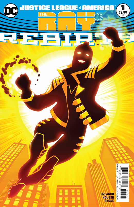
DC Comics Writer Steve Orlando, Artist & Colorist Stephen Bryne, Letterer Clayton Cowles
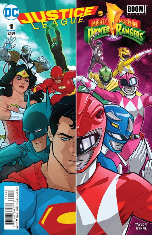
So far the prequel comics to the new JLA comic have been a mixed bag. The Atom was pretty weak but last weeks Vixen was a huge improvement. This weeks book The Ray lands somewhere in the middle. The book starts off fairly well but ends up seeming too rushed and heavy-handed with some of the elements. While I applaud DC for having a LBTGQ character at least in this story didn’t come off as well thought out as I would have liked. It certainly was not handled terribly or felt pasted on too badly, I think that the problem is that with this being a one shot that there was just not enough time to unfold everything that needed to be done. This is where the book just doesn’t work out so well. Orlando does a nice job of re-telling his origin that will get new readers up to speed and hopefully in the regular JLA series he will be able to devote time to flesh out some of these issues. The artwork on the book by Bryne who did a very nice job on last weeks JLA/Power Rangers book does a very nice job on the art here. He has a nice clean style that fits the story well and does help the book along nicely.
Is this book worth your time and money? While it’s not a waste of money, I wish that Orlando had not thrown so many things at this one shot and was both hit and miss. There is a lot to like about The Ray as a character but unfortunately this book never quite delivers a satisfying experience overall.
The Few #1
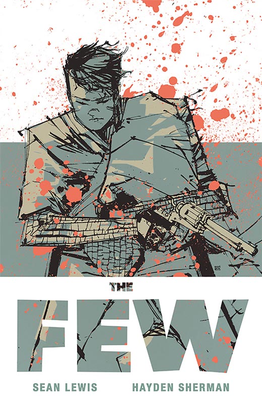
Image Comics Writer Sean Lewis, Artist Hayden Sherman
This is one of those books that seems to not start off so well because it’s purposely a bit slow in the beginning but the script by Lewis is very smart by the end of the issue. At first while I was reading this first issue, I was not overly impressed with it but by the time that you reach the last act of this first issue, it all comes together and ends up blowing your mind. Lewis shrewdly sets up things on purpose to throw you off on what is really going on with the story. He sets up things that doesn’t seem to make sense or have a purpose but then he slowly lifts the curtain on what the real point of where the book is going. I love how his script washes over you and yet you don’t relies that it’s affecting you in that way. Sherman’s artwork here is very impressive. He has the perfect blend of both style and color that elevates this book to a whole other level. His use of color on the book is where the art is very striking. He uses color to highlight story elements and tone. His layouts on the book are very bold and exciting. His art style give Lewis’s script a great boost and really makes this book shine.
Is this book worth your time and money? The book is structured to make you believe that it’s going in one direction but throws a curve ball at the end that really changes how you see the overall story direction that you previously didn’t see. Add in Sherman’s wonderful artwork and you have a solid start to this series. Well worth checking out and is HIGHLY RECOMMENDED!
Monsters Unleashed #1
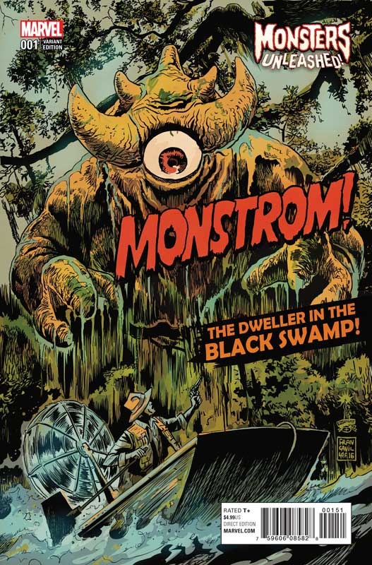
Marvel Comics Writer Cullen Bunn, Penciller Steve McNiven, Inker Jay Leisten, Colorist David Curiel, Letter Travis Lanham
Bunn is one of those writers that I love his creator owned stories such as Harrow County but his mainstream stuff never quite is as good. I will give him that while the first issue of Monster Unleashed is a bit repetitive and gets off to a bit slower start than I would have liked, it did have a certain charm and the ending of the first issue does give the book a boost in going forward. The main problem that I had with the book is that I get that monsters are appearing all over the world but to just keep repeating the idea and inserting new heroes battling them is a little sloppy and basic. On the plus side the humor of some of the dialog is nice. The art by McNiven and Leisten gives the book a better than average Marvel title. They really deliver some great monsters and give the book a nice shine.
Is this book worth your time and money? I was not overwhelmed with the first issue but I will say that the last few pages of the book are enough to give it a second chance. Bunn is a better writer than most of this issue and I hoping that now that he has stumbled through the exposition the book can build upon the set up at the end of the issue. The artwork nearly saves the book with some very nice work by McNiven. I can’t give the book a huge recommendation but it wasn’t a terrible read just disappointing.
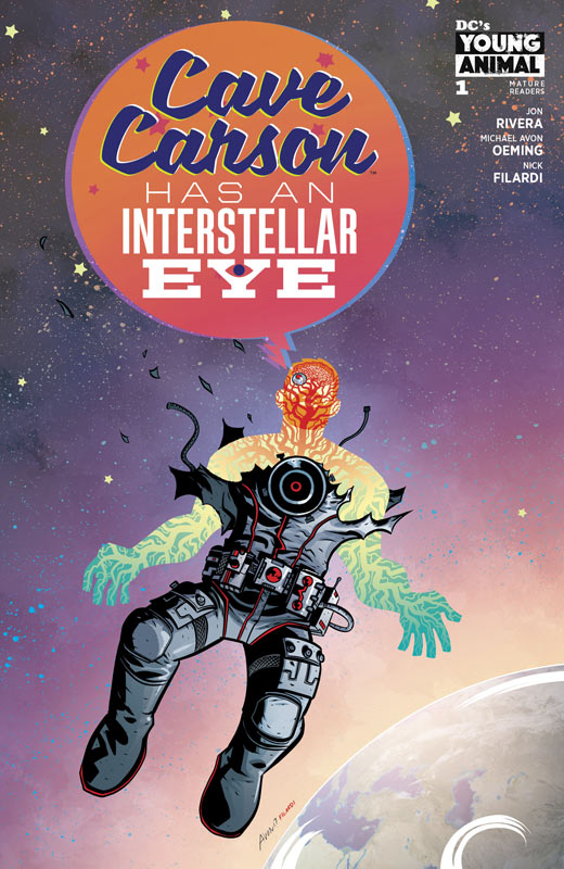
Cave Carson Has A Cybernetic Eye #4
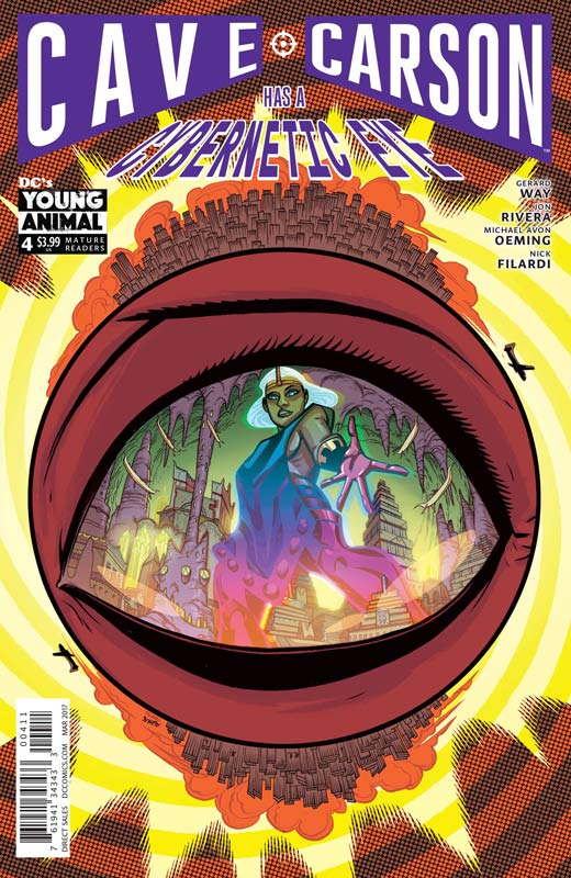
DC’s Young Animal Writer Jon Rivera, Story Gerard Way & Rivera, Artist Michael Avon Oeming, Colorist Nick Filardi, Letterer Clem Robins
I have been a huge fan of this book from day one and I have to say that this fourth issue is a really good turning point in the story. We are getting to the real meat of the story with the previous issues setting things up for a lot of key elements that really pay off this issue. Rivera has a lot of spinning plates with the script in this issue with reveals and new questions and handles everything quite well. The pacing of the story this issue is done very well with a nice mix of action but alway putting the characters development first and foremost. He also keeps the story grounded quite well considering all of the weird elements of the story and that is what is making the book so satisfying. How do you continue to praise Oeming’s artwork on the book? I simply can’t imagine any other artist to handle this book so well. His style really gives this book the key elements for the script to come together and deliver such an enjoyable read. His bold layouts and willingness to take chances with style are simply amazing.
Is this book worth your time and money. For me this is the book from the Young Animal line that has not only been consistently good but is one of those rare books that actually keeps getting better each issue. Rivera and Oeming are capturing both history and nostalgia but also a very contemporary comic book at the same time. There are so few pure adventure comics that are simply fun to read and Cave Carson is a real breath of fresh air in comics today. HIGHLY RECOMMENDED!
Curse Words #1
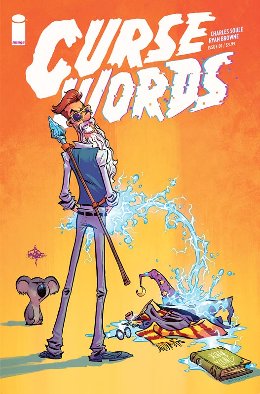
Image Comics Writer Charles Soule, Artist Ryan Browne, Colorists Browne & Jordan Boyd, Letterers Chris Crank, Browne, & Shawn Depasquale
Curse Words is one of those comics that has a lot of good ideas but it never quite pans out. The biggest problem with the book is Soule’s script that is disjointed and a bit all over the place. One of the problems is that the narrative really jumps around and you simply get lost and after a while I really didn’t care what was going on. The main character didn’t quite gel for me and the humor fell flat for me. The only thing that helped the book was Browne’s artwork on the book that had a snappy look to it with a slight cartoony style that tired it’s best to help the so-so script along. There are some nice visual puns but he can only do so much with what he had to work with.
Is this book worth your time and money? The biggest problem with this book is it was simply not very compelling and a bit of a chore to get through. The concept is not too bad but the book never really goes anywhere and there was nothing that will make me stick around for the second issue. SKIP IT!
Slam #3
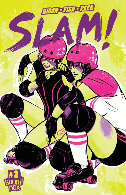
Boom! Box Writer Pamela Ribon, Artist Veronica Fish, Colorist Brittany Peer with Laura Langston, Letterer Jim Campbell
I really enjoyed the first two issues of this book but this third issue was a real mixed bag for me. The story this issue didn’t really seem to move the story forward too well. The other issue is that the story really lacked focus this issue. Ribon seemed to throw a lot of things out this issue but never really seemed to connect any of them that made for a very disappointing read. It also seemed to be treading a lot of water with the story elements that didn’t go anywhere. Likewise Fish’s art on this issue really lacked the charm and spark of the previous two issues. It could have been more that I was disappointed in the story that made me feel about her artwork, so that could have some baring on it too. She still give the book a good look and does a wonderful job of capturing the emotions of the characters.
Is this book worth your time and money. I’m still a fan of this book but this issue does really worry me. The story this issue really sat there for me and hope that this is not a sign of things to come. The next issue is going to be a big key for me to continue on the book. While this book is still good I guess that I just expected better this issue.


0 Comments