Well the plan was to have these up last Friday but the website was crashing and my webmaster had to do some emergency work on the backend to get it back going. Considering that there are very few comics coming out this week between Christmas and New Years it’s a good time to catch up with last weeks comics anyways.
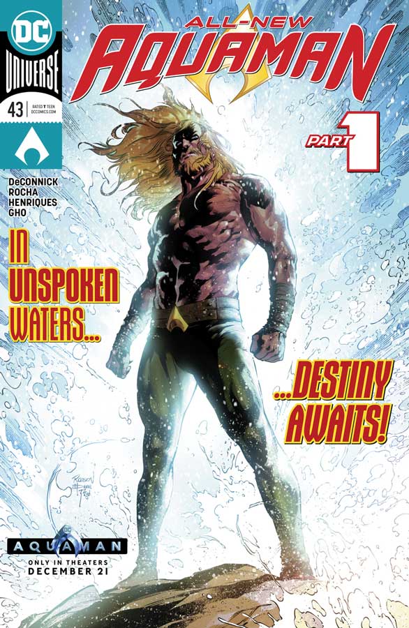
Aquaman #43
DC Comics Writer Kelly Sue DeConnick, Penciller Robson Rocha, Inker Daniel Henriques, Colorist Sunny Cho, Letterer Clayton Cowles
With a major film being released it make sense that DC would revamp this title and start fresh for both new and old readers and thankfully they didn’t go the old Marvel route and renumber the book but just point out that it’s a part one on the cover. I was pretty impressed with the approach that DeConnick takes with this first chapter and instead of a scorch and burn that a lot of new creative teams use, she take a more lets just tell a story but not throw anything previously away just yet. In a lot of ways this first outing is fairly subdued and I liked that she wants to build a new chapter for Arthur with a reset but a more soft reboot. She uses the old amnesia story trope here and while that is certainly not super original it was fine for this first chapter. While this first chapter is not going to blow you away by any means it does however give you a reason to start buying the book again to at least see how this first story arc pans out. I will say that the art team of Rocha and Henriques give the book a huge lift in the art department and this is a damn fine-looking book. Rocha really puts a great deal of detail into each panel and takes the time to make sure that there is detail in the background that really gives the book a nice heft and weight that adds greatly to the reading experience.
Is this book worth your time and money? Even though this first chapter wont knock your socks off but it was never intended to. DeConnick takes her time here to set up the story and lets both the story and the characters breath and that gets the book off to a solid start. I like that she didn’t try and reinvent the wheel here. While there are no big reveals here she does however lay solid groundwork for the book and it shows a lot of promise. With gorgeous artwork from Rocha and Henriques helps this book out immensely on the visual side. I enjoyed this first issue and I’m intrigued to see where the new team take it from here. Well worth checking out.
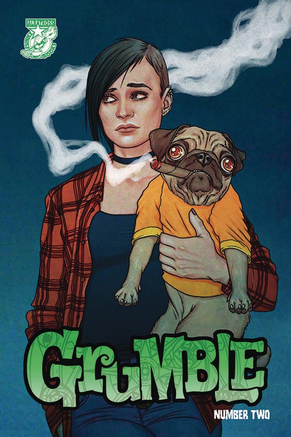
Grumble #2
Albatross Funnybooks Writer Rafer Roberts, Artist Mike Norton, Colorist Marissa Louise, Letterer Crank!
I enjoyed the first issue of this book and glad to say that the second issue builds out nicely from it and keeps a nice momentum going. While Roberts script my not be super original here he does however keep the book light and fun and makes for an entertaining read. The one thing that is done well in this second issue is the building of the characters and how he is peeling back the layers of the mysteries of them and helps the readers want to follow them on this journey. While the book is fun I do hope that Roberts will dive a little deeper as the book continues and while it’s not bad it doesn’t really add much to the average story tropes that the book is built on. I just want to see some freshness added to the mix here. The one thing that the book does have a strong footing is Norton’s artwork that does a nice job of capturing the characters emotions and is able to ramp up the action when it hits. Let’s be honest here and just say that he really captures Eddie as a dog perfectly and it adds a great deal of charm to the book.
Is this book worth your time and money? I did enjoy this second issue and is does move things forward well, I just wish that Roberts script had a bit more meat on the bone so to speak here. The minor gripe that I have with the book is that there is nothing that you don’t see coming here and that could hamper the long-term with the book. Norton’s artwork does really help this book out quite well but it can only do so much with a story that is a bit too familiar. Overall I enjoyed it but wished that it had grown a bit more.
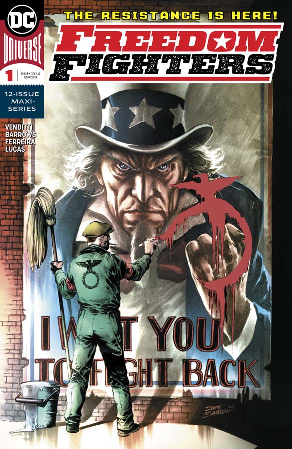
Freedom Fighters #1
DC Comics Writer Robert Venditti, Penciller Eddy Barrows, Inker Eber Ferreira, Colorist Adriano Lucas, Letterer Deron Bennett
Be forewarned that this book is really tough to read with the current state of the world because it’s the story of if the United States had lost WWII and was run by the Nazis and that may be sensitive to some with our current political climate. I know it was a tough read for me on that and another level. I grew up reading the 1976 version of the DC Comics version of the Quality Comics so I am very fond of these characters and while there have been many attempts over the years to revive them, none had been able to capture the 1970’s version that I fell in love with. Venditti gets the original team back and sets it back in the Earth-X timeline to great effect that does a nice job of adding new elements to the mix that I will not spoil here. One of the reasons that the book works is that it’s not part of the DC Universe and that allows Venditti to plot his own course here and not be shackled with the baggage that comes with that. He also doesn’t pull any punches here with this book and that not only makes it difficult at times to read but offers bigger payoffs than you normally see in a mainstream DC Comic. The one thing that sometimes these second tear books suffer from is mediocre artwork but thankfully Barrows delivers some really outstanding artwork here and gives it a great gritty realism that really seals the deal on this book. The level of detail that the art has is quite impressive and he delivers the emotions that are sometimes hard to digest but that is what makes this first issue so strong out of the gate.
Is this book worth your time and money? I was very surprised by this book and that it was that strong for a first issue. The fact that Venditti and Barrows was able to push the boundaries of the story and artwork is the big reason that it works so well. Reading this book is uncomfortable and that is why it works. Not every superhero story is pretty and neat. Sometimes they need to be hard to swallow but if done right that is a good thing and they have achieved that here. VERY RECOMMENDED!
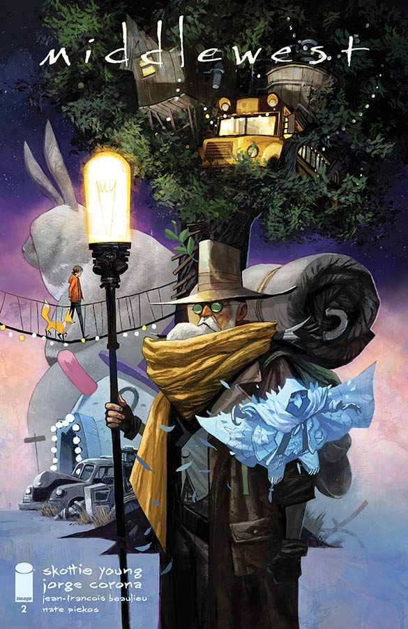
Middlewest #2
Image Comics Writer Skottie Young, Artist Jorge Corona, Colorist Jean-Francois Beaulieu, Letterer Nate Piekos
The first issue of this book really impressed me and Young and Corona don’t rest on their laurels and continue to build and develop the story. The one thing that I loved about the book is how fluid and natural the book feels when you read it. Young has given the story a nice light feel but there is quite a bit of depth to it at the same time. He also continues to raise the stakes for Able and his Fox that keeps the reader on its toes because you’re not quite sure where the story is going to take you. The basic premise of the book is fairly basic but what Young has done here is give it a fresh spin and cleaver dialogue that keeps it from feeling too familiar. He also nicely is adding new characters to the mix and Jeb is a nice addition to this second outing. Young certainly is building a wonderfully exciting world here but it’s Corona’s beautiful artwork that makes this book work. He really brings every little detail of Young’s script to life perfectly with such detail that every panel is a story unto itself. It’s the subtle emotional expressions that I really love about his artwork. It’s very difficult to capture a lot of emotions in just one panel but Corona does it with such ease here that makes this comic such a pleasure to read.
Is this book worth your time and money? This is one of those rare books that simply works perfectly. It also doesn’t try to be more than it sets out to be. It simply tell the story exceptionally well and that is why it works so well. Smart and charming story with stunning art make this book a real winner. HIGHLY RECOMMENDED!
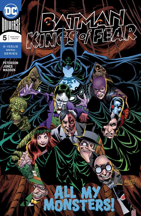
Batman: Kings of Fear #5
DC Comics Writer Scott Peterson, Artist Kelley Jones, Colorist Michelle Madsen, Letterer Rob Leigh
With all of the Batman comics being published sometimes some get a little lost in the shuffle but hopefully you have been reading my reviews of this wonderfully offbeat book that has taken a very different approach to the Batman mythology. It has been a mix of both what if and a deep psychological mind f**k that break from the traditional approach that a lot of Batman stories tell. Peterson really goes deep into Bruce’s subconscious this issue and nearly breaks the man but the real question is Scarecrow just toying with him or is he actually trying to help him. That is what has made this story so fascinating is you’re not sure what is real or hallucinations. He never takes the easy path with the story in the sense that it just a dream and that in fact this might be what is buried deep down in Bruce’s deepest depths of his soul. Peterson really plays the devils advocate story quite well here and never gives you the answers. It lets you the reader take away what you want from it that is quite impressive for a Batman story. I honestly can’t imagine any other artist that could pull off this mind trip as well as Jones has done here. There is a two page spread in this issue that will blow your mind. My favorite thing so far in this book is the way that he draws Batman’s greatest villains as normal people who really captures the essence of the characters in a way that you have never seen before that was quite delightful. As much as I am a fan of Jones work it still blows me away that he able to find new ways to draw Batman and this book has been a great tour de force that might just be his best work to date.
Is this book worth your time and money? This is one of those comics that continues to surprise me and that is pretty hard to come up with a truly unique Batman story in todays comics. Peterson and Jones are delivering a story that cuts deep and takes a uniquely different approach to Batman. It’s a book that continues to surprise and impress and quite frankly keeps you on the edge of your seat. At this point I honesty cant wait to see where it all ends next issue. HIGHEST RECOMMENDATION!
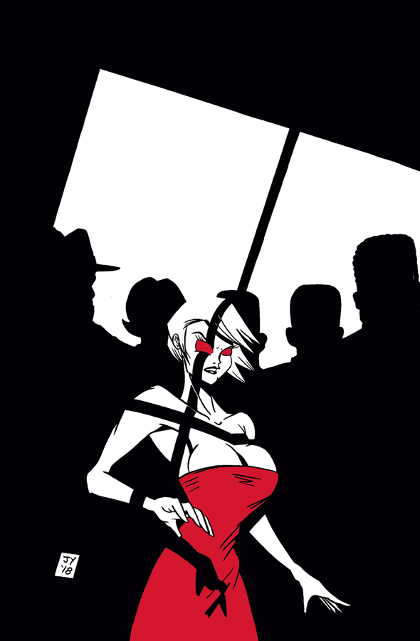
Love Town #1
First Comics Writers John Yuan and Matthew Yuan, Artist John Yuan, Digital Shading Matthew Yuan
Love Town reminds me of indy comics from the 1980’s with its black and white look and simple style but in this case the book seems to be lost in time. John and Matthew obviously are big noir fans and I did like that aspect of the book but where the book fails is on two fronts. First there are many times where there is so much dialogue that you simply get bored with panels that drone on and on. The other bigger issue is that simply not much really happens here in this first issue and certainly not enough to want you to come back again. They try to mix up the concept of noir by throwing in vampires to the mix but never really do much with it. The story pretty much just plods along and goes through the motions of the story but ultimately there is really not much weight to this basic story that doesn’t really bring anything new to either genre. I will say that I did like the artwork on the book that reminded me of early Matt Wagner or Neil Vokes and does try to make this story work and while the artwork is nice it simply can’t save a story that you simply don’t care about. It’s a shame because the book does look really nice.
Is this book worth your time and money? At a five buck cover price for a black and white comic is simply not worth it for a story that nothing really happens here. While I think that John and Matthew have a decent idea here they really never go anywhere or use the hook that they have given the noir genre. I’m all for new voices in comics but a book like this is just not going to cut it. SKIP IT!
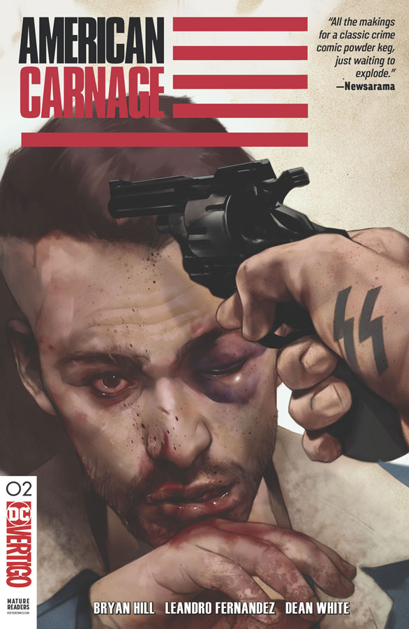
American Carnage #2
Vertigo Comics Writer Bryan Hill, Artist Leandro Fernandez, Colorist Dean White, Letterer Pat Brosseau
The second outing of this story of an underground white supremacy club does move the story along and starts to dig deeper into this disturbing world that Richard is trying to infiltrate. Hill is still setting things up here so this second round wont necessarily blow you away but it does however move the story forward nicely. What Hill does de here is try to not create or make it feel stereotypical and while it work pretty well, it’s too soon to tell where he is going to go with it. Fernandez’s artwork give the book a good visual feel and he uses a lot of noir visual elements to give the scenes a darker look that really helps with the feel of the story. There are a few times where there is some inconsistent art but nothing major that takes you out of the story.
Is this book worth your time and money? I like this book but not quite loving it. Hill is wisely taking time to unfold the story and that is working well so far. There are a few clichés that I hope that isn’t a sign of where the book is going to go with the story but we will have to wait and see. I think that the book is still worth checking out but still too early to let it stay or cut loose.
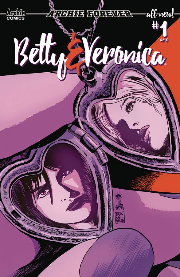
Betty & Veronica #1
Archie Comics Writer Jamie Lee Rotante, Artist Sandra Lanz, Colorist Kelly Fitzpatrick, Letterer Jack Morelli
This is a really tough one to review because I have enjoyed a lot of the new Archie universe book but this one unfortunately is not that good. On the other hand its certainly not terrible but the script by Rotante is so basic and been told a million times before that it doesn’t bring anything new to the table. It’s such a by the numbers affair that I was board the hole time I was reading it. The characters go through the motions but literally nothing happens here. The other thing that the book struggles with is the artwork by Lanz that is not bad but has a lot of inconsistencies that really interrupt the flow of the book on numerous occasions the artwork is stiff and flat. There are a few bright spots but not very many.
Is this book worth your time and money? Certainly not but if you have a younger reader that really wants to read this book they might like it but there are so many better comics to choose from that its hard to even give the book that. It’s almost like the book is stuck in a time warp of the old Archie basic storytelling but with more modern artwork. Archie has really struggled lately with their book and the quality has really gone downhill on some of their book and sadly this is just a mediocre book that just wont cut it. SKIP IT!
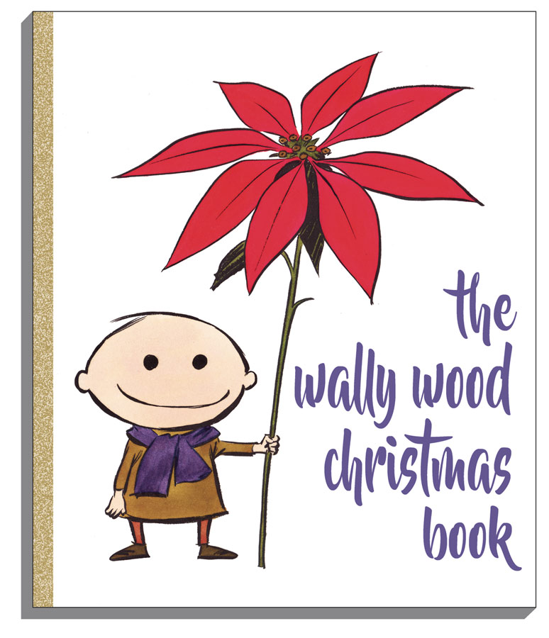
The Wally Wood Christmas Book
Vanguard Productions Writer and Artist Wallace Wood, Colorist Tatjana Wood
This is not really a comic book per say but a wonderful collection of holiday panel strips from the great Wally Wood. It mimics the style of classic little golden books that gives it an ever greater charm. Some of the work has been reprinted before but a lot of this book will be new to most readers. There are One panel and some strips along with never seen personal Christmas cards done by Wally and Tatjana. The longest story Bucky and the Christmas Caper is the longest story and one of the most charming and is the biggest win for this book because it was reprinted in Witzend collection that is great but also pretty expensive so this is a nice little treat for this book. As always nice to see Tatjana’s color work who was a staple of DC color work in the 1970’s and 1980’s. While the book is not very big it certainly delivers a great little gift for the holidays.
Is this book worth your time and money? I really love this book and for ten bucks is a real steal for a book with Wally Wood artwork. He was one of comics best storytellers and this is a great little package that is a perfect gift for anyone. This is a book that you really need to seek out and is a big win this week. HIGHEST RECOMMENDATION!



0 Comments