We’re getting to the end of the year and this week sees a big push of new comic book series releases to get to. On a side note I hope that you like the new look of the website and it should run a lot smoother now that the new infrastructure behind the scenes brings to it. There are a lot of books this week so let’s get cracking.
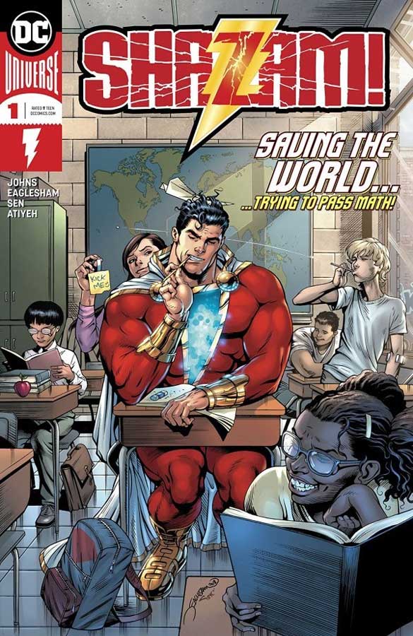
Shazam! #1
DC Comics Writer Geoff Johns, Artist Dale Eaglesham, Colorist Mike Atiyeh, Letterer Rob Leigh, Mary Back-Up Story Artist Mayo “Sen” Naito
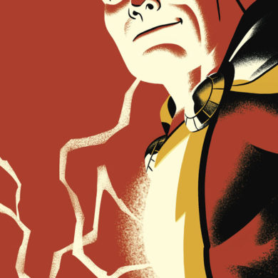
The big red cheese is back after an all too long absence from the DC Universe with his own book and gets off to a good start. While I like Johns as a writer, I am not one to think that he is as great as a lot of readers think but I never hold that against him. In a way this first issue is both good and some missed opportunities for new readers. Johns only spends three pages to semi recap his origin so some new readers might be a little lost out of the gate and the other thing is that this first issue seems to be more in line with the upcoming feature film of the same name with what we have seen so far in the trailers. As a long time reader of Captain Marvel (his real name not Shazam) I’m not sure that I like the new version of the Marvel Family and that they have all of these different superpowers but it’s only the first issue so I will cut the book a little slack for now. The one thing that Johns does get right is that the book has a good sense of humor and doesn’t forget to have fun and that does give it a great charm that goes a long way. He also does a decent job of introducing the cast that is pretty big and while we don’t learn a lot right out of the gate here, he makes sure that you at least get to know their names and a bit about their personalities. The hands down big win for this book is Eaglesham’s gorgeous artwork that capture all of the right elements that this book needs. He brings great emotions to the characters and gives this book a great weight visually that captures both the great super heroics but also the more subtle little elements that give this book a warm charm. There is a back up story by Johns and artist Naito that gives more back story to Mary and how she came to live in the Vasquez Foster Home and even throws in a nice nod and wink to some other characters from the Captain Marvel history that I dare not spoil here. Naito gives the story a nice storybook visual quality that makes this short story work well and fills in some gaps from the main story. The one thing that I do have to touch upon here is a complaint that I have had recently with Marvel in that a lot of their new big first issues have has a higher cover price but with mostly filler back up stories that don’t add much to the main story and while this book is only 6 pages longer than a standard 22 page $3.99 and $1.00 more cover price, at least in this case the 8 page back up story does fit with the main story and adds some background and story to one of the cast members. Unlike the recent Uncanny X-Men that was over bloated with backup stories that gave little to justify the $7.99 list price. In this case the one extra dollar on this book isn’t the best but at least it doesn’t rake you over the coals on your budget.
Is this book worth your time and money? I did like this book and while I’m not totally sold on the changes, I will say that it’s too early to tell how much has changed due to seemingly bringing this book in line with upcoming film. Johns is a big fan of Shazam and I have faith that he will do him justice in this new comic series. This first issue gets off to a good start in both story and the wonderful artwork. The next few issues are going to be the key but this first issue is worth checking out and buying this week.
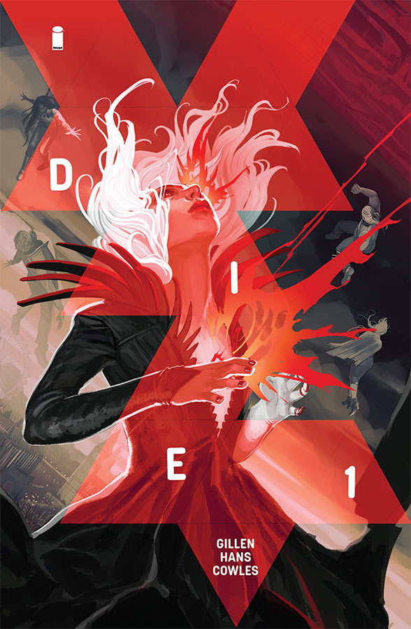
Die #1
Image Comics Writer Kieron Gillen, Artist Stephanie Hans, Letterer Clayton Cowles
This is a book that I nearly didn’t buy this week but was a huge surprise. It’s a story that starts off as sort of murder mystery type story (not an actual murder but the framework of said story) that goes along and in the last act of this first issue throws in a great twist that will have you both shocked and impressed that it was nothing that you expected from the set up of the story. Gillen does a great job of balancing exposition while still moving the story along very well here. What he wisely does is take the time to introduce the cast to the reader so by the time you’re at the end of this first issue, you as the reader care about them and are willingly along for the ride. So many writers have a hard time balancing these elements but Gillen handles it with ease here in this first issue and does the rare thing of getting you excited for more of the story. It’s one thing to have a solid story but you need an artist that can bring it all to life and Hans is the perfect choice here. With the strong fantasy elements in the story she gives the book a great etherial quality not only those elements of the story but she also gives great heft to the characters and heart and soul so that you care about them in the story. Her painted work here is one of the big reasons why this book works so well.
Is this book worth your time and money? To say that I liked this book is a real understatement. The big reason this book is so good is that Gillen really infuses the story with depth and heart and makes sure that you care about the characters, and while we are just starting to know them and the story he gives you a reason to care and that is a big win for this comic. When you throw in Hans spot on gorgeous artwork you have a real winner here. HIGHLY RECOMMENDED!
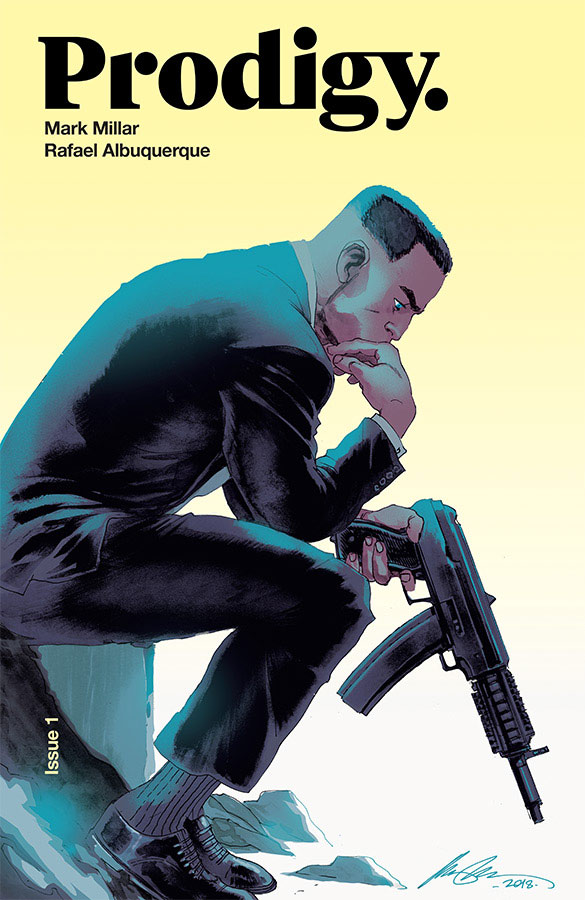
Prodigy #1
Image Comics Writer Mark Millar, Artist Rafael Albuquerque, Colorist Marcelo Maiolo, Letterer Pete Doherty
Oh boy another new Mark Millar comic that is really a film or television script for Netflix in comic book form. While I understand that having your comic made into another medium is the dream of all comic book creators but it should be made as a comic book first and foremost not as an afterthought. Once again that is what Millar is doing here and you can practically see Will Smith doing this project as a film. The problem that I have will Millar is that he isn’t even trying anymore. He is telling basic structure here and note very well on top of that. There are many problems here and the biggest is that the main character Edison Crane is flat and two-dimensional and not very well fleshed out. He is the rich guy that excels in everything and is simply bland and boring just like the flimsy script that Millar has thrown together here. The first issue reads more like a pitch for a movie than an actual story. By the end of this cliché filled first issue there is very little care about here and the only thing that I liked was Albuquerque’s artwork that is great but can’t save this truly half assed story. Visually the book is great and that makes it all that much more disappointing that it’s absolutely wasted here on this mess of a story.
Is this book worth your time and money? I would say that this book is a hot mess but that would be saying that it’s actually good in the story department and that is certainly not the case here. Even as good as Albuquerque’s artwork is here there is no reason for buying this book. SKIP IT!
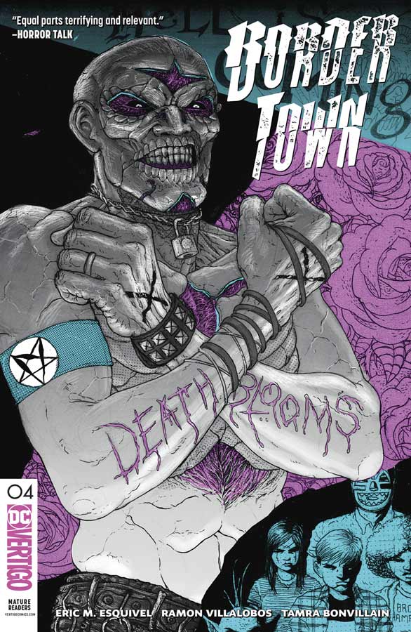
Border Town #4
Vertigo Comics Writer Eric Esquivel, Artist Ramon Villalobos, Colorist Tamra Bonvillain, Letterer Deron Bennett
It’s been a while with a comic that has me waiting each month for the next chapter of the story but Border Town continues to deliver on every level and delivers on both the story and artwork that makes each issue a pleasure to read. What has impressed me the most about this book is how Esquivel has taken the time each issue to peel the layers back of the characters so that we are highly emotionally invested in them so when all of the crazy shit going on around them happens you are in it with them for the ride. Esquivel strength as a writer is in that he not only cares about the characters but passes that on to the readers so that we have that same passion about the story. While there are a lot of timely and social commentary that he puts into this book, it never uses it as a crutch or lets it overwhelm the story. He lets it become part of the mythology that he is creating here with the story and in a strange way it’s both timely and timeless. It’s hard to continually praise Villalobos’s artwork because he has already blown me away with his artwork but he continues to surprise and impress with each passing issue. He just keeps getting better as this comic goes along and finds new ways to blow your mind visually. Bonvillain’s color work on this book is top-notch and this issue she really takes it to a whole new level that a lot of readers may not notice and that is a huge complement. The color should never stand out per say but compliment the line work but bring it to the next level and that is what she is doing with this book.
Is this book worth your time and money? This comic has really shot to the top of the must read list every month and is in the running for one of the best comic books of the year. Esquivel and Villalobos are really firing on all cylinders on this book that is not only a real treat each issue but has you on the edge of your seat to see where they take it in the next issue. HIGHEST RECOMMENDATION!

Laguardia #1
Berger Books/Dark Horse Comics Writer Nnedi Okorafor, Artist Tana Ford, Colorist James Devlin, Letterer Sal Cipriano
Laguardia is one of those books that has some really good ideas but never quite gels together as well as the concept. Okorafor is a well-respected writer and as with her recent book at Marvel Shuri for me struggles a bit with the structure of a monthly comic book. Part of the issue with Laguardia is the pacing and the denseness of the script. It’s didn’t flow as well as I would have liked it to. I get what she is trying to get across here with the story but the characters are not well fleshed out here in this first outing and I didn’t connect with the characters as well as I would have liked. She also throws a lot of ideas out in this first issue but it has a disjointedness as you read it and parts were a little boring. Ford’s artwork is good but there are a few times where there were noticeable inconsistencies here and there that were a little distracting but overall the book looks nice and she did help the story move along visually that helps out considerably.
Is this book worth your time and money? When you do a comic that relies heavily on social commentary you have to go one of two ways with it. Either go full on deep and heavy or use it to enhance a story with basic tropes. This is where the book struggled for me was that it wants to be both but never served either side well. While the book has some intriguing ideas I’m on the fence on this one. I will give Okorafor for trying something different but not sure it’s going to work for a lot of readers though.
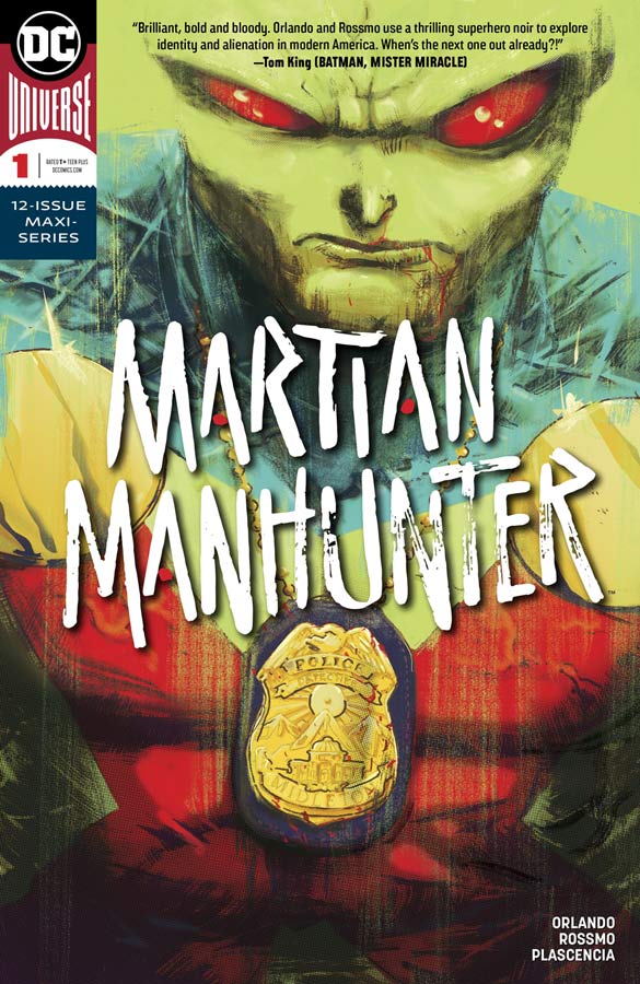
Martian Manhunter #1
DC Comics Writer Steve Orlando, Artist Riley Rossmo, Colorist Ivan Plascencia, Letterer Deron Bennett
I’ve always had a soft spot for J’onn J’onzz aka The Martian Manhunter and this new series get a lot right out of the gate with just a few minor bumps in the road. What Orlando gets very much right is that J’onn is a detective and he uses that to his advantage right out of the gate and with his powers makes him one hell of a detective. This is the thing that I loved about this first issue but on the flip side the Mars sequence in the middle of the story was a bit on the convoluted side. On the one hand I’m glad that his is diving into the past with J’onn and telling stories from his past on Mars. I just felt that part of the story was a little disjointed and didn’t have the flow that the detective part did. That is not to say that it ruins the book but just slowed the flow a bit. Hopefully this will flow together better as the series goes along. Rossmo’s artwork on this book is outstanding and is unique and stylized that gives the book a very outside the mainstream look but that is why it worked so well. Rossmo visually takes great risks here and it really pays off with the look and layouts for the artwork. He really pulls out the stops on the Mars sequence and there is so much to take in that it’s nearly overwhelming. Plascencia’s color work follows Rossmo’s lead and takes chances but greatly complements the line work here and pulls the visuals of the book together nicely.
Is this book worth your time and money? The few minor issue that I had with this first issue should not turn you away from this book. Orlando gets nearly everything right on this first issue and is taking this book in a great direction that veers off the mainstream path and that is a good thing. There is a lot to explore with this character and with Rossmo’s gorgeous and wild artwork this is book that is one to watch.
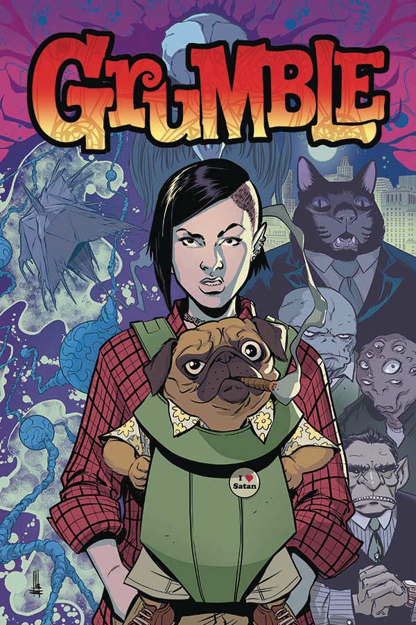
Grumble #1
Albatross Funny Books Writer Rafer Roberts, Artist Mike Norton, Colorist Marissa Louise, Letterer Crank!
Grumble is a story that you have read a million times before and while there are a lot of familiar tropes here in Robert’s script it has a charm that will win you over by the end of this first issue. What he does here is give the basic story enough twists to make you forget that the story is pretty basic but where he does it right is with the snappy dialogue and let’s be honest a talking dog in a story is alway a plus for a comic. He also give the story a nice pace that moves the story along for a nice read. Norton does a nice job on the artwork and the only minor complaint is that there were a noticeable lack of backgrounds at times that for me was a little distracting but not fatal to the overall look of the book. The one thing that he does quite well is with the facial expressions on the characters and he really nails it with Eddie as a dog because animal expressions are very difficult to pull off well and Norton does that perfectly here.
Is this book worth your time and money? I think that Roberts and Norton bring a lot to this basic story and give it great charm and shows promise and while it’s not going to blow you away, it never set out to do that. The one thing that it does do is gives you a reason to come back for a second outing and shows a good amount of promise. There is always a talking dog to look forward to.
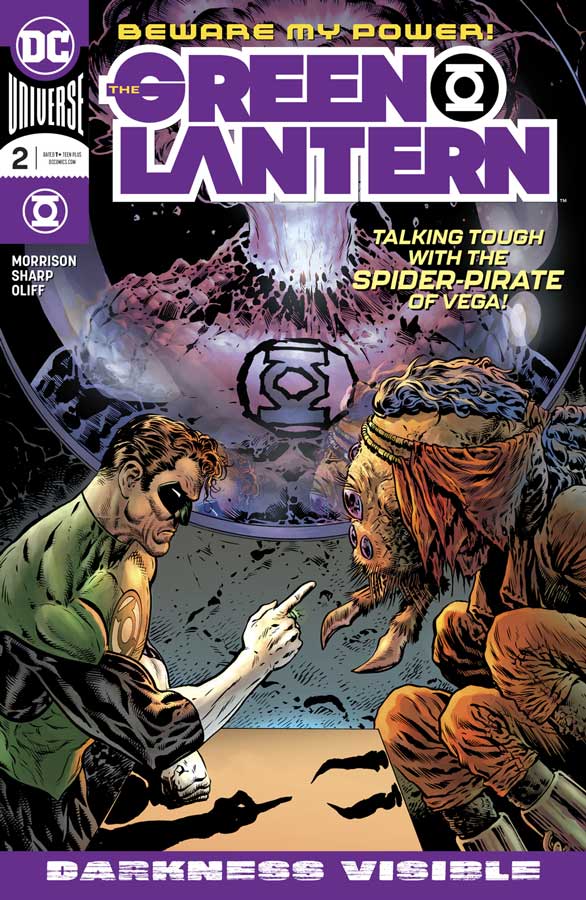
The Green Lantern #2
DC Comics Writer Grant Morrison, Artist Liam Sharp, Colorist Steve Oliff, Letterer Tom Orzechowski
This is the Green Lantern book that I have been waiting for years. Morrison has taken all of the best elements from the history of the characters and mythology and blended it into a deep and story that gets everything so right this early on in a series. The one thing that I am really loving is not only the fragility of Hal Jordan but the vast Green Lantern Corps that can be anything or anyone and Morrison is going way outside the box and not using the usual suspects of the Corps that we tend to see far too often. I mean he’s got a Green Lantern that has a volcano for a head and it really does get much more better than that (oh I’m sure that Morrison has much more up his sleeve than that). He is also not afraid to get messy and shows that nothing is sacred in that he really amps up the stakes with throwing characters under the bus to make the risks of the story far greater than most writers are willing to take it. While the script here is pretty dense it never drags or makes the readers feel over whelmed. It is however a book that you need to let breath meaning that you should take your time to let it wash over you and not rush things. When you have a writer like Morrison go off the tame story train you must have an artist that can keep up with him to not only deliver the scope of the vastness of an epic story like this but capture all of the little elements like Hal sweating because he hates spiders and has to interview one that is bigger than he is and that is where Sharp shows that he is not only the perfect match but accepts the challenge and goes even further with it. He is not afraid to take chances with the art in both layouts and characters to make this book feel so epic and yet personal and emotional heartfelt. He also will blow you away with the epic space opera feel of this story and that he can capture the huge scope of Planet Oa. But let’s be honest anyone that can draw a volcano for a head and make it seem normal is a brilliant artist in my book. I have to hand it to Oliff who is not only a great color artist but is able to keep up with Sharp’s line work and in this issue that is a truly Herculean task indeed.
Is this book worth your time and money? This is a rare case of the second issue nearly blowing the first issue away and that was an amazing start to this series. This is a grand space soap opera but the reason that it works and sets it apart from the rest is the emotional core that Morrison is infusing this book with and Sharp, Oliff and Orzechowski rounding out the creative team has turned this into the dream team. It shows that you can still do a mainstream superhero comic but go deeper than most are able to achieve. In just tow issue that have se the bar very high and I can wait to see where they are going because the end of this second issue will simply blow you away with the raised stakes in the story. HIGHLY RECOMMENDED!
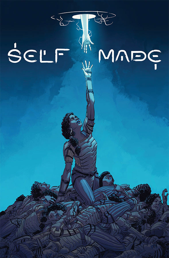
Self Made #1
Image Comics Writer Mat Groom, Artist Eduardo Ferigato, Colorist Marcelo Costa, Letterer Troy Peteri
Self Made is one of those comics that has some good ideas but never quite takes off with the first issue. I will say that Groom does have some decent ideas here but it’s also concepts that have been told before and he doesn’t bring much of a new spin to the concept. Sure the twist at the end of the issue wasn’t expected but that is where the problem is because at that point you realize that all of the things that you thought were one thing are now not that way and then you just find out that it was something that you have read many times before. The biggest flaw is that Groom doesn’t bring much new to the concept and that is where it misses the mark. The one thing that was nice was the artwork from Ferigato that delivers great detail to the story and does deliver the emotions of the story quite well here. He really does his best to hide the basic story tropes here and he pulls that off nicely but once the reveal is delivered then it just becomes nice art for a mediocre story.
Is this book worth your time and money? The book is far from a train wreck but unfortunately the story is just average and not all that compelling. With so many comics being published this book is simply going to get lost in the shuffle and forgotten. SKIP IT!
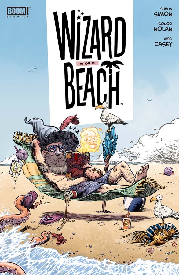
Wizard Beach #1
Boom! Studios Writer Shaun Simon, Artist Conor Nolan, Colorist Meg Casey, Letterer Mike Fiorentino
This is one of those comics that I’m not quite sure what to make of it. On one hand there is a lot to like here with the concept and the wonderful artwork. On the other hand the story is very disjointed and not sure what is really going on. I will give Simon credit that there are some really good ideas here and quite a lot to like but honestly I’m not quite sure where he is going with the story. He throws a lot out in the story here but he never fleshed out the characters as well as one would like. The way that he formats the story with the breaks in the chapters ends up being on the awkward side of things and really interrupts the flow of the story. The one thing that the book does have going for it is the artwork by Nolan that has an underground/Mad Magazine feel and look that really help sell this book. The shame is that the visuals try to steer things in the right direction but with the flow of the script not working well ends up being more frustrating and ends up making this book a disappointment. It’s a shame because I really loved the artwork on this book.
Is this book worth your time and money? I really wanted to like this book but honestly I’m not quite sure what to make of it. It’s not that its bad but Simon structure of the story is all over the place and I never really connected with any of the characters and that is a big flaw in this book. I might give the second issue a chance but its going to have to convince me that its going to be worth it.


0 Comments