Well its a new year and it was a huge week for new comic books. With some great new comics and many returning ones made for a lot of reviews so let’s get started.
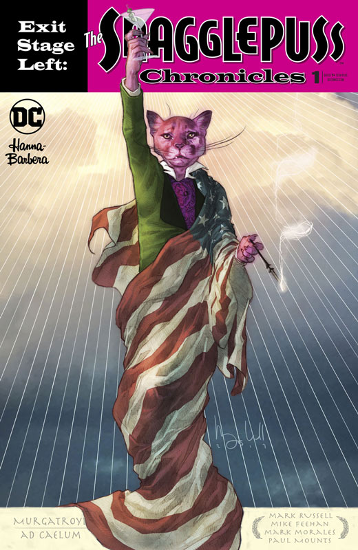
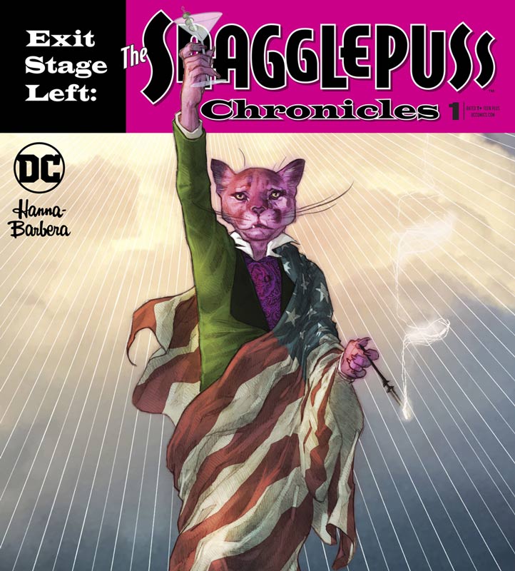
Exit Stage Left: The Snagglepuss Chronicles #1
DC Comics Writer Mark Russell, Penciller Mike Feehan, Inker Mark Morales, Colorist Paul Mounts, Letterer Dave Sharpe
After the wonderful short story in the Suicide Squad/Banana Splits Crossover last spring that Flintstones writer extraordinaire Russell gave a great new twist to Snagglepuss that really had me excited for this mini series and picks right up from that story. While you don’t necessarily need to read that to understand this first issue, it would be good to read it before hand to fill in a few things. Russell’s brilliant run on the Flintstones proved that he has a knack for the characters in the Hanna-Barbera and gives them a great new spin without forgetting what made the characters so beloved in the first place. While there are old timers that are going to bitch about the changes that Russell has made with Snagglepuss makes perfect sense. Having him as a southern gay playwright set in the 1950’s has a lot of great overtones and period elements that adds a great backdrop to the story. Russell weaves all of these elements into a great story that gets off to a great start in this first issue. The other fun thing that he plays with is the anthropomorphic mixing with humans gives it a natural feel and adds some interesting elements to the story. Feehan and Morales do a very nice job on the artwork and blend the two worlds together nice and seamlessly. The most impressive thing is that they give some of the human characters a little animal facial traces that really give the book a great look and goes back to the seamlessness of the visuals. There were some time where the backgrounds were a little sparse but colorist Mounts does a good job of helping it not to stand out too much and complements the line work really well here.
Is this book worth your time and money? There is a lot to like here and I was very impressed with Russell’s take on the characters. While some will find it not as out of the gate like his Flintstones and that is a good thing here. This is a much deeper story that he is telling here and there are a lot of subversive undertones to explore. The Flintstones was a broader comedy with social commentary, but here he digs a lot deeper and more dramatic. With solid artwork and wonderful coloring brings the whole comic together very nicely here and am excited to see where they take it. VERY RECOMMENDED!
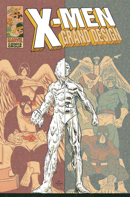
X-Men: Grand Design #2
Marvel Comics Writer/Artist/Colorist/Letterer Ed Piskor
The first issue of this book really blew me away and while I did love what Piskor did with this second issue, there was a minor gripe I had with this issue. The first issue took it’s time to tell the story and fill in a lot of elements that Piskor put in between the original stories. This issue is so crammed with more issues to cover than the first never gave the story time to breathe like the first issue. I love what Piskor does with this book but honestly this issue should have been two full 40 page issues instead of one. The story is fast and tends to be a little disjointed at times because of it. He is covering so much more ground in this issue that it was very overwhelming when reading it and I had to go back just to help digest it all. With that being said, I still love what Piskor is doing with the mythology and his unique story and art style gives this book a great visceral feel and look unlike any other Marvel book on the shelves and that is a very good thing fo them now. He also taps into that great nostalgia element that makes you remember how great that the X-Men were back in the day, and all of the great creators that he is paying homage to with this book. His wonderful underground art style gives this book a great feel that you rarely get from a mainstream Marvel comic. The artwork really adds to the fun of reading the book and makes you feel like a kid reading the X-Men for the first time.
Is this book worth your time and money? Piskor has really tapped into a great story here. While it’s filled to the brim with nostalgia, it also reminds you that sometimes the old comics have a certain magic that has mostly been lost over time and this comic reminds us of why we love to read comics in the first place. I am excited to see the next set of book tackle the New X-Men of the Wein/Claremont/Cockrum/Byrne era that is my X-Men. While I would have wished that he had not crammed as much story into this issue compared to the first, it’s still by far one of the best X-Men stories in years and still HIGHLY RECOMMENDED!
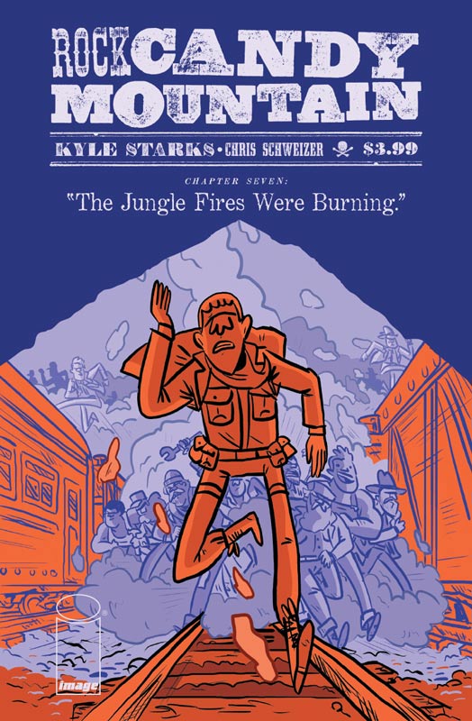
Rock Candy Mountain #7
Image Comics Writer and Artist Kyle Starks, Colorist Chris Schweizer
With the final chapter in sight Starks starts to pull all of the story threads so far together and this issue is filled to the brim with so many great things that I was nearly exhausted from the story. The one thing I have loved about this book is the layers that Starks has delivered with the story in each issue that has made this comic such a joy to read and care about all of the characters in it. You are so invested with Jackson and Slim and they are back together again because they have always needed each other whether they knew it or not. The comic has been a great puzzle of mystery but now that the final pieces are falling into place it’s going to be a finale that I’m very much looking forward to. One of the best thing about this issue is that there is a lot of fun humor that tempers the drama of the story quite nicely and gives the book a great emotional range that you don’t see often enough in comics today. I’m a big fan of Starks art style that adds so much to this story. It looks simple on the surface but it’s those subtle details and emotions that he infuses into the art that gives the book a great visual tone. As always Schweizer’s color work on the book gives the line work a wonderful touch that completes the visual mood that makes this comic such a pleasure to read.
Is this book worth your time and money? With only one more issue to go Starks has packed this issue with a lot of fun, action and drama that set the stage up perfectly for the final showdown with the devil and the secrets to Rock Candy Mountain. It’s been a great ride and this issue shows the care that Starks has put into this book from day one and it’s really paying off as you can see with this issue. HIGHLY RECOMMENDED!
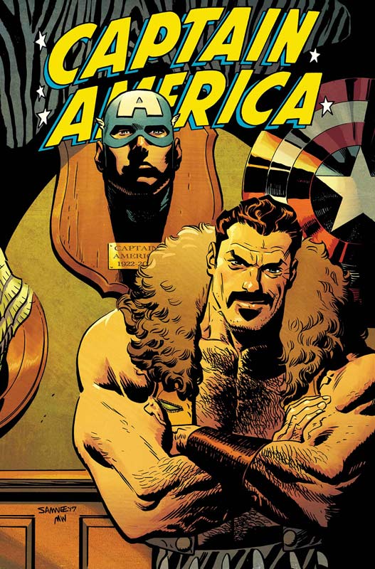
Captain America #697
Marvel Comics Writer Mark Waid, Artist Chris Samnee, Colorist Matthew Wilson, Letterer Joe Caramagna
With two solo stories under their belt Waid and Samnee give us the first multi issue story and delivers another win for this comic. It was nice to see Kraven as the villain of the story because he’s out of the usual wheelhouse of Cap’s usual rogues gallery that gave the story a nice fresh feeling and out of the comfort zone. I love that they tell a story that has a lot of clichés thrown in but somehow they make it feel fresh and exciting. Waid has always excelled at telling stories that are simple and to the point and that is why they work so well here. He doesn’t try to oversell it or overstuffed it with unnecessary story elements but just keep it on track and fun. It surprisingly has a lot of subtle depth to it at the same time that while it’s a fairly quick read it sticks with you and gives you a satisfied reading experience. Samnee has been his partner in crime and I can’t think of a better artist on the book than him. There are many time in this issue where there is no dialog but Samnee has to convey the story with his artwork and that shows what a great talent he is and how in sync they both are on the book. It’s amazing to believe how in such a short time on the book they have returned the book into a must read and restored faith in a character that had been nearly ruined by the previous run on the book. I can honestly say that I love reading Captain America again.
Is this book worth your time and money? Waid and Samnee are simply delivering a great superhero comic that won’t necessarily change the face of comics but it does however deliver a fun and satisfying reading experience and make you fall in love with what makes Captain America such a great character. RECOMMENDED!
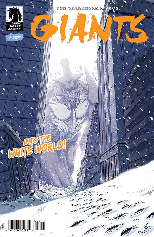
Giants #2
Dark Horse Comics Writers, Artists, & Lettering Carlos and Miguel Valderrama
I really loved the first issue of this book and while the basic structure of it is not original Carlos and Miguel have found a way to make it feel fresh and new and that is saying a lot of their talents. I like that they are taking their time to let the story unfold at a nice pace that is allowing the story breath and not take the easy road of action and style over substance is the reason that the book is working so far. This issue we start to get introduced to some of the supporting cast that join Gogi’s story and give him support. This issue story is a bit cliché but still works well and hopefully they will expand things out over the next few issues. The book really shines with the line art and their color work that gives the book a great look and feel that helps it get over the basic story tropes and helps it get a better footing. Their art is gorgeous and they are able to go from both the dramatic and action with ease that gives the book a great flow while your reading it.
Is this book worth your time and money? While I would have liked a bit more original story elements in this issue, I do think that the book is still solid and the next few issues will tell if they can continue to build on the story. While the book wont necessarily blow you away it does however deliver with a solid read with wonderful artwork. I like the book so far and cant wait to see where they take it from here.
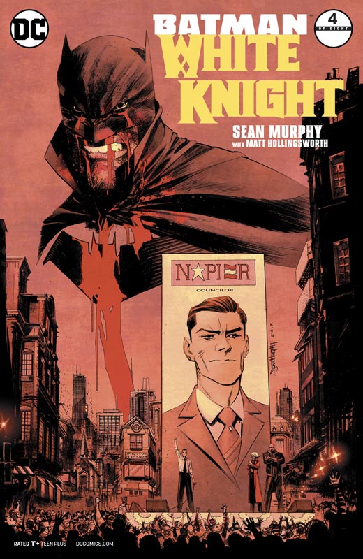
Batman: White Knight #4
DC Comics Writer and Artist Sean Murphy, Colorist Matt Hollingsworth, Letterer Todd Klein
We’re at the halfway mark on this book and Murphy continues to surprise and impress with the story on this book. Just when you think that you know where the story is going to go, he takes it in a direction that you never see coming. He also keeps the core of the characters but gives them new and fresh twists on them that wonders who are the good and who are the bad. This story is one that is dealing with the grey area of storytelling that can be tricky but Murphy handles it all with ease and charm that always makes sure that it’s grounded in the chaos of the story. As he peels back the layers of the story that slowly wash over you while your reading it and find that you’re rooting for characters that you would have never thought of before. Where the book comes together is with his stunning artwork on the book that is very dense but has a wonderful flow that captures the world of Gotham in a way that we have never quite seen before and his layouts are simple brilliant. While it seems that Murphy is doing all of the heavy lifting it’s Hollingsworth amazing color work and Klein’s spot on lettering that add the perfect icing to this amazing and wonderful cake.
Is this book worth your time and money? What Murphy brings to this book is gravitas by taking the best of the Batman mythology and giving the story a fresh spin and look to something that we haven’t quite seen before. He doesn’t try and reinvent the wheel here but simply tell a great story and bring his gorgeous artwork along that is making it one hell of a ride! HIGHEST RECOMMENDATION!
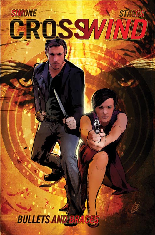
Crosswind #6
Image Comics Writer Gail Simone, Artist Cat Staggs, Letterer Simon Bowland
The final chapter in this surprising little book has an unexpected low-key ending and that is not a bad thing. Simone had set things up nicely along the way but I love how you expect this big gun fight at the OK corral and taking the a different path makes this story that much more satisfying. She takes the simple body switch story and gave it a nice new coat of paint and while it didn’t blow me away, it did however deliver a fun ride. She did however come up with a nice explanation for the switch that will lead to more stories with these characters down the road. I think one of the reasons why the story worked well was that Simone took the desire for us all to be able to see what it would be like to be the other sex and wisely didn’t overplay it or exploited the concept. The big win for this series has been Staggs gorgeous artwork on the book and gave the book a great look that complemented the story perfectly. What has always impressed me with her artwork is the way that she captures facial expressions with the characters that really gave this story a striking look and feel. The other thing that I loved about this book is that its done by female creators. I have always been a firm believer that both women and men are just at good as writing comics but there are so few women writers and artists that has really limited real diversity in comics. Simone and Staggs proves that women can deliver a solid comic book that works for everyone.
Is this book worth your time and money? I rather enjoyed this book and while it’s not the greatest comic book ever, it did however deliver a solid reading experience with gorgeous artwork. They took a basic story trope and gave it some nice twist and turns for a fun little read. If you missed this monthly comic the trade should be out next month and you will be about to read it in one shot. It’s worth checking out.
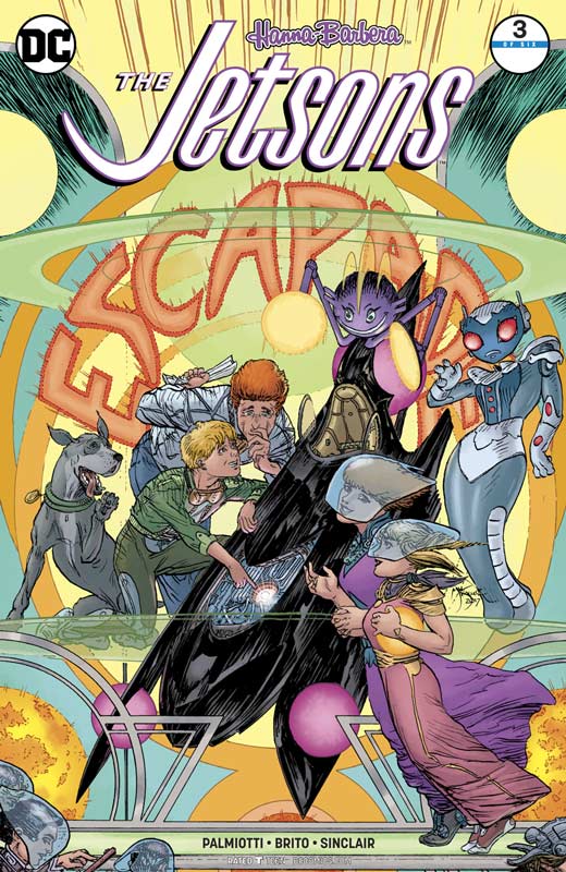
The Jetsons #3
DC Comics Writer Jimmy Palmiotti, Artist Pier Brito, Colorist Alex Sinclair, Letterer Dave Sharpe
The Jetsons has been an interesting ride so far and while I do like a lot of it there are times where it seems to be a little drawn out but not in necessarily a bad way but just seems to sag at time getting to the point of the story. I will give Palmiotti credit that he has captured the world of The Jetsons nicely and has done a nice update on them. I think that the problem is that the focus of the story hasn’t quite jelled as well as I would have liked with the story being at the half way point. This issue finally starts to get to the mystery of what is going on but again never quite answers any questions and could have been a bit tighter story. This book might have worked better as a four or five issue series instead of six. Brito’s artwork continues to be on the inconsistent side but he does really nail the underwater scenes and the George mind link sequence that is some of his best artwork to date on the book. Where he struggles is with the human characters in both the faces and the bodies that sometimes have strange anatomy or bad angles. He does improve with each passing issue and that is a big plus for him but he might have benefited from a strong inker. Colorist Sinclair does really save the day with the overall look of the book with adding great color that helps hide some of Brito’s mixed line work.
Is this book worth your time and money? The book started off fairly strong but has stumbled a bit with the second and third issue. The book has not gotten bad or anything but seems to be sagging in the middle of the story and needs to be tightened up a little. Brito’s artwork is good but the inconsistency do stand out and he is improving so that is helping. Overall I like the book I just wish that I loved it. I will stick with it because there are more positive than negative but it’s becoming a bit of a mixed bag at this point.
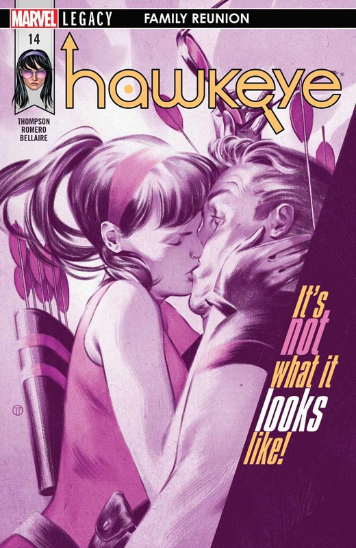
Hawkeye #14
Marvel Comics Writer Kelly Thompson, Artist Leonardo Romero, Colorist Jordie Bellaire, Letterer Joe Sabino
It sad to know that there are only two more issues of this book and its a real shame. I honestly don’t buy that many Marvel books currently because there quality is pretty piss poor now and this book came along and I gave it a shot and loved it but apparently not enough others felt the same way. Thompson has made this book not only fun but handles the action with ease and with strong character development along the way. While there is a lot of humor in the book, it’s far from a humor comic like The Unbeatable Squirrel Girl. What she has infused in the book is character and heart and that is why the book is so great. She gave you a reason to care about the cast but never forgot that the book was a superhero first and foremost. What is the most depressing part is that now that she had both Kate and Clint together she was delivering some really great story elements with the chemistry between having two Hawkeye’s working together. This issues story was a prime example of what direction she was taking the book in and it was a great element that sadly wont be fully explored. The other big win for the book is Romero’s wonderful artwork on the book. He was able to really capture the tone of what Thompson’s script needed and always captures all of the emotions perfectly with his art. This issue has one of my favorite scenes to date with the flashback of young Kate and her mother and it perfectly captures Romero’s ability to perfectly capture the subtle detail and emotions of Thompson’s script but shows how Bellaire’s color work on the book is second to none and why she is one of the best colorist in town. They really are a perfect team of line work and color and how they complement each other and the book. There’s a lot of emotions in this issues story and Romero and Bellaire capture it beautifully.
Is this book worth your time and money? This issue makes the ending of this book that much harder. It’s such a shame that more people didn’t read this wonderful comic. Thompson, Romero and Bellaire have delivered their best each and every issue and adding Clint to the mix was taking the book in a great direction. If you haven’t been reading this book than shame on you and that is why Marvel has been struggling lately is that Marvel zombies wont read a book like this and because Marvel has burned so many others they wont try a book like this. This issue is a great one and its sadly going to be missed when it ends. But for now lets just thank and enjoy the ride. VERY RECOMMENDED!




0 Comments