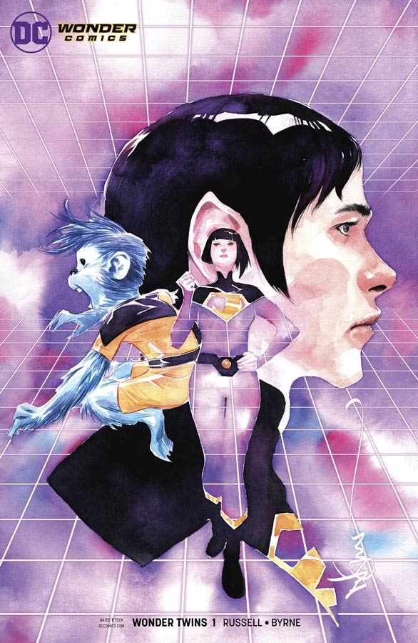
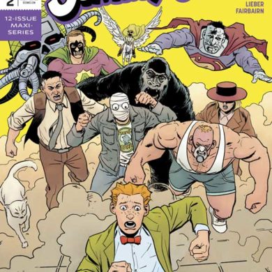
Wonder Twins #1
DC Comics/Wonder Comics Writer Mark Russell, Artist Stephen Bryne, Letterer Dave Sharpe
Fans of the Superfriends Saturday morning cartoon fondly remember the Wonder Twins but it was an odd choice for one of the new Wonder Comics line of all ages comics to say the least but with Russell at the helm you know its going to be a wild ride. More known for his more edgy comics like Prez, Flintstones and Snagglepuss his take on these characters still has all of the wit and humor that he is known for but keeps it in more of a PG level that does get a little racy but make sure that the humor of the book is first and foremost. While there was no origin story for Zan and Jayna on the Superfriends series there was one created for the 1977 comic book series but Russell has crafted a brand new origin for them and I think that his version is spot on. He also gets the whole awkward shapeshifter powers out of the way and dives straight into that their abilities are on the absurd side and he get quite a bit o milage out it just in this first issue. He also uses the Justice League members quite well and takes a far less serious approach to them that really gives this book a great charm. What works so well with Russell’s script is that if your familiar with the Superfriends show then there are a ton of inside jokes that are brilliant for people like me but Russell is carful about keeping new readers on point with the story that is presented here. He also gets all of the things that goes with being a teenager and that high school is harder than being a superhero. As much silly fun there is to be had here the one thing that Russell makes sure is that you get to know and care about Zan and Jayna and this is why this book is so brilliant. One thing that a lot of all ages comics struggle with is artwork that fits the story. Sometimes it’s to childish and sometimes the artist is new and struggles with pulling off a smart script like this one but thankfully Bryne not only picks up on every little detail that Russell puts into the story but really captures the visual charm and satire that makes it work. He makes sure that visually the book is firmly grounded in the superhero world but is able to capture the subtle emotions and facial expressions that take this book to a whole other level. Bryne also makes some really wise color choices with his artwork and it really complements his line work and gives it a fresh and fun feel.
Is this book worth your time and money? I had high hopes for this book with both Russell and Bryne as the creative team but also my childhood memories of the Superfriends cartoon and thankfully this book not only delivered but truly exceeded my expectations. Russell was a perfect choice for this book because of his understanding of satire but he also gets what it’s like being a teenager and that plays very well here. He also delivers a book that is fun and that is very sorely missing from DC now and this book works on every age level and that is a huge plus that it will please both young and old. Bryne artwork on the comic is both beautiful and inviting and captures all of the charm and fun that Russell brings to this book. While some might write this book off as a silly kids comic book they are sadly missing one of the best written and looking books of the year and it’s only February. HIGHEST RECOMMENDATION!
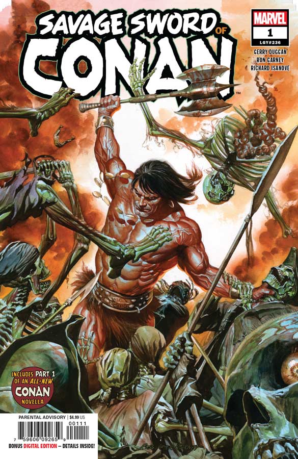
Savage Sword of Conan #1
Marvel Comics Writer Gerry Duggan, Artist Ron Garney, Colorist Richard Isanove, Letterer Travis Lanham
This second new series of Conan comics from Marvel gets off to a solid start and as with the main Conan title Duggan doesn’t try and reinvent the wheel here. Duggan simply tells a solid story here and hits all of the notes that make Conan such an enduring character over the years. It has action, blood, and magic and Duggan script has a nice solid pace to it and makes for a nice read. What he does so well with the script here is that he blends all of those elements together is an intriguing story that gives you a good reason to come back for a second issue. Garney is a perfect artist for the book because he brings an old school classic comic book look to the book that perfectly fits this story and book like a glove. He doesn’t try and be flashy with the artwork here and that is what makes it so good that it has a roughness to it that gives a great grounded look to the world of Conan. One of the things that he brings as a seasoned artist is the way that he lays out the artwork that gives the story a look and feel that makes the book work so well.
Is this book worth your time and money? I’ve never been a huge Conan reader over the years beyond the classic original Marvel series but if you have never liked Conan this book is not going to probably change your mind here but if you want to dip your feet into the Conan universe this is a solid starting point and while it may be another Conan story, I found it to be quite fun and entertaining and worth checking out.
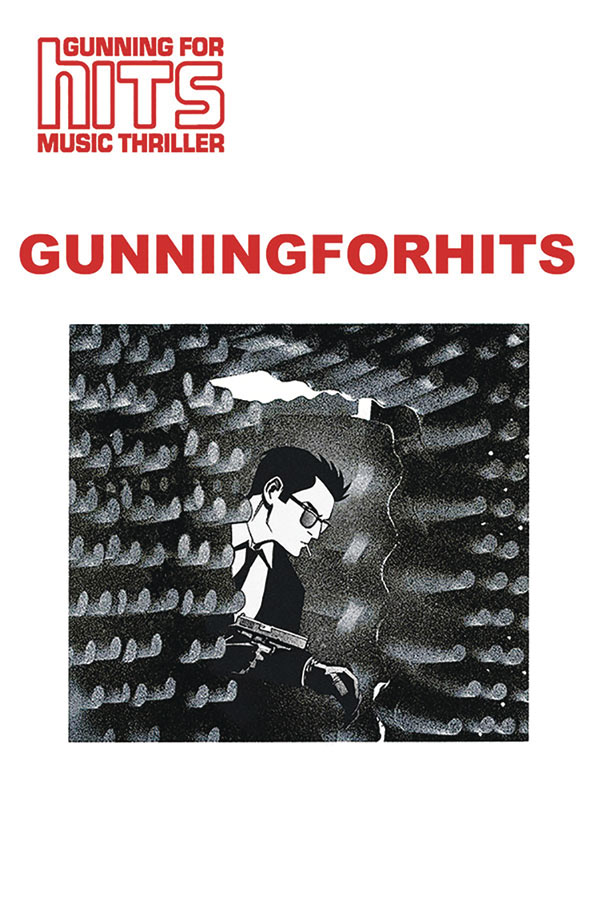
Gunning For the Hits #2
Image Comics Writer Jeff Rougvie, Artist Moritat, Letterer Casey Silver
I was very impressed with the first issue of this book and thankfully Rougvie and Moritat build very nicely in this second issue. One thing is for sure is that Rougvie knows the music industry but what makes this book so fascinating is that the story is based on real events the story has such a great flow and isn’t anchored by them. While its easy to spot the real life events, characters and settings of the time that will only take a non fictional story so far. What Rougvie does very well here is build the cast of characters in this story quite well and he has done so well here with Martin is that he is a total ass but he does what he needs to do to get the job done and in this case sign bands. There is also his past that continues to be alluded to but were still in the dark as to what exactly that is but Rougvie continues to tease us with bits and pieces here and there and that along with the story will keep you coming back again. He is very lucky to have Moritat as an artist on the book because there is a lot of dense story here and he is able to visually bring it all together for the reader to take it all in and traverse the road and make it work in both story and visuals. There is a lot of drama and dialogue here and that can be a real challenge and if you don’t have the right artist to bring it all together the book would sink but Moritat takes it all and puts the words to the visuals perfectly.
Is this book worth your time and money? This book continues to intrigue and impress with both its story and artwork and is something that you rarely see in comics. Most comics like this are real life stories or biographies and while this is based on Rougvie’s personal stories in the music industry he has found a way to spin it into a fictional story that is able to balance fiction and non fiction into a really good comic story and when you add in Moritat’s spot on artwork you have a real winner here. RECOMMENDED!
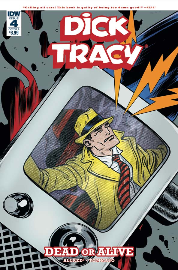
Dick Tracy: Dead or Alive #4
IDW Writers Lee & Michael Allred, Penciller Rich Tommaso, Inker Michael Allred, Colorist Laura Allred
The final chapter of this new Dick Tracy story comes to a roaring and satisfying conclusion from team Allred and Tommaso has been a real joy to read. The thing that has been the most satisfying is that they have stayed true to the original Chester Gould feel and tone but updated it to fit into modern times without sacrificing what made the characters great in the first place. I hope that new readers to Dick Tracy will have as much fun with this story as I did because he is one of the few comic strip characters that translates quite well into a comic book format. Lee and Michael give the story a nice pace and while they wrap up this story they leave room for more stories in the future and have created a really solid and new supporting cast for future stories. Not only has the story been a lot of fun but Tommaso’s artwork has been a really solid standout for this comic. His retro style is perfect but he makes it all his own while still keeping the original Gould look but keeping his own visual style. My favorite thing that he does with his artwork is give the characters great facial expressions that really help sell the action and drama of the story.
Is this book worth your time and money? If you haven’t been reading this mini series I really recommend picking up the trade collection when it comes out because this comic has been a real hoot and blends vintage and modern in a perfect way. Lee, Michael, Rich and Laura have really outdone themselves on this book and I can safely say that Gould himself would have loved this comic. It may have deep roots into the past but updates things slightly so that its able to be accessible to new and older readers alike. RECOMMENDED!
Gideon Falls #11
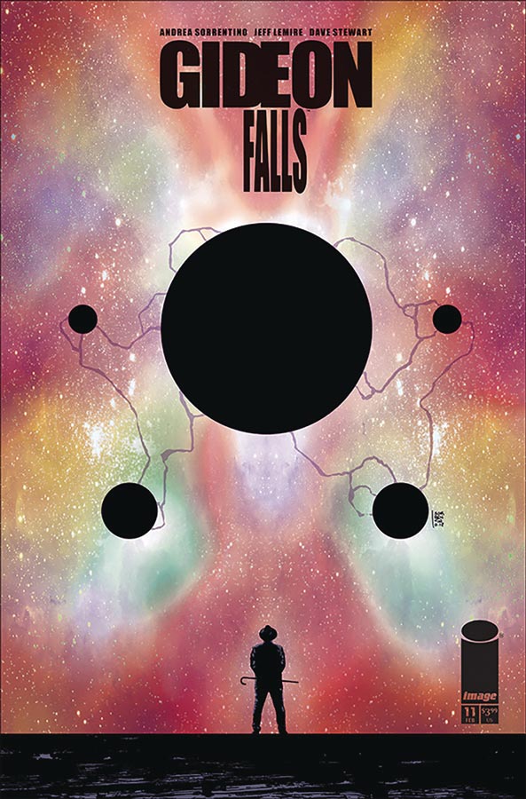
Image Comics Writer Jeff Lemire, Artist Andrea Sorrentino, Colorist Dave Stewart, Letterer Steve Wands
What has started out as a murder mystery has turned into a stream of conscious and continues to take readers on a journey that is a real mind blower and with this latest installment literally turn the world upside down. What is most fascinating thing about this book is that on the surface there may not appear that a lot is going on because the last few issues have been more visual story telling over dialogue but that has been one of the books best assets is that it can go back and forth between the two and still tell a very deep story without a word being spoken. This is a great example of when a writer and artist are perfectly in sync on a comic book. What started out as a simple murder mystery has bloomed into a story that has dived deep into the human psyche and blurs the lines between reality and the other side. It also continues to stay in the grey area of many things and leaves a lot to the reader to interpret some of the stories emotional elements. Lemire and Sorrentino give you a lot of information but they also let the readers interpret the story in their own way in a sense. There is a lot of the times where your not exactly sure where the story is going but you simply hang on and enjoy the ride. Visually Sorrentino is taking this book to a visual place that very few comics go to and actually pull off but you know when your able to have two pages of black pages and yet visually it tells so much. It’s really hard to describe how the book works so well with the artwork but I can say that Sorrentino has a way of blowing your mind visually each and every issue.
Is this book worth your time and money? I can not impress upon you how amazing this book is each month. It’s one of those rare comics that you read each issue as it comes out and then you go back and read it again from the start and see lots of little things that you didn’t see before and then you see things going forward in a whole new way. This comic grabs you and shakes you to the core and that is a truly rare feat. HIGHLY RECOMMENDED!
Captain Marvel #2
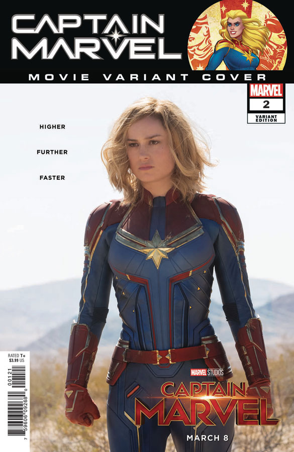
Marvel Comics Writer Kelly Thompson, Artist Carmen Carnero, Colorist Tamra Bonvillain, Letterer Clayton Cowles
With this second issue of this series I really wanted for Thompson to take this book in a less traditional way like she did with Hawkeye and West Coast Avenger and while this book is a nice read, it really is feeling like a standard super-heroine comic. This is not to say that the book is bad or unreadable but I had really hoped that she would take a chance and try something different here but I think that there are forces above her (editorial and a major motion picture) looking over her shoulder here. While I’m sure that this book is going to satisfy the average superhero reader there is little beyond that to get excited about this book. The story tells a pretty by the numbers affair here and there is not as much charm as the first issue had going for it. Carnero continues to deliver some nice artwork on the book and she does he best with a standard super hero script that is here and she does her best but there is only so much you can do with a so-so story.
Is this book worth your time and money? I really like Thompson as a writer but all of the fun and charm that the first issue had has been sucked out of the book and what your left with is a basic superhero trapped in a dystopian dimension that is neither original or good and that is disappointing. The first issue showed promise but this issue killed the joy and fun of that. It’s going to be a tough hill to climb back from after this issue but hopefully Thompson can get this book back on track.
Murder Falcon #5
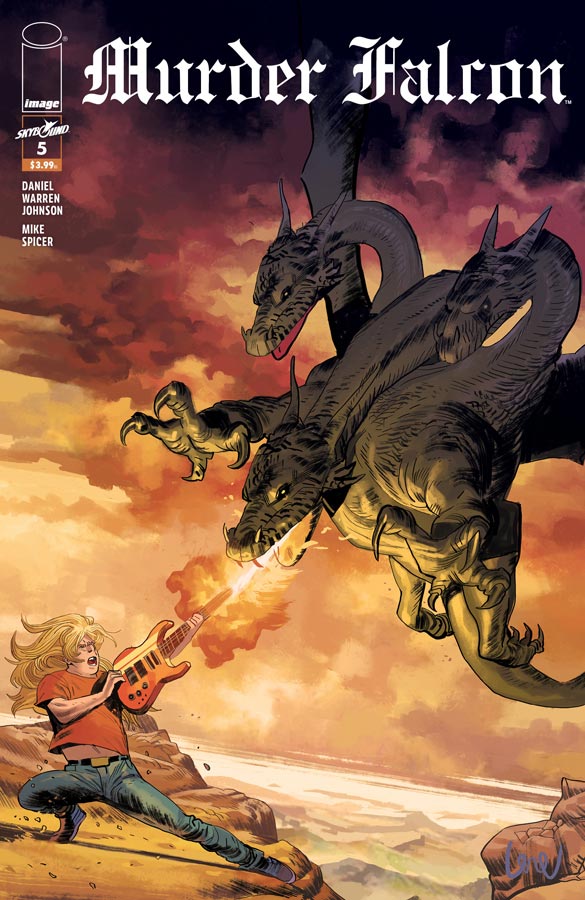
Image Comics Writer/Artist/Letterer Daniel Warren Johnson, Colorist Mike Spicer, Letterer Russ Wooton
Well now that the Khaos has opened the portal to the world things are looking tough for our rock band heroes and this issue dives deeper into the drama of the story and while there is still a lot of action, we start to see clearer is Jakes past and what has happened to him and Anne with their relationship and his breakdown. What has made this comic such a treat is that it started off loud and over the top action but what Johnson has done here was get you in the door with the epic battles but at the core of the book was the character drama of the story and that’s what keeps you coming back each issue. He made sure that your became invested in them and that is what make this such a great and fun read. Johnson continues to have surprises up his sleeves with this book and there are some fantastic twist and turns in the story this issue that are leading to the final few issues of the story. Johnson’s art has always been wonderfully detailed and there is a lot going on in this issue but the scene with Falcon and Anne going to the other world might just be one of the best visual moments of the book because it’s huge in visual scope and yet quiet and intimate that really impressed me this issue.
Is this book worth your time and money? What may have started as a silly concept that was loud and brash has become quite the deep and intriguing story that has you looking forward to the next issue. Johnson has really outdone himself with this book and each issue just keeps getting better and better and is VERY RECOMMENDED!
Wonder Woman #64
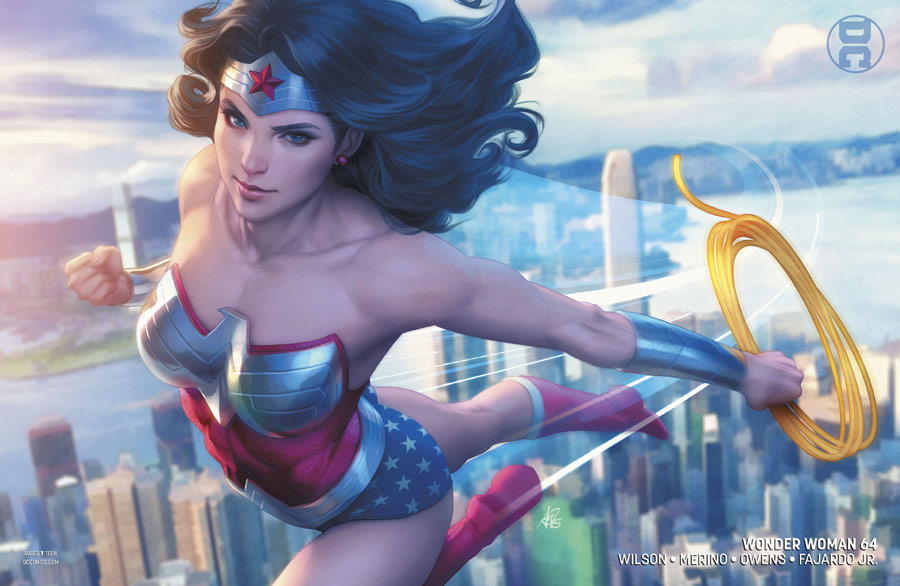
DC Comics Writer G. Willow Wilson, Penciller Jesus Merino, Inker Andy Owens, Colorist Romulo Fajardo Jr., Letterer Pat Brosseau
With the first story arc setting things up for this book, Wilson is now moving the pieces on the board around and there is certainly trouble in paradise and we soon discover that Diana might just be on her own and that Themyscira and Olympus might not exist. There is a lot to digest this issue with the return of Veronica Cale that continues plot threads from the Greg Rucka run of the book a few years back and that is double edge to the story. For those who have read that run you understand why Veronica is doing what she does to Diana but for new readers they are going to be a bit lost here. I wish that Wilson had spent a bit more time explaining what happened instead of a few lines of dialog that barely scratches the surface of that storyline. So if for some reason you have not read Rucka’s run I highly recommend reading it because it appears that Wilson is drawing from that here in this storyline. What Wilson has done well here is to break Diana and strip her mythology down but hopefully she will not fully break from that history from the book but knowing Wilson she has a lot more in store for some story twist and turns. Merino joins the book on the artwork side and does a bang up job with lots of great detail into each panel. But what really stood out was the emotions of the characters visually that was most impressive. The last page of this issue is a real heartbreaker and Merino pulls it off perfectly. I hope that he is able to stay on the book for the foreseeable future.
Is this book worth your time and money? While I do question some of the story elements that Wilson is doing here, I know from her writing skills that Wonder Woman is in good hands and trust her that she is not going to throw the baby out with the bathwater on the book so to speak. Merino brings a nice visual style to the book and overall this was another solid issue and cant wait to see where she take it.




0 Comments