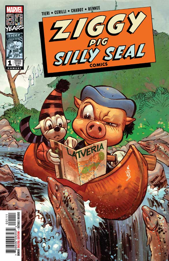
Ziggy Pig – Silly Seal Comics #1
Marvel Comic Writers Frank Tieri & John Cerilli, Artist Jason Chabot, Colorist Stefani Rennee, Letterer Joe Caramagna
The last of the Marvel 80th Anniversary one shots celebrating themes from Marvel’s past is based on the 1946 comic of the same name. I’m a huge fan of funny animal comics so I was eagerly awaiting this one and sadly it was a bit disappointing. I think where the book struggles the most is that writing a funny animal comic has to have a certain sense of humor to be able to capture what I would call the “Loony Tunes” or Tom & Jerry” type of humor but in comic form that is a very fine line to capture and Tieri and Cerilli try and get close a few times the story never quite reaches the sweet spot that it needs to make it really work. It’s not to say that the book is bad because it does have some great moments but they are simply just too few and far in-between that left me unsatisfied. On the plus side for the artwork by Chabot does a good job of capturing the cartoon characters but still making the “real world” look good so that they blend together. He does a great job of capturing the cartoon characters perfectly and that really helps the book move along and does a nice job of propping up the script to make it work better visually that was a big help.
Is this book worth your time and money? As I stated I was really disappointed with this comic because I had really hoped that the creative team would be able to pull this book off, but it just misses the mark with the story that never quite goes above the average and that is where it ends up landing. It’s neither really good or really bad just kind of an OK read that could have bee something great.
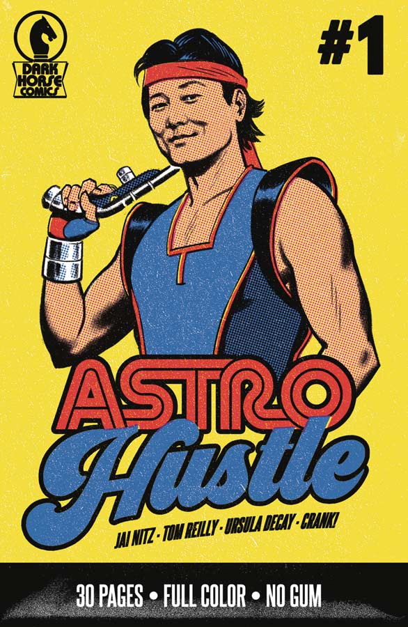
Astro Hustle #1
Dark Horse Comics Writer Jai Nitz, Artist Tom Reilly, Colorist Ursula Decay, Letterer Crank!
On the surface the concept of this book is a good idea and while I felt the idea didn’t lead to the perfect execution there was something about this first issue that had a weird charm to it. Nitz script has some good and unique ideas that he sets this story up with and mixes the genres well together. The one thing that was missing a little was the character development in that you don’t connect with Chen as well as I would have liked for a first issue. I know that Nitz didn’t want to give too much away at first but I felt that there wasn’t much to grasp onto in this first outing. Reilly’s artwork is really nice here and I like that it has an old school 1960’s comic vibe to it that helps the book with a look and feel that fits the tone of the story quite well. Even with not a lot of action in this first issue he does a nice job of capturing the characters emotions with his artwork that I really liked.
Is this book worth your time and money? I had wished that this comic got off to a stronger start and that is not to say that that it doesn’t work, I just think that this first issue is not that compelling and doesn’t give you enough to rush back for a second issue. There are some good ideas here but not enough to give it either a buy or skip because it just lands in the middle.
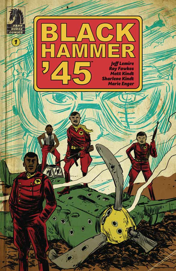
Black Hammer ’45 #1
Dark Horse Comics Story Jeff Lemire and Ray Fawkes, Writer Ray Fawkes, Artist Matt Kindt, Colorist Sharlene Kindt, Letterer Marie Enger
This is the first time that a Black Hammer spin-off mini series was written by another writer than Lemire but he still worked on the story so don’t despair Hammer fans because he has left the book in very good hands with Fawkes on scripting duty. What I loved about this book was how it both very outside the normal Black Hammer universe but very much in it at the same time. While there are still superheroes in the story it follows the team of WWII airmen that are called the Black Hammer Squadron of pilots who are going for one final mission in the final days of the war. But it also shows the present day of the men and there is a secret about their final mission that we don’t quite know yet. The one thing that I really enjoyed here was how Fawkes blended normal heroes and superheroes so well in the story. The other strong element of this book is how well they set up the characters in the story so that you care about what is going on and how its affecting them. The other big win for this book is Kindt’s wonderful artwork on the book that gives it a great visceral look and feel that gives the story that much more weigh while your reading it. The one thing that I have always loved about his artwork is the way that he perfectly captures the characters emotions in his art that always adds so much to the story and here it’s the perfect match.
Is this book worth your time and money? The bar for the Black Hammer Universe side stories has been set really high but in just one issue, it seems that this one might just be the best one yet. Sure it’s a bit early to call that just yet but this first issue is such a great read that waiting for the second issue is going to be very hard. The other big win for this book is that even if you haven’t read a Black Hammer story before this one stands on it’s own (just as the other mini series do) so even a new reader can pick this comic up and enjoy it and join team Hammer!
Lemire, Fawkes and Kindt have really outdone themselves here and this is truly a must read comic book this week. HIGHEST RECOMMENDATION!
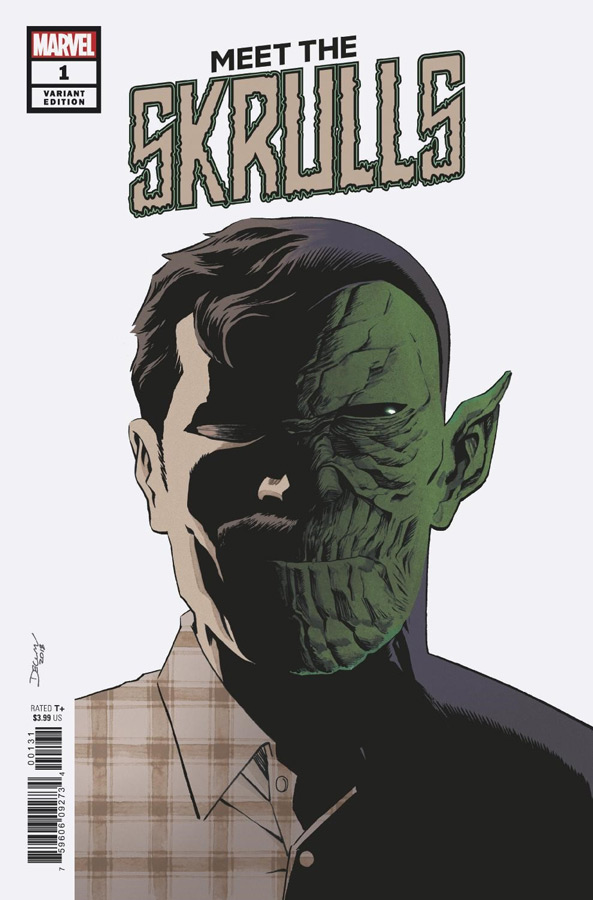
Meet the Skrulls #1
Marvel Comics Writer Robbie Thompson, Artist Niko Henrichon, Color Assistant Laurent Grossat, Letterer Travis Lanham
It’s been a tough road over at Marvel lately with a lot of the same old ideas wrapped in a new cover and being panned off as something special. But rarely does that work out but Meet the Skrulls is a rare one that bucks the trend and delivers a compelling story. Much like Tom King’s Vision series Thompson takes the road less traveled here. He still plays the Skrulls as the villains but goes for a story that falls more into the grey area of storytelling that is always more fascinating to explore then simple good verses evil ones. Thompson script does have a lot of familiar tropes in the set up but what he does here is use them as a foundation but build a story that stands on its own. The reason why this story works so well is that Thompson has taken the time to not only set the story up but give you a great reason to care for the characters and that is a mark of a good writer. The other strong thing going for this book is Henrichon’s wonderful artwork on the book and a big reason is that he really captures the emotional core of the story and gives the characters great weight that makes it not only a great read but wonderful artwork to help drive the story home.
Is this book worth your time and money? I really like this book and with a great starting point with this first issue and a solid reason to come back for a second issue makes this an easy recommendation this week. VERY RECOMMENDED!
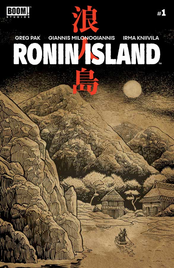
Ronin Island #1
Boom! Studios Writer Greg Pak, Artist Giannis Milonogiannis, Colorist Irma Kniivila, Letterer Simon Bowland
Pak is a writer for me is hit or miss thankfully this is one of his hits. One the surface this is a basic story with a twist that is not original but there is something about this story that has a strong intriguing concept that make this first issue a pleasant read. He does a nice job of setting the story and characters so that you get to know them and when the twist to the story comes at the end of the issue you care about what is happening to them. While the story wont blow you away I did find it charming and fun and that helps the book. It also has a good sense of humor that is always a plus to a story if handled well and Pak does it here nicely. Milonogiannis’s artwork on the book is a perfect match to the story and handles the period and location I can see why he was chosen for the book. There were a few times where the backgrounds were a little sparse but that is a minor complaint compared to nice artwork that he does for the book.
Is this book worth your time and money? I wasn’t blow away by this book there was a certain charm that it delivers and there is enough here to give the second issue a try. A good story and art makes this comic worth looking at and giving a chance.
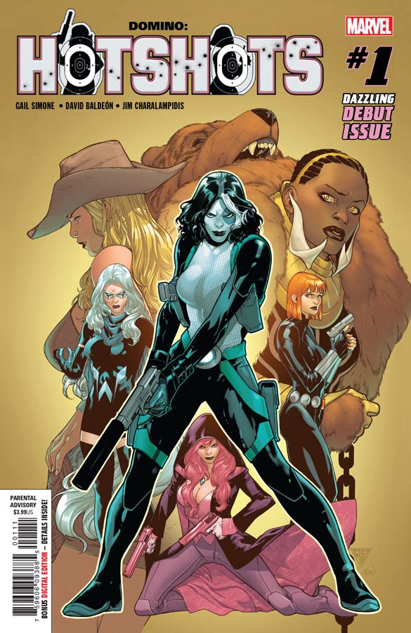
Domino: Hot Shots #1
Marvel Comics Writer Gail Simone, Artist David Baldeón, Colorist Jim Charalampidis, Letterer Clayton Cowles
I have been a fan of Simone’s run recently on Domino and she brings the fun to this book that takes a great group of female characters and delivers a solid read that will simply capture your fancy. What I love about this book is that she doesn’t try and overplay things and just lets the story unfold at a nice pace but makes sure that you have a good time along the way. There is no grey area that she makes sure that the humor is spot on but doesn’t overplay it either and that is why the book works so well. She also handles the large cast well and keeps the introductions short and sweet and just enough for new readers to jump right in. Baldeón’s artwork on this book is great and really adds greatly to the reason why this book works so well. He does a great job of capturing all of the emotions but also brings the goods when the action starts and does both quite well here. The big win is the facial expression that he give the characters that makes the artwork so perfect.
Is this book worth your time and money? I really had a blast with this book and its great for both new and seasoned readers. Simone and Baldeón deliver a fun and charming book that fires on all cylinders and not only made for a good read but gives you a good reason to come back for more. RECOMMENDED!
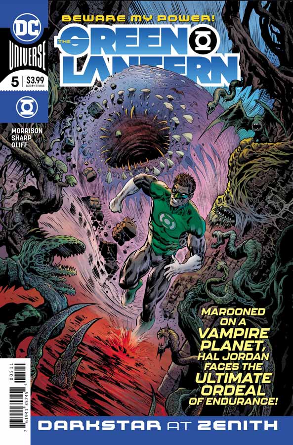
Green Lantern #5
DC Comics Writer Grant Morrison, Artist Liam Sharp, Colorist Steve Oliff, Letterer Tom Orzechowski
Without spoiling anything here the first four issues have been leading up to a very nice reveal at the end of this issue and really sets the stage for the book going forward. What has been so great about this book is that Morrison is not afraid to go to places with Hal that some might say is outside the box but actually I find that its very grounded in classic superhero mythology. On the surface this issues story has been told many times before but what Morrison does with it here is take it and uses it to set the stage for the story to go in a direction that you’re not really expecting but make perfect senes when you look back at the foundation that he has set up previously. Sharp has really outdone himself with the artwork on this issue. It’s truly impressive that he just continues to deliver stunning artwork on a monthly basis. This issue visually is pure horror comics at its finest but what he does with it in the way that he lays out the flow of the story that takes so far beyond a standard superhero comic but yet grounded in classic feel and style at the same time. He takes every little detail of Morrison’s script and captures every last detail that will have you taking you time in reading this book so that you can marvel at both the story and the artwork.
Is this book worth your time and money? This is a comic that proves that the superhero genre can do something different and bold without sacrificing what we love about them in the first place. This is a comic where the writer and artist are perfectly in sync and makes you excited to read comics again. There is nothing wrong with the superhero genre, it just takes a book like this to show that you can add more depth and take visual chances and still be mainstream at the same time. HIGHEST RECOMMENDATION!



0 Comments