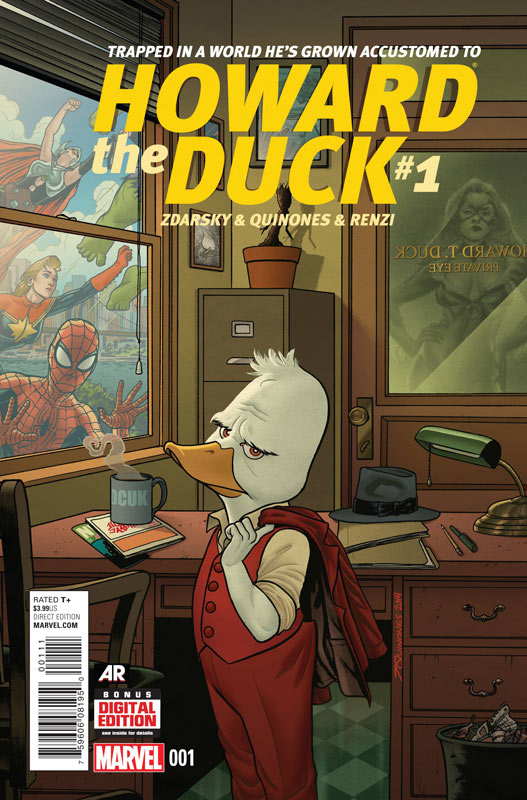
Howard The Duck #1
Marvel Comics Writer Chip Zdarsky, Artist Joe Quinones, Colorist Rico Renzi, Letterer Travis Lanham
Doing a new Howard the Duck without the original creator Steve Gerber is always going to be a tough road to travel. And while Zdarsky and Quinones give it a good shot the first issue is a good effort but misses the mark just a bit. Zdarsky does get some of the tone of Howard right with the script but the problem with the first issue is that it’s a bit scattered at times and seems to cram too much into the first issue. The tag line for Howard was “Trapped in a World He Never Made” this book could be called “Trapped in a World Where He Became Irrelevant”. The one big misstep that Zdarsky misses is the biting humor that Howard was all about. The book feels more like a standard Marvel Comic instead of bordering on the fringe of it. Quinones does a nice job on the art but I wish that he would have made Howard look different from the other human characters in the book. While he draws a really good Howard he tends to blend in to the book instead of standing out. The visual point of Howard the Duck was that not only did he not fit in both figurative and visually. I just wish that Quinones had done that tweak in the artwork.
Is this book worth your time and money? I like the first issue but didn’t love it. I will give Zdarsky and Quinones that they certainly did more right than wrong on this new incarnation of Howard. I just wish that it felt more edgy instead of an average Marvel Comic with a bunch of guest stars. The book is worth checking out and I do hope that the next few issues can take the book in a bit more solid direction than this first issue did.
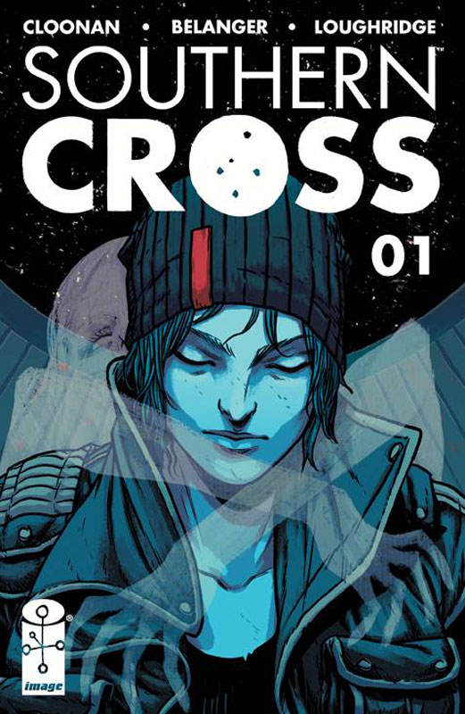
Southern Cross #1
Image Comics Writer Becky Cloonan, Artist Andy Belanger, Colorist Lee Loughridge, Letterer Serge LaPointe
Southern Cross is one of those first issues that presents an interesting idea but comes off as somewhat standard when you are finished. Cloonan story suffers from too much been there and done that story. It just feels as if you have read this story before. The characters are a bit standard and honestly there is not a lot that happens in the first issue. With that being said I do think that there is some potential in the book. The end of the issue does leave me wanting to read the second issue but she is really going to have to bring a lot more to convince me to stay on longer. Belanger’s art is good but there are a few times where the characters feel a little stiff. He does do some nice layouts and good backgrounds.
Is this book worth your time and money? The first issue gets off to a shaky start but there are a few ideas that are worth checking the book out for. The second issue is going to be a make or break on this book for me.
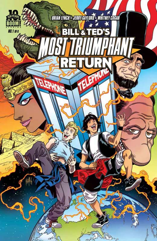
Bill & Ted’s Most Triumphant Return #1
Boom! Studios Writers Brian Lynch/Ryan North, Artists Jerry Gaylord & Penelope Gaylord/Ian McGinty, Colorist Whitney Cogar/Fred Stresing, Letterers Jim Campbell/Fred Stresing
The winner of the WTF! were they thinking with this book. Why would anyone who loved Bill & Ted’s Excellent Adventures continue the story in a comic from the awful sequel that everyone hates. In 1991 Evan Dorkin did a comic that took place after the second film he took the book in a whole new direction and gave it a great shot in the arm from the disappointment of the second film. Lynch really missed the boat on this book. Trying to read the story is tedious because it’s simply boring and pointless. The story is basic and just rehashes the themes of the films. The characters don’t feel like the movie and ends up being a lot of who cares. The minor saving grace of the book is Gaylord’s artwork that has a nice cartoony style that fits the book but if you don’t care about what you are reading it’s hard to care about the artwork. The backup story by North and McGinty is a cute idea but is a short gag that is dragged out for six pages and could have easily told in about three. It’s marginally better than the lead story only in that I didn’t hate it as much.
Is this book worth your time and money. I was really looking forward to this book but it simply not very good. Terrible and pointless story make this book a real train wreck. Avoid this book even if you love Bill & Ted. So don’t say that I didn’t warn you. AVOID IT!
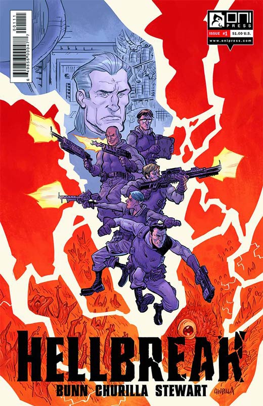
Hellbreak #1
Oni Press Writer Cullen Bunn, Artist Brian Churilla, Colorist Dave Stewart, Letterer Crank!
This is one of those titles that is quite a pleasant surprise. Bunn has crafted a really interesting concept that on the surface seems a bit like Ghostbusters but only in passing. The thing that I like about the idea is that he built the book off of the Orpheus and Eurydice mythology and that there are thousands of Hells that you could end up in. I like the idea of an extraction team that when to the Hell to try to save a soul and get them back safely. The story in the first issue is a very good set up and hits all of the right beats. He introduces the main characters, gives you an idea of the where the story can go. The only thing that I could see a problem with is that it might become repetitive but the next few issues will bear that out. Churilla does a very good job on the art that has a slight cartoony style but keeps it very in line with the story. The style does allow great leeway with it for example with the demons in the Hell that they are in are fun a disturbing.
Is this book worth your time and money? I was really impressed with this book and I see that there is a lot of roads that it go in. The first issue does a great job of giving you exposition but with a well-balanced story and with very good artwork this is a book that is well worth checking out. VERY RECOMMENDED!
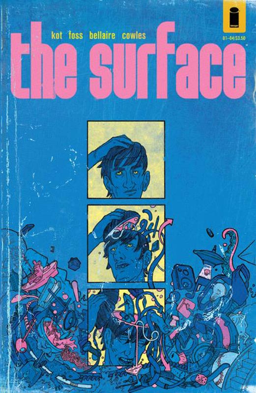
The Surface #1
Image Comics Writer Ales Kot, Artist Langdon Foss, Colorist Jordie Bellaire, Letterer Clayton Cowles
The Surface is one of those book that is trying to be more than it really is. Kot has some good ideas in the story but it’s so overly written that it gets lost under the weight of the over blown dialog and dragged down into confusion. The shame is that there is some really good ideas with the story. The only way that I can describe the problem is that the book is a very simple idea of what is reality. Yet after 29 pages of long drawn out story that is so confusing that it doesn’t even seem to know what it wants to be. It’s a real shame because there is a lot of possibilities to the book. Foss artwork is simply gorgeous but the story is so confusing that you end up looking at the artwork and caring less about the story as you go along. Bellaire does some wonderful color work in the book and the overall look of the book is stunning.
Is this book worth your time and money? I wanted to like this book but it’s so overly written that it becomes nearly unreadable and a real chore to read. I am all for dense stories but this just comes off as pretenses and that is a real shame with a lot of interesting ideas that are just wasted. SKIP IT!
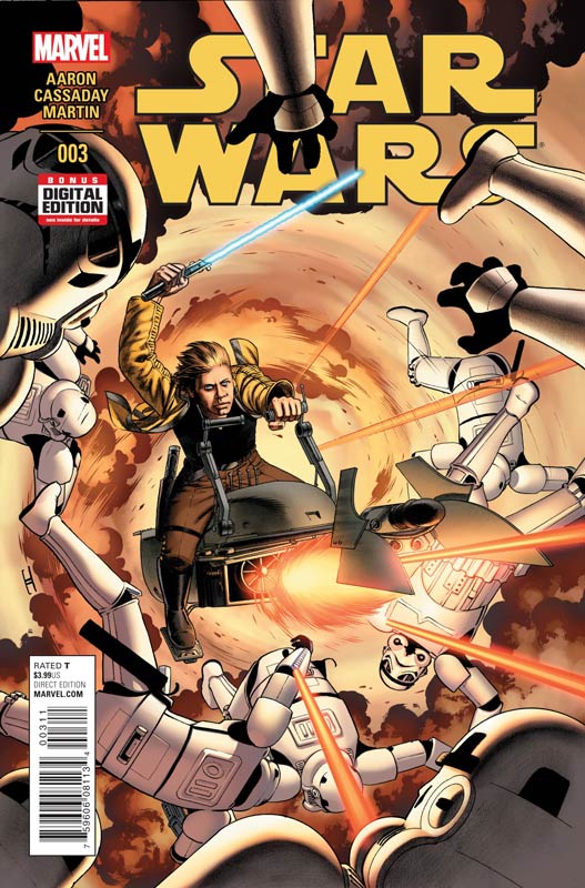
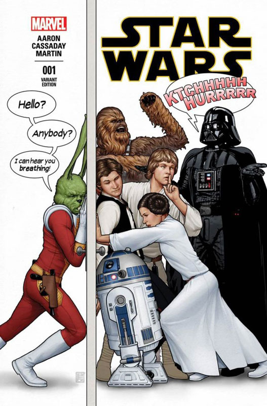
Star Wars #3
Marvel Comics Writer Jason Aaron, Artist John Cassaday, Colorist Laura Martin, Letterer Chris Eliopoulos
This book is making me love Star Wars all over again. I have missed these characters for so long and Aaron has really nailed this book and it just seems to be getting better each issue. I have said it before Aaron has a great grasp of what made the characters so great in the first place. It feels like a long-lost original Star Wars movie than a comic book. The scope of the story is what makes is so good. Even though the issue is a quick read it sits really nicely after you are finished. As with the last two issues I can’t wait to see where the story is going to go. Cassaday is a the top of his game on this book and captures the visuals that is making this book so much fun. He nails the details both in the grand scale battle scenes and the dialog scenes so very well. This is one of the best looking Star Wars comics.
Is this worth your time and money? I have been very impressed with this book and has gotten me excited about Star Wars and reminds me of what it was like to experience the original films before Lucas destroyed the franchise with those three atrocious prequel films. I had nearly given up on ever seeing a comic that lived up to the feel of the original films. Thanks to Aaron and Cassaday this book make me feel like a little kid again watching the original film. HIGHLY RECOMMENDED!


0 Comments