A really big week for Dark Horse Comics with the debut of their adaptation of Neil Gaiman’s novel American Gods just in time for the television series from Bryan Fuller that debuts next month on Starz. It’s also a big week over at DC with both old and new series. So let’s get started.
American Gods #1
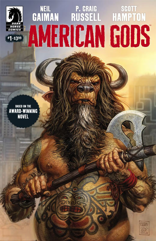
Dark Horse Comics Story and Words Neil Gaiman, Script and Layouts P. Craig Russell, Artist Scott Hampton, Letterer Rick Parker, Back-Up story by Russell and Lovern Kindzierski
I am eagerly awaiting the Fuller television version of the novel but have never gotten around to reading the Gaiman source material so I was very excited that Dark Horse was doing an adaptation of the novel instead of the series. This allows the full story to be done without budget or time constraints. So for me I have no pre-conceived expectation with not having read the novel so I take this adaptation at face value and what I read I really enjoyed. The first issue on the surface could be seen as a bit on the slow side but if your familiar with Gaiman’s writing style the pacing of this story should come as no surprise. At first I wasn’t sure where the story was going but that is what I liked about it was that they slowly build up Shadow so that you really get to know him by the time the pieces of the puzzle fall into place with this set up issue. Russell does a nice job of adapting the novel to comic form to make it feel more like a comic than a novel and that is a very tricky thing to do. He lets the story breath and while this first issue is pure exposition he opens the script up to let Hampton come in and work his visual magic. Hampton is the perfect artist for this book with his lovely artwork that is able to capture the very subtle elements in this first issue. He has a very difficult task in this first issue considering that most of it takes place in a prison with very little visual elements to work with and this is where Hampton really shines. What he does so well is the subtle emotional expressions that is where a story like this can me made or broken on the artwork side. The short back up story by Russell and Kindzierski is quite a trip and really shows where this story is and going to go to. It has gorgeous art by Russell that add a nice icing to the cake of this first issue.
Is this book worth your time and money? There will be debate about this comic from those who have read the novel. On that end I can not answer that question but, based on what I read here for the first time I really enjoyed the set up and am looking forward to see where the story goes. You should know going in that this first issue is a set up to the story so it’s exposition heavy but if your willing to go with it, there is a lot to like here. Well worth a read and is RECOMMENDED!
Cave Carson Has A Cybernetic Eye #6
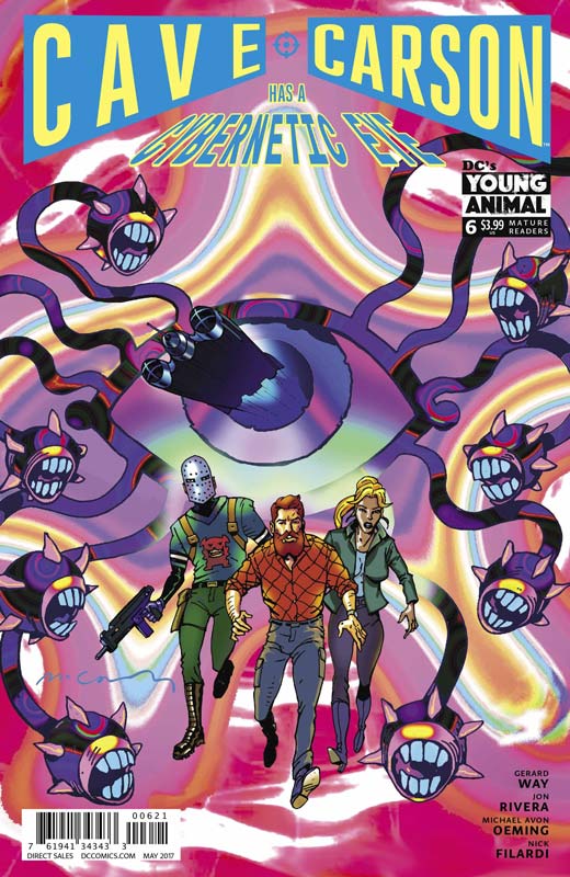
DC’s Young Animal Writer Jon Rivera, Story Gerard Way & Rivera, Artist Michael Avon Oeming, Colorist Nick Filardi, Letterer Clem Robins
Wow the ending of the first story arc of this series was not only great but left a huge cliffhanger that will lead into the second story arc. Rivera story is a rip-roaring shot em up fiesta that is as weird as it is exciting. What I am loving about this book is that it’s such a great throwback to the great 1960’s adventures books that I loved as a kid. Rivera takes all of those loved and classic elements and gives it a fresh spin and while there is a lot of wild and weird elements thrown in for good measure that is what makes this book so charming is that it’s not just one thing. The most important thing that Rivera remembers is that you can throw a lot into a story but never forget to make the characters interesting and grounded and here he makes sure that no matter how wild things get you still care for Carson and the gang. It’s one thing to have a great story but you need an artist that can really bring it to life and Oeming has really topped himself with this issue. There is a lot going on in this issue and in a lesser artist hands this issue could have easily spiraled out of control and been very confusing. Oeming not only brings it all together but gives it a scope that you don’t see a lot of in comics today. He gets the grand adventure to it all and draws the reader into this world and makes them a part of it with his artwork. This is an amazing book to look at.
Is this book worth your time and money? I have been praising this book from day one and each issue continues to top the previous one and surprise and impress every time. This issue not only solidifies the book but sets it up to even more surprises ahead. What I love about this book is that it’s fun. Many books try to achieve this but few actually attain this. Rivera, Way and Oeming are delivering a comic that is not only a must read but a book that simply delivers a great experience. HIGHLY RECOMMENDED!
Dead Inside #4
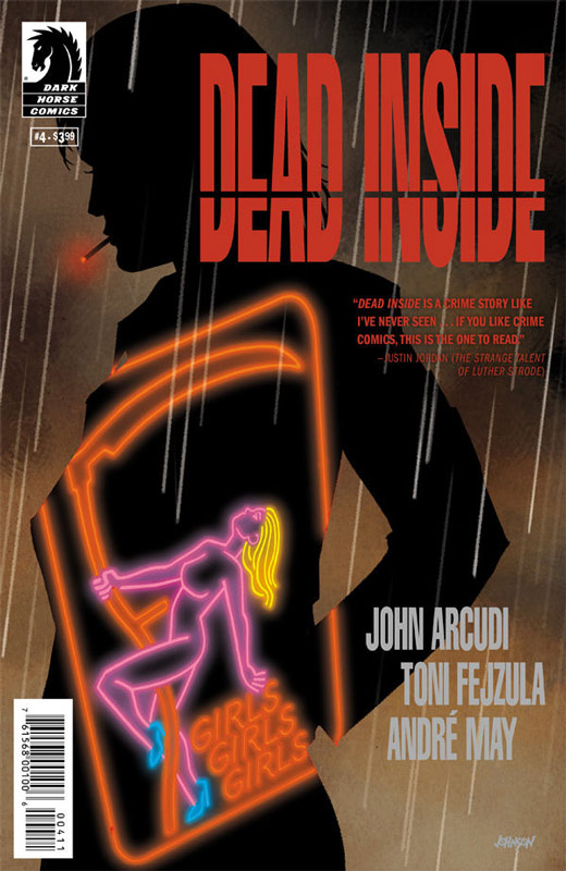
Dark Horse Comics Writer John Arcudi, Artist Toni Fejzula, Colorist Andre May, Letterer Joe Sabino
Dead Inside is a comic that doesn’t try to reinvent the mystery genre, it just tells a damn good story. Each issue unfolds the story in a way that not only keeps you on the edge of your seat but slowly peels back the story in a way that keeps you wanting more and yet love how it is slowly unfolding. I have to hand it to Arcudi for taking the bold step of pacing on this book. Few comics today are bold enough to challenge the norm and let a book like this breath. He also keeps the readers guard up because you never quite know what direction the story is going to take. In this issue there is some nice twist and turns that are nicely done. I also love that Arcudi doesn’t take the cheap shock route with this story that a lot of writers would have taken and that is what is making this book such a joy to read. Fejzula artwork on the book continues to impress with the way that he sets the visual mood of the story. In a way this mystery is like a classic horror film and that is the approach that Fejzula takes with the art. It’s a great cinematic approach that really pulls the story together. He keeps improving and impressing with each issue.
Is this book worth your time and money. I have been really enjoying this book but this latest issue was a real game changer. There was a great shift to the story that really upped the game on the story and takes it on a path that is both surprising and satisfying. This is a great comic that continues to impress and is a solid read. RECOMMENDED!
Batwoman Rebirth #1
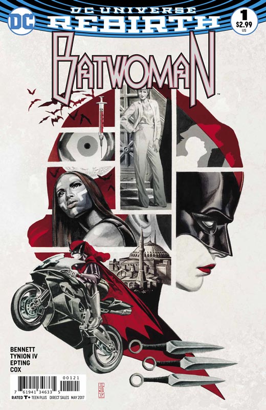
DC Comics Writers Margurite Bennett & James Tynion IV, Artist Steve Epting, Colorist Jeromy Cox, Letterer Deron Bennett
I was not very impressed with the #0 issue of this book and really hesitated to pick up the first issue. It’s a big improvement over that issue, it still ends up being kind of average in the end. The biggest problem with the book is that Bennett and Tynion script makes this book unique from the pack. It’s a very by the numbers affair and you could pretty much insert any other hero in place of her and it really wouldn’t change much here. It’s a very by the numbers affair and their in lies the problem with the book. It is simply a Batman clone story that you have simply read a million times before. What is even worse is that the previous incarnation of the book was a real breath of fresh air to the staleness of the New 52 line (before they screwed it all up and the creative team left the book). This has none of that excitement or depth. Instead we get a run of the mill forgettable first issue of a book that will satisfy new or old readers. The only plus that the book has going for it is the fantastic artwork by Epting that is really wasted here on such a mediocre script. It makes it all that more disappointing because the book really looks great and was the only thing that really kept my interest in reading the whole issue.
Is this book worth your time and money? While not a total train wreck, the book is simply bland run of the mill superhero here. If you’re a current reader of Tynion’s Detective run then you can pretty much skip this book. The artwork is really nice and I love Batwoman, that make this book that much more disappointing.
Ether #5
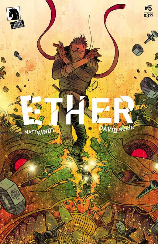
Dark Horse Comics Writer Matt Kindt, Artist & Letterer David Rubin
This issue is the end of the first story arc and it’s a doozy. Kindt and Rubin have really hit a great creative comic that has been a real surprise. This is a book that really could have fallen off the rails. Kindt takes a tried and true idea here and gives it such a great spin with creating worlds and characters that are smart and heartfelt. I liked that he told the story in a somewhat backwards way meaning that it starts off as a straight forward action adventure book and then slowly reveals the character and the heart of Boone and what he has sacrificed to try to save both worlds. This issue you find out the price that he has paid for this and it was a real emotional moment in the story that really hits the reader hard emotionally. This issue was not what I was expecting and really gets to the core of what this book is and can be and Kindt has again shown what an amazing storyteller he is. Rubin’s art on this issue really impressed me with the visual way that he delivers the story. His layouts are particularly impressive in this issues story that really conveys the emotional impact of Boone’s story. The level of detail that he delivers in the art is simply breathtaking and captures the emotions perfectly. Not only is his line artwork impressive the color choices take the art to a whole other level. The last panel was breathtakingly beautiful.
Is this book worth your time and money? The only disappointing thing that I can say about this book is that it’s the end of volume one of the story and that we have to wait a bit for the next chapter in the story. While the story sort of ends it leave you with wanting so much more and yet it satisfies you at the same time. This is a comic that not only works the first time you read it but, when you go back and read it as a whole again it works even better the second time. That is a true testament of a great comic and this is one of those rare ones to be treasured. HIGHEST RECOMMENDATION!
The Wildstorm #2
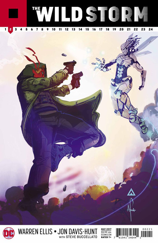
DC Comics Writer Warren Ellis, Artist Jon Davis-Hunt, Colorist Steve Buccellato, Letterer Simon Bowland
The first issue of this re-imagining of the Wildstorm Universe got off to a good start but this second issue really goes a lot deeper into what the book is going to be. The first issue was just a taste of the impressive level of detail that Ellis is taking the story to. I love that Ellis is unfolding the mystery of the story to both the characters and the readers at the same time. This is a bold storytelling move that is very difficult to pull off but this is where Ellis writing works so well. He is building a world from the ground up but still keeping the characters that are known but giving them a fresh spin. What is most impressive is that as with the first issue this is still in exposition mode that can drag a book down but with Ellis you can see the scope and scale that this story is telling and you understand why he has taken the slow burn approach to it. Another bold move is that his is not taking the normal introducing the characters and kind of dropping readers into a universes story that is already going. This is where it gets interesting because of the approach that he is taking is a huge risk but this second issue shows that it was a very wise choice. Hunt’s artwork really shines because he has to deliver so much with at time no dialog the subtle emotions of the characters that is a real task of a great artist. I can see why Ellis choose him for the book. He is not only able to handle the big action scenes but the smallest little details in the story. Hunt is really bringing his A+ game to this book.
Is this book worth your time and money? Ellis and Hunt are going for the long game with this book and it’s really nice to see this in a mainstream book. Most superhero books rarely take this path of long form storytelling because most mainstream readers are unwilling to take chances like this book is taking. If you are looking for a deeper superhero experience then look no further than this book. If you want more spoon fed fair then move along. This book is on the right track and this second issue is really impressive. RECOMMENDED!
Archie #18
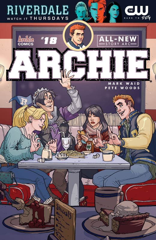
Archie Comics Writer Mark Waid, Artist Pete Woods, Letterer Jack Morelli
The new Archie book has been a comic that each issue simply puts a smile on your face and constantly delivers sweet and heartfelt stories each issue. Waid continues to write stories that while are straight forward and simple, that is the formula that has worked out so well for Archie comics over the years. This issue is a good jumping on point for new readers and with the new hit CW television series Riverdale there are a lot of new people looking for Archie comics. While I love the new television series I’m glad that the comic series continues to keep the light and fun tone of the classic Archie universe. This issue has a story for the main cast and are nice little stories for both the regular readers and new ones. This issue new artist Pete Woods joins the Riverdale gang and brings a very nice pop art look to the book. His style fits perfectly into the book and I loved how he played around with the layouts for the artwork that worked very well in the book. A very minor gripe was that there were many times where there were a lack of backgrounds and it became a little noticeable. That aside Woods brings a great fresh and fun style to the book and I hope that he stays on for a while.
Is this book worth your time and money? As I mentioned before the book is not super deep and very much on the simple side but you know that what I love about the book. Waid wisely doesn’t try to make it more than it is. He tells simple straight forward stories that are fun and enjoyable and sometimes you just want to read a book like this because it puts a smile on your face. Adding Wood’s great and solid artwork to the book is a real treat and a very welcomed addition. I’m a fan and it’s one of my fun comics to read.
Super Sons #2
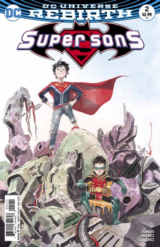
DC Comics Writer Peter J. Tomasi, Artist Jorge Jimenez, Colorist Alejandro Sanchez, Letterer Rob Leigh
I have to admit that I was pleasantly surprised by the first issue of this series and am glad to see that it was no fluke. The second issue continues to tell simply fun and light stories that gets away from the gritty and dark places that have become the norm. Tomasi does a great job of telling stories that are not only fun but is also willing to go to darker when needed. He has struck a very nice balance to the book and this second issue is a blast. I love that the two break into Lex Corp just to hack his system but also mixed in a nice subplot that gave the story some bite. He does a nice job of them being opposites and it adds a lot of fun to the mix. Jimenez artwork is perfect for the book because his style is able to fit both the more humorous cartoony moments but he can also handle with ease the action and the darker moments in the script. He brings a sense of fun to the art that really complements Tomasi’s script.
Is this book worth your time and money? This second issue does a nice job of showing where the book can go and does a nice job of balancing tones in the story. Tomasi keeps things on the light side but as we see this issue is able to go to some darker places but not change what the book needs to be. He never loses sight of keeping the book fun. Jimenez’s artwork fits perfectly with the script and continues to make the book charming. Well worth checking out.


0 Comments