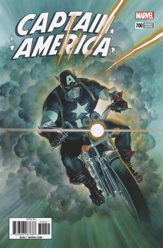
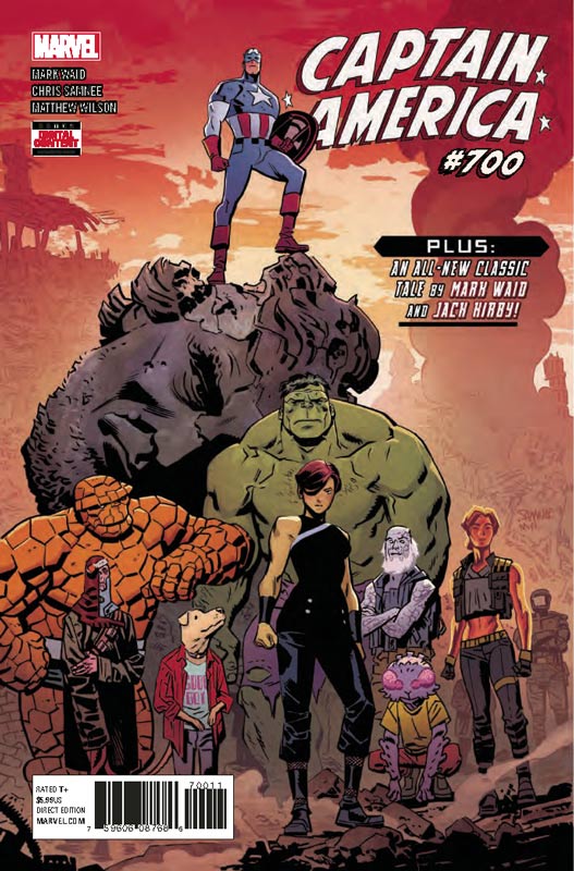
Captain America #700
Marvel Comics Writer Mark Waid, Artist Chris Samnee, Colorist Matthew Wilson, Letterer Joe Caramagna, Back-Up story by Mark Waid based on material by Stan Lee and Jack Kirby, Artists Jack Kirby & Frank Giacoia, Colorist Matthew Wilson, Letterer Ferrando Delgado with Artie Simeon & Sam Rosen, Cleanup Michael Kelleher
The final chapter of the epic Steve Rogers in the future is a very satisfying ending to this storyline. Waid has really captured the essence of Cap here and shows his human frailty and that he can only do so much. One of the challenges of doing a time travel story is that the writer usually trips up with continuity or fails to follow the path that they have laid out. Thankfully Waid didn’t make the story about that but simply used the tool to tell the story. The best thing about this last act of the story is that it really runs the emotional gambit and wears it’s heart on it’s sleeve and makes you fall in love with the character all over again that feels fresh and new but Waid wisely doesn’t try and change him but just uses the best elements to craft one of the best Captain America stories in years. Sadly this is the final artwork by Samnee and he finishes this final outing with some of his most astounding artwork to date. He really captures the emotional core of the story and never overplay it or goes for the easy way to deliver it. There are so many subtle moments and some of the best is where there is just artwork to deliver the story and he brings it all to life so effortlessly and beautifully that makes this last chapter so wonderful to read and enjoy. And if the main story wasn’t good enough Waid pieces together a story culled from Kirby’s Cap work over the years and crafted a brand new story that is exciting to relive the golden age of Marvel Comics and even makes sure that it captures the tone and feel of the work of Lee and Kirby. This story makes a great bookend to Waid and Samnee’s short but oh so brilliant run on Captain America and this story is simply icing on the cake.
Is this book worth your time and money? I have given Marvel a lot of crap lately with a lot of their line but if they would just look at what Waid and Samnee have done in just a few issues and get better creative teams on their top comic books they might be able to save the sinking ship. With that out-of-the-way this book has been a great and fun read and really showed what solid superhero comics can be. I can not recommend this book enough! HIGHEST RECOMMENDATION!
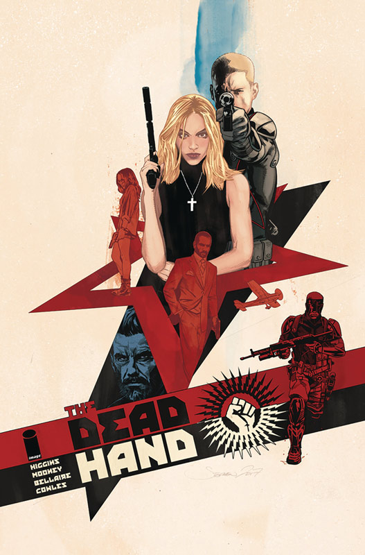
Dead Hand #1
Image Comics Writer Kyle Higgins, Artist Stephen Mooney, Colorist Jordie Bellaire, Letter Clayton Cowles
This is one of those comics that starts off ok and is a decent read but delivers a very unexpended ending that gives the reader a WTF moment. Higgins for me has been an up and down writer but I will say that this book has a lot of promise but is going to hinge on where he takes the story. This first issue is a bit exposition heaven but it make sense with the direction of the story that he is crafting. You really need it to get the payoff at the end of this first issue and that is why it works so well. He deliberately underplays the story so it lulls you into a false sense of what the story is and then the shift at the end doesn’t feel forced or shocking but gives you a sense of OK now where is this story going to go. Mooney does a nice job on the artwork and while there were a few minor hiccups with the consistency, overall he gives the book a nice look that captures the beats of the story well. The one thing that he does deliver nicely is the facial expressing that really help during the dialog scenes.
Is this book worth your time and money? I wouldn’t say that this comic blew me away or anything but Higgins has come up with a nice twist on the Cold War story tropes and gives you a solid reason to come back to the second issue that always helps. With nice art makes this book worth checking out this week.
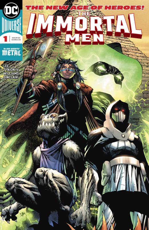
The Immortal Men #1
DC Comics Writers James Tynion IV, Jim Lee and Ryan Benjamin, Penciller Jim Lee, Inkers Scott Williams & Richard Friend, Colorist Jeremiah Skipper & Alex Sinclair, Letterer Carlos M. Mangual
DC’s New Age of Heroes is turning into the new age of disappointment. The Immortal Men is not bad but pretty underwhelming start to a series that was supposed to give more freedom to the creators to develop the stories in a more collaborative way. Sadly there have been more misses than hits. Tynion along with Lee and Benjamin script goes through the motions of setting up the story in a pretty by the numbers affair but, the book ends up being not very interesting or new. While it’s not a terrible read it simply didn’t give me a great reason to buy the second issue of this book. The biggest issue is that the story structure is so basic and there is little depth to the characters that you simply don’t really care whats going on by the end of this first issue. I get you don’t want to give it all away but Tynion is a better writer than what I read here. I’m not sure if the problem is with him or Lee and Benjamin with the overly simply structure of the script. The artwork by Lee is what you would expect from him and while I’m not the biggest fan of his artwork, it does the job and at least makes the book nice to look and while your reading it and helps distract you from the basic story that is pretty boring.
Is this book worth your time and money? I have read a lot worse but the whole line of New Age of Heroes is not working out all that well. By far the only real winner is The Terrifics but the other books have been good to down right misses. One of the biggest flaws is that most of these books including The Immortal Men suffer from stories that we have read a million times before and the creative teams are not really bringing anything new to the table. SKIP IT!
Domino #1
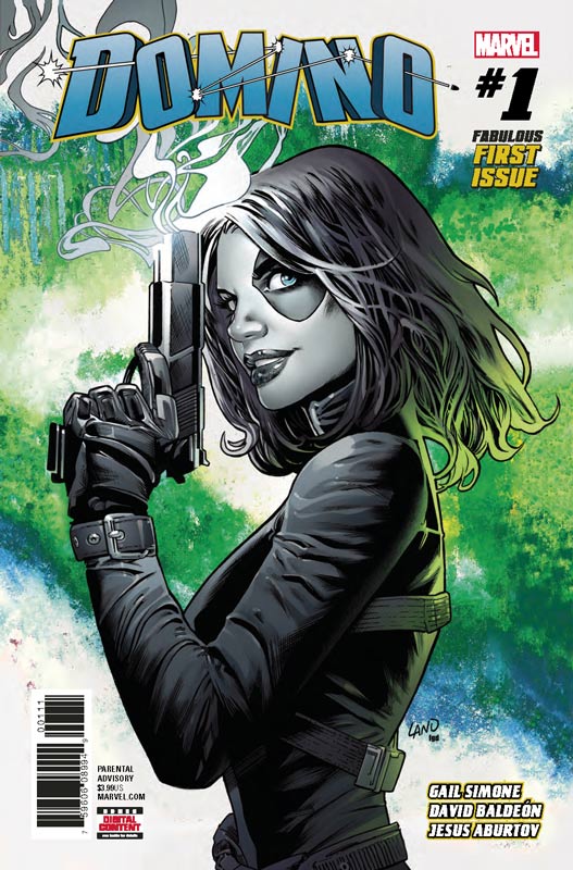
Marvel Comics Writer Gail Simone, Artist David Baldeon, Colorist Jesus Aburtov, Letterer Clayton Cowles
Who would have guessed that Marvel would pull off two great books in one week and besting DC’s co-publisher’s debut book. Well leave it to Simone to tell a hell of a fun story that hits the mark perfectly. What I liked most about this book is that she doesn’t try to make it bigger than it is. Simone also keeps the book lite and fun that is another strong asset to this book. I was not familiar with the character and Simone does a nice job of making sure that new readers don’t feel lost while reading this first issue. She slips in exposition but it never slows down the flow of the story. Sure this is a set up story but she does a great job of peppering it with fun and great action scenes that give this first outing a very nice flow. The other big win for this book is the wonderful artwork by Baldeon that has a nice clean style that really complements Simone’s script. He really puts a lot of detail into the book and he really captures the wonderful facial expressions of the characters. He also keeps the artwork fun and loose when it needs to be but slips into the drama and action with ease. This is a very nice looking book.
Is this book worth your time and money? I really loved this book and sure there are standard superhero tropes abound here, Simone give the script the right amount of zing to make it feel fresh and fun. It’s the kind of comic that doesn’t try and be more than it is and add in the great artwork by Baldeon and you have a nice solid and fun read and they give you a great reason to come back for more. RECOMMENDED!
Gideon Falls #2
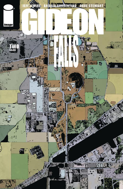
Image Comics Writer Jeff Lemire, Artist Andrea Sorrentino, Colorist Dave Stewart, Letterer Steve Wands
I was very impressed with the first issue of this book and the second issue hits the ground running and really gets the book on a great footing. The first issue kind of threw you off guard and that was very much on purpose as you will see in this second issue. Lemire starts to unfold the mystery ever so slightly but keeps the story going at a very strong pace. There are a lot of different story elements in place here and he keeps them all weaving together very seamlessly and that is why the story is working so well. One of the best things about the story is that the way that the reader will uncover things just as the characters in the story do and makes you relate to them and the situation that is a mark of a great writer. It’s one thing to have a great script but you need an artist to bring it to life and in this case I can’t imagine anybody better than Sorrentino to deliver the story perfectly. It’s the subtleties that really helps get this story under your skin and while it’s not a straight horror comic, it does however deliver some really creepy stuff and that is where Sorrentino shines on this comic. The other thing I love about his artwork is the subtle facial emotions that he delivers that gives the book a chilling effect along with the other emotions of the characters. I also like how he plays around with the layouts of the artwork that can change as it needs to get the desired effect.
Is this book worth your time and money? This issue really seals the deal on this great book. There is so much that they deliver in this second outing that not only caught me off guard but blew me away with the direction that they are taking the story in. It’s one of those rare comic books that at the end of the issue leaves you craving more and the anticipation that you have to wait a month for the next chapter is a very hard. HIGHLY RECOMMENDED!
Dry County #2
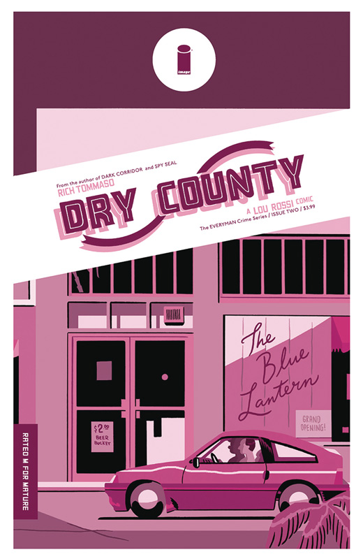
Image Comics Writer/Artist/Colorist/Letterer Rich Tommaso
I’m a big fan of Tommaso’s work and this second issue of Dry County does a very nice job of moving the story forward quite well. This second issue on the surface may seem to not move very fast but there is a lot of great depth to the story that is doing a great job of building up the story elements for the overall story arc. I like how he has Lou and Rob try to discover what has happened to Janet and I liked the twist and turns that he gave the story. Tommaso has a way of capturing that noir feeling in comics that are not fully entrenched in it. While the story is set in the present he gives it a feel that makes it seem like a different time period and that adds greatly to the story and gives the reader a more down to earth reading experience. Tommaso’s artwork on this story really makes this story pop with an Indy/Underground visual flair that captures the tone of his story. It needs this simple yet very detailed look to bring this story to life and along with his spot on color work makes this book a great visual feast.
Is this book worth your time and money? The second issue really goes down the rabbit hole and took the story in directions that I never anticipated and that is a big win for this book. While it does have familiar story tropes Tommaso gives it a great new spin with both the script and the artwork that blend perfectly together. This is a bold book that is well worth picking up and I can’t wait to see where he takes the story. VERY RECOMMENDED!


0 Comments