Batman #21
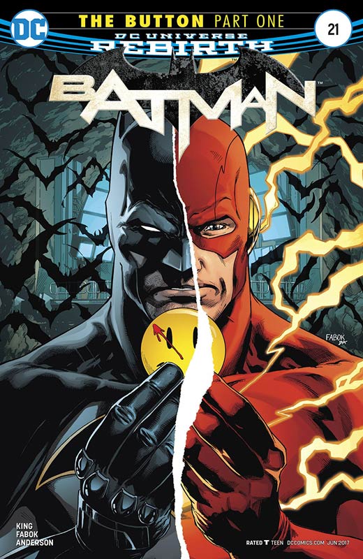
DC Comics Writer Tom King, Artist Jason Fabok, Colorist Brad Anderson, Letterer Deron Bennett
Well the mystery surrounding the Watchman smiley button that was hinted at the end of last years Rebirth special is finally coming to fruition and was it worth the wait? At least in this opening chapter it’s too soon to tell. I wasn’t one of those who was offended by the before Watchman books a few years ago and took a wait and see attitude about the folding of the Watchman characters into the DC Universe. While nothing will ever come close to the impact and lasting impressions that Watchman had on the comic book industry, I don’t think it’s some sacred cow either. King opening chapter to The Button is simply OK. It’s neither bad or terrible but after reading it, I wasn’t overwhelmed with it either. For the start of an “event” story this one wasn’t a super start. The script goes through the motions of setting things up but the flaw is that by the end of the chapter there is not a lot of compelling reasons to read the next chapter. King is a good writer and this might just come together in the end but I don’t see that in this first outing. Fabok does a nice job on the art but doing the whole nine panels per page a la Watchmen seemed very heavy-handed. I get that it’s a Watchman story but at this point you should strike out on your own visually like Cooke and Connner did on their Before Watchman stories. I just wish that Fabok had done something different but on the other hand it could have been King’s script that decided this look.
Is this book worth your time and money? While the book is not a train wreck, it really gets off to a slow and uninspired start here. King and Fabok have done better than this in the past so I’m hoping that this first chapter is more of a set up because if the next chapter doesn’t pick up the pace then I’m out of here. If your curious the book is not terrible but it doesn’t leave much of an impression or a big reason to read the next chapter. This ones on shaky ground!
Plastic #1
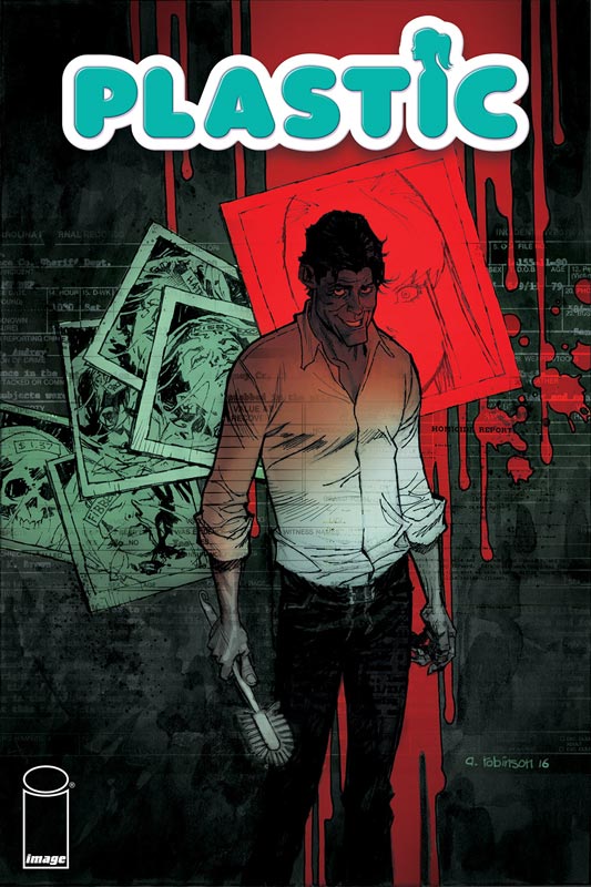
Image Comics Writer Doug Wagner, Artist Daniel Hillyard, Colorist Laura Martin, Letterer Ed Dukeshire
Comic that go to the dark side of the humans is always a tough comic to pull off but Wagner and Hillyard have found a unique take on it here in Plastic. Wagner’s script gets the story off to a good start and what really impressed me was the way that he handled Victor. Most writers would have made him the typical psychopath with mommy or daddy issues but her Wagner has Virginia as his muse/trigger. He hits all of the story beats well for a first issue without letting the story get too bogged down with exposition and does a nice job of setting up the second issue. One thing that he does very well is give the story some sly humor that really helps the book from getting too dark and brings some nice levity to the story. Hillyard’s artwork on the book is very nice with lots of great facial details that really help sell the story. He also doesn’t overplay the visuals on Victor that could have made the book not work as well but he really makes this book pop.
Is this book worth your time and money. The first issue gets off to a good start but with a book like this there is a question of where are you going to take it and do you have an end game? Wagner and Hillyard pull off a good first issue but the key to the book working is that they have a plan with a beginning, middle and end game for the book. I like what I read here and will give the next few issue a go to see where they are going to take it.
Nick Fury #1
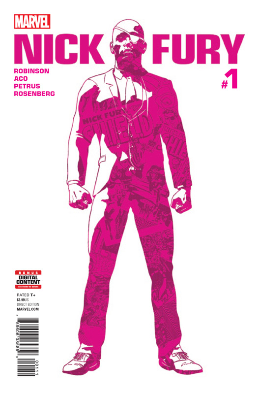
Marvel Comics Writer James Robinson, Penciler Aco, Inker Hugo Petrus, Colorist Rachelle Rosenberg, Letterer Travis Lanham
The main reason that I picked this book up was because of Robinson and Aco who have done some great books lately and wanted to see what they would come up with here. Robinson’s script is pretty simple here but that makes it work well. He delivers a fun espionage story that gets the book off to a good start. Wisely he dispenses with the exposition of who Fury is and hit the ground running with the story by keeping it fast and loose and that is one of the books best assets. Where the book really shines is with Aco (along with Petrus) gorgeous artwork that was very much inspired by Steranko but makes it all his own. He makes this book really stand out from the usual Marvel crowd with its bold and colorful take (thanks to colorist extraordinaire Martin) make this book a huge visual treat. It literally explodes with bold and exciting art that I haven’t seen in a mainstream comic in years. This is an amazing looking comic book.
Is this book worth your time and money? The book is a lot of fun and visually stunning with an amazing pop art look that will have your head spinning from it. While the story is pretty basic Robinson and Aco have delivered a sweet read that will make your eyes pop. RECOMMENDED!
Wold Reader #1
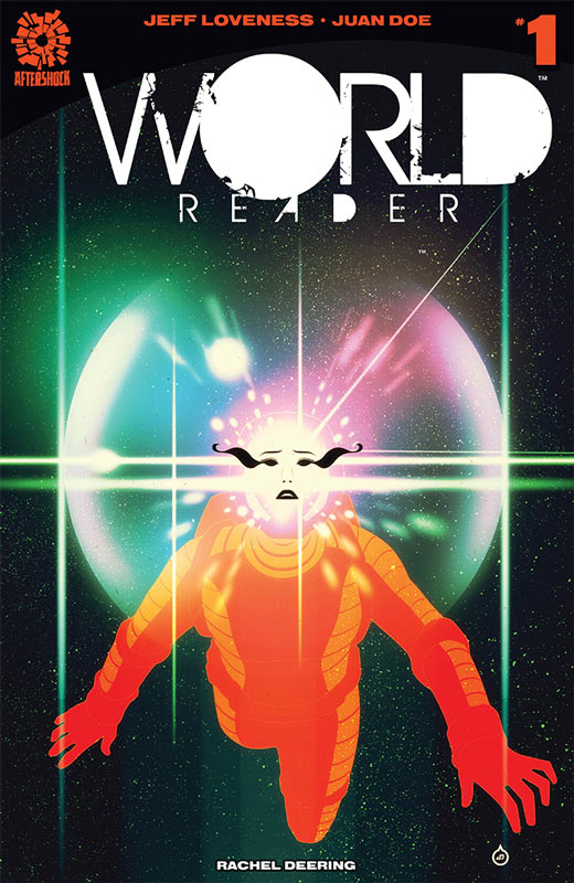
Aftershock Comics Writer Jeff Loveness, Artist Juan Doe, Colorist Rachel Deering,
This is one of those books that will not blow you away but you find sweet and charming. Loveness script is a tried and true telepathic story that you have read before. The biggest problem with the story is that Loveness doesn’t bring much new to the story. That is not to say that the book was a terrible read or anything I would have preferred a better twist to the story than what was there. On the plus side he does keep the story simple and sweet and the pacing of the story is quite good. Where the book does shine is the wonderful artwork from Doe and Deering. They elevate the story very nicely here and give it a great fresh look and feel even with the simple story. Doe line work is quite exceptional and really gives the book an epic scope visually that does make this book stand out. Deering does and amazing job with the coloring that really complements and enhances Doe’s artwork.
Is this book worth your time and money. It sounds like I’m hard on the story and I am a bit but I will give it that Loveness script for this first issue is a bit cliché, I did enjoy reading it. The next issue of the book is going to be a make or break it. He will need to give the story a better hook for the overall story for it to break out of the been there and done that first issue. The artwork really helps this book along and hopefully the next issue will turn things around. It’s still worth checking out.
The Greatest Adventure #1
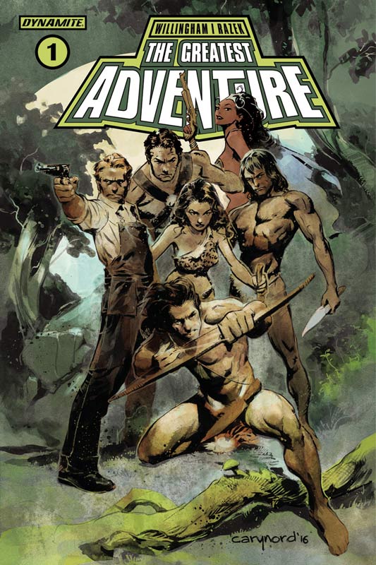
Dynamite Entertainment Writer Bill Willingham, Artist Cezar Razek, Colorist Daniela Miwa, Letterer Taylor Esposito
I have been a fan of Willingham’s back to the Elemental days and of course his brilliant run of Fables. He is obviously a fan of Edgar Rice Burroughs with this new series from Dynamite. This first issue is pure set up so it’s hard to get a feel of where he is going to go with it. It does get dragged down by the exposition that kind of makes for a bit boring read here. He is setting up a lot here but it never quite gels as much as I would have liked. The bigger question with the story is that Willingham tends to go for the long-term with a lot of his stories and that could be the case here. I really wish that there had been more going on in this first issue than this dry story. Razek’s art is a bit of a mixed bag here. For the most part it’s pretty good but there are times where some of the detail is a little weak and not as well-developed. It has a noticeable inconsistency problem that is not terrible but you do notice it throughout.
Is this book worth your time and money? Considering Willingham’s track record I honestly expected more out of this book that this first issue delivered. While I will probably give the second issue a chance, it’s certainly hanging by a thread here. The inconsistent artwork didn’t do the book any favors either.
Harley Quinn #18
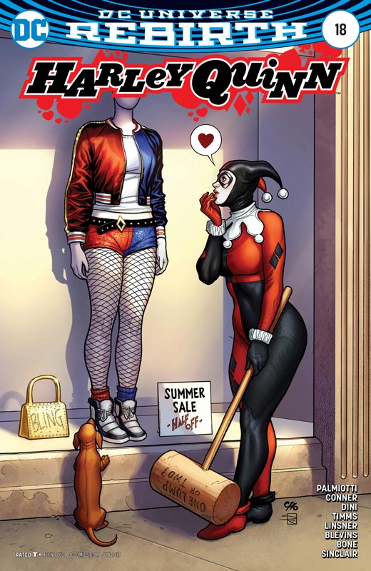
DC Comics Writers Jimmy Palmiotti & Amanda Conner, Artist John Timms & Joseph Michael Linsner, Colorists Alex Sinclair with Jeremiah Skipper, Letterer David Sharpe Back-Up Story Writers Paul Dini & Palmiotti, Penciler Bret Blevins, Inker J. Bone, Colorist Sinclair, Letterer Sharpe
As with last issue the main story continues the Red Meat story and ends up being another so-so story that never quite delivers a satisfying story. Unfortunately Palmiotti and Conner seem to be dragging this one out and while it’s not a terrible read the real reason to buy the book I’ll cover in a minute. Timms does his usual best with the story that he is given. He delivers some really nice work here, I had just wished that the story was up to the quality of his artwork. The good news is that classic Harley is back in the second outing by Dini and Palmiotti that continues to outpace the main story by a mile. Even at six pages there is more story squeezed in here than the main story and that is most impressive. Dini and Palmiotti have found the perfect sweet spot that will satisfy both fans of classic Harley and newer readers who may not know this version. Why this story works so well over the main one is that it keeps the story focused and fun and that is why it’s such a treat. Blevins and Bone continue to deliver beautifully charming artwork for these stories and is some of their best work to date. What I really love is that there is a perfect blend of cartoony with a slight realistic edge that gives the story a more modern look without abandoning the classic BTAS style of Harley’s origins. This is the perfect combination of story and art.
Is this book worth your time and money? Honestly I normally would be hard pressed to recommend a three dollar book based on six pages but this is the rare case where those six pages are simply the gold standard of great story and art that is HIGHLY RECOMMENDED! But be forwarned that the main story is disappointing.
Royal City #2
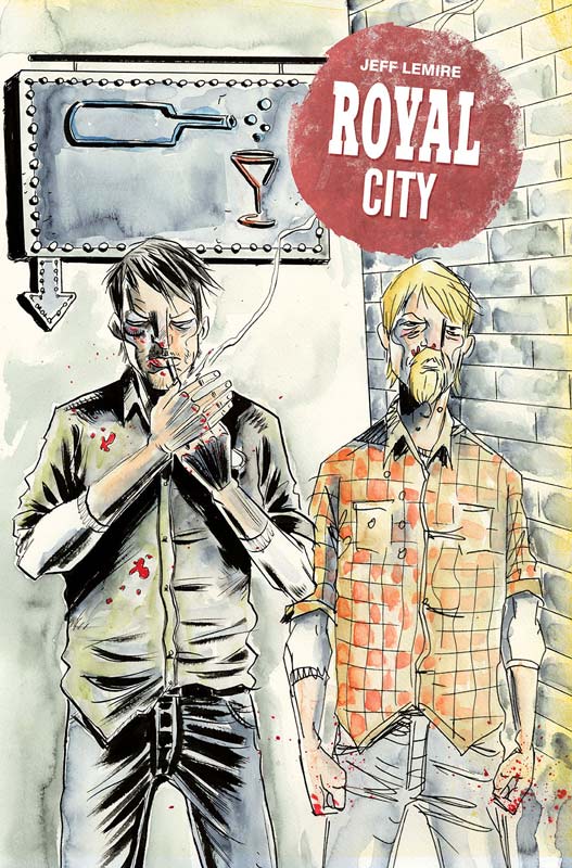
Image Comics Writer and Artist Jeff Lemire, Letterer Steve Wands
Lemire really knocked the first issue out of the park and the second issue really seals the deal on this one for me. Lemire continues to mine a great character study piece here and we start to find more pieces to the puzzle here. I thought that maybe I was just excited to read Lemire’s new book and over praise the first issue but that is not the case here. After reading this second issue I am sure that we are in for a special treat with this book. There are so many layers to the story going on here and the way that he is unfolding the story feels just right. What is making the book so great is that while you want to discover the mysteries of the town and why certain things are happening, but at the same time your drawn into the drama of the characters and their lives that are truly fascinating. Lemire’s art style is such a compliment to his scripts that is where the book really comes together. It’s the subtle artwork elements that really brings this story and world to life and where I absolutely love this book.
Is this book worth your time and money? This is a book that comes along and each issue washes over you and really sticks with you. There is so much to take in but the wonderful pacing of the story leaves you satisfied and wanting more at the same time. It’s rare that a second issue is better than a great first issue but Lemire is one of those rare creators that delivers that feat. HIGHEST RECOMMENDATION!
Cave Carson Has A Cybernetic Eye #7
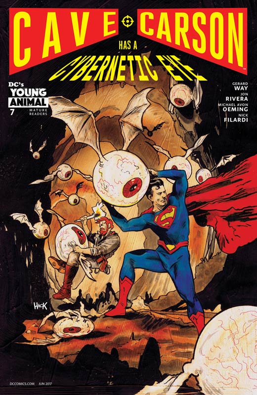
DC’s Young Animal Writer Jon Rivera, Story Gerard Way & Rivera, Artist Michael Avon Oeming, Colorist Nick Filardi, Letterer Clem Robins
After the shocking ending of the last issue, this issue is a big surprise but not for the reasons that you think. It pulls off a switcheroo in a way by telling a story from Carson’s past that in a weird way leads into the present. Rivera has a lot of fun with this story telling a classic adventure story with Carson and Superman is as fun as it is trippy. While on the surface it may seem like a little side story but when you get to the end of the issue you discover how it ties the past to the present and that is what makes this issue such a great read. Rivera continues to nail this book by simply keeping it fun and weird. There is a lot here that shouldn’t work but he is able to wrangle all of the elements and keep them going in the right direction and this story is a very good example of that. Oeming continues to knock this book out of the park. His version of Superman is classic and truly impressive. What make Oeming such a great artist is that all of the insane visual elements that Rivera throws at him each issue and he delivers it with such ease is where this book really shines. He is able to visually bend reality and yet what he never losses sight of is the emotions and the hearts of the characters that make this book perfect.
Is this book worth your time and money? For me this has been THE book of the DC’s Young Animal line. With no disrespect to the other titles that I also love but there is something truly special about Cave Carson that it’s such a pleasure to read each month and Rivera and Oeming continue to keep readers on their toes with each issue. It challenges readers in all of the right ways to simply make a fantastic comic each and every issue. This is a must read comic and gets my HIGHEST RECOMMENDATION!
The Wildstorm #3
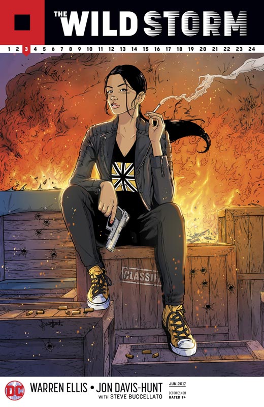
DC Comics Writer Warren Ellis, Artist Jon Davis-Hunt, Colorist Steve Buccellato, Letterer Simon Bowland
Ellis reinvention of the Wildstorm Universe takes a great turn in this third issue. This issue has some really heart stopping action that will have you on the edge of your seat. While this issue has a lot of great action we also get to learn more of the story surrounding the mysterious suit and what both sides are willing to sacrifice to capture her. I like the slow burn approach that Ellis is taking with this story. While it does make it a little tough to read in monthly installments there is a lot to take in each issue and I find myself re-reading the issue to find hidden little nuggets that I missed the first time around. Hunt continues to impress with his amazing artwork that shows what a versatile artist that he is. This issue he really pulls off the attack by the kill squad and he perfectly captures the emotions of the battle that is a key element to why this book is working so well. This is a really great looking book.
Is this book worth your time and money? If you’re wanting a slam bam superhero book then this one is not for you but if you want a deeper more meaningful superhero comic then you have landed in the right place. With its methodical unfolding story that has some truly outstanding artwork then this book is well worth buying.


0 Comments