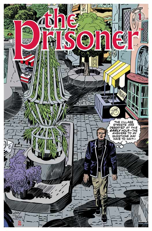
The Prisoner #1
Titan Comics Writer Peter Milligan, Artist Colin Lorimer, Colorist Joana Lafluente, Letterer Simon Bowland
As a big fan of the original Prisoner television series, I was skeptical about this new incarnation of this comic because I also loved the 1988 sequel comic by Dean Motter published by DC Comics back in 1988. While I would love to live in the past with this new comic, I do however see the need to bring it into the 21st century and that is where it can be very tricky. The good news is that Milligan sets things up nicely in this first issue and while I’m not totally sold on it yet I did like a lot of the elements that he set things up with. He wisely doesn’t try and reinvent the wheel here and while it takes place today he does give it a nice back story to Carey and how he ends up on the island. We will have to see how Milligan handles that in the future issues. He does a nice job of getting new readers up to speed with the basic premiss but keeps the exposition to a minimum to keep the pace moving along well for this first go around. Lorimer has to fill some pretty big shoes here with following up both Motter and Kirby who had previously brought the Prisoner to the comic world and he does a nice job here. The one thing that I liked about his art is that he took the time to do backgrounds for the book that so many artist leave out and it really benefits the art greatly here. There are a couple of things that I liked here was the facial expressing that he does and the mood that he sets with the shadows and mystery that add greatly to the look and feel of this book.
Is this book worth your time and money? I like the first issue but it’s too early to tell if I’m totally sold on this book yet. It does show a lot of promise and Milligan and Lorimer do a nice job on setting things up and keep the visual look of the original series. The second issue is going to be the make or break on this book with the arrival of the island. If you’re a fan of the original show than I would say give this book a try. If you’re not familiar with the original 1960’s series I highly recommend watching it then checking out this series. Either way the book is off to a good start.
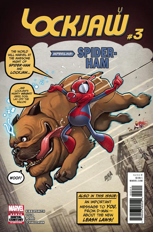
Lockjaw #3
Marvel Comics Writer Daniel Kibblesmith, Penciller Carlos Villa, Inker Roberto Poggi, Colorist Chris O’Halloran, Letterer Clayton Cowles
This comic continues to be sheer pleasure and the story just keeps getting more fun as it goes along. This issue we start to learn as to why Lockjaw has been teleporting and how the other siblings fit into the story. The big surprise of this issue is how Kibblesmith pulled Spider-Ham into the story and made it feel very natural without being hokey. There is also another surprising cameo at the end of the issue that I dare not spoil but if you’re a comic fan of the 1980’s your going to be very surprised. I have to hand it to Kibblesmith that he has crafted a story with a main character that has no dialog and yet he has found a way to capture his character in a way that I don’t think that anyone would have ever thought of. He also treats the characters with respect meaning that while the book is really fun it never talks down to readers and embraces it’s all ages badge perfectly. This issue is a real turning point in the story and is a great lead in to the final chapter. Villa continues to impress with his artwork on the book. He is able to flow with both cartoony and realistic characters with ease and that is what makes this book so charming. Often times an artist would have went the simple style and left a lot of detail out but Villa is able to keep it simple but makes sure that the level of detail is front and center and makes sure that the emotions of the story are front and center.
Is this book worth your time and money? This comic has been a real charmer and continues to be a fun and fulfilling read. Kibblesmith keeps it simple but yet he makes sure that there are nice twist and turns in the story that will keep older readers interested but still easy to follow for a younger reader. Throw in the spot on artwork by Villa and you have a real winner here. The only complaint that I have is that there is only one more issue of this comic and can wait to read how it all ends. RECOMMENDED!
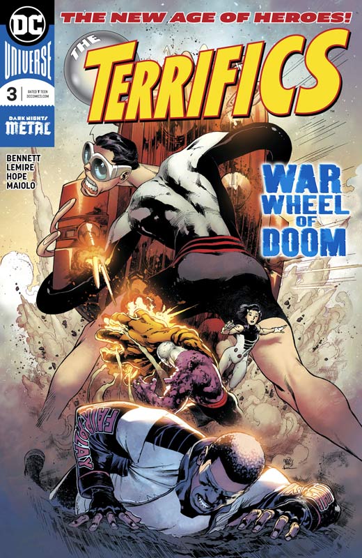
The Terrifics #3
DC Comics Writer Jeff Lemire, Penciller Joe Bennett, Inkers Sandra Hope, Jaime Mendoza and Art Thibert, Colorist Marcelo Maiolo, Letterer Tom Napolitano
The last standing The New Age of Heroes books for me and still the big winner of the bunch The Terrifics is in no small part to writer Lemire who has taken this b-list characters and delivering a fun and exciting superhero series that keeps getting better each issue. I’m a big fan of Lemire’s more personal work and his mainstream books have been a bit up and down but this book seems to have hit his sweet spot. I think the reason that its working so well is that it’s a real rag-tag team of DC Heroes that are great but just out of the mainstream just enough for them to be left alone and not inflicted with continuity or crossovers that will hopefully stay that way. This issue he throws in a lot of action but still keeps the humor that has made this book such a joy to read. He is also laying some nice ground work to this first story arc and its mysteries. It’s one of those story that on the surface is pretty straight forward but there is a lot going on underneath the surface to where the story really is. While I would have liked for Reis to stay on the book as the artist, I will say that Bennett has taken the challenge and done a very nice job with the artwork on the book. He does Plastic Man proud and I love his Metamorpho that has a very nice visual nod to Frankenstein but makes sure his humanity shines through. I have to give credit to the trio of inkers that make it flow effortlessly though out the issue.
Is this book worth your time and money? This issue may have not had any big reveals but there was a lot of subtle underlying story elements that are continuing to deliver some great ground work for the story. I love that Lemire gives the superhero readers the basic story elements to satisfy but give more discerning readers more meat to chew on so to speak. I hope that Bennett will stay on the book because he is able to go big when needed but is able to capture the smaller moments with ease just as well. I cant wait to see where Lemire takes this book and it continues to be very enjoyable. RECOMMENDED!

Deep Roots #1
Vault Comics Writer Dan Watters, Artist Val Rodrigues, Colorist Triona Farrell, Letterer Aditya Bidikar
This is one of those comics that has a lot of good ideas but is a little too disjointed with its first outing. Watters has a lot of really good ideas that he puts into this story and that is good but where the book struggled for me was that the focus of the story was all over the place. While that can work sometimes, the reader really needs to have a character to guide them and while Sal is interesting I didn’t connect as well as I would have liked in this first issue. The biggest problem was that the story jumped around and quite frankly didn’t give the readers much to go on as a linear narrative. While the book was a bit frustrating to read there are some real positive elements also. Watters introduces some compelling story concepts here that are very intriguing and when the story does work it does very well. It’s a mixed bag to sift through but there is more that I liked than didn’t. On the plus side for the book is Rodrigues’s artwork that helps this book along greatly. There were a few minor inconsistencies here and there but overall his style gives the book a moody and unique look that I very much liked. He was able to deliver the drama well but handled the action scenes with ease. For a small publisher like Vault this is a really good-looking comic that has a lot of promise.
Is this book worth your time and money? I would have wished that the story had made a lot more sense but there are some good ideas here and I am hoping that Watters will get the story on a better track with the next issue. There are more pluses than minuses that give the book some hope. The second issue is going to tell where I will land on this book. Good ideas are one thing but you have to give the reader something much more than ideas. Still worth looking at this week.
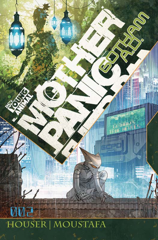
Mother Panic Gotham A.D. #2
DC’s Young Animal Writer Jody Houser, Artist Ibrahim Moustafa, Colorist Jordan Boyd, Letterer John Workman, Back-Up story artist Paulina Ganucheau
This second outing with a reimagined Gotham continues to be both familiar and different at the same time. Houser is doing a nice job of giving new angles to the villains of Gotham but make sure that they are not too different. While I like the concept of this new storyline, I’m not sure if I love after this second issue. It just seems to not have the excitement that the first story arc had. The story is there but the pacing seems to be not moving along as well as I would like with this second issue. It’s not to say that it’s boring but I’m not sure that I really care about any of the characters. They seem to go through the motions but there is not a lot of motivation beyond the surface. The only thing that I found exciting about this book is Moustafa’s artwork on the book that is really nice but there is only so much that an artist can do with a story that is kind of boring. It’s a real shame because he’s really doing a nice job on this book but the story is just not there.
Is this book worth your time and money? I really want to like this new story line but after this second issue there is just not enough there to keep me going. It kind of feels like rearranging the deck chairs on the Titanic where the boat is still going to sink even with the changes. Giving the story a Mirror Mirror concept is one thing but you have to give readers more than just slightly changing things around. It could just be me but I just got board with this book. It’s certainly not terrible but with so many comics coming out there is just not enough room to keep a book like this on the pull list even with the very nice artwork. SKIP IT!





0 Comments