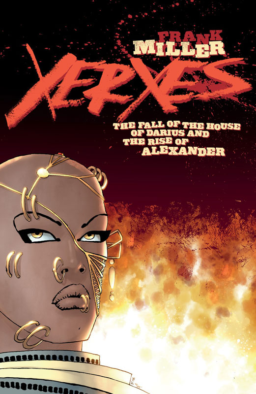
Xeres The Fall of the House of Darius and the Rise of Alexander #1
Dark Horse Comics Writer and Artist Frank Miller, Colorist Alex Sinclair, Letterer Steve Miller
In a book that is sort of but not really a sequel/prequel to Miller’s classic 300 series this story is about a war with the Greeks and the Persian’s that is both new and yet mines familiar territory. This marks the return to classic Millar ground that ends up being both exciting and somewhat disappointing a bit. While I did enjoy the first issue of this new story it doesn’t really break any new ground like the original series did. There is not really anything that you don’t expect from this book and that is where it struggles a bit for me. It’s all great and fun while your reading it but ends up leaving you with not much afterwards. There is no grey area that Miller can tell a damn fine story and this book proves that he still has it after some lackluster projects over the past few years. The script hits all of the right beats that the story needs and he keep the pacing of it tight and on point for a first issue. The good news is that his art is quite good on this new book and while there were a few minor bumps with the visuals I think that it ends up being a good-looking book in the end. A lot of the credit for the look also must include Sinclair’s color work on the book that really makes this a visual feast and adds greatly to Miller’s line work on the book.
Is this book worth your time and money? Don’t get me wrong I did really enjoy this first issue and will probably pick up the entire mini series. The problem is that this book is simple a sequel to 300 no matter how Miller try’s to not say that it is. While the story and the artwork are very good here, it does suffer from a been there and done that feeling. Miller didn’t really bring much new or freshness to this story that sets it apart from 300. Hopefully that will change as the story goes along but this first issue doesn’t really point in that direction. If you looking for more of the same that you liked about 300 then you’re going to like this. If you’re looking for something fresh and new to the sword and sandals genre then there is not much here.
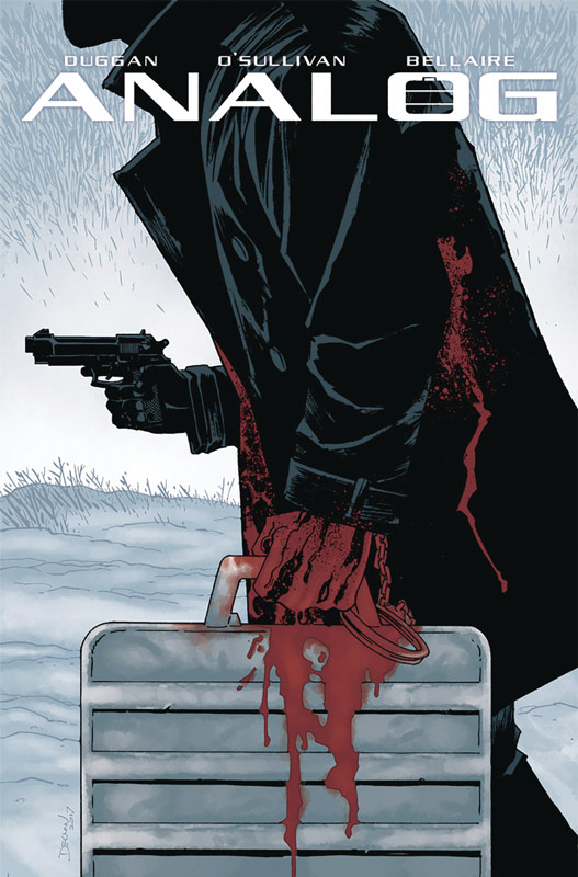
Analog #1
Image Comics Writer Gerry Duggan, Artist David O’Sullivan, Colorist Jordie Bellaire, Letterer Joe Sabino
On the surface reading this first issue of Analog doesn’t scream much originality, but I have to give Duggan credit for giving the tried and true hitman story a neat twist with the story that was pretty impressive. For most of the first issue it’s a pretty by the numbers affair but he slips in a nice twist with the worlds internet spilling everyone’s secrets and creating a whole new world and how society has adapted to this new age of spilled information. While the story won’t necessarily blow you away but that is one of the reasons that it ends up working so well. Duggan doesn’t try and over play the story in the sense that he doesn’t try and make the story bigger than it is. It aims for the middle and hits it perfectly. He also doesn’t try and reinvent the basic hitman and his past catching up with home scenario. He plays it by the numbers but he gives the story some nice little twists and turns to keep it interesting. The key for this story is where he takes it from this first issue and can he continue to add new ideas to the story. O’Sullvan’s artwork adds a nice clean style that fits the story quite well here. He gave the story a nice punch but doesn’t over play the art that gives the book a very nice visual flow while your reading it. In keeping the art simple really helps sell the story.
Is this book worth your time and money? I was pleasantly surprised by this book and while it didn’t blow my mind, it did however deliver an enjoyable read and gives a good enough reason to at the very least come black for the second issue. Duggan and O’Sullivan have done a nice job here and is worth checking out.
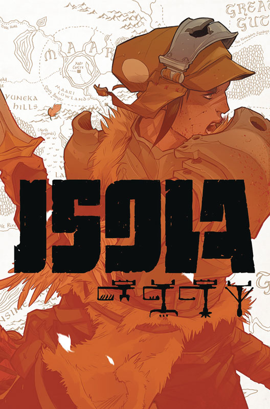
Isola #1
Image Comics Writers Brenden Fletcher/Karl Kerschl, Artist Karl Kersch/Msassyk, Letterer Aditya Bidikar
The team that brought you Batgirl and Motor Crush dip into the fantasy world with their new series Isola. This first issue story is largely told trough visuals that gives the book a great flavor that your don’t see often in comics today. While there is not a lot of dialog in the first issue, the story is quite amazing and is paced very well. On the surface it may seem like a quick read but there is so much story that is told in each panel even without dialog that you want to take you time to let the story soak in. They also set a great mystery with the story and while you’re not quite sure of what is going on and why the Queen is a tiger but that is what makes the story interesting. The world that they have created here feel fresh and new and you are instantly drawn into both the story and the world that they have created. There is little revealed story wise in this first issue but there is enough here to satisfy the reader with the ideas that are presented here. The big win for this book is the gorgeous visuals from Kerschl that are simply breathtaking with both the large scope of the world and the emotions that he is able to capture in both the human and animals in the story. It a comic that blurs the lines between story and artwork and it’s quite satisfying.
Is this book worth your time and money? There is a lot to like here and with Fletcher and Kerschl’s track record lately there is a lot more to come from this book. This first issue is very much a set up so it mostly exposition and very little revealed in this first issue. The key is going to be the next couple of issues to see where they take the story and reveal the mysteries surrounding the Queen and how she came to be a tiger. The artwork alone is worth buying the book but the story has a lot of promise and is well worth checking out. I really enjoyed this first issue and cant wait to see where it goes from here.
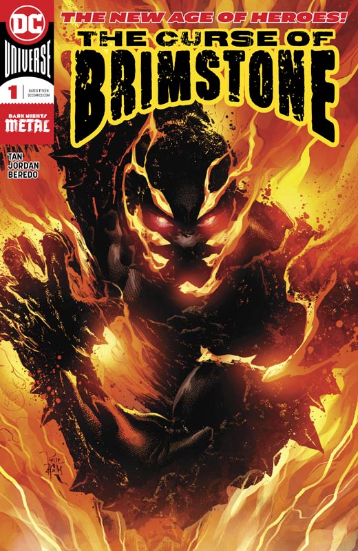
The Curse Of Brimstone #1
DC Comics Writers Justin Jordan & Philip Tan, Artist Philip Tan, Colorist Rain Beredo, Letterer Wes Abbott
Another The New Age of Heroes lands this week and while it’s better than some it does get off to a bit of a middling start. The story follows the basic tropes of fallen on hard times teenager with struggling family and is offered a basic “deal with the devil” and is given superpowers. Sounds pretty familiar, right? So this is what Jordan and Tan have come up with in this first issue and I can’t say that I’m very impressed with what I read here. There is nothing that you haven’t read here before and there is simply nothing new that they bring to the story. It’s not to say that the book is a terrible read but by the end of the issue there is no compelling reason to come back for a second issue. The only saving grace is Tan’s artwork that gives the book a great visual punch but with a very by the numbers script even good artwork cant really save this one.
Is this book worth your time and money? So far the whole New Age of Heroes has been a big bust sans The Terrifics that has been the only book that has been worth getting. I had hoped that this line of comics would try to be something different but as the case with Brimstone there is nothing here that you haven’t read before and this is one of the worst offenders of this so far. Jordan is a better writer at times than this book and while Tan’s artwork is great without a script that lays there like a slug the book is not worth it. SKIP IT!
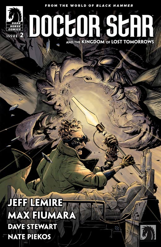
Doctor Star and the Kingdom of Lost Tomorrows #2
Dark Horse Comics Writer Jeff Lemire, Artist Max Fiumara, Colorist Dave Stewart, Letterer Nate Piekos
If your though the first issue of this Black Hammer side story was great like I did then this second issue will blow you away. A lot of people say that the superhero genre is dead and doesn’t have anything new today but, they are not reading what Lemire is doing with the genre in the Black Hammer Universe. This issue deals with the drawback that can arise from being a superhero and the sacrifice that they can have. What I love about Lemire’s take with this book is that he portrays Jimmy as an every man character that you as a reader could easily find yourself in his shoes. He also shows that some decisions that seem right at the time can have a huge ripple effect on both Jimmy and his family and that is what this issue deals with and its a truly heartbreaking tale that really sticks with you after you finish reading this issue. He is not afraid to go outside the box and tell superhero stories that have weight to them and yet they have the classic tropes that make superheroes in comics so great. He isn’t re-inventing the wheel here but simply telling great stories. Fiumara artwork on the book continues to impress with his ability to capture the emotions of Lemire’s script and bring it to life in such a visual way that makes this book so wonderful to not only read but to have such a great visual impact while you’re reading it. He is able to flow from action scenes to the dramatic emotional scenes with such ease that makes this such a pleasure to read.
Is this book worth your time and money? I was impressed by the first issue of this mini series and this second issue simply blew me away. It’s not that Lemire story is super original but he always finds a way to give it a new and fresh spin that captures the heart and soul of the characters that makes this book such a wonderful reading experience. And along with Fiumara artwork that is pure icing on the cake this is a must read book and another great addition to the Black Hammer mythology. HIGHLY RECOMMENDED!
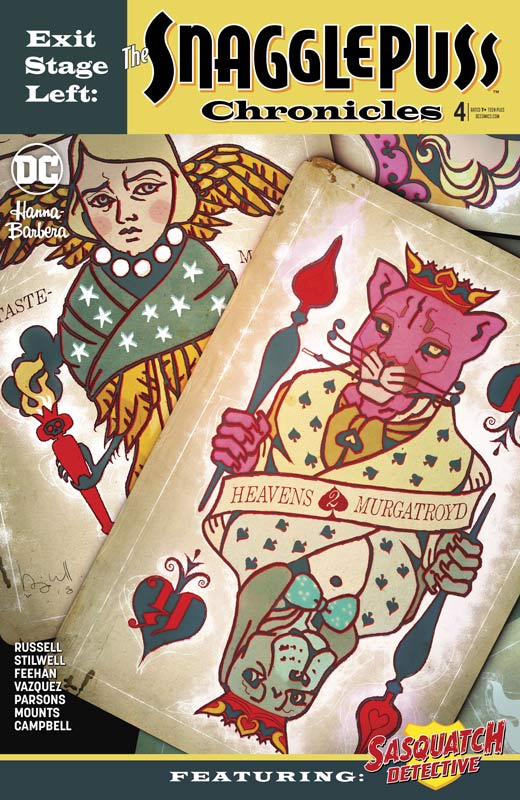
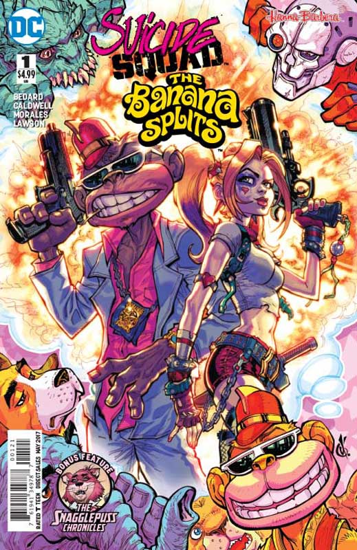
Exit Stage Left: The Snagglepuss Chronicles #4
DC Comics Writer Mark Russell, Penciller Mike Feehan, Inker Sean Parsons, Colorist Paul Mounts, Letterer David Sharpe, Sasquatch Detective Back-Up Writer Brandee Stilwell, Artist Jus Vazquez, Colorist Ross Campbell, Letter Dave Sharpe
Wow this book has been really great so far but this issue really takes it to a whole new level and throws in all sorts of twist and turns that are sure to impress. What continues to impress me with this book is how Russell is able to seamlessly weave social commentary, humor, drama and funny animals and have it flow so perfectly that continue to surprise readers with each passing issue. While the story is set in past history, it’s all sadly timely today to current events that delivers a much deeper reading experience that one would have expected from a re-imagined Hanna-Barbera character. Sure he could have told this story without Snagglepuss or Huckleberry Hound but I don’t think it would have worked as well. In a way he has taken stereotypes and turned them on their heads with this story. He also keeps readers on their toes with the story to where you’re not sure where Russell is going to take it and that is another reason that it’s working so well. Feehan continues to deliver spot on artwork for the story and he does such a great fine line between the human characters and the animals that is a very hard element to deliver visually but he is able to bring it all together perfectly here. He also captures the time period very subtly that you don’t realize at first but gives you a perfect feeling as you read it and that is a huge help to this book. The back-up Detective Sasquatch is cute but really seems out-of-place in this book. I would have much preferred a more obscure Hanna-Barbera character instead of this.
Is this book worth your time and money? This book just keeps getting better and better and this is the best issue to date and that is really saying a lot with this book. Russell delivers a spot on story that is dealing with real world issues that affect us all and yet he is crafting a story that is entertaining at the same time. He has found a way to make difficult subjects palatable and yet in a weird way exceptionally entertaining. This is a comic that will be talked about for many years to come and that is why you really should be reading this great comic book. HIGHEST RECOMMENDATION!
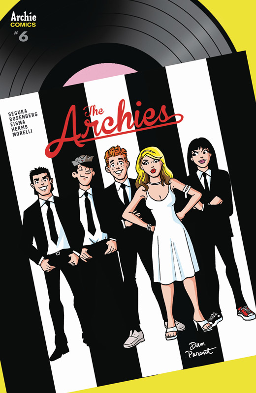
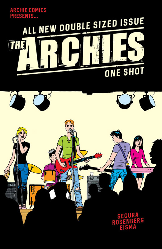
The Archies #6
Archie Comics Writers Alex Segura and Matthew Rosenberg, Artist Joe Eisma, Colorist Matt Herms, Letterer Jack Morelli
Another fun little gem of The Archies meeting Blondie that is short and sweet but still a blast. This book has always been a bit of a bridge between the old school Archie and the new updated version and while visually it’s based on the new look the stories have a more simple and sweet tone that makes it a nice one-off type stories. This issue is not nearly as good as the Monkees from a few issues back but this is still a nice little romp in the 198u0’s flashback music world. I think where is doesn’t work as well is the fact that Blondie was a brilliant band beyond Debbie Harry the other members of the band are not well-known and that is where the story struggles a bit. Segura and Rosenberg do the basics for the script and it is what it is type of story that is a by the numbers affair but doesn’t try to be anything more than that. Eisma’s art on the book is good but I wasn’t overwhelmed with his visual depiction of Harry that honestly didn’t really look like her much of the time. It’s a minor complaint because he does a nice job with the regular Archies cast so overall he does a good job.
Is this book worth your time and money? I like this crossover but didn’t really love it. I think the biggest issue is that Blondie just doesn’t have that nostalgia element compared to the Monkees so while it was fun it a bit disposable in the end and it ends up being pretty much for hardcore Archie fans and little else.
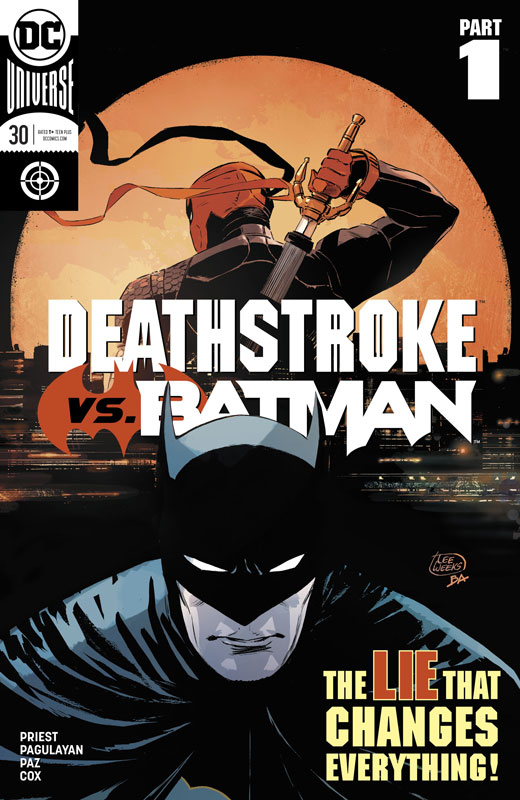
Deathstroke #30
DC Comics Writer Christopher Priest, Penciller Carlo Pagulayan, Inker Jason Paz, Colorist Jeromy Cox, Letterer Willie Schubert
I love Deathstroke but never felt that he needed a regular series where maybe DC should have mini series for him that might work better. This issue is the big Batman crossover story that left me pretty meh with it. It seems to be lately that many crossovers and event comics coming from DC have been letdown and failed to generate much enthusiasm from me and I had hoped that this one might be good and sadly I was wrong. Priest has done some good writing but this first chapter fell flat and really didn’t go anywhere. It really struggled with two problems the reason for Batman to be in the story was pretty flimsy at best and very cliché. The other issue was the pacing of the story was all over the place and made for a not very cohesive read. It was also a by the numbers affair with simple plot elements and very little else to the story. Pagulayan artwork is nice here and so nice looking superhero type artwork. It gets the job done and while it’s not very flashy he does a nice job of the mood that the story delivered and helped move things along but honesty he could only do so much with the script he had to work with.
Is this book worth your time and money? I picked this up on a whim this week and while it wasn’t terrible, it wasn’t terribly good either. The story elements to get Batman and Deathstroke together was pretty weak and the story is an average by the numbers crossover with very little depth to it. Save your money and SKIP IT!


0 Comments