A.D. After Death #3
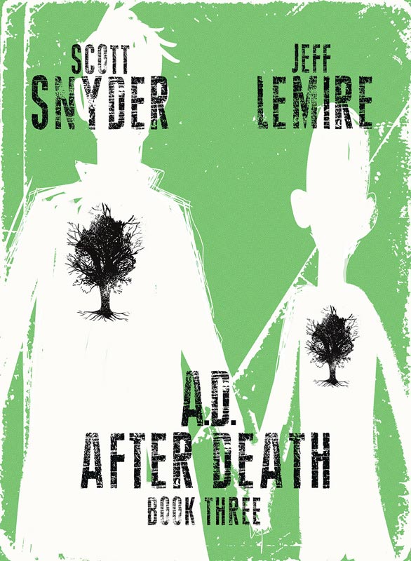
Image Comics Writer Scott Snyder, Artist Jeff Lemire, Letterer Steve Wands
Every once in a while you come across a comic book that tells a story that truly surprises and impresses you. A.D. After Death is one of those rare books that is difficult to put down because it’s that good. Snyder and Lemire have crafted a story that is a rare page turner in comics. It’s a book where the story and artwork blend together seamlessly that made this such a perfect story. While there are many times in the story where it’s simply written dialog this is where the subtlety of Lemire’s artwork really comes into play. There are many times where you subconsciously feel the artwork blend with the words and give them much more weight than if it was just text on a blank page. The mix between traditional comic and novels is very blurred with this book and that is what makes it both unique and impressive. While Snyder and Lemire are credited separately as writer and artist, this book really captures when a collaboration is perfectly in sync. The story is both personal and epic at the same time and while your never quite sure where the story is going you never feel lost. What you do feel is the emotional impact of the story right to the end that doesn’t wrap it all up in a bow for you but your fully satisfied at the same time. Lemire’s artwork perfectly suits the story and he captures both the grand scope of the story and yet delivers the raw and subtle emotions that deliver the heart and soul of the story.
Is this book worth your time and money? This is a book that envelopes you and takes you on a grand journey that really shakes you to your core emotionally. It’s a great take on the human condition that asks many questions but it leaves the reader to decide how answer them. The story is very straight forward but leaving you with moral and emotional questions is where the book works so well. This a must read book and is a huge must buy and gets my HIGHEST RECOMMENDATION!
Bug: The Adventures of Forager #1
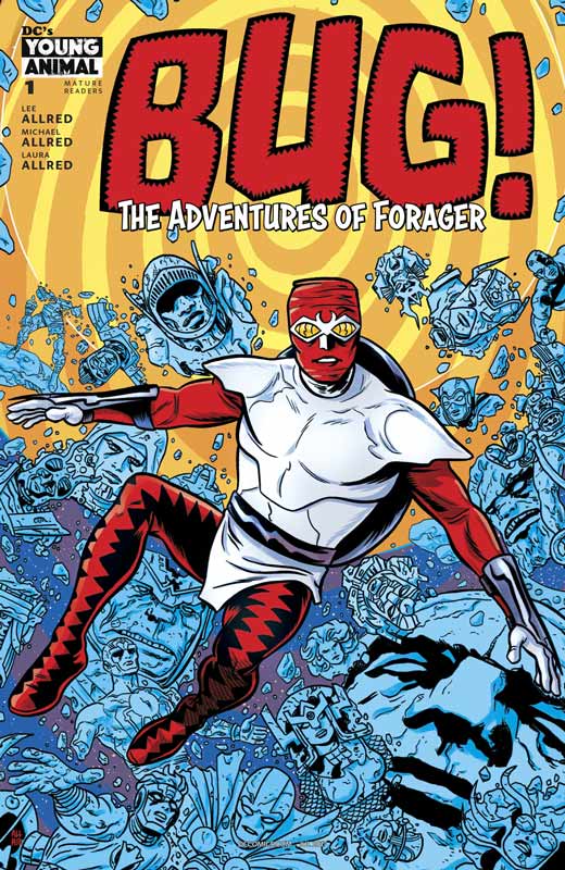
DC’s Young Animal Storytellers Lee Allred & Michael Allred, Colorist Laura Allred, Letterer Nate Piekos
The newest addition to the Young Animal imprint at DC is the Allred’s take on Jack Kirby’s Bug (AKA Forager) from the New Gods series created in the 1970’s. This new interpretation is more akin to Michael Allred’s Madman than the original Kirby but that’s not a good or bad thing. The one thing that is a bit of a challenge is that like Madman there is a lot of weird story elements that will throw off some readers but if history holds true to Allred, it will all make sense in the end. There is a lot that Lee and Michael throw into this first issue and it reads a lot like a dream and that is kind of the point. The one thing that you have to do when you read the book is simply pay attention to all of the details both big and small. What makes the book interesting is that it’s OK to be a little lost in the story because you are put in the same place as Forager. What the Allred’s do so well is throw things a little off kilter and that is part of the charm of the book. It’s also creepy, silly, fun and throwback to the old school DC Universe. The one thing that definitely comes to mind when you read the book is surreal and that is where the book shines. Michael’s artwork is really top-notch here and throws a lot of nice homages to both Kirby and the DC Universe in the book, but he also makes it all his own at the same time. One thing that I love about Michael’s artwork is that he uses ever inch of the pages to fit in an insane amount of detail. He also plays with the page layouts to keep things moving along and dares to take the book in wild directions with the art. As always Laura does a bang up job on the colors here and keeps the color tones in line with the color work of the 1970’s that really adds to the look and feel of the book that was a very nice touch and homage.
Is this book worth your time and money? I admit that the book will take a little getting used to because of the wild tone and look of the book. There is a lot of places that the book can go with this first issues jumping off point and it’s going to be a wild ride with the Allred team. If you’re not sure what to make of the first issue don’t worry because the Allred’s past comics prove that this is going to be one hell of a ride. I enjoyed the book and if you’re looking for an off kilter and fun ride then you have come to the right place. Well worth checking out.
Misfit City #1
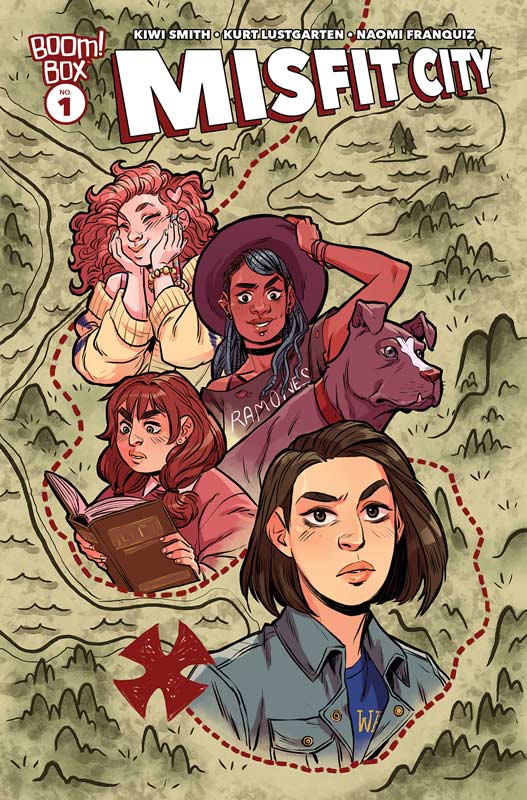
Boom Box! Writers Kirsten Smith, & Karl Lustgarten, Artist Naomi Franquiz, Colorist Brittany Peer, Letterer Jim Campbell
Misfit City was a bit of a mixed bag for a first issue. I get that Smith and Lustgarten are big fans of the Goonies but the first issue didn’t quite breakaway from being a so-so retelling of the same story without much of a twist. I will give them that the concept is interesting but I think were the book stumbles a bit is that the story is just slightly changing things. The other problem was that characters were not fleshed out as much as I would have liked for a first issue. I think the biggest problem with the story was the real lack of anything happening. The story is pretty by the numbers and you can see everything coming a mile away and that was disappointing. I did like Franquiz’s artwork overall but there were a few times where there was a bit of inconsistency but nothing fatal. There was too many panels that simply didn’t have any backgrounds in them and that was a bit sloppy and made it look flat sometimes.
Is this book worth your time and money? The book was more good than bad but the thing that really hurt it was that the first issue didn’t really go anywhere and ended up being too much of a carbon copy of the Goonies. I get that they love the Goonies but they really needed to bring an original hook to the concept of this book. It certainly wasn’t a terrible read but didn’t really stand out either.
Rock Candy Mountain #2
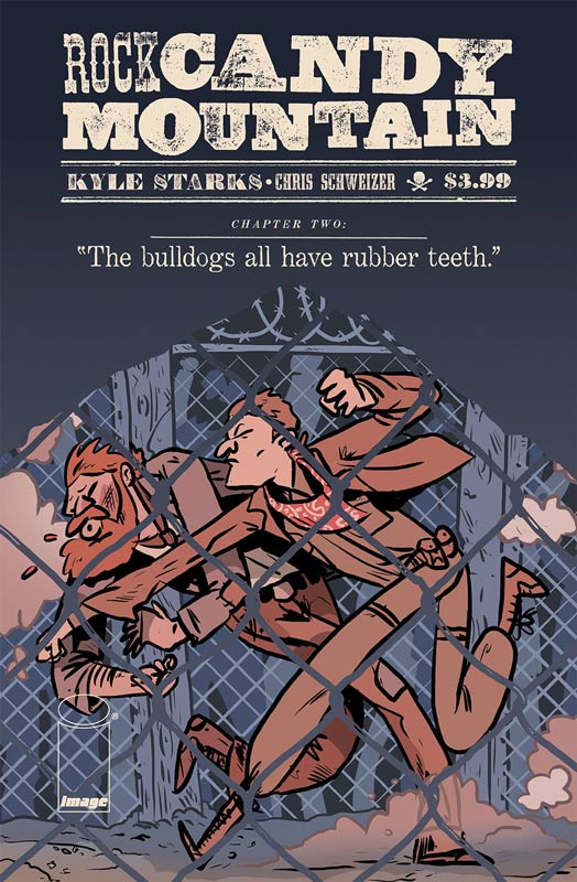
Image Comics Writer and Artist Kyle Starks, Colorist Chris Schweizer
I really enjoyed the first issue of this book and this second issue really seals the deal on this comic. A second issue is a key to see where the book is going from the initial set up and Starks has really nailed it here. What really made the story work was his blending of the past and present in the story that really propelled the story forward and gave it some great back story to the world. This is one of those comics that just hits every beat of the story perfectly and is a real joy to read. Starks really blends things together so well with humor, drama and action that keeps you entertained on every page. What I think really makes the book work is that Starks never overplay the story meaning that he doesn’t try to make it bigger than it is. This is simply a solid and well told story that is a pure joy to read. His art style give the book a real charm and great look. It’s simple yet detailed artwork gives the story the perfect visual looks that convey every emotional element of the story. This is a really great looking book that delivers on a grand visual level.
Is this book worth your time and money. This book is becoming a must read and with this second issue really impressed me. It’s a fun and simple story that works perfectly and is a great ride. There is a lot of story that Starks seems to have up his sleeve and I can’t wait to see where he takes it. HIGHLY RECOMMENDED!
Grass Kings #3
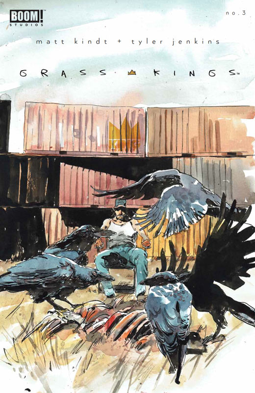
Boom! Studios Writer Matt Kindt, Artist Tyler Jenkins, Letterer Jim Campbell
The first two issues of this book have done a solid job of setting the story up and creating a great mood and world for the book but this third issue really kicks the comic into high gear. The one thing that really impresses me with Kindt’s writing is the way that he lets a story unfold naturally and this book really proves that point. By having the first two issues were a lot of exposition there was also a great deal of world building that was there and it really paid off in this issue. The slick dialog of the book is where the book really shines and this is where Kindt’s script works so well. This issue has some amazing dramatic elements that take the story into a great direction of where things are going. There is still a great amount of world building that is keeping the reader to come back for more. Kindt’s script offers some great twist in the story that was very surprising and quite refreshing to see with the story with the mystery and tension that really keeps you on the edge of your seat. I can’t imagine a better artist for the book than Jenkins. His style really captures the script in a way that delivers the raw emotions of Kindt’s script perfectly. Each panel bust with life and captures the subtle tones both above and below the surface that make this book a real treat. Jenkins color work is what is most impressive about his artwork. There are few artists today that can deliver beautiful line work like Jenkins does but the way that he uses the color palate to pull the line work together is most impressive. He really understands how color can be used to create a specific tone to the art that makes it really pop.
Is this book worth your time and money? Kindt and Jenkins are hitting their stride on this book with this issue and continue to unfold the story at a nice pace. While some might find the books slower pacing they simply can’t appreciate the way a story needs to build and wash over you that really delivers a great emotional impact that this book really excels at. This is a must read book and is HIGHLY RECOMMENDED!



0 Comments