Due to a trip this weekend this weeks reviews are going to be a bit quicker and fewer than usual. Here we go….
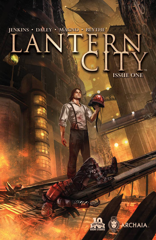
Lantern City #1
Archaia Writers Paul Jenkins & Matthew Daley, Artist Carlos Magno, Colorist Chris Blythe, Letterer Deron Bennett
Lantern City is based on a television proposal and a novel based on the property. Writers Jenkins and co-creator Daley do a good job of setting up the story with good exposition and the first issue gets off to a decent start. They set up the main characters and the plot of the concept without the story being bogged down by it. While the story was a decent read I do wonder about the long-term of the book. It’s set to run 12 issues but the basic plot is a standard dystopian future society that we have seen far too often in every media. After reading the issue I liked it but it didn’t really do anything unexpected and this is why I worry about the book. There was no real new hook to get me overtly excited about the next issue. The one thing that the book does have going for it is the stunning artwork of Mango. This is a fantastic looking book and he really puts a ton of detail into the artwork. I will say that he really elevated the book above the story at least for the first issue.
Is this book worth your time and money? I think that the book has a lot of promise but at the same time the next few issues really need to bring something new to this paint by numbers concept that doesn’t break any new ground at least in this first issue. It’s a pleasant read but doesn’t immediately grab you. The artwork does push the book to a minor recommendation and hopefully the next couple of issues push the book in a more original direction.
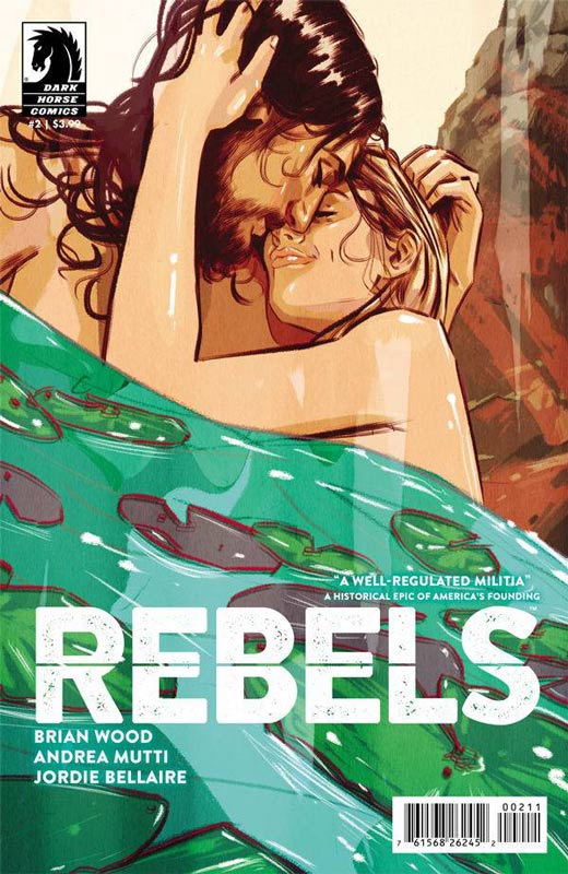
Rebels #2
Dark Horse Comics Writer Brian Wood, Artist Andrea Mutti, Colorist Jordie Bellaire, Letterer Jared K. Fletcher
I was super impressed with the first issue of Rebels and thankfully the high bar set on the first issue was not a fluke. Wood’s mixing of factual and fiction to weave a truly great work that shows how great comics can be. Wood has done a great job coming up with a great historical fiction concept that is allowing him to play in a period that rarely works well in comics and spun it into a fictional story that works on a whole new level. The key to the story working so well is that he wisely has the character Seth Abbott be the key to the readers trip back in time. By not having to strictly adhere to history this has really allowed him to put Abbott into situation that are familiar yet we as the reader do not know this outcome. Wood also doesn’t always dwell on the war and allows for growth of the characters so that readers have a reason to care for them on their journeys. While the story is great the main reason that the book works so well is the fantastic artwork of Mutti’s art and Bellaire’s colors that bring the subtle textures of Wood’s story to life. Mutti’s art brings such a great texture that gives the art a great rough feel that the story needs to come to life.
Is this book worth your time and money? I’m usually not a big fan of historical pieces but there are exceptions and Rebels is one that I am really looking forward to each month. Wood has found a way to keep the tone of the period but mix things up along the way that really keeps readers on their toes as to where the story is going to go. Add in the great visuals that make this book a must add to buy pile every month. HIGHLY RECOMMENDED!
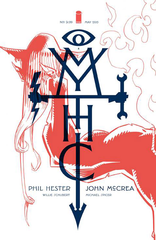
Mythic #1
Image Comics Writer Phil Hester, Artist John McCrea, Colorist Michael Spicer, Letterer Willie Schubert
Mythic is an odd little book in that the concept is a mix of familiar tropes I found the book an intriguing read. Hester sets up the concept well while keeping the story from being dragged down with too much exposition. He keeps the tone of the story light and fun and while the story is not going to knock your socks off it was a nice read. The only complaint with the story is that it’s over a bit too quickly. Just when the story starts kicking in the issue ends. I guess that is good because I will give the book a few issues to see where Hester is going to take the story. McCrea probably best known to readers of his artwork on the Hitman series over at DC is a perfect artist for the book. He has a great knack for drawing normal exposition and in the next panel have an insane monster biting someones head off and making is work seamlessly. And Hester wisely starts off the book with a monster battle that McCrea handles with ease.
Is this book worth your time and money? I like the idea that the story is playing with that science is really a cover up for mythology that is real in the story and of course there are going to be monsters and gods showing up. While not wholly original it was a pleasant read and I really enjoyed McCrea’s artwork on the book. You might want to give the book a try if you are interested in the concept of the book and at a $1.99 cover price it won’t break the bank.
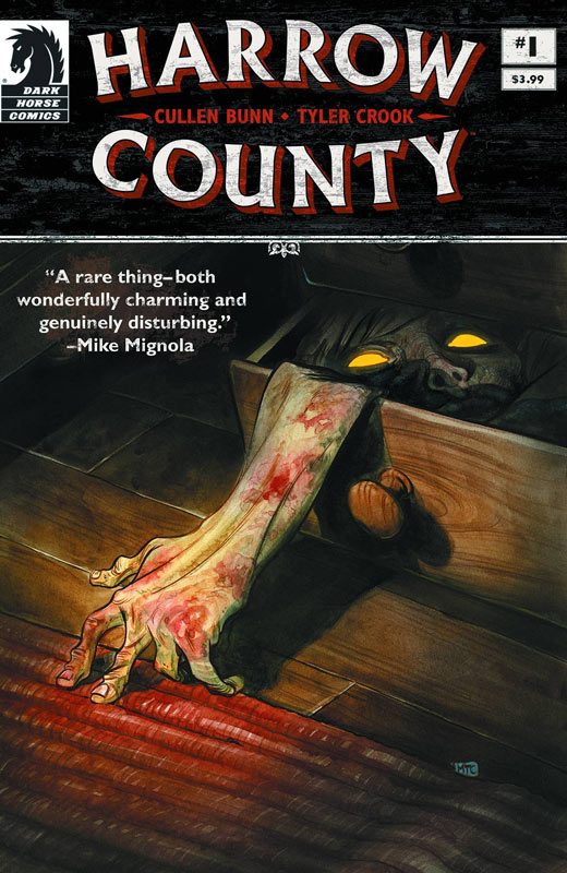
Harrow County #1
Dark Horse Comics Writer Cullen Bunn, Artist & Letterer Tyler Crook, Tales of Harrow County Art by Owen Gini
Bunn’s track record has been real hit and miss but it seems when it comes to his own concepts he tends to do better. In this case Harrow County is a home run. Bunn takes the tried and true witch/ghost/horror concept and fashions a really solid story for the first issue. Setting up the story in the past to connect it to the present was very well told in three pages and really got the momentum of the book off to a great start. While some might not get the pacing of the story I found it to be quite refreshing because he does a great job of exposition to both the characters and the plot of the story that he is weaving. Horror is a hard thing to pull off well in comics and Bunn has done a really good job with making this story really disturbing and yet it feels very normal at the same time. The setting of the story in a rural area gives the book a great timeless quality that makes is all that much creepier. Crook’s artwork gives the book a storybook type of look that make the story all that more disturbing. Visually the book is very charming and that is what sucks you into a false sense of normalcy.
Is this book worth your time and money? I really loved this book and it really does a great job of getting under your skin literally. Bunn does a great job of setting up a great concept that on the surface feels very familiar but he takes it in a very interesting direction that I’m excited to see where it’s going. Cook’s artwork is simply fantastic and does a great job of pulling the duality of the story visually that has a great impact on you. A really great first issue. VERY RECOMMENDED!
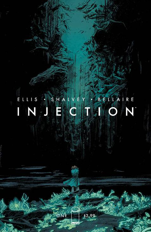
Injection #1
Image Comics Writer Warren Ellis, Artist Declan Shalvey, Colorist Jordie Bellaire, Letterer Fonografiks
Injection has some good ideas but Ellis’s story is a bit all over the place. There are some great elements that he introduces but unfortunately you are left more confused than you should be. This is the same creative team that did the recent re-launch of Moon Knight over at Marvel and was a great done in one book. Unfortunately here Ellis is setting up some interesting ideas but the characters are not quite fleshed out that well and you are not sure of their motivations. It seems that the narrative thread that should lead the reader is missing here. It’s almost too much exposition and not enough character development for the reader to latch on to. Shalvey’s art is the one thing that is really holding the whole thing together here. He does his best at visually helping the reader though the confusion but he is only able to do so much.
Is this book worth your time and money? Ellis gets the book off on the wrong foot and while there are some ideas that are interesting the overall book never quite gels together like it should. While the book may work on the long-term, it’s very hard to see it by reading this first issue. I really wanted to like the book but it just didn’t really go anywhere for me. SKIP IT!


0 Comments