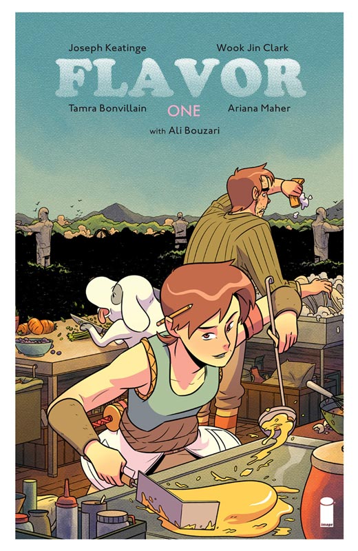
Flavor #1
Image Comics Writer Joseph Keatinge, Artist Took Jin Clark, Colorist Tamra Bonvillain, Letterer Ariana Maher, Culinary Consultant Ali Bouzari
Every week I’m alway on the look out at my local comic shop for books that are not only new but just flipping through it you get a sense that you need to read it. Flavor is a book that is visually appealing at first glance but when you sit down to read it, that is where the really shines. One thing that came to mind after reading the first issue is that the title Flavor is perfect in many ways. One that I think is fitting is that Keatinge blends many flavors together in the script. There are many influences and most obvious is Hayao Miyazaki for both the Asian and European feel of the story and the world they have set up here. One thing that really stands out in this first issue is that there is a lot of exposition but he also take the time to set the characters up so that the reader will relate to them and get to know them better. He mixes, drama, humor and mystery quite well here in this first issue and balances everything very nicely. Sure there are some familiar tropes here but Keatinge found a way to give it a fresh look and feel that gave this world and story a nice depth and charm that was very refreshing. At first glance Clark’s artwork has a strong manga influence but there is so much more to it than that. It has a great animation look to it that fits perfectly with the story and captured both the big and smaller scenes with ease. He gives the cast a warm and loving visual look that will capture both your eyes and your heart and is one of the big reasons that this book works so well. Another big plus for this book is the lovely color work by Bonvillain that greatly complements Clark’s line work and gives it a warm and inviting feel that makes this book a real winner.
Is this book worth your time and money? This book is not only charming but gets off to a hell of a start and is not only worth getting but Keatinge and Clark give you lots of great reasons to come back for more. With a solid story and wonderful artwork make this an easy recommendation and I can’t wait to see where they take the story. VERY RECOMMENDED!
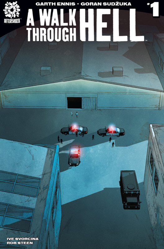
A Walk Through Hell #1
Aftershock Comics Writer Garth Ennis, Artist Goran Sudzuka, Colorist Ive Svorcina, Letterer Rob Steen
I’m a fan of Ennis’s work but there are some series that he has a tendency to get off on bad footing with the first issue and this is one of those. It’s not to say that the book is terrible but Ennis throws a lot at you in this first issue and it jumps around with the narrative that make reading this first issue quite frustrating. There is a lot that he throws into this story and it kind of becomes a Catch-22. On one hand there is a really intriguing mystery here that is quite facilitating but with the sketchy narrative it was difficult for me to get fully immersed into the story. I will say that end of this first issue gives a surprisingly good payoff considering the set up frustration I had with Ennis’s script. Sudzuka’s artwork is nice and gets the job done well and while it’s not fancy he does a nice job of capturing the facial expressions of the characters well and does help move things along visually. He also captures the dark tone of the story nicely and that was a bit plus.
Is this book worth your time and money? This one is a real tough call because Ennis tends to write stories for the long-term and it’s very hard to judge them by their first issue alone. I will give him that there are some good ideas here and the cliffhanger is great but. I’m just not sure its a comic for everyone. If you’re an Ennis fan then you know the deal with his comics but I think it’s worth checking out for at least one more issue to see where he it going to go with it.
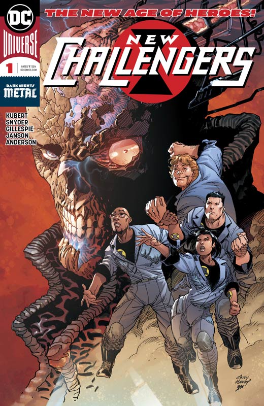
New Challengers #1
Writers Scott Snyder & Aaron Gillespie, Penciler Andy Kubert, Inker Klaus Janson, Colorist Brad Anderson, Letterer Deron Bennett
As a huge fan of The Challengers of the Unknown over the years with both the silver and bronze age incarnations, I was excited to hear that they were coming back and with Snyder at the helm gave me hope. Well it wasn’t either good or bad but this first issue was a bit middling as a start. I believe this is one of the last of the New Age of Heroes that quite honestly been pretty disappointing at this point and the credits on this book really prove that the experiment was a bit of a failure by listing them as a normal comic book does instead of the previous ones. The story does show some promise but it just didn’t have the team adventure thing down that well in this first outing. Snyder and Gillespie do introduce some new concepts here and I wont spoil them but I’m not sure if I care for them yet. While the concept of throwing a team together by random selection could work, I never felt as if they really wanted the job and that part didn’t rub me the right way. For me what made the original and the reboots work was that they wanted to fight the forces of evil and while that setup is pretty basic it did work well. This first outing didn’t really have much adventure going on so it’s a little hard to tell where that part is going. The entire first issue is exposition heavy and while it sets the story up there is little room for much else. It’s not to say that the story was necessarily bad but it’s hard to tell where they are going to take it. On the plus side Kubert and Janson’s artwork is top-notch here but was with the other New Age of Heroes the main draw of Kubert on the book is only this first issue. I am of fan of Janson who appears to be taking over the full artwork duties from the second issue on. While it’s a shame that Kubert only is doing this first issue he does get the visual tone of the book off to a solid start and while there are not many big action scenes the dramatic one are filled with great visual mood that gets the book started on a good footing.
Is this book worth your time and money? Honestly it’s really hard to tell which way this book is going to go. While there is a lot of set up here, the forward momentum of the story is a bit unclear from this first issue. I had wished that Snyder and Gillespie had delivered more of a classic action filled adventure story and they may in fact do that in the next few issues but with what we are given here the future is a bit foggy. It’s not a terrible read but was a bit middling for a first issue.
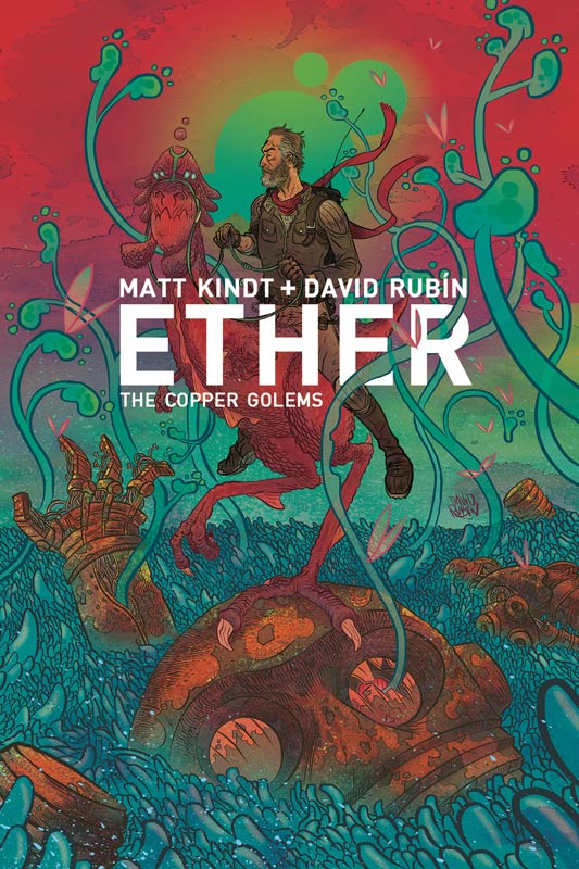
Either: The Copper Golems #1
Dark Horse Comics Writer Matt Kindt, Artist David Rubin, Color Flats Like J. Diaz
The second part of the Ether story really hits the ground running with this first issue that picks right up from the first mini series that is great for regular readers but is going to be tough for new readers. With that being said Kindt starts things off with filling in the blanks with Boone in our universe and how the Either has affect both him and his family and where they go from here is where this story really shines. We then start to put the pieces of the mystery puzzle into place with a great prison part of the story that is fun and exhilarating as we start to discover what is going on in the Either. This book really shows what a great storyteller Kindt is and how you deliver exposition the right way without it weighing down the book but still keep the narrative moving forward. There is a lot of story that Kindt uncovers here and builds things exceptionally well here As always Rubin delivers the goods with his brilliant artwork that aways is impressive an there is a lot of visually stunning stuff in this issue. The prison break scene is a real tour de force and he captures the scope and sly humor of it all with ease. Rubin really brings Kindt’s script to life perfectly.
Is this book worth your time and money? If you’re a new reader to the Either mythology then I highly recommend that you pick up the first series because without read it you will be totally lost here. For regular readers of the series this second chapter is all you could hope for and more. Kindt and Rubin have really upped the ante with the story and have pushed the book in a way that I never thought it could go. It’s a comic that can still surprise and continues to impress and is a very easy recommendation. VERY RECOMMENDED!
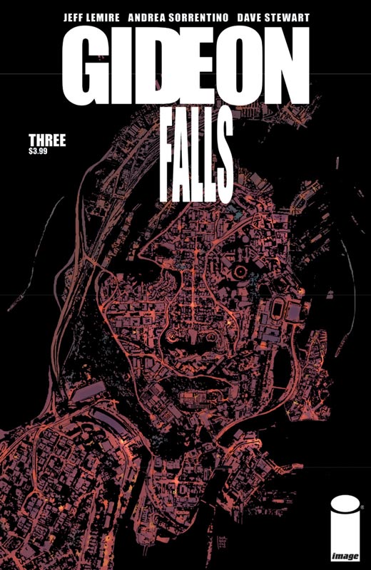
Gideon Falls #3
Image Comics Writer Jeff Lemire, Artist Andrea Sorrentino, Colorist Dave Stewart, Letterer Steve Wands
I have been very impressed with Gideon Falls so far and this third issue continues to unfold the mystery of the town and how the pieces of the puzzle are falling into place very well. The most impressive element of the story is how Lemire is unfolding the story so perfectly that gives you a feeling of it washing over you as it unfolds. He also balances the two ongoing storylines and meticulously weaves them together so they complement each other perfectly. It’s the Norton and Doctor Xu storyline that is very intriguing and is perfectly parallel to the Father Wilford one. Each issue digs deeper into the mystery of the Black Barn and how this is not the first time that these strange occurrences have happened. One thing that makes this book so good is the unnerving feeling that you get while your reading it. Doing a horror comic is very difficult but Lemire pulls it off with such ease here that you relies how much the story is getting under your skin and that is what makes a good horror story is that you don’t realize how it’s affecting you until it’s too late. Any good horror comic needs the right artists to bring it to life and Sorrentino is perfectly capturing all of those elements and more. While he delivers the goods in the creepy moments of the story its the smaller dramatic elements where he impresses me the most. The most important thing that he brings to this book is the emotional core to the characters that you need to make this work and that is what I love about his artwork.
Is this book worth your time and money? This is a book that you simply should be buying now. Smart and creepy and even if you’re not a big horror fan this book is not gory but more like what great horror films used to be, unnerving and creepy. It’s also a great mystery story that keeps you on the edge of your seat. This is a perfect matching of story and artwork and is what a great comic can and should be. HIGHLY RECOMMENDED!
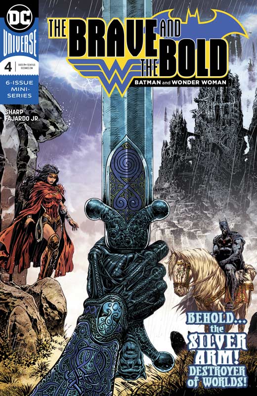
The Brave and the Bold #4
Writer and Artist Liam Sharp, Colorist Romulo Fajardo Jr., Letterer Troy Peteri
This story is really hitting its stride over these last two issues and the murder mystery is unfolding very nicely here. While at first I was not overwhelmed with the first issue, I could see that Sharp was going for the long haul with this story and this issue really shows how it is all coming tougher very nicely. One of my favorite things about this story is that it’s a great Batman detective story that you simply rarely see very often in Batman comics today. But as much as it’s a Batman story, Sharp in no way plays Wonder Woman as a second banana. She is just as important to the story as he is and in some ways more important. Her role is much more subtle but very much key to the story. It’s rare in a mainstream superhero comic to do a murder mystery and that is just what Sharpe is delivering here. One of my favorite things in this issue is the emotion of the visit with Queen Ethne that brings great weight to the story and shows the loss of the King and how it is affecting everyone in different ways. While this is a huge epic story there is a more subtle tone than I had originally expected and find it quite refreshing. Most epic stories like this get weighed down in tropes and end up being average story telling but Sharp take this book in a direction that is both deep and refreshing. As always Sharp’s artwork not only delivers but the scope and detail continues to blow me away with each new issue. This issue with the lush paintings at Queen Ethne’s castle simply blew my mind with the detail and how perfectly they fit into the story. I can only hope that there is a hardcover of this mini series to capture the heft of this story and artwork.
Is this book worth your time and money? This book is really hitting its stride and while I still think that it will read better in one sitting, I am willing to read it as it comes along for now because it gives me something to look forward to each month. Sharp is delivering a rare and unusual story here and while it’s not going to be for everyone but if you want more meat on your superhero bone so to speak then it will not disappoint. RECOMMENDED!

Justice League: No Justice #2
DC Comics Writers Scott Snyder, James Tynion IV, and Joshua Williamson, Artists Fancis Manapul and Marcus To, Colorist Hi-Fi, Letterer Andworld Design
I wasn’t very impressed with the first issue of the re-branding of the Justice League but was willing to give it one more go around this week to see if there was any improvement. Well there was a bit but the book still suffers from being a mediocre crossover story that you have simply read a million times before. The problem with these types of comics are that they try to set things up to be new and different and yet they all seem to end up being more of the same old tropes trotted out and stamped as new and fresh. It’s not to say that this is a terrible read but it’s simply all too familiar for me. While this second outing is better than the first issue, that’s not saying a lot. The sad part is that the three writers (Snyder, Tynion and Williamson) are simply better than this book. There is nothing that you don’t see coming in the story and unfolds exactly as you would expect. Even the “shocking” ending is simply not very shocking or surprising. The artwork on this issue is a bit on the uneven side and that is not to say that its bad but the addition of To to the book is noticeable but thankfully not too distracting. They do their best to at least make this so-so story at the very least visually exciting. There are some really nice action scenes that for a minute make you forget that the story isn’t that great and I have to give Manapul and To credit for their art skill on that count.
Is this book worth your time and money? Simply put this is yet another “epic event” that is neither epic or eventful, and is pretty pointless. While I still have minor hope for the spinoff books from this mess at this point I’m done with this book. There is simply little here to justify the four bucks to spend on this mess. There are simply too many good comics out there other than this book. SKIP IT!
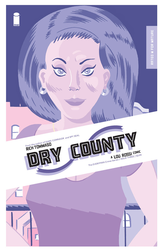
Dry County #3
Image Comics Writer/Artist/Colorist/Letterer Rich Tommaso
The second issue was good but a little drier than the first but this third issue really hits the ground running and starts to really bring the story together. There is so much story going on in this issue but a lot of it is very subtle and is giving this book such a great flow to the story. Tommaso has crafted a nice mystery/slice of life story here that nearly anyone can relate to. Rossi is a perfect everyman that has something that you can easily relate to. I actually like the slow-paced drama that this story is delivering so far and is unfolding very nicely. Some readers will struggle with the way that Tommaso is unfolding the story and that is a shame because there is such a subtle richness to it all that can you leave you very satisfied if you let the story seep in. I’m a huge fan of Tommaso’s artwork that has a great underground quality that delivers a unique visceral experience that blends perfectly with his story. It the simple line work that adds so much to the story and brings it to perfect life. With the story set in the 1980’s he is able to play with the visuals to match the times that gives the artwork another nice layer to the book.
Is this book worth your time and money? I was very impressed with this third issue and cant wait to see where they story ends up. I like that there is a lot of subtle character study to the story and many layers that is bringing it all together. This is a fun and charming mystery story that is well worth reading. RECOMMENDED!
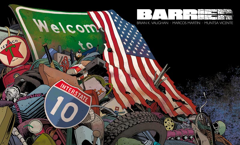
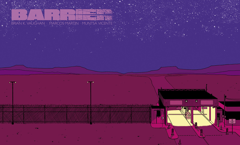
Barrier #3
Image Comics/Panel Syndicate Writer Brian K. Vaughan, Artist Marcos Martin, Colorist Muntsa Vicente
This third issue is a very special silent issue in that there is no dialog but the irony here is there is more story here that in nearly any other book this week. A lot of readers are going to write off this issue because of the lack of dialog but sadly they will not understand that there is actually much more story here than meets the eye. The one thing that you have to understand with a so-called silent issue is that the story is entirely there but the artist has to convey the dialog and this is why Vaughn and Martin are such a perfect team. There is a lot going on in this issue but it’s not all necessarily on the surface. The one thing that I found after reading too quickly the first time was that I actually missed a number of key story elements the first time around. I you take you time to study the art you will discover many little story elements that you would otherwise miss. We are so used to consuming comic books quickly that the art of silent storytelling is nearly lost today. Vaughn and Martin have crafted a wonderful story here if you simply take the time to let it seep in.
Is this book worth your time and money? I really loved this issue and was a great counter point to the bilingual elements of the first two issues. Vaughn and Martin are really taking a different approach to this story in many ways and this issue is showing that they are trying to tell this story in many different and unique ways. I think that this is a wonderful issue and is really taking this comic outside the comfort zone of many readers if they are willing to try. VERY RECOMMENDED!
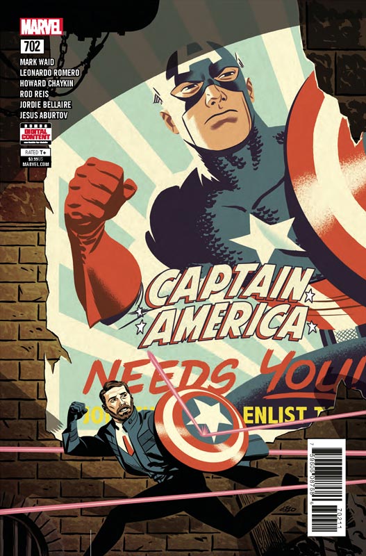
Captain America #702
Marvel Comics Writer Mark Waid, Artists Leonardo Romero, Rob Reis and Howard Chaykin, Colorist Jordie Bellaire, Letterer Joe Caramagna
I am really loving this final story arc from Waid on his all too short Captain America run. What I love about this story is that its more about how we see and feel about Captain America and what he inspires us to be. Waid uses this story element here very nicely and while there are still the usual comic book story tropes here there is a much deeper feeling of how we perceive superheroes. The irony of this story is that it may take place in a dystopian future but is all too real in todays current climate. Sure Waid puts a lot of social commentary into this story but that has always been a huge part of Caps history over the years. One of the best things in this story is how he weaves in Cap stories over the years and how they relate to Jack’s story in the current future story. What is making this story such a pleasure to read is that while the close to reality is always hard to swallow its the hopefulness that you are able to draw from the story to give you a sense of strength when you need it the most. The round robin approach to the artwork is another reason to love this story as well. Romero handles the Jack part of the story and Chaykin and Reis handle the flashback storylines that surprisingly mesh well even with their different styles. It the way that Waid sets up the story for each artist that gives the book the perfect flow in both story and art. It was great to see Chaykin take on Cap again that is a real rarity and was a real bonus for this issue. Romero continues to impress with his artwork on this book and is doing a bang up job on it. Reis underground sequence was simply classic Captain America inspired artwork.
Is this book worth your time and money? Maybe I’m an old school softy but, I’m really enjoying this story and while it’s not the most mind-blowing story ever it does however deliver the goods. Waid and company are simply delivering a solid and deserving Captain America story here that may not be flashy or epic but delivers far better than most. RECOMMENDED!
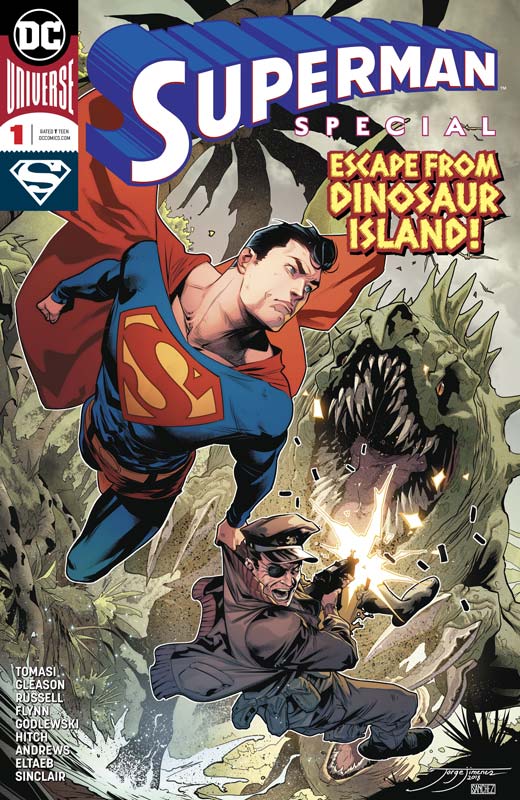
Superman Special #1
DC Comics Writers Peter J. Tomasi & Patrick Gleason/Mark Russell/Ian Flynn, Artists Scott Goldberg/Bryan Hitch/Kaare Andrews, Colorists Gabe Eltaeb/Alex Sinclair/Karre Andrews, Letterers Rob Leigh/Tom Napolitano
The march towards Bendis taking over Superman continues with another special with three new stories to keep the momentum from Action Comics #1000 to Man of Steel #1 at the end fo the month. It’s also allowing the current creative teams to do one last farewell story to end their rebirth run on the books. First up Tomasi and Gleason wisely deliver a wonderful self-contained story that has some story elements from their run but is easy for new readers to read. What I loved about this story was that not only was it a nice father and son story but was a nice final tribute to Captain Storm and The Losers. While new readers wont have the sentimental aspect of the story affect them as much as long time readers but it works for both old and new and was a nice touch by Tomasi and Gleason. What I loved about this story is the strong ties to both family and never leaving anyone behind. It’s charming and full of heart and while it’s a pretty simple story that is one of its best assets. Goldberg artwork is not flashy but in this case its a very good thing because I felt his simple and clean art style really helped sell this story and captured the heart and soul that makes it work so well. Next up is Russell and Hitch also delivering a great family theme and this one really pulls on the heart-strings. The best thing about this one is that it’s about what memories are and how they make us who we are. It’s a simple thought but they deliver such a simple and powerful story with ease that makes you really feel it when your done. Hitch really delivers some of his best artwork to date and captures Russell’s beautiful script perfectly. The final story is one that has been told many times before but Flynn finds a way to make it feel fresh because he adds some little twists here and there. Sure it’s simple but again with the running theme of these stories it fits well with the element of giving people a second chance, it’s short and sweet and spot on. I liked Andrews artwork on the story it’s very different but was spot on to the story. The one thing that added greatly to it was his color work that really visually punched this story.
Is this book worth your time and money? While none of these stories are the greatest you will every read, they however deliver something that you normally don’t get from most superhero comics today, Hope and Heart. These three stories really embody what Superman is and means to most of us. He is the best of humanity and yet still very much human and that is what makes him so great. Each creative team deliver spot on story and artwork that made this both enjoyable and sentimental and that’s what I loved about it. RECOMMENDED!


0 Comments