It was a huge week for new comic books and the start of the summer season with many events and big titles hitting the shelves so I will try to get in as many as I can this week.
COMIC BOOK OF THE WEEK!
Future Quest #1
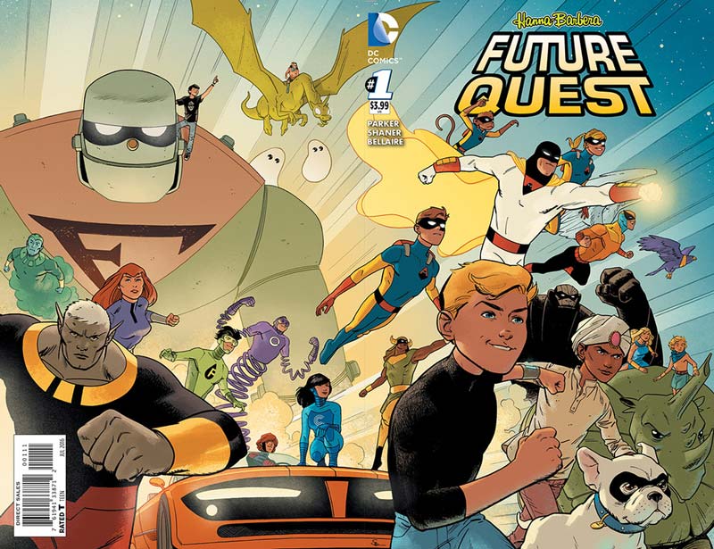
DC Comics Writer Jeff Parker, Artists Evan “Doc” Shaner and Steve Rude, Colorist Jordie Bellaire, Letterer Dave Lanpher
When DC announce the Hanna-Barbera titles a few months ago they were met with some skepticism by many but the one that really caught my eye was Future Quest by Parker and Shaner who did one of the best Convergence titles Shazam! I knew that if anyone could pull it off it would be these two. Being a kid growing up on Saturday Morning cartoons I was the biggest fan of the Hanna-Barbera superhero shows Space Ghost, Jonny Quest, The Herculoids, Galaxy Trio, The Impossibles, Birdman, and Frankenstein Jr. They were my absolute favorite ones and hold a special place in my heart for them all. The bar was set very high and I have to give it to Parker and Shaner for not only delivering one of the best comics of the year but kept the spirit of what made all of those shows great in the first place. The first issue does a lot of exposition that needs to get the story going but Parker does a great job of juggling that with action and fun that gives the book a really great pacing considering that there is a lot to set up here. The thing that impressed me the most is the telling of Space Ghost origin that had never been revealed in the original animated series. He took a bold chance on this and not only was it very enjoyable but made perfect sense to the character. There is such pure joy while reading this book and really delivers a very solid start to a grand adventure. Parker comes up with a great hook for the reason for all of these heroes to come together that makes sense and gives the book a great scope to the story. Shaner really delivers on the artwork with some of his best work yet. Like Parker he wisely doesn’t try to re-invent the wheel here and keep the original design work of the characters (The Impossibles are redesigned but they do not appear in the first issue) and yet makes them his own at the same time. This is where the book really shines with Shaner breathing new life into them with his perfectly suited art style. He makes it feel as if your watching the show but an episode that you have never seen before. His artwork transports you to a visual adventure that hits every beat of Parkers script perfectly. Joining him for the first issue is artist extraordinaire Steve Rude that is very familiar to the Hanna-Barbera world and has drawn many of the characters over the years. This is a great one two punch that gets the book off to a great visual start. I must also mention Bellaire’s extraordinary color work on the book that adds a great texture and depth to the artwork and really complements it. The best asset that the book has is that it’s not only fun but has a lot of hope and joy to it and that is what is sorely missing in most comics today. This is what comics can and should be.
Is this book worth your time and money? While I am very familiar with the characters, Parker has done a great job with the script to invite new readers into the Hanna-Barbera superhero world and yet will still please fans of the original show. Parker and Shaner wisely don’t try to reinvent the wheel here with the tone and look of the book that is both an homage and original. I haven’t had this much fun with a comic in quite a while and the best compliment that I can give the creative team is that it transported me back to being a kid and reliving that feeling of wonderment and adventure. HIGHEST RECOMMENDATION!
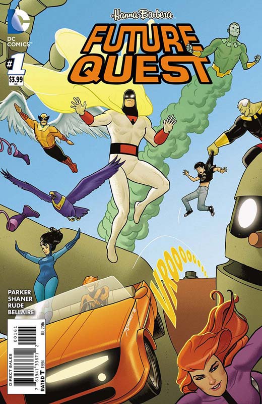
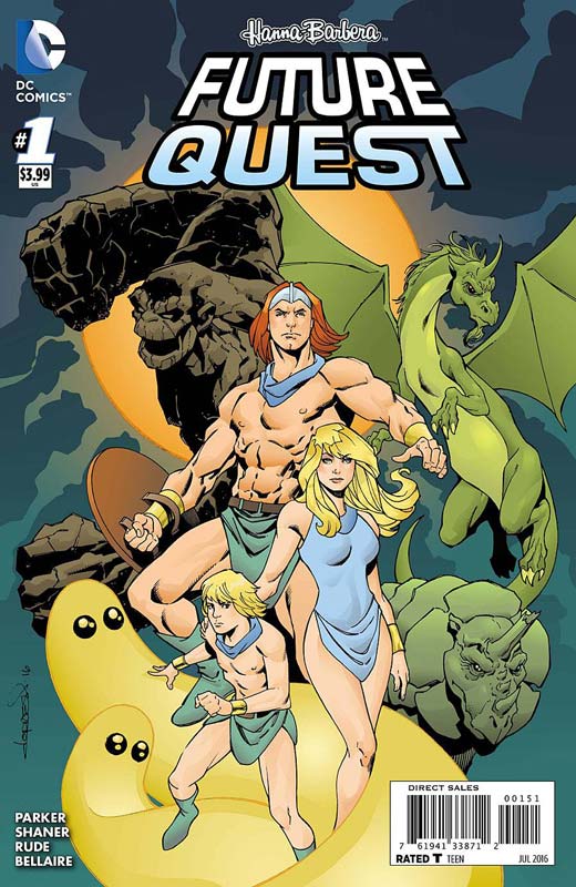
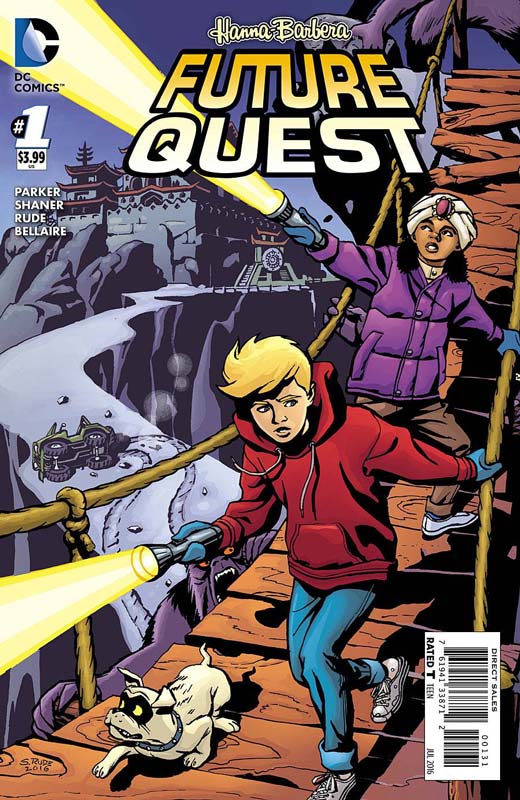
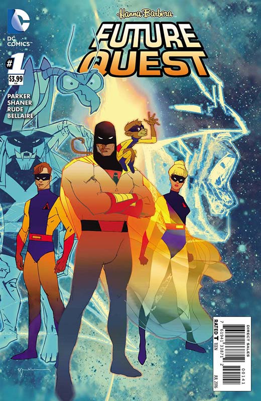
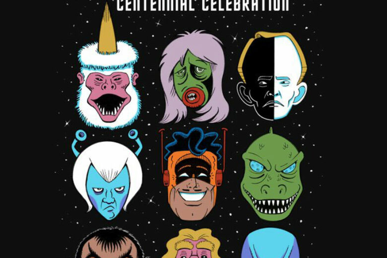
Here is the variant covers for the first issue that are must buy for fans of the book. One of the few times that I bought ever single cover for a comic.
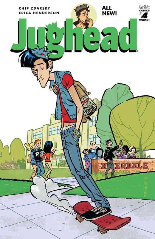
Jughead #6
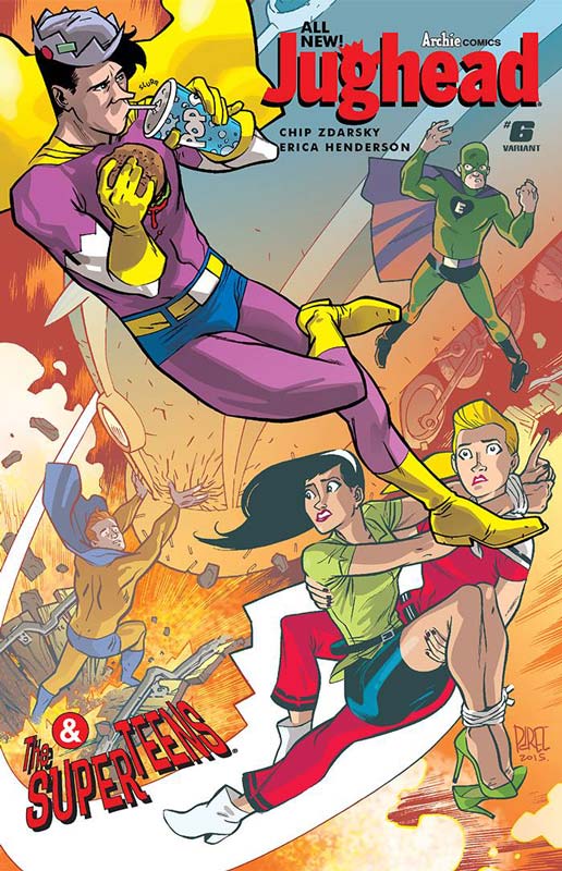
Archie Comics Writer Chip Zdarsky, Artist Erica Henderson, Colorist Andre Szymanowicz, Letterer Jack Morelli
The first story arc of the new Jughead book comes to a wonderful ending and has been a solid start to this new series. Zdarsky ties up all of the story arc threads in a story that has been a real pleasure to read. The thing that makes the book so much fun is that he keeps all of the quirks of Jughead but really fleshed out his character beyond the usual two-dimensional feel that he has had in the past. Zdarsky used his cleverness to the stories advantage making him the unusual hero that was able to save the school from being taken over in the end. Henderson has really brought a great artistic style that really complemented Zdarsky’s scripts and gave the book a great visual charm that made it a wonderful reading experience. She really captured the essence of Jughead that makes him such a lovable sweet and charming character with her simple yet detailed artwork.
Is this book worth your time and money? This book has been a real pleasant surprise and has been a solid companion book to the new revamped Archie series. Zdarsky and Henderson have been a really well oiled machine on this book and crafted a fun and epic story that captures all of the things that make up Jughead such a wonderfully fun and solid book. VERY RECOMMENDED!
Goldie Vance #2
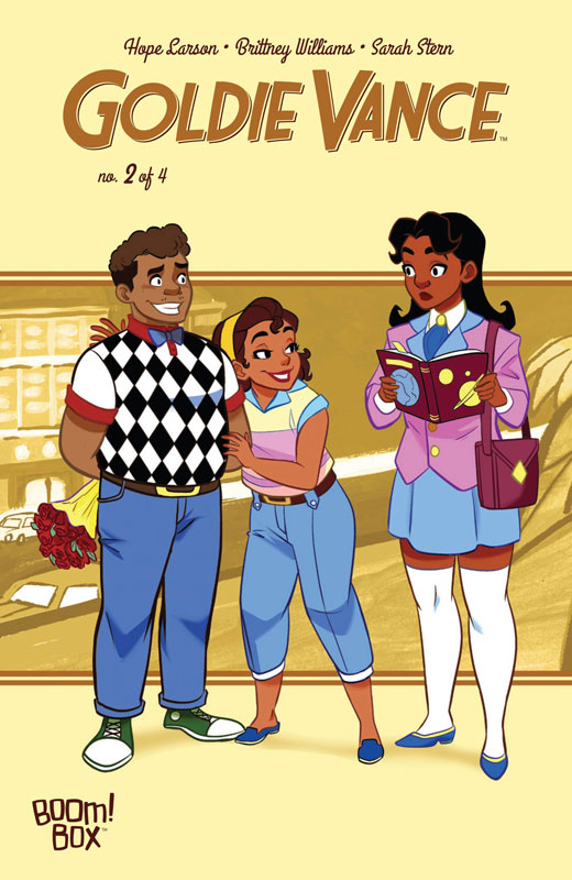
Boom! Box Writer Hope Larsen, Artist Brittney Williams, Colorist Sarah Stern, Letterer Jim Campbell
The first issue of this book got it off to a great start and I’m very glad to say that the second issue really keep the momentum of it going very nicely. Larsen builds a great mystery story here and he pacing of the reveal is very well done. Her mixing of character development and mystery are a perfect blend that is still keeping me on my toes and wanting more. The thing that is making it work so well is that Goldie is such a strong and spunky characters that it’s nearly impossible not to like her. She is charming, scrappy and smart but also a kind-hearted character that you just don’t get the pleasure of seeing very often in comics. Williams gives the story a great visual wonderment that may look simple it’s far from it. There is a lot of great subtle detail to her art that gives the book a real visual punch that pulls the book together so well with the script.
Is this book worth your time and money? With only two issues so far this is becoming a really refreshing all ages book that delivers a great mystery along with very strong female characters that is a real joy to read. Larson and Williams keeps the book fresh and fun and is giving really great reasons to come back each issue. VERY RECOMMENDED!
Archangel #1
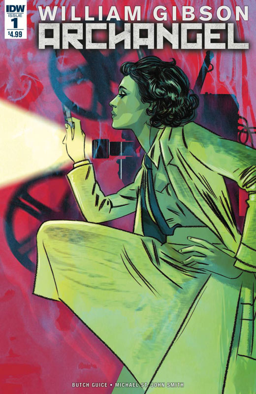
IDW Writer William Gibson, Penciler Butch Guice, Inkers Tom Palmer with Butch Guice, Colorist Diego Rodriguez, Letterer Shawn Lee
Archangel’s first issue is a bit of a mixed bag. There are some great story elements that Gibson introduces in the story but unfortunately it’s a bit convoluted and a little confusing with the overall story elements. This is not to say that it’s a total loss because there are on the other hand some strong ideas here and interesting concepts. While I did get that he is setting up a mystery here, i ultimately felt a little out of the loop with trying to connect with all of it. This can sometimes happen when your setting up a story and the first issue flounders a bit. It could also be that Gibson being more of a novelist, didn’t know that comics are a different medium and when you have a monthly comic you must have a very strong first issue to get the ball rolling. The good news is that artist Guice and Palmer give the book a very strong and great visuals that do try to help the story along and they nearly pull it off with the artwork. I’ve been a fan of Guice for a long time and his artwork here still has his great line work and detail that he does so well.
Is this book worth you time and money. It could be that this first chapter will make a bit more sense with the second issue but at the $4.99 cover price this book is a real tough to recommend. There are positive things about the book especially in Guice’s artwork and the story does have potential but with the book stumbling with the story on this first issue. I’m not sure if I would come back for the second issue. This one is too close to call.
Dept H. #2
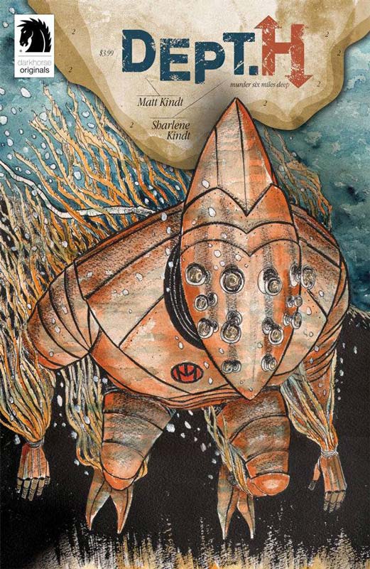
Dark Horse Comics Writer and Artist Matt Kindt, Colorist Sharlene Kindt, Letterer Marie Enger
Kindt’s new series Dept. H got off to an excellent start with the first issue and he really delivers a great followup with the second issue. The story is unfolding at a very nice pace that is slowly peeling away and is going deeper into the mystery of Mia’s fathers murder. While some might find the story too slow, I actually like the way that Kindt is unfolding the story. It’s more of a feeling that washes over you and has a more subdued reading experience than your average comic has. Kindt is definitely telling a long story that with each issue will give more clues as to what and why things might not be what they seem. On the surface it’s a murder mystery but there is so much more than that just below the surface of it. His art style has a real visceral and organic feel that is not the mainstream style but for this book it fits perfectly. It makes the book seem like a visual journal of the story. Sharlene’s color work on the book adds a wonderful touch to Matt’s artwork that gives the book a more ethereal look that serves the story very well.
Is this book worth your time and money? If you’re looking for something outside the box then you should really give this book a try. It’s a simple murder mystery on the surface but there is a great deal of subtle depth that is going on in the story that makes it a very enjoyable read. Not for everyone but well worth your time if you want more offbeat and original comics. Well worth reading.
Micronauts #2
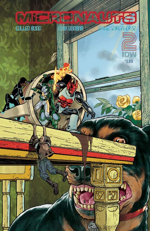
IDW Writer Cullen Bunn, Artist Max Dunbar, Colorist David Garcia-Cruz, Letterer Tom B. Long
Being a huge fan of the original Marvel Micronauts series I was disappointed in the first issue of this revival of the characters but I was willing to give the book another look with the second issue. While it didn’t knock my socks off, I will give the second issue does move the book into a better direction with the story. Bunn should have really done a better set up in the first issue and this issue does get the story on a better footing for a better long-term story. While I still have a problem with the fact that Bunn is not really developing the characters very well and seems to focus on action instead of depth with the script. On the plus side the artwork by Dunbar is much more solid this issue by not having six artist work on the book. Overall the artwork is much more consistent and does help the middling story move along better.
Is this book worth your time and money? While the second issue is a step in the right direction, I don’t have a big urge to continue on with this series. While it’s not bad it is neither pleasing to new readers or older fans of the original Marvel series and falls into the average pile.
Superman: American Alien #7

DC Comics Writer Max Landis, Artist Jock, Colorist Lee Loughridge, Letterer John Workman
One of the best Superman stories to come along in quite a while Landis ends this done in one stories with a great mix of action and a chapter in his life. This issue is a departure from the previous stores in that this is probably the most straight forward of them. The most pleasantly surprising thing in the story is that he uses Lobo as a point for both the action and dramatic story points that was nice to see him back as his classic version over the crappy emo version. I like that Landis had the final chapter as Clark becoming Superman for the first time and barely surviving it. The ending is very sweet and really sums up what the point of the book was about. It’s a shame that the regular Superman comics can’t be this good but at least there is this series that really shows what a great Superman story can be. Jock supplies the artwork on the final chapter and he gives it a bold a distinctive style that is also very subtle when it needs to be. It was amazing how he was able to really capture the emotions of the script and deliver some of his best artwork to date. His Lobo was not only great but gave the story the edge that it needed to work so well.
Is this book worth your time and money? Landis really should do more comics because this book has been one of the most consistently great Superman stories recently. He really nails the essence of what makes Superman great. It’s not his god like strength it’s his humanity that makes him so great. Superman embodies the best of humanity and Landis has delivered one of the most heartfelt stories that have graced the character in quite a while. Along with Jock this issue really ends the series on a great high note that was simply perfect. HIGHLY RECOMMENDED!
Brutal Nature #1
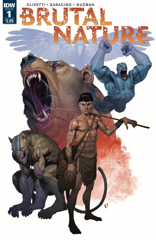
IDW Writer Luciano Saracino, Artist Ariel Olivetti, Letterer Chris Mowry
Brutal Nature is one of those books that doesn’t blow you away but kind of grows on you. The script by Saracino is pretty basic and follows basic story tropes here and while it’s not super original there was something in the delivery that made the book work well. I think that part of it is that there is a simplistic charm that the story has. It’s one of those things that aims for the middle and hits it. It didn’t try to be more than it was. Of course the big save for the book is Olivetti’s artwork that is simply stunning. Lavishly painted really gives this book a lot more heft than if it was straight line work. He visually really saves the story from falling into very average territory here. This at the very least is a great looking book and the question is will the story pick up with the next issue?
Is this book worth your time and money? I actually kind of liked this book but on the other hand it’s not a full recommendation either. The read draw of the book is Olivetti’s gorgeous artwork that really lifts the story. The story does have some good ideas and some better potential than this first issue is. If your willing to give it a chance it might go somewhere. Too early to call on this one.


0 Comments