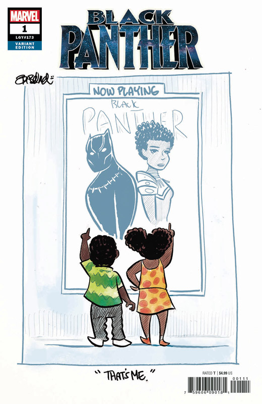
Black Panther #173
Marvel Comics Writer Ta-Nehisi Coates, Artist Daniel Acuna, Letterer Joe Sabino
I’ll be really honest that I was not a huge fan of Coates recent Black Panther run because I felt that coming from a book author background he wasn’t able to full capture the feel for a comic book script and it left me cold and flat. With this new soft reboot of the series I was willing to give him another chance now that he has had more time on the book and while this first outing didn’t bowl me over it was a huge improvement over his first outing. I liked his concept of putting T’Challa in this outer space element and while the concept is far from fresh and original, it was a pleasant read and does show some promise. The bigger question to ask is how long can he actually pull this story off because while it seems all new and fresh for some readers, it does seem like a bit of rearranging the deck chairs on the Titanic. Instead of Wakanda Africa it’s just Wakanda in space. Not bad but a bit too familiar with this first outing. Acuna does a nice job with the artwork on the book and while his style is not flashy, it does have a good amount of heft to it to pull off the dramatic scenes well. He does help the story along well on a visual level and makes it feel better than it is in some ways.
Is this book worth your time and money? For new reader to Black Panther this is a very good jumping on point with the new storyline, and as for older readers it’s a decent read but won’t blow you away by any means. I will give the book at least a second issue to see if Coates is able to bring something exciting to this story beyond the all too familiar tropes. In the end this first issue was OK but nothing special.
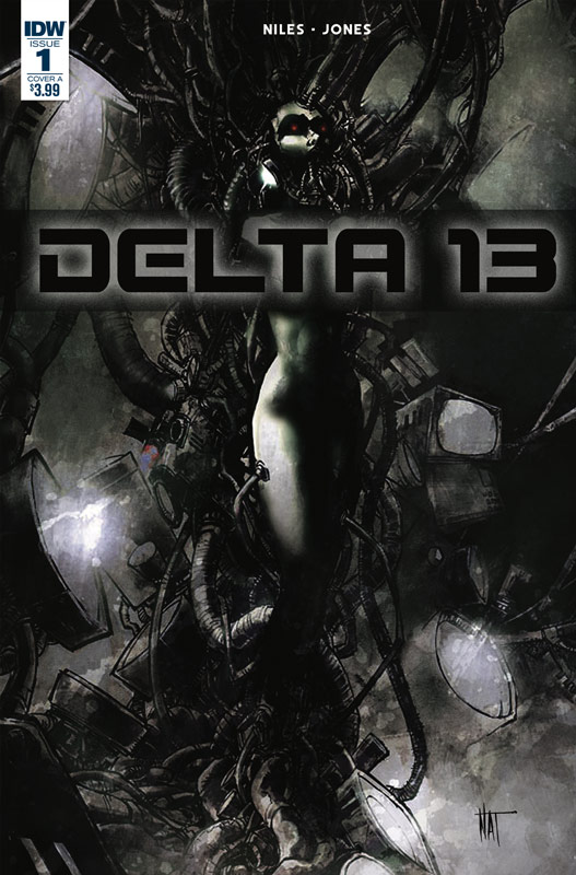
Delta 13 #1
IDW Writer Steve Niles, Artist Nat Jones, Letterer Tom B. Long,
I’m a big fan of Niles writing and was excited to see what he was going to do with this horror is space concept and I did like this first issue but I didn’t necisarrily love it. That is not to say that there isn’t something here. As with a lot of Niles stories the first chapters tend to be set ups to a bigger story and that is the case here. He is going for the long story here and it’s simply a first chapter. He does a nice job of setting up the cast and the story so that the reader gets to know them well enough to care. While there is no grey area that this story seems to be heavily influenced by Alien but thankfully no just a carbon copy of it. The big win for this book is the artwork that Jones delivers that gives this book a great and rich dark mood that really nails it visually. While you notice his great use of blacks, it was his very carefully placed color that really impressed me. He was also able to make the dialog scenes work well because of the wonderful facial expression he gave the characters.
Is this book worth your time and money? There is a lot that happens in this first issue but at the same time it’s not all necessarily on the surface. You have to know that this issue is just setting things up here and there is more to come. Any good horror story needs to be set up well and Niles does that here. The key is going to be the second issue to see where he is going to take this story. Jones really hits a home run with the artwork on the book and that alone is well worth checking out. If you’re looking for a rich horror comic this looks to be a really good bet so far but we will have to see where Niles and Jones go with the story.

Black Hammer: Age of Doom #2
Dark Horse Comics Writer Jeff Lemire, Artist Dean Ormston, Colorist Dave Stewart, Letterer Todd Klein
This second issue for the second chapter of the Black Hammer saga really blew me away. The first issue was just a taste of where Lemire is taking this story and this second issue really hits the ground running. This Lucy storyline is really impressing me and that is saying a lot because I really love this book. There have so many stories of heroes going to hell and having to face the devil but Lemire has found a really inventive way to tell it here that is both fresh and new and quite brilliant. One reason that it works so well is the sly humor that he slips into it that gives it a disturbing charm that only Lemire is able to pull off with such ease. But he also balances it with the Gail and Barbie story that gives a wonderful balance to the whole thing. There are many reveals this issue and I wont spoil them here but lets just say that this is just getting started. One of reasons that this book has worked so well is because of Ormston’s amazing artwork on the book. He is able to deliver such heft and scope but also deliver the heart of the story in a way that always moves me. It’s the subtle moments of the stories that he brings to life so well. The scene with Gail and Barbie on the steps of the library really shows the power of his artwork and why this book is so great.
Is this book worth your time and money? I have been praising this book form day one and its one of the few comics today that continues to impress and surprise with every issue. Lemire and Ormston continue to deliver a modern classic superhero story with depth and emotions that you rarely see in comic books today. This is a truly must read book. HIGHEST RECOMMENDATION!
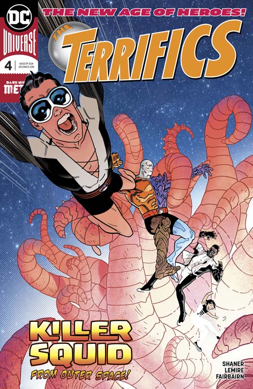
The Terrifics #4
DC Comics Writer Jeff Lemire, Artist Evan “Doc” Shaner, Colorist Nathan Faibairn, Letterer Tom Napolitano
In a wonderful week we get two great Lemire comics with The Terrifics this week. Shaner joins the fun this issue with a story that shows what a fun book this continues to be. While the credit certainly goes to Lemire for these wonderful stories, he definitely knew what Shaner would bring to this story and he plays it perfectly. One of the things that has made this book so great is that humor of the book is key but there is so much more that Lemire brings to it at the same time. It’s hard to balance that with drama, action and emotions but he is able to blend them so seamlessly that makes this such a joy to read. The ending of this issue is so heartbreaking but Lemire handles it with such care that is why this book is working so well. He has taken this rag-tag team of second string DC heroes and honestly it’s a million times better than the regular Justice League books now. The one thing that I wish is that Shaner could be the regular artist on the book but sadly he is only doing this one issue. He is able really bring all of the elements of Lemire’s script perfectly to life and is able to capture every emotion with ease. He also knows how to deliver the perfect action scenes and there are some doozies here. This is a winner!
Is this book worth your time and money? The only complaint that I have with this book is that the rotating roster of artists on this book is the only disappointment with it. Thankfully they have all been great artists on the book but visually as a whole it isn’t helping things in the long run. Shaner would be the perfect artist on this book but sadly if Future Quest was any indication that he simply can’t handle a monthly schedule. On the plus side Lemire is keeping the story on track and that is one reason that the switching artist has not dampened the book so far. This is a really fun book that hits the bullseye with its really strong stories. I’m excited to see where it goes after this issue. VERY RECOMMENDED!

The Prisoner #2
Titan Comics Writer Peter Milligan, Artist Colin Lorimer, Colorist Joana Lafluente, Letterer Simon Bowland
This book had a lot to prove to me being a huge fan of the original 1960’s series so the first issue was decent but didn’t blow me away. I will say that the second issue does build very nicely on it and now feels more like the original series but nicely updated. Milligan understands that you can’t just simply retread the original but you must keep what made it work in the first place. While set in the present it has the feel of the original period but with a more timeless sensibility. Where this second issue story impressed me was the psychological aspect of the story that was a big part of the original. Milligan sets out a puzzle for the story and nicely starts to fit them all together here and it does have me excited to see where he is going to take it. Lorimer delivers some nice work in this second issue and even improves from the first. The one thing that he does really well is the facial expressions that are key to the drama of the story. He also captures the mood of the psychology in Milligan’s script that he delivers very nicely here.
Is this book worth your time and money? I have to say that this second issue eased me into liking this book. It’s hard to do a story based on such a beloved series and make it work but Milligan and Lorimer have delivered a worthy story that keeps all of the elements of the original show but make it fit into a current world. This book is not so much a sequel but more of a continuation of the story. If you’re a fan of the original show then this is well worth getting.
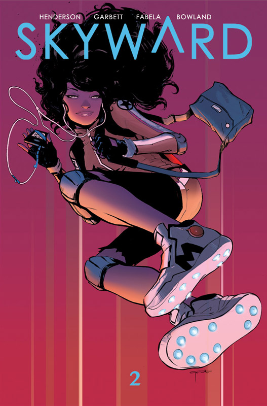
Skyward #2
Image Comics Writer Joe Henderson, Artist Lee Garbett, Colorist Antonio Fabela, Letterer Simon Bowland
The first issue of Skyward presented some unique ideas with it’s story and Henderson builds on it well in this second outing. While there are some clichés and familiar tropes in this second story, it still has enough original ideas that keeps the story moving forward nicely here. What is helping this story is Willa is such a strong and well-rounded character that is a strong reason that your able to forgive some of the basics in the story. I hope that Henderson is able to bring some more freshness to this book. It’s not to say that its bad but the story in this second issue is pretty by the numbers affair and there is nothing that will surprise you and that is where the book is worrying me a bit. The premise is great but the actual story is a bit too familiar here. On the plus side I do like how he is handling the gravity issues with the story and there is some great humor that comes with it and is working very well. Garbett is doing some nice work here and while there are a few times where the lack of backgrounds is a bit too noticeable, he does a great job overall that I’m willing to cut his some slack. There is a nice effortless charm in his artwork that is really nice and simply love his facial expressions. He is really helping this book along nicely.
Is this book worth your time and money? I like this book a lot and the concept is really great but so far that the scripts are not as good as the idea. There are just too many basic story tropes that is keeping this book from really taking off. That is not to say that I don’t like it, it’s just that I think it could be better than what I’ve read so far. Henderson needs to take this story in a better and fresher level than I’ve seen so far. I still have hope for this book and it’s still worth buying. I just hope that it can be as good as the concept and that’s not quite happening yet.
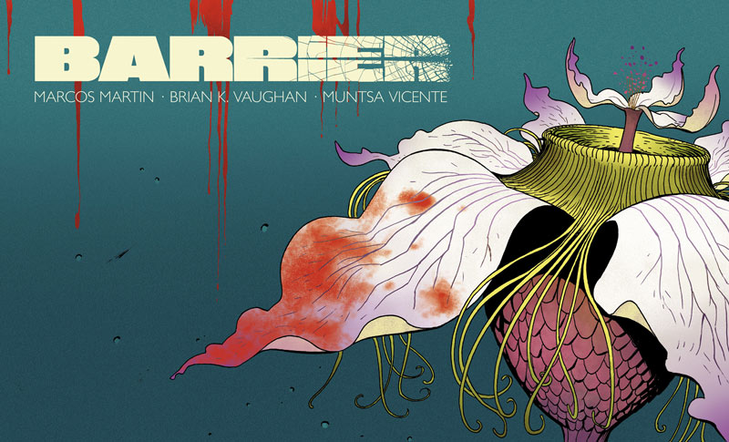
Barrier #4
Image Comics Writer Brian K. Vaughn, Artist Marcos Martin, Colorist Muntsa Vicente
The one thing that is really helping this book is that each issue comes out every week and it’s really helping the momentum of the story. So often when you read many monthly comics like I do you sometimes forget what the last issue was about and that is why a lot of stories actually work better in one reading. In this case because there will be no trade of this story you have to buy these individual issues. Vaughn is crafting a great story here and what I’m liking the most is the human experience and language barriers of the story. While I will go back and translate the Spanish once the story is finished I am taking that element and treating it like Liddy in the story because she can’t understand Oscar so for me it gives the story a different perspective than most comics. This is where Martin’s artwork comes into play because he is able to give the script a visual flow that helps you get the general idea of the Spanish story across to readers who don’t understand the language. The mystery is really getting deeper as the story goes along and while were still not sure what is happening the journey is still very fulfilling. Martin is literally blowing me away with his artwork on this book. The incredible amount of detail that he puts into every panel is simply breathtaking and the way that he is able to capture the subtle emotions is why this book is so damn good.
Is this book worth your time and money? This book continues to impress as much as it keeps you guessing as to what is going on here. I love that its more about the journey than simply answering the questions right away. It’s a story that is washing over the reader and revealing what the word barrier is and might be. RECOMMENDED!



0 Comments