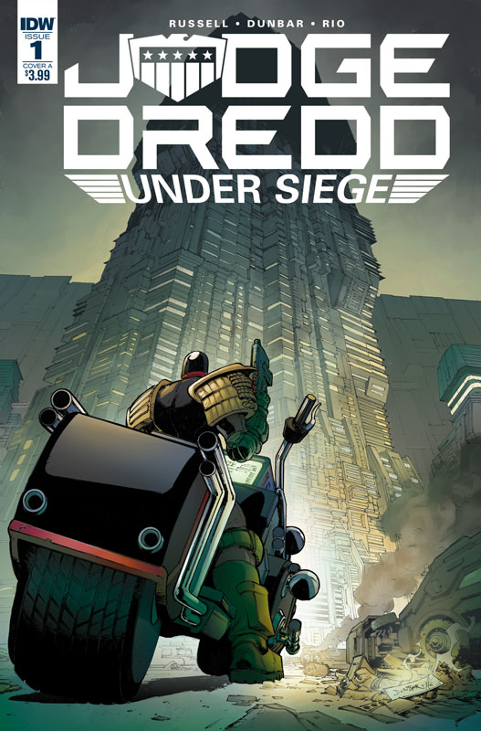
Judge Dredd: Under Siege #1
IDW. Writer Mark Russell, Artist Max Dunbar, Colorist Jose Luis Rio, Letterer Simon Bowland
I discovered Judge Dredd back in the 1980’s when Eagle Comics started to reprint them for an US audience. They were the Brian Bolland period and with Alan Grant as the writer and they really blew me away. Over the years I read many incarnations of the British 2000 AD comics with the reprints and have always had a fondness for the character. I’ve read a few of the new series from IDW and quite frankly was not very impressed with any of them. The main reason that I picked up this one because I’m such a fan of Russell’s writing on Prez, The Flintstones and Snagglepuss that I was more than willing to give this one a go. I will give Russell that he understands the character of Dredd and very much keeps him to his British roots in style and feel. This first issue didn’t overwhelm me but it does have some potential going for it. The one great thing that Russell is great at is social commentary and while there is just a bit here there is some potential for more and I hope that there in fact is more to come. The one thing that he did get very much right is the dry British humor that was a big staple of the original comics. The artwork by Dunbar is good and gets the job done. The one thing that he did nicely was have some backgrounds that gave the art a nice look. Even with the story taking place in an office/apartment building it really added nicely to the look of the book.
Is this book worth your time and money? This book didn’t wow me as much as I would have liked there is some potential here. It’s defiantly one of the better Judge Dredd series from IDW but it still lacked the bite that I really was looking for. And while the original series was very heavy on social commentary and I get that the 1980’s Regan/Thatcher era was ripe for the picking, I felt that Russell missed an opportunity to give this story some real meat on the bone so to speak. There is a bit but it did fall into the somewhat average story here. Not bad but just not there yet and hopefully Russell has more up his sleeves for the next issue.
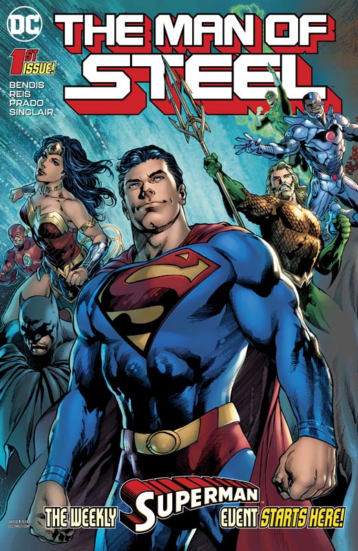
The Man of Steel #1
DC Comics Writer Brian Michael Bendis, Penciller Ivan Reis, Inker Joe Prado, Artist Jay Fabok, Colorist Alex Sinclair, Letterer Cory Petit
The first big splash from Bendis with his first full issue of Superman gets off to a very nice start and picks up from the two short stories in Action Comics #1000 and DC Nation #0. If you have not read those two stories the good news is that he fills them in here mostly and that was a smart move. As with most first issues this first one is pretty much exposition but with the book being weekly that is fine for this first one with the second chapter coming next week. I loved that he started the story off with Superman being super because he immediately tapped into what makes him not only the first superhero but all of the things that make him classic. He wisely doesn’t try and reinvent the wheel here and while some would argue that the story is pedestrian, I wouldn’t say that from jus this first outing. The one thing that is intriguing with this first issue is that he appears to be addressing the storylines from the rebirth runs and appears to be taking in back to the more basic elements. We get a glimpse of this at the end of the issue and this series will be setting up both the past, present and future of where he is going to take it. Each issue of this book will have a different artist and this one gets off to a great start with Reis and Prado bringing a classic comic book hero style that fits perfectly into Bendis’s reboot of the character. The one thing that I love about Reis is that he puts a lot of detail into the art but never forgets to capture the emotions and fun of the story. The opening fire rescue is both classic in story and art and that is what I loved where this book gets started from.
Is this book worth your time and money? While I have never been a huge fan of Bendis’s Marvel work that was both hit and miss for me, I can see his passion for Superman in just these first few stories. He gets that Superman is better than the best of humanity and that is why he has endured for 80 years. This first full issue will not blow you away but it will however get you excited to read Superman again, and for a lot of readers I think that they will be pleased with where he is taking it. RECOMMENDED!
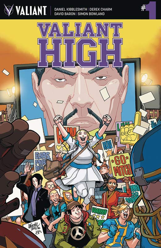
Valiant High #1
Valiant Entertainment Writer Daniel Kibblesmith, Artist Derek Charm, Colorist David Baron, Letterer Simon Bowland
Lets be really honest here that Valiant is simply doing Archie in high school with this book and on that level its a fun little book. Kibblesmith does a nice job of introducing the cast of characters that is quite large and a bit of this first outing Achilles heel at the same time. Just as the story gets going we are introduced a character and it unfortunately give the story a not so great start and stop element while your reading it. While this is not fatal but it does tend to get a bit annoying after a while though. He wisely keeps the story simple in classic Archie fashion and doesn’t try to make the book more than it supposed to be and that is where for some its going to not impress. The first issue story didn’t blow me away but it did however do a nice job of setting things up and that is a plus for Kibblesmith’s script. The one thing that I really liked was the way he captured high school drama for the students and the sly humor that he brought to the script. If your going to do an Archie rip off comic who better than to get Charm who has recently done both the Archie and Jughead comics and brings his spot on style to this book. His style fits this comic perfectly and he brings a charm (pun intended) to this book and he defiantly brings a lot to this book.
Is this book worth your time and money? I’m a bit torn on this one. On one hand I like the whole high school drama/Archie angle that the book does. On the other hand this first issue is really rough and while the set up is decent, it seems to spend too much time on it and kind of drags it down. I will say that I will give the book a second issue because the positives do outweigh the negatives in this book. In the end the book is OK for what it is.
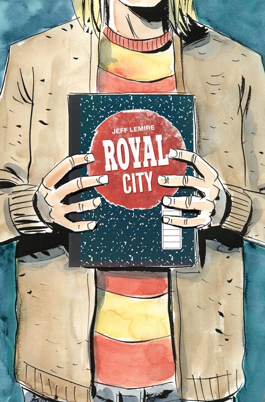
Royal City #11
Image Comics Writer and Artist Jeff Lemire, Letterer Steve Wands
This amazing book is coming in for it’s final chapter and this issue starts to bring a lot of the story threads together and we art starting to uncover the mystery of Royal City. I love how Lemire has been keeping the past and present storylines somewhat separate to build the story but now with the story coming to its final chapters he is able to blend them seamlessly together and is a real treat for readers of this comic. What has been this comics best asset is that how the story washes over you with each passing issue and this one is one of the best so far. As the prices of the puzzle fall into place the story gives readers great flash backs to those elements and how they are coming to fruition. As always Lemire has a wonderful way of capturing the story with his artwork and this issue has a lot of raw emotions that with his artwork really affect you emotionally and the way that he handles the Tommy and Clara scene is really loving but at the same time heart wrenching because of the way that he captures it all in the artwork.
Is this book worth your time and money? I can not recommend this comic enough. Each issue captures the subtle human nature of life and it’s so much more than some would call this a slice of life story and in a simple way it is. But its so much more than with deep emotions and a wonderful mystery this book has been a great reading experience and I simply cant wait to see where Lemire takes this comic. HIGHEST RECOMMENDATION!
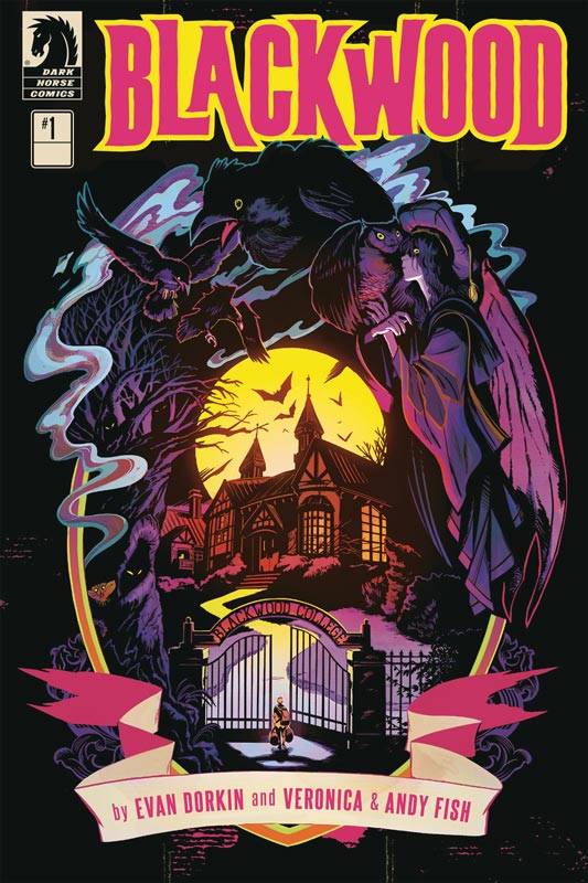
Blackwood #1
Dark Horse Comics Writer Evan Dorkin, Artist Veronica Fish, Layouts and Letterer Andy Fish
I’m a big fan of Dorkin with both his comics and as a writer of Beast of Burden and this fist issue was disappointing. I will say that I think that there are some really good ideas that he introduces in this book and gives me hope that this first issue might have just hit a bit of a rough patch getting off the ground. I felt that the script just plodded along in this first issue and was a bit on the boring side. In a way a simple way to describe this book is a darker Harry Potter story but I would have liked for him to give it more of an original spin than he did here. On of the other problems was that I really didn’t connect with any of the characters and they seemed really two-dimensional and flat. They came off as basic tropes and simply were not that interesting. There are some positives to the book. Dorkin does deliver a few good ideas and the story does have some nice creepy moments but it never quite fulfills them well. The only plus for this first issue is Fish’s artwork on the book that tries to do the best she can with the story and does really help the book along as best she can. She gives the comics a nice visual mood that nails the creepy feeling that the story attempts to deliver and I love her characters facial expressions that are spot on.
Is this book worth your time and money? I am willing to give this book a chance to redeem itself with the second issue but quite honestly this comic is really on thin ice. Simply put Dorkin has delivered better than this and it’s not to say that this book is terrible but it’s not as good as it should be considering his track record. It really seemed to be stitched together and didn’t flow very well. The saving grace of this book so far is Fish’s spot on artwork that does its best to try to save this problematic first issue.
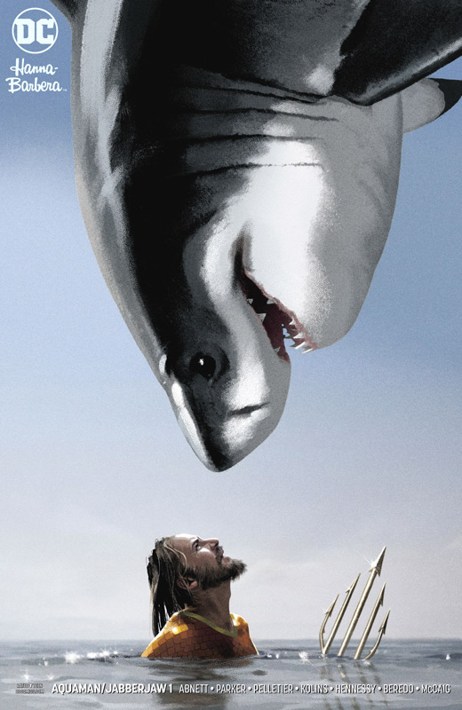
Aquaman/Jabberjaw #1
DC Comics Writer Dan Abnett, Penciller Paul Pelletier, Inker Andrew Hennessy, Colorist Rain Beredo, Letterer Carlos M. Mangual, Captain Caveman Back-Up Writer Jeff Parker, Artist Scott Kolins, Colorist Dave McCaig, Letterer Carlos M. Mangual
DC brings back the successful crossovers of the Hanna-Barbara and DC Universes once again and have both some hits and some misses but thankfully no train wrecks. First up is the Aquaman/Jabberjaw special that ends up being a bit on the weaker side. Abnett wisely plays up on the Jaws jokes and I would have been disappointed if he had not gone there. I think the problem with the story is that Abnett tries to squeeze in too much Jabberjaw back story that it ends up dragging the story down and there is not much else to support the simple story. While the story is not a terrible read by any means, it just ends up being a fairly pedestrian team up story that is nice but not wholly satisfying in the end. I will give him props for keeping the tone of the original animated Jabberjaw series with the comedy and charm that the show had with the cast of characters. On the plus side Pelletier and Hennessy deliver some very nice artwork and do a great job on Jabberjaw. They keep him looking like a real shark but find little ways to give him subtle facial expressions that deliver the charm of the original animated character. The back up story with Captain Caveman by Parker and Kolins is pretty much a retelling of his animated origin but throws in Shazam and The Specter to the story. With with only 8 pages to work with Parker keeps it pretty simple here and Kolins delivers some wonderfully detailed artwork for the story. It’s nice but not wholly memorable.
Is this book worth your time and money? This one is probably the weakest of the four specials and it simply ends up being OK. It’s a decent read that has some charming moments and some nice super heroic moments but not much else. If your on a limited comic budget you could skip this one but I enjoyed it for what it was, fun but not great.
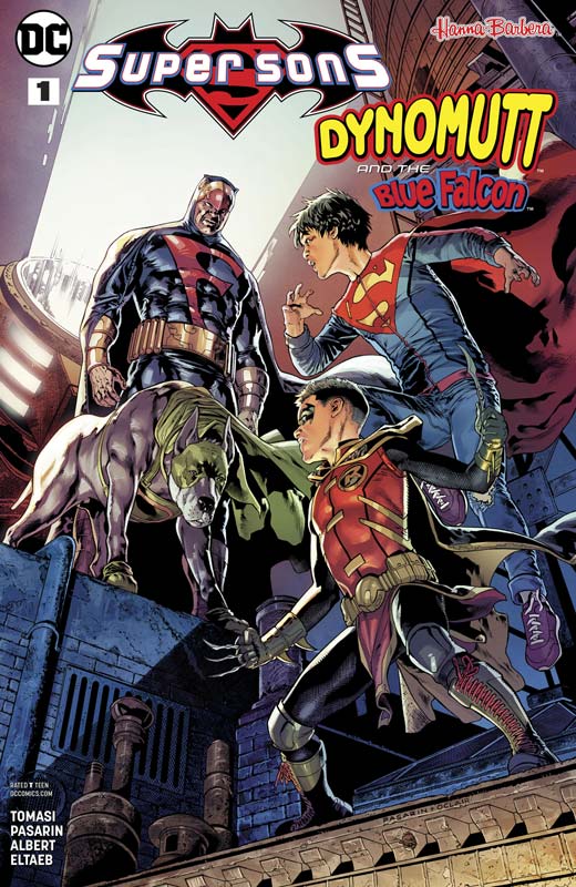
Super Sons/Dynomutt and the Blue Falcon #1
DC Comics Writer Peter J. Tomasi, Penciller Fernando Pasarin, Inker Dclair Albert, Colorist Gabe Lltaeb, Letterer Rob Leigh
Of all of the DC/Hanna-Barbera crossover comics this week, this one was one of the most surprising and wonderful stories that really caught me off guard. I liked the regular Super Sons comic but but didn’t love it but was a huge fan of the Blue Falcon and Dynomutt animated series so this one for me had a lot to live up to. I have to give Tomasi props for creating an origin for Blue Falcon and Dynomutt that was never revealed in the original animated series and he really nails it here. The one thing that I was worried about was that Dynomutt was pretty much comic relief in the series but here Tomasi give them a more reality angle but does slip in some nice one liners as a nice nod to the original. While their origin is pretty simple Tomasi gives it nice heart and soul that makes it work perfectly. Obviously being the writer of the regular Super Sons series he knows those characters well and does a great job of blending the two universes together very naturally. While there is a darker tone to the story he makes sure that they never stray from their superhero roots and keeps that very well in the script. I was taken aback how much heart he instilled into Dynomutt and that is one of the reasons that this story works so well. It’s one thing to have a great story but getting the right artist to bring it all to life is where a comic will sink or swim and this is where Pasarin comes in. This book is gorgeous and the level of detail that he and inker Albert bring to this book is really amazing. They are one of the reasons that this book works so well in that they bring every detail of Tomasi’s script so perfectly to life that delivers the emotional impact that makes this book such a joy to both read and visually devourer.
Is this book worth your time and money? Tomasi and Pasarin have delivered the perfect combination that makes a good comic book. Solid story with gorgeous artwork that work hand in hand to give you a wonderful reading experience. With a great emotional core will leave you wanting more of this for sure. HIGHLY RECOMMENDED!
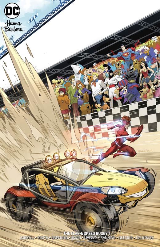
The Flash/Speed Buggy #1
DC Comics Writer Scott Lobdell, Penciller Brett Booth, Inkers Norm Rapmund, Mark Irwin, Marc Deering, Matt Banning, and John Livesay, Colorists Andrew Dalhouse & Pete Pantazis, Letterer Tom Napolitano
This is one of the looser of the crossovers where it feels like a Flash story but with Speed Buggy taking the place of Kid Flash. The story by Lobdell is fun and nice superhero moments it didn’t fit as well together as much as I would have liked. Lobdell’s script does hit the needed beats of the story well and I will give him kudos for creating an intriguing origin story for Speed Buggy that was well done. I think where I struggled a bit with the story was that it seem pretty standard and while I understand that crossovers are going to be fairly limited in scope this one just felt middling. I think one of the issues was that he tried to go to big with the story and it ended up being too complex for this type of book and he spent a too much time on the Speed Buggy origin while it was good it ended up being too much for a one shot. Booth is able to capture the kinetic energy of the story with his pencils and with six inkers there are some noticeable visual jumps with the inking style that was a little problematic at times but overall the artwork was good if inconsistent.
Is this book worth your time and money? This is another one of the lower end DC/Hanna-Barbera crossover specials. It was a decent read but was Lobdell’s script was too dense for it’s own good. It also lacked some of the fun factor from the animated series and while he was going for a more realistic tone it ends up coming off as an average superhero team up story that is nice to read but not very memorable. If Lobdell had done with the main story what he did with the epilogue this could have been a better comic.
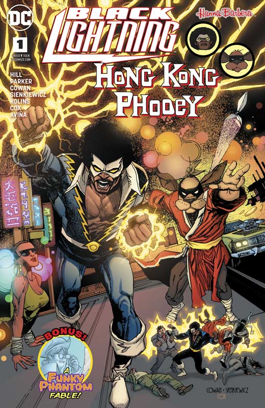
Black Lightning/Hong Kong Phooey #1
DC Comics Writer Bryan Hill, Penciller Denys Cowan, Inker Bill Sienkiewicz, Colorist Jeromy Cox, Letterer Janice Chiang Funky Phantom Back-Up Writer Jeff Parker, Artist Scott Kolins, Colorist Tony Avina, Letterer Janice Chiang
There were two thing that had me excited for this special. One I love both Black Lightning and Hong Kong Phooey and second the artwork of Cowan and Sienkiewicz is always a visual treat. Going into this I knew that Hill would not be using the bumbling Hong Kong Phooey from the animated series but instead he crafted a wonderful ancient mythology of a secret technique that had all of the elements of a Bruce Lee story but wrapped in a superhero story. His wisely dispenses with the whole origin motif with the script so the story hits the ground running out of the gate and moves along at a very nice pace. He also keeps it lean and simple that is one of the books best assets and makes a fun read the whole time. Cowan and Sienkiewicz are brilliant artist in their own right but when they work together like this their unique styles blend together into a gorgeous looking book and this one is no exception. There are a lot of visually powerful moments in the story and the pull it off effortlessly that gives this book the perfect balance between epic scope and subtle dramatic moments that shows how well these two masters work so well together. The Funky Phantom back up story ends up being a bit on the odd side. Parker tries to deliver a social commentary with guns and the 2nd amendment that might have been a good idea for a full story but with only 8 pages to work with it just ends up being a bit on the weird side. He tries to inject humor into it and ends up making it just not come together well at all. I did dig Kolins visual take on the Funky Phantom and he did a nice job on the artwork but there was only so much he could do here.
Is this book worth your time and money? I really loved the Black Lighting/Hong Kong Phooey story that fired on all cylinders with both the story and the artwork that blended both characters perfectly together. Hill did all of the right things that you should do in a crossover like this. Keep it simple and to the point, keep it fun and get two of the best artists in town to bring this book to life and you end up with a real winner. VERY RECOMMENDED!




0 Comments