Another big week of new comic book reviews. There are some strong new series that start this week and the DC Universe crossovers with the Looney Tunes specials starts off this week and continues through the month. So let’s get started.
Legion of Super Heroes/Bugs Bunny #1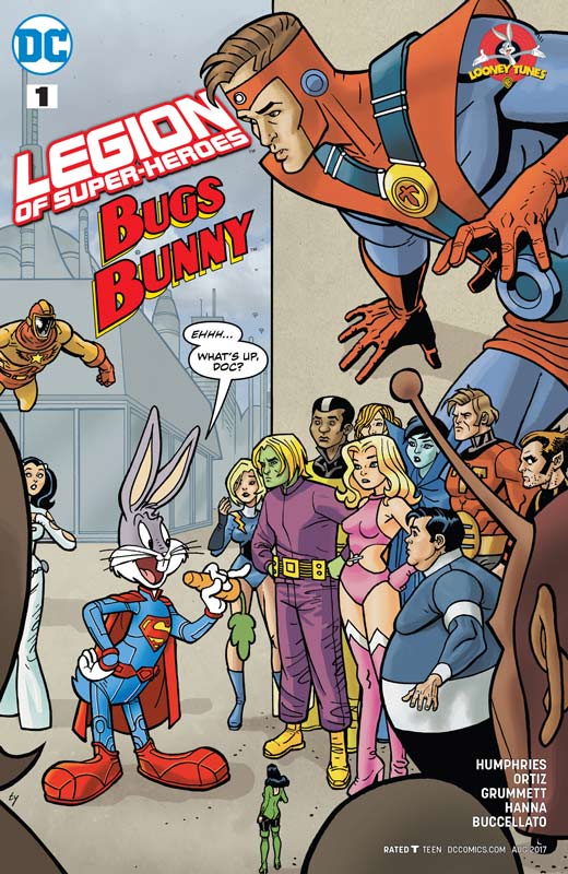
DC Comics Writer Sam Humphries, Penciller Tom Grummett, Inker Scott Hanna, Colorist Steve Buccellato, Letterer Josh Reed, Back-Up Story Writer and Artist Juan Manuel Ortiz
After the success of the reimagined Hanna-Barbera comics crossover with the DC Universe it made logical sense that DC would give the Loony Tunes characters the same shot. This week is the first two releases and they get off to a good start. First and foremost they are simple and fun stories and mix the two together nicely. I have to commend Humphries for doing his homework for the book. He makes sure that both the Legion and Bugs sound and feel like themselves and that makes for a very fun read. The other win for the script is that he makes sure that the reader has fun with it that made for a very entertaining read. Humphries nearly throws every Legion member into the story that if you’re a Legion fan knows that it’s quite a feat to achieve. Grummett and Hanna artwork rises to the challenge and really do an amazing job on the artwork. While I was never in doubt about his drawing of the Legion the fact that he was able to capture the animation style of Bugs was a very nice surprise. It’s hard for some artist to be able to draw in a cartoony style but Grummett handles it with ease and blends them together seamlessly. The only disappointment with the book is the back up story by Ortiz that is not bad by any means but is pretty much a retelling of the main story that I felt was a very odd choice. I loved the artwork on it but was board with it because I had just read the same story.
Is this book worth your time and money? I had a lot of fun with this book and while the back up story was more disappointing than bad overall the book was a fun read and have to give props to Humphries and Grummett for keeping the tone and look of the respective characters perfect. If you’re looking for a light and sweet read then this book is well worth picking up. RECOMMENDED!
Martian Manhunter/Marvin The Martian #1
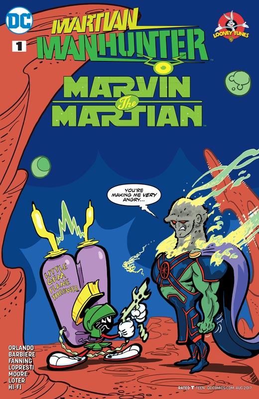
DC Comics Writers Steve Orlando and Frank J. Barbiere, Penciler Aaron Lopresti, Inker Jerome Moore, Colorist Hi-Fi, Letterer Carlos M. Mangual, Back-Up Writer Jim Fanning, Artist John Loter, Letterer Saida TemTemfonte
On the flip side Orlando and Barbiere take a different approach to this book and the results work well for the story. They take a more “realistic” comic book style to the story that is very different from the Legion/Bugs one and as with that one they keep the story simple for both new and old readers that make it work well. While not a humorous as the other one they still keep Marvin in sync with the animated version and he does feel like the original character and wisely didn’t try to change him. They have a nice play on John’s quest to find other Martians and how this one doesn’t want to play nice. The best aspect to the story is no matter how much trouble that Marvin causes and the humans distrust of him, he never once stops being a hero that give the story a nice sweet tone that I really enjoyed. Lopresti and Moore take a more traditional comic book style to Marvin so he is a bit less cartoony and for this story it works quite well. They do a very nice job of handling the scope of the story but also do a great job on the small dramatic moments in the story. While they don’t do a straight cartoony look they do have some visual fun and add a bit of stretch and squish too have some fun with it. The real treat with this book is the very funny back up story by Fanning and Loter that is a classic WB cartoon with Marvin and John that simply nails the feel and look of the original animated shorts. They even fit in some little cameos along with K-9 that is simply icing on the cake.
Is this book worth your time and money? While this special is a little more straight forward it was still a solid read with lovely artwork. While I did like the Legion/Bugs a bit better the back up in this book is nearly worth the cover price alone with no disrespect to the main story. If you enjoy either Marvin or the Martian Manhunter then you will not be disappointed.
Jimmy’s Bastards #1
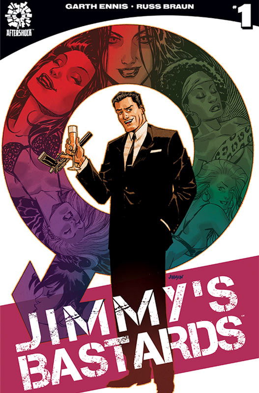
Aftershock Comics Writer Garth Ennis, Artist Russ Braun, Colorist John Kalisz, Letterer Rob Steen
Ennis is at it again and this time with his unique take on “James Bond” that is much more tongue in cheek here and is really damn good. What Ennis has done here is created a hard R version of Bond that is way over the top and that is what makes the book charming in all of the wrong ways. Where the book really shines is in its cheeky humor that made for a very enjoyable read, but he does not forget the action and adventure that is a staple of Bond. Where the book take the wildest turn is the idea that Regent is a womanizer and quite simply he has fathered a ton of kids that now want his head on a platter. What makes the book so good is that Ennis doesn’t shy away from being so far from being politically correctness that is very refreshing to see. This first issue gets the series off to a grand start that sets up the story and gives you a great reason to come back for the second issue. He keeps things moving along briskly and doesn’t bog down the story with unnecessary exposition that drags a lot of first issues down. The other win for the book is artist Braun that brings a perfect style to the book and brings Ennis’s script to life perfectly. What I love most about Braun’s artwork is the way he captures the expressions on characters faces so perfectly that conveys the emotions of the scene that makes the book work so well. This is a great looking book and the team of Ennis and Braun are perfect.
Is this book worth your time and money? Ennis and Braun may have simply created the best Bond story never told. While it’s a grand play on the formula they make it fresh and exciting because they are not constrained by the licensed characters. While the story may be raw and cheeky it never disrespect the homage that it’s based on. This book gets off to a resounding start and I can’t wait to see where Ennis and Braun take the story. HIGHLY RECOMMENDED!
Winnebago Graveyard #1
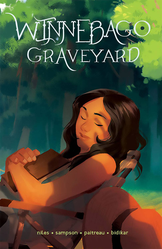
Image Comics Writer Steve Niles, Artist Alison Sampson, Colorist Stephane Paitreau, Letterer Aditya Bidikar
It been too long since we have had a new Steve Niles series but thankfully that drought is over and he comes roaring back with one of his best stories. What I liked most about the book is that he gives the story a great sense of mood that is hard to pull off in comics unless you are able to give it a solid foundation in both story and characters and he really nails it here on this first issue. Set ups to horror stories are difficult but Niles really has a great knack for it and this series is no exception. Exposition in a first issue is tough but Niles manages to balance that along with an intriguing mystery that gives your enough to get started but keeps things close to the vest for later. What Niles does best is tell a story that is all too familiar but gives it a fresh new spin and that is the case with this book. You have read or seen this story many times and yet it feels different at the same time. The other big win for this book is the incredible artwork from Sampson that gives this book the visual impact that brings it to life. This is where a great collaboration between the writer and artist comes into play. There are many times in the first issue where there is no dialog but Sampson brings the story perfectly to life and conveys all the information of the story without the need for dialog. She is an artist to watch and she gets this book to a whole other level with her amazing artwork. Another win for the book is the wonderful color work from Paiteau who does a bang up job of complimenting Paiteau’s line work and adding to the mood of the book immensely.
Is this book worth your time and money? Niles and Sampson really deliver a creepy story here and get it off to a solid start with this first issue. What I love about Niles beyond his great writing is his amazing knack for finding the perfect artist for the material. He has worked with some of the greats such as Bernie Wrightson and Kelley Jones but it’s when he finds newer talent like Paiteau it always impresses me. This is not only a great horror comic but simply a great comic that will have you on the edge of your seat and really gets under your skin. HIGHLY RECOMMENDED!
Dark Days: The Forge #1
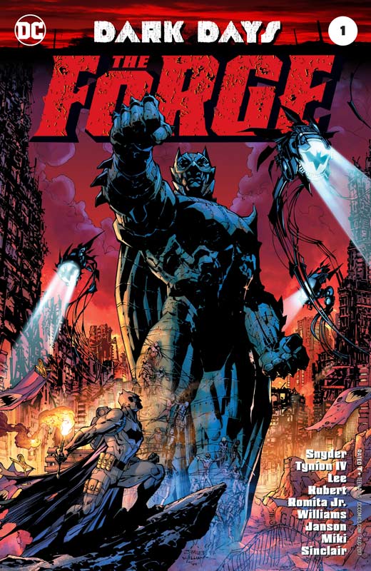
DC Comics Writers Scott Snyder & James Tynion IV, Pencillers Jim Lee, Andy Kubert & John Romita, Inkers Scott Williams, Klaus Janson & Danny Miki, Colorists Alex Sinclair with Jeremiah Janson, Letterer Steve Wands
This book is a set up for the next big DC event and while there are some interesting ideas here, I felt that it’s too vague and dense for its own good. While there are some time jumps that throw you off a bit the bigger problem with Snyder and Tynion’s script is that it’s no super compelling. Look I’m all for a good mystery but you need to give the reader something to grab onto and for me there wasn’t much there. There are too many times that the story tries to do these big reveals that it becomes redundant and boring because it seems to try way too hard to set up these “epic” moments that end up having the opposite effect. It’s not to say that the book is terrible but it just meanders around too much of the time. I will give it that there are some good ideas thrown around in the script and there’s barely enough for me to give the next chapter a shot but it’s on pretty thin ice. On the plus side for the book the round table of artist do a nice job on the book and it blends together pretty well and their styles thankfully don’t clash together like some of the event book suffer from. They also do their best to help the story along visually that helps the reader try to make sense of the script. The other problem is that the book is pretty pricey for what it delivers and that doesn’t do it any favors.
Is this book worth your time and money? While I try to give the benefit of the doubt to these big superhero event books they rarely seem to ever deliver. There are far too many that have either disappointed or were outright terrible. While it’s too early to call on this one, it certainly stumbles out of the gate and is not off to the strongest start. I will give them that there are some interesting ideas here and hopefully this prelude is not an indication of what is to come.
Kill The Minotaur #1
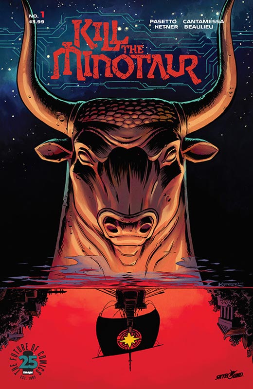
Image Comics Writers Chris Pasetto and Christian Cantamessa, Artist Lukas Ketner, Colorist Jena-Francois, Letterer Clem Robins
This new series by Pasetto and Cantamessa has some intriguing ideas and puts a fresh spin on the Minotaur mythology and gives it a bit of an update and fresh coat of paint. What works well for the book is that they don’t try to completely reinvent the wheel here. The stick to the basic mythology but expand the story and characters to flesh out the story. The only minor gripe I had with the book was that I felt that having Theseus as a spoiled prince was a bit on the cliché side and was a too basic story trope. The first issue sets up the story pretty well and moves the exposition along but the key is going to be the next issue and where are they going to take the story. I had wished that there was a stronger hook for this first issue and while there is room for the story to grow I hope that it gets away from the clichés that are in this first issue. The big plus for the book is the gorgeous artwork from Ketner that really makes this book shine. The detail that he delivers in the art is very impressive and is one of the reasons that the book does work. He has a classic style that reminds me of Jim Aparo and Norm Breyfolgle but as more of a foundation to the emotions that he gives the characters that makes the book really pop.
Is this book worth your time and money? While the first issue starts off pretty well, I just hope that Pasetto and Cantamessa steer the book into some different directions than this story that felt a bit too familiar at times but they did throw in some ideas that hopefully will surprise down the road. Ketner’s artwork is the real star of this book that gave the script great life and gave it a wonderful spark that helped the script. The book while not perfect is a good start and has promise. While I wasn’t overwhelmed with it, I did like it and it shows potential to something intriguing.
Bug!: The Adventures of Forager #2
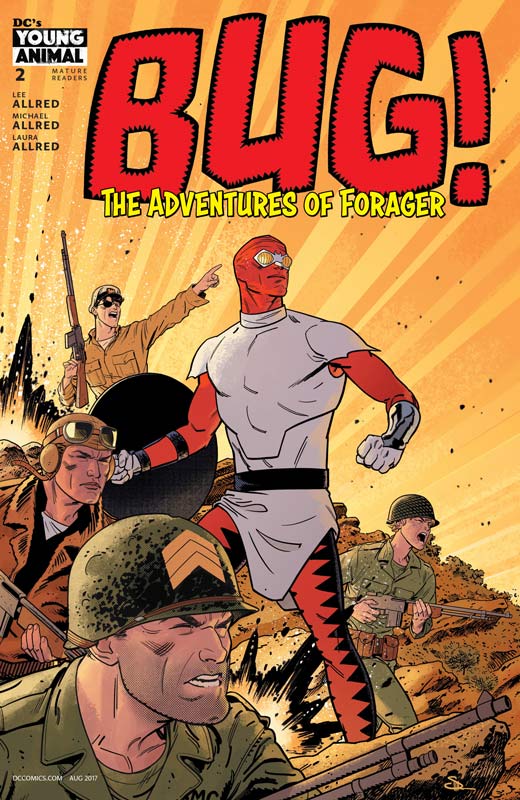
DC Comics Writers Lee Allred and Michael Allred, Artist Michael Allred, Colorist Laura Allred, Letterer Nate Piekos
I liked the first issue of Bug but did feel that it veered a little too far to the wild and weird Allred zone but this second issue really hit the ground running and was a blast but knocked my sock off. What I loved about this issue was the tour de force of classic DC Comic characters that made this issue such a fun read. It’s no secret that both Lee and Michael are big comic fans and this book has allowed them to play in the DC Universe sandbox and they brought a lot of toys with them for this story. What I’m loving about this book is that they don’t try to be slavish to the Kirby original. It’s not that they are changing him or his original tone it’s just that they are freely going where they want with him. This issue they go back to the WWII ears with the Losers and Blue Beetle that were other Kirby characters that he was famous for and it made for not only a great nostalgia story but a really fun one at that. I mean who else but the Allred’s come up with a great war story and figure out how to throw robots and abominable snowmen into the mix and have it all seem perfectly natural. Lee and Michal have crafted a trippy drug induced tour through the DC Universe and yet they somehow keep the whole thing grounded and fun and I simply can’t figure out how they keep it all together. The one thing that does pull it all together is Michael’s artwork that is a joy to see in the DC Comics world. You can tell that he is having the time of his life playing with the Kirbyverse but making it all his own visually. The final piece of the Allred puzzle is the wonderful color work by Laura that always adds that extra visual pop that complements Michael’s smooth line work. What I love about her work here is that she understands old school color work and while she has access to many more colors than they did back in the hand colored days, she makes sure that she doesn’t stray too far and keeps it in the old school color mode.
Is this book worth your time and money? When is the last time that you read a comic and found it to be a real hoot. Well then this is the book that brings back the fun and thrills that Kirby created back in the 1970’s and adds the Allred’s family stamp to it. This book is simply pure joy that shows when creators put their heart and soul in a book. This is a must read comic and get my HIGHEST RECOMMENDATION!
Betty & Veronica #3
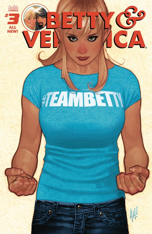
Archie Comics Writer and Artist Adam Hughes, Colorist Jose Villarrubia, Letterer Jack Morelli
Well it surprisingly took less than a year for the three issue storyline to finish but Hughes brings the story to a satisfying close that was well worth the wait. While it was his artwork that sold the book initially in the end it was his story that was the winner at the finish line. What made this story so fun was the twists and turns that Hughes went with the story. And while there was a lot of cheeky moments in the book it was the heart and sweetness of the story that won out in the end. Where the book really shines is his snappy dialog that kept the story moving along quite nicely. Probable the single best moment of the issue was when Veronica was teaching Betty to swear and it was funny and adorable at the same time. What I love the most about the story was that Hughes didn’t change any of the Riverdale gang. They all felt natural and what we all love about them in the first place. The biggest surprise was the ending to the story which I will not spoil here but lets just say that I was very surprised and impressed with it. Of course having Hughes gorgeous artwork on the book was the main selling point and I liked the style he went with in the book. With the more subdued color palate by Villarrubia it gave the book a very nice retro style that made the book that much more visually charming and perfect. It was the art that sold it initially but it was the story that won the day.
Is this book worth your time and money? I was excited to see what Hughes was going to do in the modern Archie Universe but while we knew it would look amazing I honesty never thought that the story would be this good. The first two issues were solid but with this spectacular ending it really changed the way that I saw the overall story. The book was funny, sweet, and perfect. I hope that Hughes does more stories with Betty & Veronica because this book was really good and HIGHLY RECOMMENDED!


0 Comments