DC revamped line starts this week and while not all of them are hits they at least a better direction than DC has been going lately. So because there are so many of them and trying to do as many reviews as possible I will keep the DC #1 reviews a little shorter than usual similar to the Convergence titles.
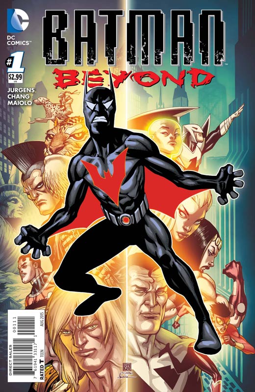
Batman Beyond #1
DC Comics Writer Dan Jurgens, Artist Bernard Chang, Colorist Marcelo Maiolo, Letterer Dave Sharp
I was not a follower of the Futures End series that this book spins out of so I am going in fresh with this. Terry is no longer Batman and Tim Drake is now the future Batman. The first issue gets off to a decent start and does a very by the numbers first issue with laying out the changes that have happened to the future. Jurgens script get the job done but while the book is OK, it never quite excels either. I will give that there is a nice twist at the end of the issue but overall the story is just OK. On the bright side you have former Wonder Woman artist Chang who makes the book look great. He is able to balance the action and the dialog scenes with ease and a very good-looking book?
Is it worth your time and money? If you are a fan of Batman Beyond your probably going to like the book but, if you are new to this character then I don’t know if you are going to be convinced by this version. Again it’s not a bad book but never quite takes flight either. If it interests you then it’s probably worth a throw but otherwise there are some stronger DC debuts this week.
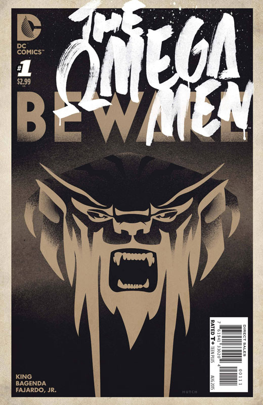
Omega Men #1
DC Comics Writer Tom King, Artist Barnaby Bagenda, Colorist Romulo Fajardo Jr., Letterer Pat Brosseau
I must first start with a tip of the hat to the creative team and DC for including a very deserved dedication to the late Roger Slifer who wrote the original series back in the 1981 with Keith Giffen and passed away recently from a hit and run accident. The first issue is pretty much about set up and introduction to the cast and is mostly laying the ground work for the series. King definitely take a cue from Slifer with setting up the team. I am probably one of the few reviewers that actually read the original run of the book so it’s very smart of King to take the time to introduce them. He also wisely keeps certain cards close to the vest in not explaining everything in this first issue. I was very impressed with Bagenda’s artwork and paying homage to Giffen’s page layout of the nine panels per page when needed. The art does a great job of brining the script to life and was overall very impressed with the look of the book. I also want to point out the great color work by Fajardo Jr. who really makes Bagenda’s artwork come alive with a style that complements the art and give the book a distinctive look. This book is off to a solid start and is a nice set up for the series.
Is this book worth your time and money? I give props to King and Bagenda for taking the time to go back and look at what the original series was about and yet still made this book their own. There are way too many times where a series is redone and they blow off the original. In this case they don’t try to re-invent the wheel they just put the wheels that worked well and put them on a new car. You should give this new book a spin. RECOMMENDED!
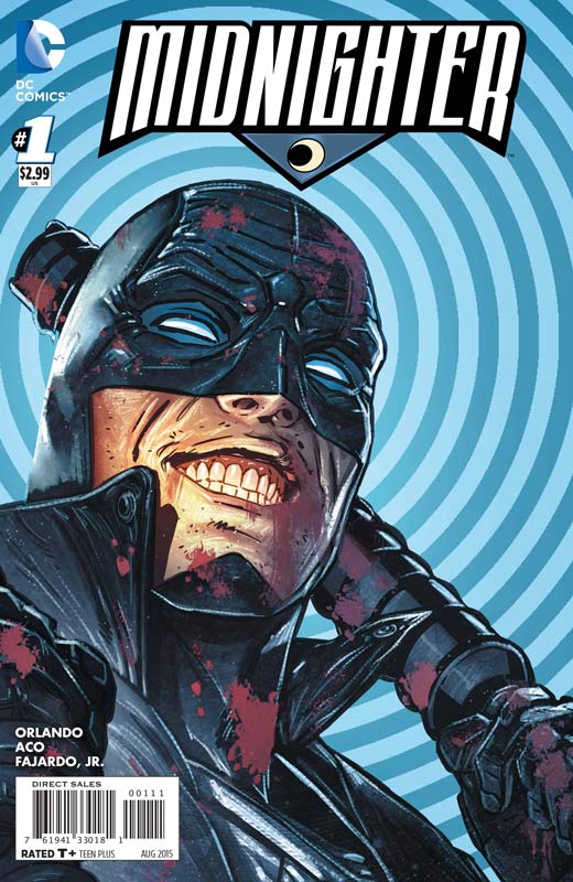
Midnighter #1
DC Comics Writer Steve Orlando, Penciller Aco, Inker Aco with Hugo Petrus, Colorist Romilo Fajardo Jr., Letterer Jared K. Fletcher
One of the Wildstorm characters gets a second life in a new DC book with this relaunch and is quite the ride indeed. Orlando handles the task of taking all of the previous incarnations of the character and mixing together most of the parts that he was and added some new spin to the character and you have quite the wild ride in just the first issue. Lets get the elephant out of the room so we can move on, Midnighter is gay. End of story and lets move along shall we. Orlando takes a no holds bar approach to the book and add a lot of nice depth to him at the same time. The script is pretty dense and you will need to take your time with it for two reason. One is the script that has a lot of subtlety in it and the wild layouts of Aco’s artwork (more on that in a minute) Orlando gives a nice introduction to the character for new readers without bogging down the story and always moving it forward. He does a nice job with this first issue of setting the tone and layout for the series. Where do I start with Aco’s artwork? He is one of the main reason that this book really works well. He puts so much detail into the art that you simply have to take your time to bask in the glow of it all. He shatters all of the conventional layouts and perspectives that a normal artist might take with the script and then turns it up to 11 and you better hang on. It’s one thing to do wild storytelling during action scenes but he’s just as impressive with the dialog and character development scenes. This is a great looking book!
Is this book worth your time and money? I have to admit that this book really impressed me. It could be the biggest surprise from this new generation of DC books. This book is not going to be everyone’s cup of tea because of the action and tone of the book but as long as those don’t bother you then you should buy this book. Orlando and Aco have set a new standard for off beat heroes that don’t fit into a specific box and that is why it works so well because this book runs over the box. VERY RECOMMENDED!
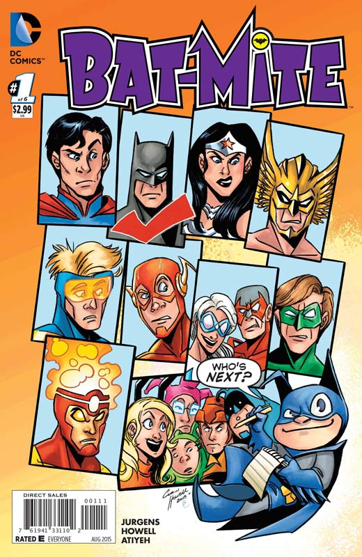
Bat-Mite #1
DC Comics Writer Dan Jurgens, Penciller Corin Howell, Inkers Howell & Andres Ponce, Colorist Mike Atiyeh, Letterer Tom Napolitano
Bat-Mite was an odd choice for this new relaunch and sadly it kind of misses the mark. It seems that Jurgens tries to hard with the comedy and feels very forced at times. The first half of the story doesn’t quite click right and while it gets Bat-Mite to the place he needs to get to in the story by the time the story starts to work you don’t seem to care after the slow start. I think that the idea of Bat-Mite as a mini series is not bad I just don’t think that Jurgens is the right choice as a writer. On the plus side the artwork by Howell and Ponce give the book the visual look that is needed and the art is a lot more fun than the story. Their facial expressions for Bat-Mite are right on target and make the book work a heck of a lot better than it should.
Is this book worth your time and money? I really wanted to like this book a lot more than I did. While it’s not a train wreck it’s certainly not light and breezy and that is the problem. This book has a lot of the ingredients but it’s missing the most important one, it’s not fun and that is the biggest flaw of this book and that is a shame. SKIP IT!
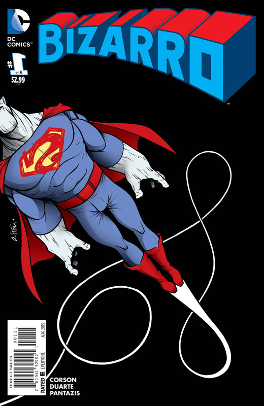
Bizzaro #1
DC Comics Writer Heath Corson, Artist Gustavo Duarte (with guest artist Bill Sienkiewicz), Colorist Pete Pantazis, Letterer Tom Napolitano
Of all of the new DC books this week I was the most excited for Bizzaro. From the time that they announced the book with Gustavo’s art and the 8 page preview last month in Steel #2 (the ONLY reason to buy that book) only wetted my appetite for this book. This is what Bat-Mite should have been. I really have to hand it to Corson this book could have crashed and burned really easily but his script kept the story steady and on track. I love how he makes Bizzaro more of an innocent child who just wants to fit in and be loved. He is not a monster or stupid and Corson keeps that point throughout the story. His take of Jimmy Olson is very refreshing and work very well as a sidekick. The humor of the story is very refreshing and mixes many different genres and emotions to make this a fun and very satisfying read. The key to the book’s success is Duarte. His style is so fresh and exciting and I can’t imagine anyone else that could bring this story to visual life any better. His Bizzaro is one of the best takes I have ever seen for the characters and he fills him with such beautiful emotion that makes his adorable and who ever thought that Bizzaro was adorable. Another nice art touch was the Bizzaro dream with art by Sienkiewicz that is such a different art style that works perfectly for the story.
Is this book worth your time and money? I had high expectations for this book and that is always a hard thing to go into a book with because you can really disappoint yourself most of the time. This book truly exceeded my expectation and it knocked my socks off. This is the direction that DC desperately needed to go in. While on the surface it’s an oddball cute and funny book but once you peel those layers back you get a book by creators that are allowed to create. The one thing that this book does that most mainstream book are sorely lacking is that your left with an impression of the book after you are done reading it. I was left with a good feeling and wanting more. HIGHLY RECOMMENDED!
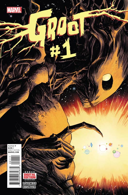
Groot #1
Marvel Comics Writer Jeff Loveness, Artist & Colorist Brian Kesinger, Letterer Jeff Eckleberry
This is a nice companion book to the Skottie Young Rocket Raccoon and definitely lives in the same lighter side of the Marvel Universe. I have to give the tip of the hat to Loveness in that he was able to pull off a story with the main character speaks three words. If you are looking for a serious and dark comic you have landed in the wrong spaceport. Loveness keeps the book light and a ton of nods and winks that will impress any comic fan. There is one very unusual cameo that is priceless and I won’t spoil it here but I will say that it’s Super! He has also modeled the story loosely on the Bob Hope and Bing Crosby road pictures in keeping that tradition going here. Of course Loveness can only do so much with a character that speaks three words and this is where Kesinger steps in. His cartoony style fits the book like a glove and he is able to give the visual dialog to Groot that the book need to work and he does it masterfully. This is a very funny book because it’s smartly written and beautifully drawn.
Is it worth your time and money? I loved this book and the only reservation that I have is how long can they do this book. I can see maybe 12 issues of possible stories with a character that speaks three words. I hope that they prove me wrong and have more stories planned out for the book. I might even dare say that I might have enjoyed it a bit better than Young’s Rocket Raccoon book, but that is not a knock but a huge complement to the team here for hitting the bulls-eye with this book. This book is fun with a capital F! VERY RECOMMENDED!
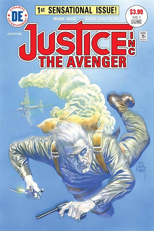
Justice Inc. The Avenger #1
Dynamite Writer Mark Waid, Artist Ronilson Freire, Colorist Marco Lesko, Letterer Troy Peteri
Dynamite book are real hit and miss for the most part but when they work they turn out well and in this case it’s a hit. Waid is the perfect writer for this book because he gets the period and the tone that the character is based in. He wisely keeps the book in the 1940’s period because so often when classic pulp characters are brought into the modern world it never seems to work out. Waid uses the period to his advantage by allowing Benson’s team to be able to create modern type things because they develop them and that allows him to go in different directions with the story. There is a fair amount of exposition in the first issue and Waid does a nice job of both introducing the cast and setting up the first story arc. One of the biggest problems with Dynamite is that most of the time the artists for their books are not the best, but thankfully Freire artwork is quite nice. He not only puts a lot of nice detail into the art but is able to capture the visual time period that artist sometimes miss on period pieces like this book. One of the things that really impressed me with his artwork is the facial expressions that are very good.
Is this book worth your time and money? This series gets off to a solid start with both the story and the artwork. I have a real fondness for the classic pulp characters but most of the time they are poorly done thankfully this is not the case here. Waid and Freire have done a nice job of bringing the Avenger and his team back but kept all of the things that made it work so well in the first place. If you like pulp character this is definitely a book that you want to pick up. RECOMMENDED!
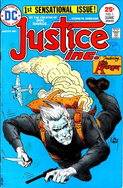
As an added bonus here is the original Joe Kubert cover that Alex Ross’s homage cover is from.
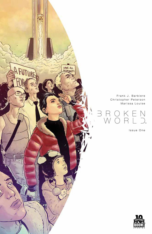
Broken World #1
Boom! Studios Writer Frank J. Barbiere, Artist Christopher Peterson, Colorist Marissa Louise, Letterer Ed Dukeshire
I was a bit hesitant on this book because most end of the world stories are mostly just rehashes of things we have already seen before. I picked it up mostly because of my local comic shop always has titles each week that are half off to get people to try them. So with that in mind I was willing to give it a shot. I admit that I was surprised at the story. While Barbiere’s set up to the story follows the basic end of the world tropes there are a couple of nice story nuggets that set up some nice groundwork for the story in the future. The first is the why does Elena need a forged passport to get off the earth before the asteroid hits, and the last panel changes the whole game that you thought was going to happen. I will give Barbiere kudos for the first issue being the MacGuffin to the story and will at least stick around to see where the next issue goes with the story. Peterson’s artwork is decent but not outstanding. It gets the job done fairly well but there is a lot of empty backgrounds and lack of detail to the art. Nothing terrible but just OK.
Is this book worth your time and money? This book isn’t going to bowl you over or anything but does actually get off to a far better start than I would have thought. The next issue is going to be a make it or break it for this one. The twist that Barbiere pulls off at the end of this issue has me very curios about were the story is heading.
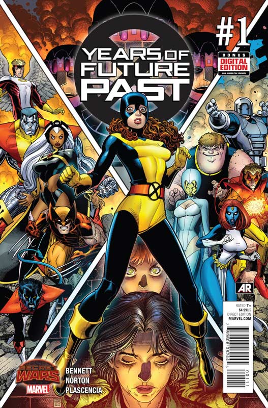
Years of Future Past #1
Marvel Comics Writer Marguerite Bennett, Artist Mike Norton, Colorist Fco Plascencia, Letterer Joe Caramagna
The Secret Wars flood continues over at Marvel and now they are re-imagining every event that has ever graced or screwed up most of the time in their books to change the story. I was a reader of the best run that the X-Men books ever had with Claremont and Byrne with one of their best stories Days of Future Past. Now most people are only going to be familiar with the film version that is pretty close to the structure of the original two-part story. Bennett has taken a great story and rehashed it into a very average story that has the emotional impact of pointlessness. You would be so much better off reading the original story than this. Bennett does nothing with the story unless you change a few characters around and add a few siblings to the mix. I wouldn’t really call that amazing storytelling. She brings nothing new to the story to ultimately change and is just flat on the page. Norton does a decent job on the artwork but compared to the Art Adams cover it’s a letdown from there.
Is this book worth your time and money? Not a complete waste but pretty close. Why would you want to read a watered down version of a great story with average art. Sadly most people are gobbling up this waste of paper that Marvel is doing with this whole Secret Wars event. This is the most pointless book that I have read in a while. SKIP IT!
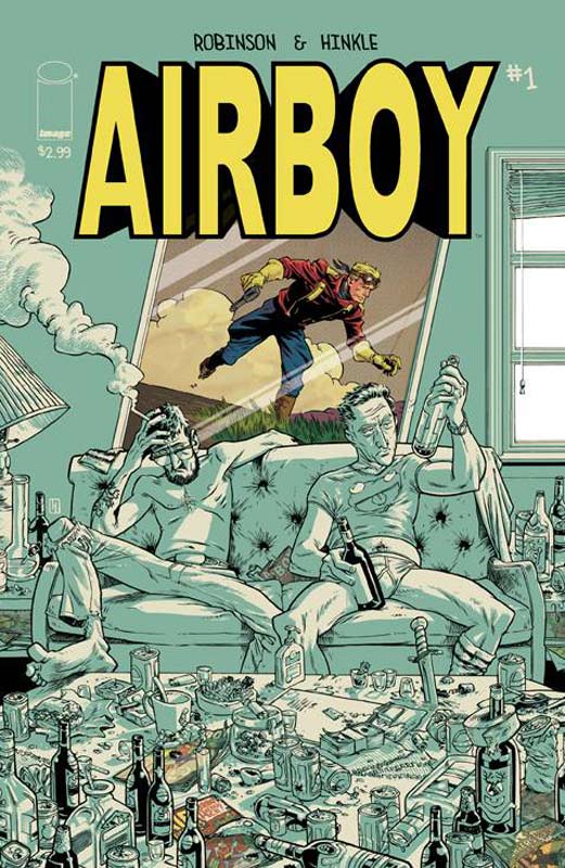
Airboy #1
Image Comics Writer James Robinson, Artist/Colorist/Letterer Greg Hinkle
I thought that I would be getting Airboy but this book is the strangest comic that I have read in a long time but was one of the most surprisingly off the wall and fantastic book. Instead of a superhero book you get one of the most personal and thought-provoking stories from a creator’s in comics. Robinson tells the story from the creators point of view and Airboy only shows up in the last page. It mixes reality and fantasy to a whole new level. Robinson self-deprecating look at his career and mixing in fantasy and reality to where you’re not sure what is real and what is made up make the story so fascinating. Now this book is not for everyone and will probably divide a lot of readers but I was very impressed with it. It runs such a fine line between glorification and criticism of himself that make the story that more intriguing. Hinkle’s art style is a mix of realistic and exaggerated reality that brings Robinson’s script to visual life. He brings a sense of a great underground feel in the artwork that you rarely see in the mainstream today.
Is this book worth your time and money? If you are looking for something that will amaze, offend, depress, fascinate, disturb, and goes way outside the box then this is the book for you. If any of those are not on your check list then you are missing out on one of the most intriguing comics in quite a while. I’m not sure where this book is heading but I am hanging on and enjoying the ride. HIGHLY RECOMMENDED!
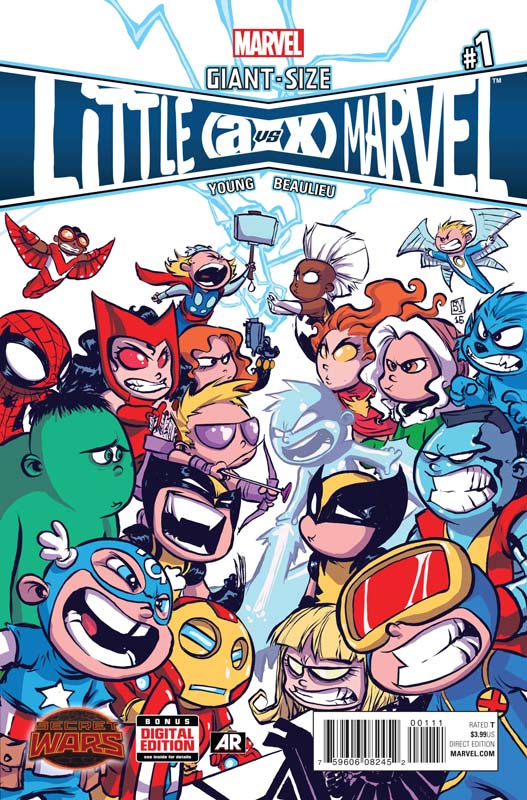
Giant-Size Little Marvel A VS X#1
Writer and Artist Skottie Young, Colorist Jean-Francois Beaulieu, Letterer Jeff Eckleberry
CUTE, and that is what this book is all about. This is one of those books that is a quick read and is just simple and fun. It’s simply X-Men vs Avengers as little kids and doing what little kid superhero’s do, pick on each other. Young has a real knack for this type of material and keeps the story simple and sweet. In other words its adorable.
Is this book worth your time and money? If you love Young playing in the Marvel Universe and turning everyone into kids then you have come to the right place. This is a book that both young and old can enjoy without any real tie into Secret Wars. This book is a stand alone fun read that I am a sucker for. RECOMMENDED!


0 Comments