A huge week for new comic books. Marvel is ramping up the Marvel Legacy with some to their big guns like Hulk and Deadpool. Also this week and DC continues to hit the summer with a bang with the relaunch of Justice League. There is a ton to get to so let’s get started.
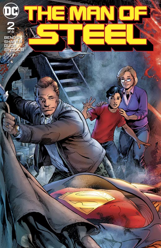
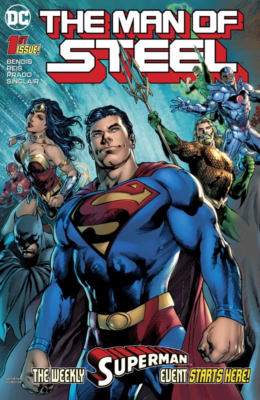
The Man of Steel #2
DC Comics Writer Brian Michal Bendis, Artists Doc Shaner, Steve Rude and Jay Fabok, Colorist Alex Sinclair, Letterer Josh Reed
This second outing while not a strong as the first is still quite good but Bendis is starting to lay the ground work for his rebuilding of Superman for his upcoming run. There is quite a bit that is going on in this issue but a bit heavier on exposition that is needed but he still throws in some action to help move things along. What I have been liking about his approach to Superman is that he is not only getting him back to the better than the best of humanity but he is wisely not forgetting about the Clark Kent aspect that is just as important. He definitely takes the age-old question of is it Clark or Superman that is the true North of the character? In a lot of ways it not that simple either way and Bendis is tackling this here and I really applaud him for it. The artwork on this issue is good but it still disappoints me that Shaner once again is unable to complete a full issue of a book but it’s always a treat to see Rude draw Superman at any opportunity. The few pages that Shaner does deliver in this issue are a wonderful treat and that is why I give him a hard time about this. He is an amazing artist that delivers the goods but hasn’t been able to stay on a book for any regular amount of time. The real bonus of Shaner not drawing the full book is that we get that classic Fleischer style Superman that Rude that is both retro and modern at the same time. There are few artist that can deliver like this and would love to see him draw the Man of Steel regularly.
Is this book worth your time and money? You have to remember that this is only the second chapter of a six part story so Bendis is letting this story breath and letting it unfold nicely here. There is a lot of groundwork that he has to cover and we see a lot of it here in this second outing. Even with three artists this issue looks great and still a great ride so far. I like where he is taking this story and cant wait to see where each chapter goes. RECOMMENDED!
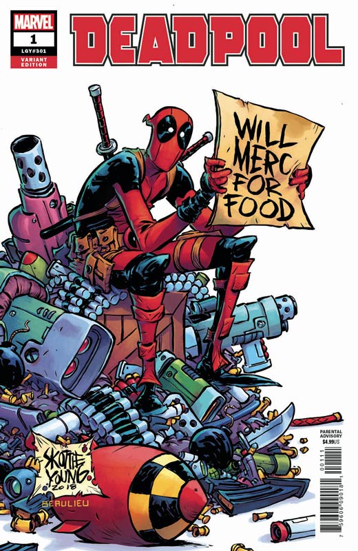
Deadpool #1
Marvel Comics Writer Skottie Young, Artists Nic Klein & Scott Hepburn, Colorist Ian Herring, Letterer Jeff Eckleberry
I will be very honest that I’ve never been a huge fan of Deadpool in the comics mostly because he’s pretty much been turned into a one trick pony that has become stale and repetitive. With the hug success of the films it’s not surprising that he is getting a new series. Young known more for his artwork than writing aims this new series more on the film threads than the comic continuity and that is both good and bad. It’s good for new readers that may have never read a Deadpool comic before so it will be comforting for them because they are familiar with the films. The down side to this is that while you get the jokes and the action it’s doesn’t play as well in comic book for as it does on the big screen with Ryan Reynolds. While the book is a decent read and has its moments there is very little real story here that makes this issue memorable. Young does hit all of the right beats that should work but that is where the book falls into a been there and done that. There is simply nothing here that is fresh and new and the jokes and gags become less effective with each passing page and get very old very fast. The main story artwork is by Klein and the back up story is by Hepburn and they do a nice job with the script that they are given. Klein has a bit of an edge of the two with the wonderful detail that he puts into his art that has a very nice look to it. Hepburn has a more comic book type style that is nice and does the job. Both did well with what they had to work with.
Is this book worth your time and money? Honestly unless you’re a huge Deadpool fan there is very little beyond that. If you’re a fan of the films you would probably enjoy this but its pretty unlikely that they would stay beyond a few issues. I get that Deadpool is a huge cash cow for Marvel and I get why people like the character but simply put if you’re looking for something beyond basic average comic dreck, you looking in the wrong place here. It’s not terrible but there are better comics that you could be reading instead of this one. SKIP IT!

The Immortal Hulk #1
Marvel Comics Writer Al Ewing, Penciller Joe Bennett, Inker Ruy Jose, Colorist Paul Mounts, Letterer Cory Petit
Every time there is a new Hulk series it’s tough for me because I feel that Peter Davids 12 year run on the book is one of the litmus test I have for nearly any Hulk story and while this book is too early to call I will give Ewing that this first issue gets off to a very nice start. The Hulk is a very tough character to crack but Ewing finds a way to get his story going in a direction that doesn’t fall into the Hulk Smash mode that trips up a lot of writers out of the gate. I very much like the Tommy story that while horrible to see but is a lot closer to current reality than most readers realize. While it’s not full on social commentary, there are light threads to it that give the story some teeth that help the story on an emotional level. He also wisely plays on the split personality of Banner and the Hulk that is what makes the character good in the first place and plays it quite nicely here in this first outing. The other win for this story is that Ewing captures the emotions of the events very well and some of his best writing to date. I’ve not been the biggest fan of his work but this book is very good and hopefully he will be able to keep the momentum going. Bennett and Jose really deliver some very fine artwork on this book and one of the best assets is that they capture the emotions of the characters perfectly and it adds greatly to the tension of the story. They put a lot of great detail into he art that is one of the best looking Marvel Comics that I have seen in quite a while. It’s a perfect matchup of story and artwork that was a very pleasant surprise.
Is this book worth your time and money? It’s obviously too early to tell the long-term of this new series but gauging it on this first issue shows a very strong start. Ewing sets things up and leaves you wanting more that is a wise idea. He wisely keeps the exposition to a minimum here and that really helps one thing with a great flow. Bennett and Jose deliver some damn fine artwork for this comic and overall there are many reasons to come back for more. I was really caught off guard by this book and cant wait to see where they take it. RECOMMENDED!
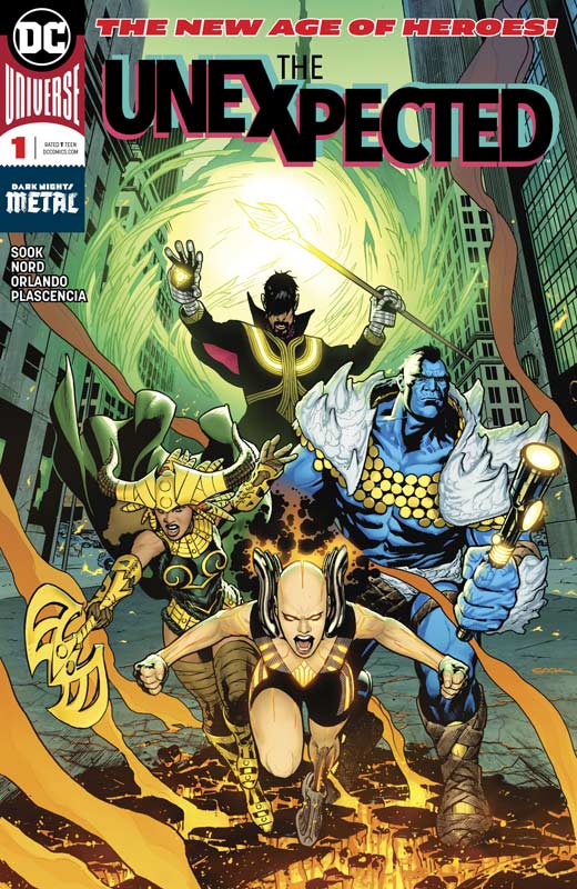
The Unexpected #1
DC Comics Writer Steve Orlando, Pencillers Ryan Sook and Cory Nord, Inkers Mick Gray and Wade Von Grawbadger, Colorist FCO Plascencia, Letterer Carlos M. Mangual
The last of the New Age of Hero limps to the sad ending of one of the most underwhelming new line of comic books from DC Comics in quite a while. The biggest problem with The Unexpected is that its simply underwhelming. The story is a very by the numbers affair here and there is very little fresh or new about this comic. It’s a bit of this and that thrown together that you haven’t seen before. Orlando has a bit of a hit and miss record lately and sadly this falls into the latter here. It’s not terrible but every element is something that you have read far too many times before and there is very little to get excited about with this book. The other problem is that Orlando does a decent job of setting up Firebrand the other characters just show up and you really don’t care what happens to any of them after that. It just turns into a big fist fight that ends up being pretty boring. The only thing that the book has going for it is the gorgeous artwork by Sook and Nord but even with nice artwork like this can really save a mediocre story like this one. Visually the book shines but as with the other New Age of Heroes no art team has stayed on the book beyond the first couple of issues and even if they stay on it with the weak story even they can’t save this one.
Is this book worth your time and money? The New Age of Heroes has quite frankly been a disaster and with the exception of The Terriffics the books have simple been of mediocre quality and the original artist have left the books after a few issues and considering that this line of comics was to be artist focused that is just embarrassing. It’s not that The Unexpected is a terrible read but it’s simply not anything new or fresh and with so many comics coming every week, a book like this is just not going to cut it. SKIP IT!
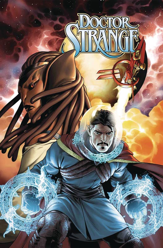
Doctor Strange #1
Marvel Comics Writer Mark Waid, Artist Jesus Saiz, Letterer Cory Petit
The first of three Waid scribed titles this week we start with his Doctor Strange run that sadly gets off to a bit middling start. The character of Stephen Strange has alway been a bit of a tough nut to crack and while there have been some good stories over the years the only ones that have really suck have been the original Ditko ones. While he is an interesting character writers have always struggled to find an angle to make him work. Waid does throw in some different ideas in this first issue and does make for a decent read but the story never really excited me as much as I had hoped it would. I do think that he throws out some good ideas here and while the plot is not wholly original it moves along fairly well and might go somewhere decent. I had wished that Waid would have come up with a better plot than bad thing happens, then character runs away to outer space then crashes on weird planet only to be captured is a story that has been done to death and there is nothing new here. The big win on this book is the gorgeous painted artwork by Saiz that gives it a semi realistic look that is the best thing this first issue has going for it. He really gives this book great scope and a great visual emotional core that helps you forget the basic story tropes while your reading because of the lush artwork.
Is this book worth your time and money? I didn’t hate this book but didn’t really love it either. I’m a huge fan of Waid’s writing but this was a bit of a miss here. I’m willing to give the book a second outing to see if Waid has an ace up his sleeve and is able to inject something fresh and new into the second issue. Saiz’s beautiful artwork alone is nearly the price of admission here but great artwork can only take a comic book so far. This ends up as a so-so start but I hope that it can get better.
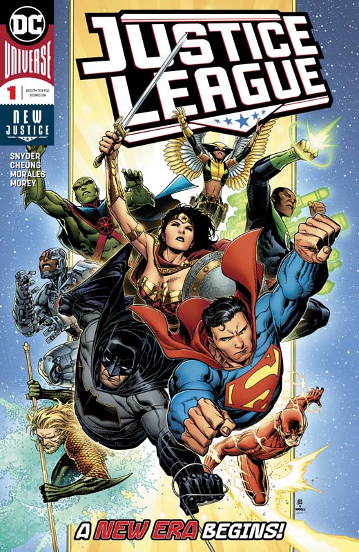
Justice League #1
DC Comics Writer Scott Snyder, Penciler Jim Cheung, Inker Mark Morales, Colorist Tomeu Morey, Letterer Tom Napolitano
I’ve always had a soft spot for the Justice League but lately there has been very little reason to read or get excited about the comics that have been coming out. I had hoped that the No Justice mini series would be an improvement but that was a bust. So I had my fingers crossed that Snyder could turn the sinking ship around. It kind of ends up a in the middle but does show promise. Of course the nice thing with this book is the nod to the Super Friends animated series with the Hall of Justice and the Legion of Doom and that was nice to see. I think the biggest problem with this first issue is that the exposition really drags the story down in this first issue and makes it a bit of a slog to get through. I get you have to set things up but you still have to entertain your reader and Snyder script has a bit of patchwork feel and flow to it. There is no real spontaneity in the script and there are very little story surprises either that makes for a slow read. I did however really enjoy Cheung and Morales artwork on the book and they really deliver on the detail in the art very well. They really help move the book along even with the exposition heavy script that they try their best to punch up with the artwork and most of the time they succeed nicely.
Is this book worth your time and money? While this book isn’t a total disaster it was a bit on the disappointing side. I will give the book a second outing because Snyder is a good writer and now that the exposition train has left the station, hopefully he will get things rolling along in the second issue. With super strong artist in place and the first issue hump out-of-the-way, I hope that this book can get the Justice League back to being a good comic book. It’s worth a look but don’t get to excited.
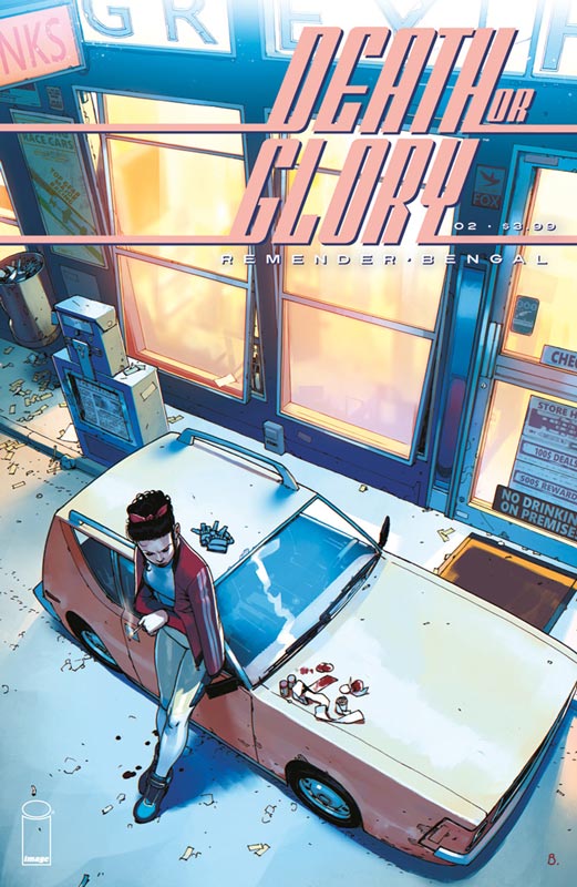
Death or Glory #2
Image Comics Writer Rick Remender, Artist Bengal, Letterer Rus Wooton
I fell in love with the first issue of Death and Glory and while this second issue slows things down in the action department, we start to dig deeper into the plot of the story and we start to see where the story is going. In the first issue Remender keep the script tight and focused in this second issue there is a bit of jumping around with the different storylines that are not necessarily hard to keep track of things but does has a slight disjointed effect but thankfully doesn’t kill the books momentum too much. The one thing that did work very well here was the introduction to the supporting cast in the story that was done nicely and of course you fall for Pablo who is a nice opposite to Glory. Their dialog is a snappy banter that fits this story like a glove and it will be nice to see where Remender takes that story. He also gives more questions than answers here and while this can be frustrating at first, you do need this to give more depth to the story and you can see that here in the seeds that he’s planting. I love, love, love Bengal’s artwork and he continues to impress here. Sure the action in the first issue is spectacular but the dramatic dialog scenes in this second issue is for me where he really shines. A great artist is able to capture the subtle nuances of the characters in a story like this and that is what I am loving about this book so far. Bengal really nails this issue with the artwork and makes this book such a joy to read and devour his art.
Is this book worth your time and money? This issue may seem to slow down on the surface but the great thing that Remender is doing here is building a world and characters that make this story have a great richness to it. There is a lot to take in here but if you let it wash over you then you will enjoy where they are taking it. RECOMMENDED!
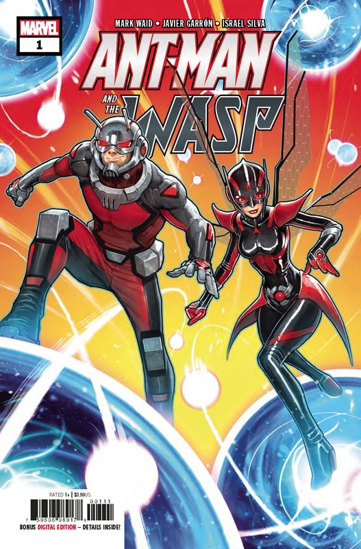
Ant-Man and the Wasp #1
Marvel Comics Writer Mark Waid, Artist Javier Garron, Colorist Israel Silva, Letterer Joe Caramagna
Waid’s second comic this week just in time to coincide with the Ant-Man and Wasp movie he delivers a pretty straight forward superhero team up comic story that may not be super spectacular but has a nice light fun. It’s one of those comics that doesn’t try and be more than it is. Waid’s script hits all the beats well but it is a bit too simple and safe at the same time. It’s one of those stores that you have read many times before and while this was a fun little read, it wasn’t very memorable either. The story hits the familiar tropes along the way that you easily expect and has a cliffhanger that is pretty weak. On the plus side he gives the book a nice pace that keeps it moving well and keeps it simple and sweet. Garron’s artwork is simple but nice and he really puts a lot of detail into every panel. There is not a wasted space anywhere in the artwork and he does give the book a great visual lift that makes the book a bit better than it actually is.
Is this book worth your time and money? This book aims for the middle of the target and hits it where it aims for meaning its a quick fun little read that is entertaining while your reading it but you won’t honestly really remember it later. If you like Ant-Man and the Wasp your going to like this book but if you go into it expecting something grand then you shouldn’t bother with it.
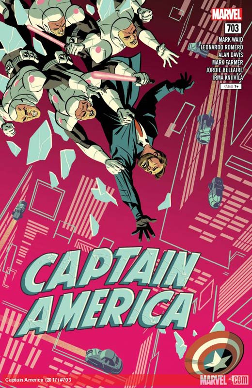
Captain America #703
Marvel Comics Writer Mark Waid, Artists Leonardo Romero with Alan Davis & Mark Farmer, Colorist Jordie Bellaire with Irma Kniilila, Letterer Joe Caramagna
Our last book this week with Waid’s writing continues to impress with the next to last chapter of this future Captain America story. The one thing that I have loved about this story is how the main storyline with Romero follows the Jack story while the guest artist do the flashback stories and how Waid is able to blend them together so seamlessly. This “world without cap” story is pretty basic but also touches upon the current events at the same time but never falls into the preachy category. In a way he mixes the past, present and future and shows how they all relate to each other in way you would not normally thing of them fitting together. One of the best parts of the story is about family and how important it is to keep them close and do whatever you can for them. The key to this story is heart and courage and while its pretty simple it the emotions of this story that I have really enjoyed with Waid’s scripts. Romero does a fantastic job with the artwork on the main story and there are some really big scenes that he delivers the WOW factor perfectly but it’s the more emotional moments where he really shows off his art skills. This issues flashback story is illustrated by Davis and Farmer who always deliver the absolute best art that graces comics today and this short story is no exception. They simply deliver perfectly every time and this was some of their best.
Is this book worth your time and money? Is this the greatest Captain America story, no but it’s simply delivering an entertaining but deep story that hits all of the right beats and I simply cant wait to see how Waid wraps it all up. With top-notch artwork in both the main with Romero and the guest artists, this has been a solid and satisfying Captain America story and that all I simply want from it. RECOMMENDED!




0 Comments