Sorry about missing reviews last week but with spending five days at SDCC there is simply no way of doing reviews or anything else. I have videos and stories from the show and will get those up soon. So this will be a mix of this weeks and last weeks comics that we will cover in the reviews this week.
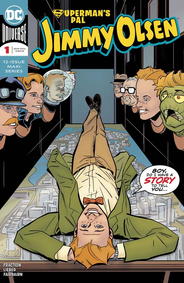
Superman’s Pal Jimmy Olsen #1
DC Comics Writer Matt Fraction, Artist Steve Lieber, Colorist Nathan Fairbairn, Letterer Clayton Cowles
After a great start in the Superman Leviathan Rising special a few weeks back I was very excited to see how a full issue was going to turn out and at first I was a bit taken back with the format that Fraction took with the book with the multiple short stories but once I discovered that they all connected together I was quite impressed with the way the issue turned out. Let’s be honest here that if your looking for a mainstream superhero comic you have totally come to the wrong place because this book is weird, goofy and stupid but that is why it works so well. While Olsen has alway been a bit of buffoon Fraction never treats the characters with disrespect on the country he simply has fun with the chaos that Olsen brings on himself. I honestly cant think of another artist besides Lieber that could visually pull this comic off. He really captures the charm and fun of Fraction’s script and his simple yet very detailed style bring the perfect look to this book. The one thing that I love that he does is the facial expression that Lieber brings to this book that really makes this book pop in all of the right ways.
Is this book worth your time and money? Is this comic going to be for everyone, no but if your looking for something way outside the sandbox then you have come to the right place. Fraction and Lieber are really firing on all cylinders here and brings the fun back to DC Comics that has been missing for far too long. VERY RECOMMENDED!
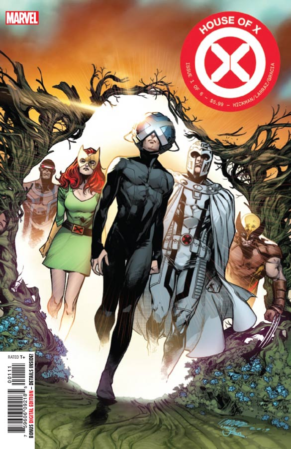
House of X #1
Marvel Comics Writer Johnathan Hickman, Artist Pepe Larraz, Colorist Marte Garcia, Letterer Clayton Cowles
It’s really been a long time since I have actually wanted to read an X-Men comic and I was hoping that Hickman was going to shake up the status quo that has plagued the books for as far back as I can remember. So what do I make of this rebooting of the book, Honestly it’s a bit hard to tell from this first outing. This first issue is filled to the brim with exposition and while there is a lot to take in, I did feel that is was a bit on the slow side for a first issue. That is not to say that it was bad but it did feel a bit bloated and with 11 more comics to come (House of X and Powers of X six issues each series) we will have to see where he is going to take the series. On this first issue I liked some of the ideas but I also felt that it wasn’t the biggest fresh taste on the characters that I had hoped for with one of the big issues is that Hickman’s script is a little confusing as to where the story is going to go. It falls into the average area with it not being bad but not overly good either. The one thing that the book really has going for it is Larraz’s artwork that really makes this book standout. He really puts a lot of detail into each panel and does his best to help the story make a bit more sense visually but as good as the artwork is it can only do so much with the story.
Is this book worth your time and money. The one thing that I am hoping for is that a lot of Hickman’s writing works better as an overall story and not as a single chapters and that is what I am hoping for here. A lot of hardcore fans are going to gush all over this book but for new readers where does this one land? I sadly can’t call it on this first issue because in a lot of ways it’s not really new reader friendly in a lot of respects and that is where I was disappointed the most in that a big comic like this should be accessible to new readers but in a lot ways it’s just preaching to the choir meaning that regular readers should not be the target audience for a book like this. The second issue of the story is going to be the key so you might want to hold off until then if your new but even if your a regular reader I can’t recommend this book yet. We will just have to see where Hickman takes it.
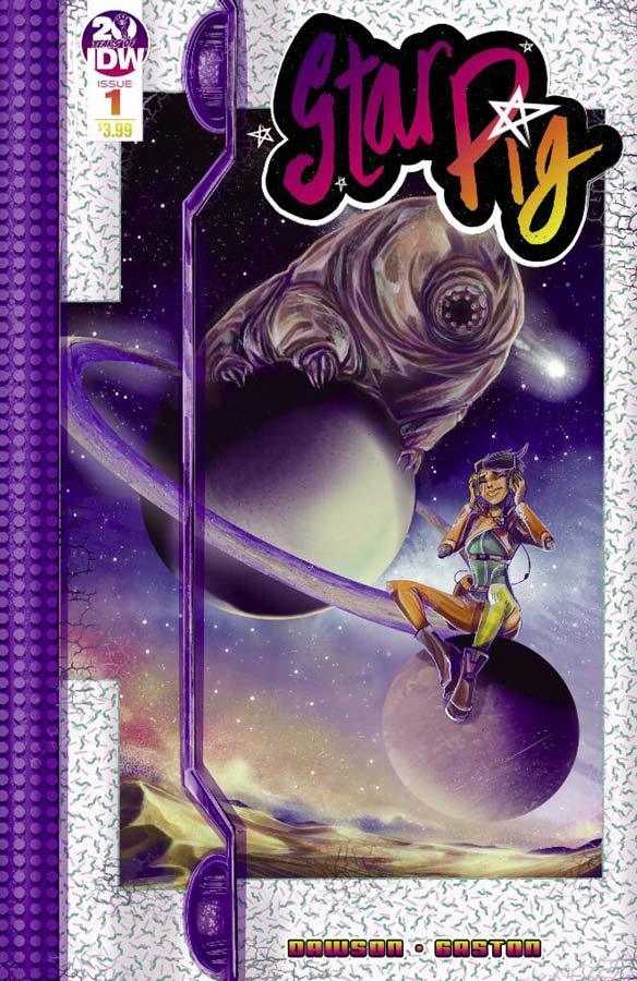
Star Pig #1
IDW Writer Delilah S. Dawson, Artist Francesco Gaston, Colorist Sebastian Cheng, Letterer Shawn Lee
There was something charming about this title in that it didn’t blow me away but it works well in a simple fun way. Dawson script sets things up nicely here in this first issue that takes a lot of ideas from various sources but make the story all her own. What I liked about the story is that she keeps it simple and straight forward and while there are still many questions to be answered in the series it was a fun little ride out of the gate. Gaston’s artwork has a simple clean style but that really works perfectly for this story. The one thing that was impressive was the subtle emotions that he gives the Space Pig. They are not always obvious but considering that it has no face this is quite a feat for an artist to pull off.
Is this book worth your time and money? While this book won’t blow you away it is a charming all ages comic that works because it doesn’t try and be more than it set out to do. Dawson keeps the script simple and to the point and gives you a nice reason to come back for a second issue. If you looking for something a bit different and charming then give this comic a try.
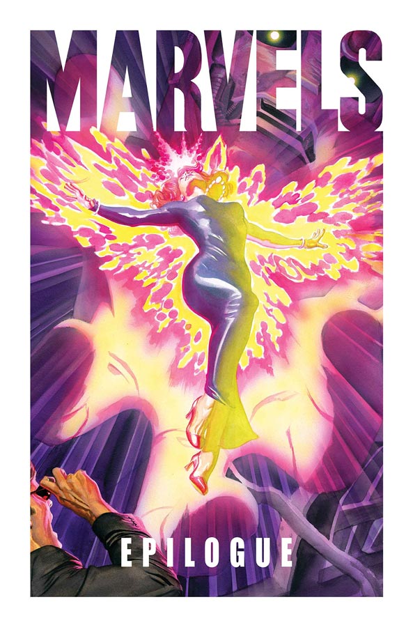
Marvels: Epilogue #1
Marvel Comics Writer Kurt Busiek, Artist Alex Ross, Letterers John Roshell & Richard Starkings, Back-Up Story Writer Steve Darnall with Busiek & Ross, Artist Mark Braun, Letterer Josh Johnson
To say that I’m a fan of the original Marvels series is an understatement but I have to say that I am really disappointed in this Epilogue book. It’s not to say that the story is bad on the contrary it brings back great memories of the original series but the fact that it’s only 16 pages long and five bucks is a total cash grab. While the story is really good in the end it doesn’t really add anything new to the overall story. It’s more of a side story from the original series but not necessary to read in the end. As always Ross’s artwork is spectacular here and the homages in the story are very nice just as in the original series. The rest of the book is filled out with a 2 page gag story by Darnell and Braun that is Ok but nothing special beyond the simple gag. The rest is text interviews with Busiek and Ross that is fun to read but is just padding to fill out the page count. A six page sketchbook fills out the book and while it’s nice to see Ross’s pencils before he paints the artwork doesn’t make it feel more special.
Is this book worth your time and money? While I really enjoyed the story the fact that Marvel had the gall to charge five bucks for a 16 page story is embarrassing. It’s most likely that it will be included in a future collection and and that simply will add insult to injury in the end. SKIP IT!
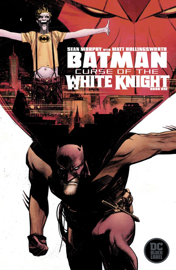
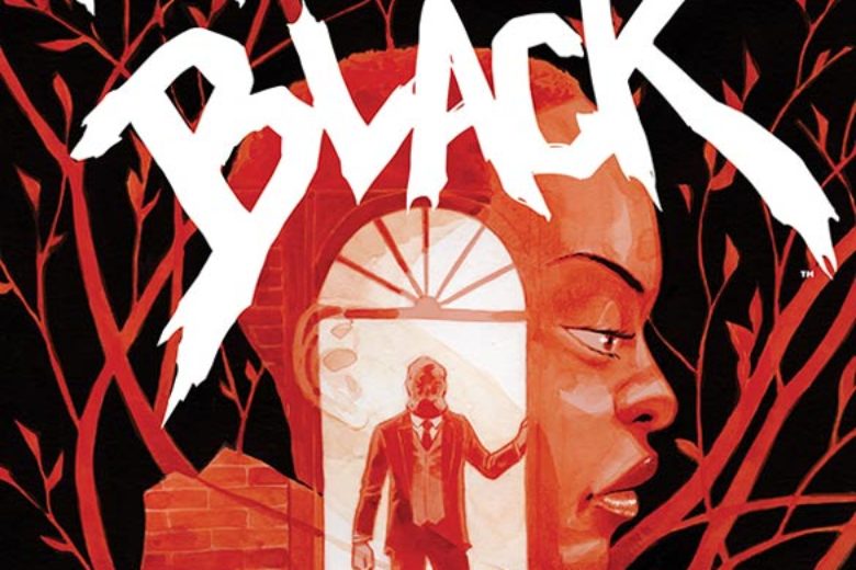
Batman: Curse of the White Knight #1
DC Black Label Writer & Artist Sean Murphy, Colorist Matt Hollingsworth, Letterer AndWorld Design
Murphy is back with a follow up to last years White Knight series that was really impressive and the good news is that it’s a solid first issue. The only slight downside is that your going to be a bit lost if you haven’t read the previous series that ties directly into this story. What I liked about this first issue is that Murphy gets the story off to a nice methodical pace that lets this first issue wash over you nicely as it sets things up for the series. There is a lot to take in from the repercussions of the first series and he build on them in this story quite well. As with the first series there is some really great and deep mythology that he builds here and it will be interesting to see where he takes it. As always Murphy’s artwork is a real win for this book and the amount of detail that he puts into each panel is really impressive and makes this book work so well and when you add in Hollingsworth’s beautiful color work this is the real deal.
Is this book worth your time and money? For new readers you really have to read White Knight before you dive into this one. The thing that I really liked is that Murphy doesn’t have to set things up here because he had already done that in White Knight. This allows him to let the story wash over you and takes his time telling it that I really enjoyed. I’m intrigued to see where he take this one. RECOMMENDED!

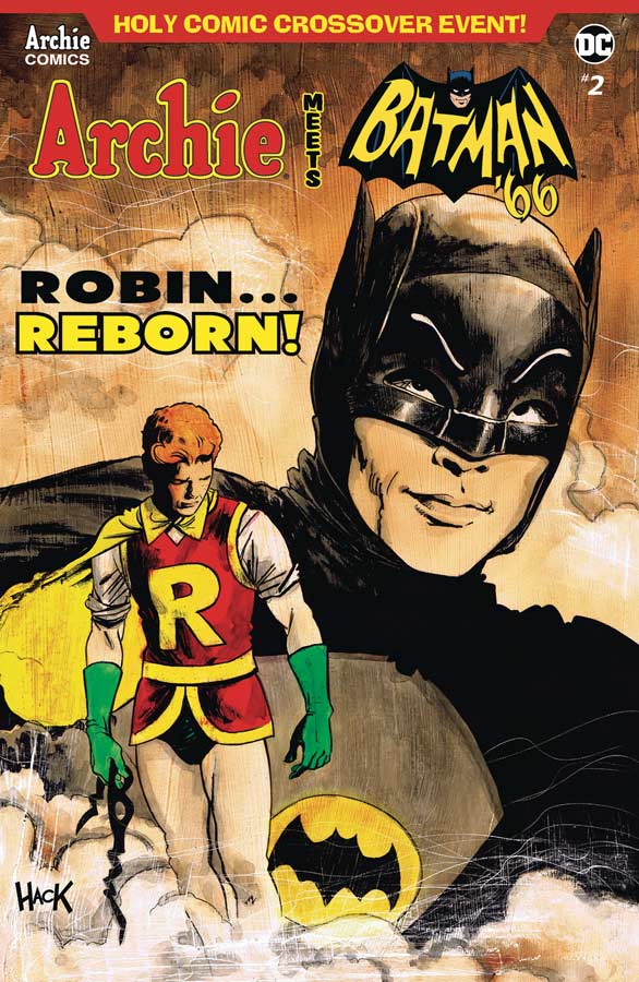
Archie Vs. Predator II #1
Archie Comics/Dark Horse Comics Writer Alex De Campi, Artist Robert Hack, Colorist Kelly Fitzpatrick, Letterer Jakc Morelli
It’s been four years since the original crossover of Archie and Predator and that series was a lot of fun, and while it’s nice to see another go with this idea there is a serious problem right out of the gate. It’s not that the story by De Campi is bad but it really requires you to have read and try and remember what the first mini series was about. I read the original four years ago and honestly haven’t a clue as to what the actual story was so I was even pretty lost reading this first issue. While the story is not incoherent, it does however refer to plot point that you simply don’t understand as your reading this first issue. The story is decent but you feel as if your missing something and that is not a good thing when your reading a comic. Hack’s artwork has a nice gritty feel to it and adds to the creepy nature of the story but he is able to only do so much visually while you lost reading the story. Somewhere between the story and the artwork the book never quite takes off like the first mini series.
Is this book worth your time and money? I was really disappointed in this book because I really loved the original series but asking readers to remember a story from four years ago to be required before reading this is just not the best way to get a mini series to work. If your willing to re-read the original then the book is not bad just disappointing.
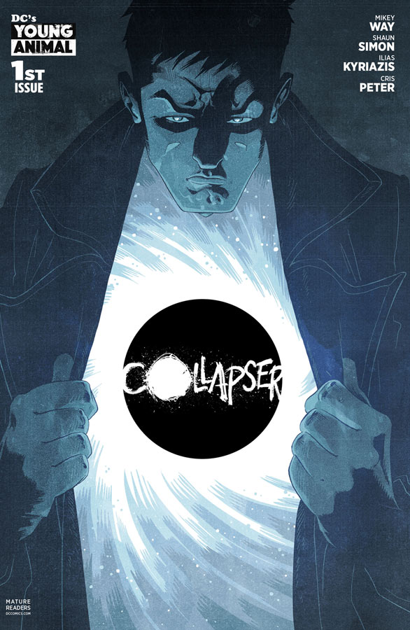
Collapser #1
DC’s Young Animal Writer Mikey Way and Shaun Simon, Artist Ilias Kyriazis, Colorist Cris Peter, Letterer Simon Bowland
The second of the new Young Animal series in this round of books is a bit on the odd and wild side and while I’m not quite sure what to make of the story, I am weirdly intrigued by it. It’s not that Way and Simon’s story doesn’t make sense and in some ways it doesn’t because they are not revealing everything yet but you just kind of go with it as your reading it. The one thing that they wisely do here with the script is that you can relate to Liam as an average guy who is just trying to get though life and then all of a sudden all hell breaks loose and he suddenly has these strange powers and is being hunted because of them. Where the book really came together for me was the great artwork by Kyriazis that really captures all of the strangeness to the story and give the book the perfect visuals that make it all come together in a strange but satisfying way. There is a lot to take in here and he really helps the reader visualize all of the bizarre things that are going on in the story.
Is this book worth your time and money? This is one of those comics that is really hard to review because it’s so out there. If your a mainstream reader I can safely say that this one is not for you but if you wiling to venture outside that then this one is worth checking out. I can’t say that I loved it but there are some really interesting ideas here and shows a lot of promise.
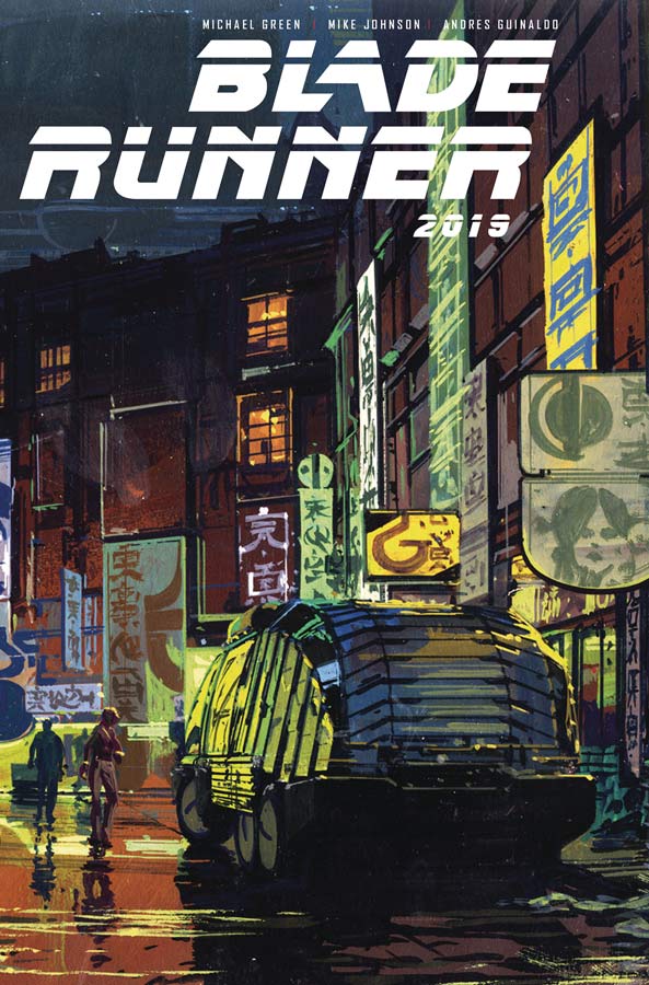
Blade Runner 2019 #1
Titan Comics Writers Michael Green & Mike Johnson, Artist Andres Guinaldo, Colorist Marco Lesko, Letterer Jim Campbell
I was a bit skeptical of this book considering its based on one of the greatest and influential films of all time so the writers were going to really have to impress me with this one. The good news is that it’s actually a pretty solid story and Green and Johnson wisely take their own route with the story instead of rehashing or trying to use plot elements from the original or sequel films. What they do use however is the atmosphere and designs of the original film and build out their own story. Using a basic detective noir approach works well in this first issue and using a female lead gives it a different feel and that is a good thing. While the story doesn’t break a whole lot of new ground it does tell an interesting one and there are some new elements that they throw in at the end of this first issue that is very impressive. The artwork by Guinaldo is really good here and he uses the original films designs very well here but still gives the book his style with the characters and it blends together very well. He does a nice job of capturing the noir feel that helps a lot too.
Is this book worth your time and money? In a lot of ways this book won’t blow you away but it doesn’t try to either. It take the elements of the original film and Green and Johnson build out their own story that is why this book works well and when you throw in Guinaldo’s spot on artwork you have a comic that will satisfy fans of the films nicely.


0 Comments