Lots of new #1 comics this week and with San Diego Comic Con next week there will be lots going on both there and the website. There is exciting news about the site so stay tuned for a big announcement. So let’s get to the reviews shall we.
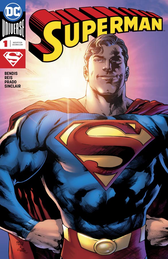
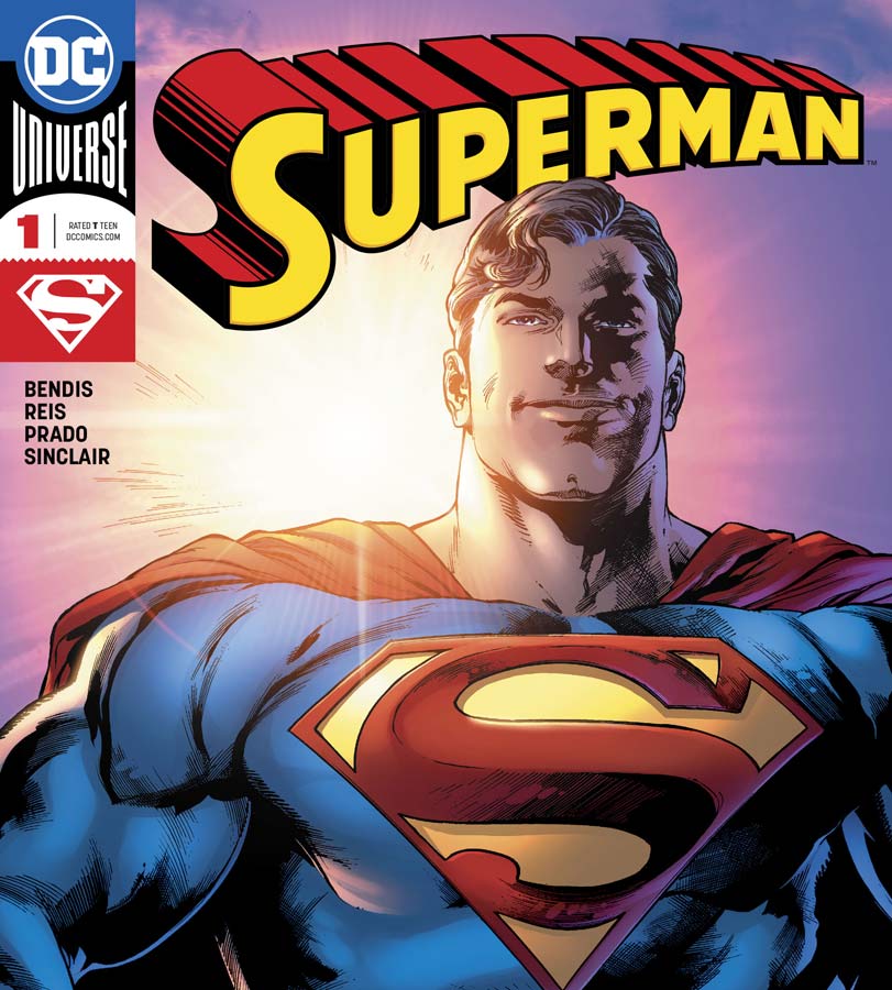
Superman #1
DC Comics Writer Brian Michael Bendis, Penciller Ivan Reis, Inker Joe Prado, Colorist Alex Sinclair, Letterer Josh Reed
If you haven’t read the Man of Steel mini series then you might want to read it before this first issue because it follows the events of that story and builds upon it in this first issue. I will give Bendis props for giving new readers a nice recap of the events. While that is good for new readers it does make this first outing a tad pedestrian for a first issue but there is enough here to forgive him with this first outing because what he does very well here is flesh out Clark Kent and how the human aspect shows his vulnerable side that a lot of times is forgotten. While the whole great Superman epic elements are always good, it’s really nice for a change to see this other side. To be fair there is some great heroic moments as well and the conversation between him and J’onn is priceless. Bendis built a really good set up that led into this first issue but where it really works is that he continues to build a great story here but doesn’t try and re-invent the wheel and quite frankly takes the book back to the basics and that is why its working so well. Reis is a perfect choice for the artwork on the book. His art style not only complements Bendis’s script perfectly but has a classic feel of Curt Swan or Jose Garcia-Lopez that just feels right. It’s a classic comic book style but the level of detail that he puts into each panel gives this book much more heft and weight.
Is this book worth your time and money? What Bendis and Reis is doing here is re-establishing and getting back to the core of what and who Superman is. It’s not to say that they are willing to keep the status quo because they have already shown that not every Superman myth is sacred and that there will be changes in the book and characters. But Bendis is not forgetting what makes him a great superhero in the first place. He shows that you can balance both history and embrace the new at the same time. Throw in Reis’s beautiful artwork and you have a real winner here. VERY RECOMMENDED!
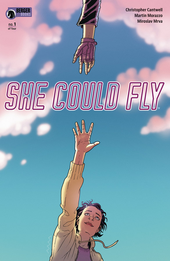
She Could Fly #1
Dark Horse Comics/Berger Books Writer Christopher Cantwell, Artist Martin Morazzo, Colorist Miroslav Mrva, Letterer Clem Robbins
The Berger Books line has been a little on the mixed side but I like that she is trying different things and not stuck with the tried and true. This new series written by Cantwell who is the co-creator of Halt and Catch Fire so that peaked my interest in this book. It does start a bit on the slow side but does have some interesting ideas that makes it worth a look at least. This first issue has both mystery and exposition so you cant tell for sure where Cantwell is taking the story so far. The one thing that I would have like a bit more was a better connection to Luna that the story revolves around. You just get that she might be crazy and I get that but you kind of don’t care as much as I would have liked. The underlying plot of the mystery flying girl does give the book a good spin but is not quite enough in this first issue to literally fly. I did enjoy Morazzo’s artwork on the book and there is some visually wild stuff that he has to bring to life from Cantwell’s script. He does help move this first issue along well even with the heavy exposition that it struggles a little out of the gate. The one thing that Morazzo does well here is the emotions of the characters and he captures that quite well and is a plus for the book.
Is this book worth your time and money? I like a number of things about this story but the first issue didn’t quite grab me as well as I would have liked for a first issue. I will give Cantwell that there are some very interesting seeds that he plants here and the book does show promise. It’s just hard to recommend this comic either way because the key is going to be the second issue and where the story goes from here. I will say that if you’re looking for something different then you might want to give this book a shot. I liked it enough for a second issue but didn’t love it enough to give it a recommendation yet.
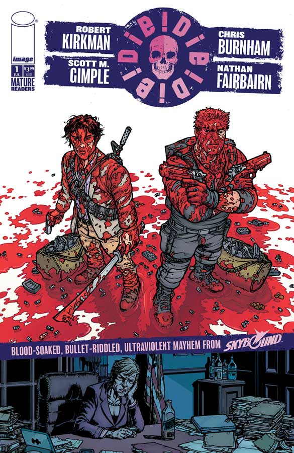
Die! Die! Die! #1
Image Comics Writers Robert Kirkman and Scott M. Gimple, Artist Chris Burnham, Colorist Nathan Fairbairn, Letterer Rus Wooton
I’m not the hugest Kirkman fan and while I liked the early Walking Dead, I honestly hated Outcast so I wasn’t waiting with bated breath for this new book and there is no doubt that it’s a visual feast, the story was decent but didn’t blow me away. The problem here is that there is more style than substance with the script. Kirkman and Gimple lean the story to the outrageous over the top violence and blood bath and didn’t bother to infuse it with much story. What little story is here consist of the whole what if scenario of well if so and so does this then this would happen but if you change this element then this would happen. The biggest problem with the script is that you simply don’t care about any of the characters that are introduces and there is very little below the surface as far as the story goes. It kind of comes off as a bad Mark Millar rip off of Kick Ass but with less plot or a watered down Garth Ennis book. Either way while it’s not a horrible read there is not much here in the story that is compelling me to pick up the second issue. The only plus this book has going for it is Burnham’s stunningly gorgeous artwork that helps move the simple story along here. Quite frankly the artwork is the only reason to buy this book because it’s a visual feast but that’s where it pretty much ends.
Is this book worth your time and money? There was a lot of hype surrounding this book just as it was coming out and sadly it ends up being an outrage only to the readers who actually expects a story when they buy a comic. This is not the worst comic that I have ever read at least its readable. The problem is that it just try to shock the reader and ends up being totally forgettable after your done reading it. Don’t fall for the hype on this one folks. SKIP IT!
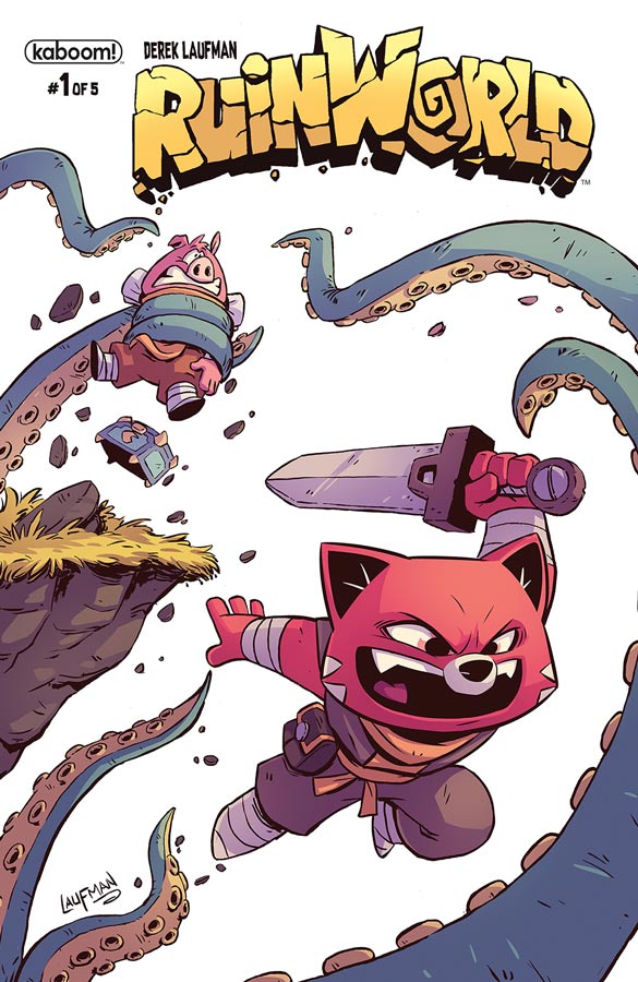
Ruinworld #1
kaboom! Writer and Artist Derek Laufman, Letterer Warren Montgomery
Here is a book that may not be super original but delivers a fun and charming all ages story that enchant young and old alike. Laufman takes the Hope and Crosby road picture concept and throws in magic and swords and it ends up working nicely together. You have Rex the smart mouth hero and Pogo the comic relief on an epic quest that leads them on an adventure along with a thief and keeps the story tight and moving along well with good pacing. While the story may be on the simple side that is not to say that Laufman has dumbed down the story so much that adults cant enjoy the story. Where the book really excelled was the charm that is infused into both the story and the characters. Sure you have read this story a million time before but it’s all in the delivery and this is where Lufman’s story and artwork come into play. It’s one thing to have a good story but where this book really works is the wonderful artwork that hits all or the right beats. The thing that I love the most about his artwork is the expressions that he gives the characters that capture both the big and subtle emotions of the characters that make this book such a treat. I really must point out the color work that Laufman delivers on this book that adds so much richness to the simple line work that makes this world burst at the seams with life.
Is this book worth your time and money? What I love about this book is that while Laufman keeps the story simple that doesn’t mean that there is not more under the surface. Sure this book is not going to blow you away but then it’s not supposed to. This is a solid all ages book that doesn’t try and be more than it is. It aims and hits the mark perfectly and that is why it works so well. VERY RECOMMENDED!
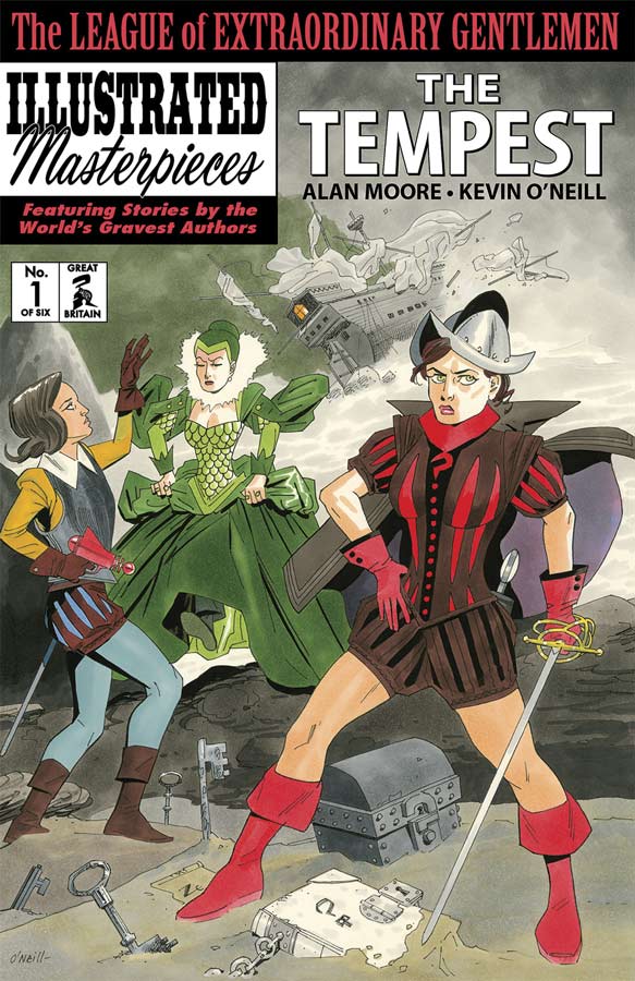
League of Extraordinary Gentlemen Volume 4: The Tempest #1
Top Shelf/Knockabout Writer Alan Moore, Artist Kevin O’Neill, Colorist Ben Dimagmaliw, Letterer Todd Klein
This fourth outing of Moore and O’Neill’s epic mash-up of literary characters continues to surprise and impress with each outing. Now if you’re not a regular reader of these books you might me a little on the lost side but as with the others it does stand on its own but has a lot of back story that feeds into every new chapter. This final outing for the characters and the cast gets off to a rousing start that pulls all of the elements and cast leading up to this story and it does not disappoint. This story centers around Orlando, Mina Murray and Emma Night who are looking for Nemo’s grandson and then there is the M.I.5. story that weaves throughout and then there is the seemingly unconnected Seven Stars storyline that is sure to be a key as the story goes along. All of these storylines weave in and out of each other and in a lesser writers hands this would fall apart. Moore has always done this with a lot of his stories and that is one of the big reasons that these books have worked so well and continues here. Things that seem important may not be and things that seem off to the side will become key elements and make for a deep and satisfying reading experience that has made each chapter so grand. This has always been a book that is more about the experience than just reading is some respects. The story washes over you and make you look for the small subtle things that could turn out to be important story clues. As always O’Neill matches the artwork to each story and that makes for a wonderful reading experience. Each style is unique but still has one thread that connects them for a visual flow that complements Moore’s script. I personally love when he does the newspaper strips that I love the style and that they are black and white gives them a sentimental charm and memories of reading a newspaper.
Is this book worth your time and money? If you haven’t read any of the previous chapters of this book then this is not a very good starting point because there is so much of the previous stories that lead directly into this one that your going to be lost a bit and not catch a number of the subtle elements of the script. If you have been along for the whole ride then you can see that Moore and O’Neill have pull out all of the stops on this one and it’s going to be a great ride to the finish line. HIGHLY RECOMMENDED!
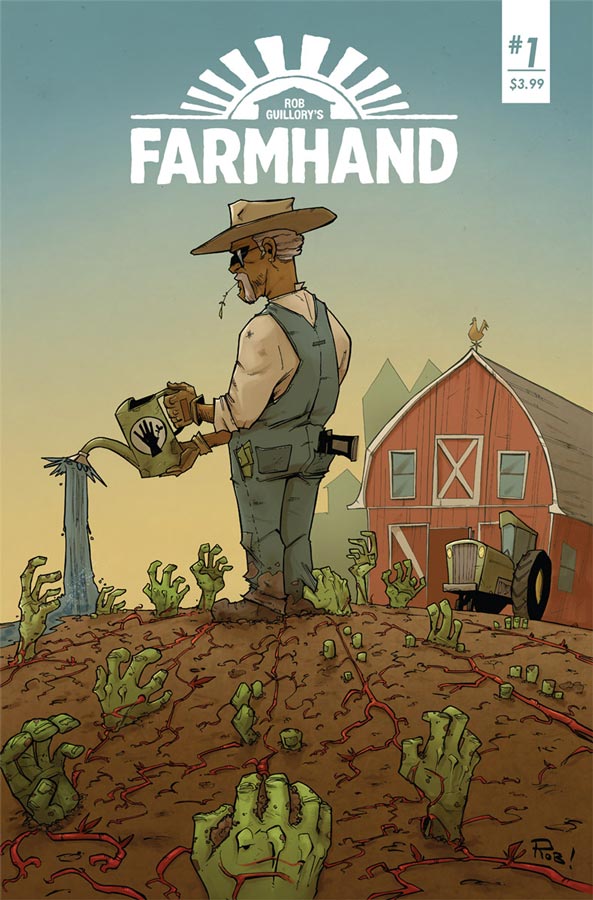
Farmhand #1
Image Comics Writer and Artist Rob Guillory, Colorist Taylor Wells, Letterer Kody Chamberlain
If you have ever read Guillory’s Chew then you know that you’re in for one hell of a ride with his new book but if your new to this book then you in for a treat of weirdness. This first outing there are definitely more questions than answers because Guillory is wisely not showing all of his cards yet. What he does make sure even with all of the weirdness going on in the story is that you get to know the characters so that you are able to go along with everything. Guillory is careful to make sure that many things in the story are grounded even with all of the strange story elements that are thrown at you. I like how he uses the middle America angle and then crosses it with invasion of the body snatchers and mixes it all together with humor and creepiness that blend together nicely. Its going to be very interesting where he takes the story from here. His art style fits the story nicely with a bit of a cartoony style that works perfectly for the humor scenes but is able to capture the horror elements of the story just as well. It has a bit of Stepford tones to the art that gives it that under your skin feeling at times and visually brings it all together in a perfect package.
Is this book worth your time and money? Guillory has gotten this story off to a very good start with this first issue. It has a great balance of exposition and pacing that gives you a good reason to come back for a second issue. There are lots of noticeable influences here and there but Guillory makes it all his own in the end. A perfect blend of horror and dark humor make this a book that is well worth checking out. RECOMMENDED!
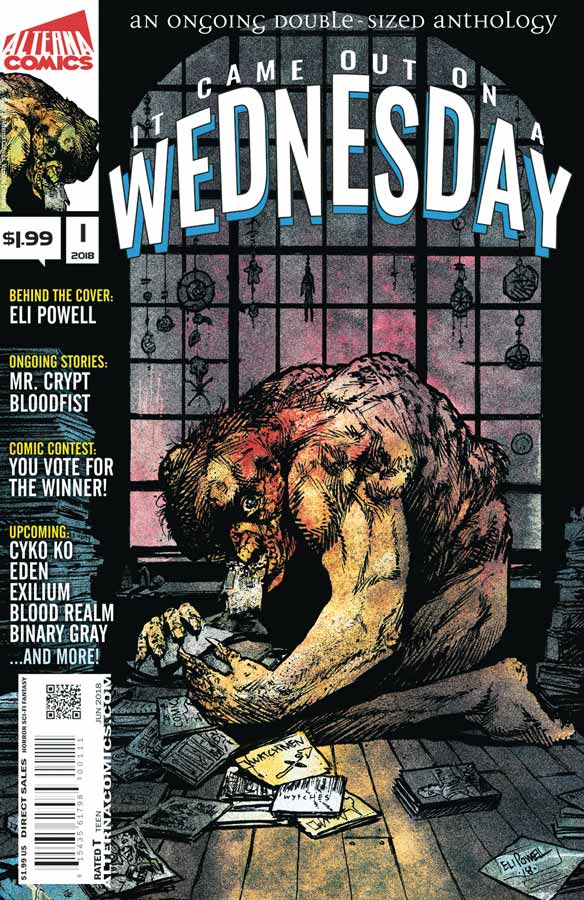
It Came Out on Wednesday #1
Alterna Comics Writers Ben Slabak, Stephanie Cannon, Eastin DeVerna, Troy Vevasis, Peter Simeti, Scott Bryna Wilson, Terry Mayo, Jeremy Massie, Artists Salomon Farias, Javi Laparra, Shawn Daley, Aleksandar Jovic, Michael Oppenheimer, Ken Knudtsen, Dave Swartz, Jeremy Massie, Colorists Marc Sintes, Letterers Hde, Marshall Sriboonrung, Tom Napolitano
Alterna Comics has been pushing new comics on classic newsprint to cut cost and pass this along to readers with this double sized anthology. While anthologies tend to be a mixed bag this book is more like the old DC New Talent Showcase that is what it reminds me of that comic. At a $1.99 cover price it’s hard to complain about this book but I will say that none of the stories really blew me away and a couple were misses but I will give the company and the creators that they at least tried here. One of the standouts was The End of the Beginning by DeVerna and Daley that looks amazing and while the story starts a little slow it ends up being a nice little short story in the end. Another standout was The Maddening Sound by Simeti and Oppenheimer that has a very familiar hero but with a natural fear that we all have in life. While the price is cheap because of the use of newsprint paper, there in lies part of the problem with this book. Sadly the reproduction of some of the artwork really suffers from mediocre print quality that the paper stock doesn’t do it any favors. While there were a few stories that I didn’t personally care for at least this book provides a showcase for new creators to try new ideas and they may appeal to other readers. At least there was a base level of quality that all of the stories and artwork hit and that is a plus.
Is this book worth your time and money? Ironically the two stories that I liked were the short story contest ones but overall the book was OK but for two bucks it didn’t feel like a total loss. For most comic book readers this is going to be a tough sell even at the cheap cover price because a lot of hardcore readers will not be willing to bother with a book like this. The reason to buy this book is to support new comic book creators and on that level the book works well. If your willing to give some new talent a chance then you should check out this comic.
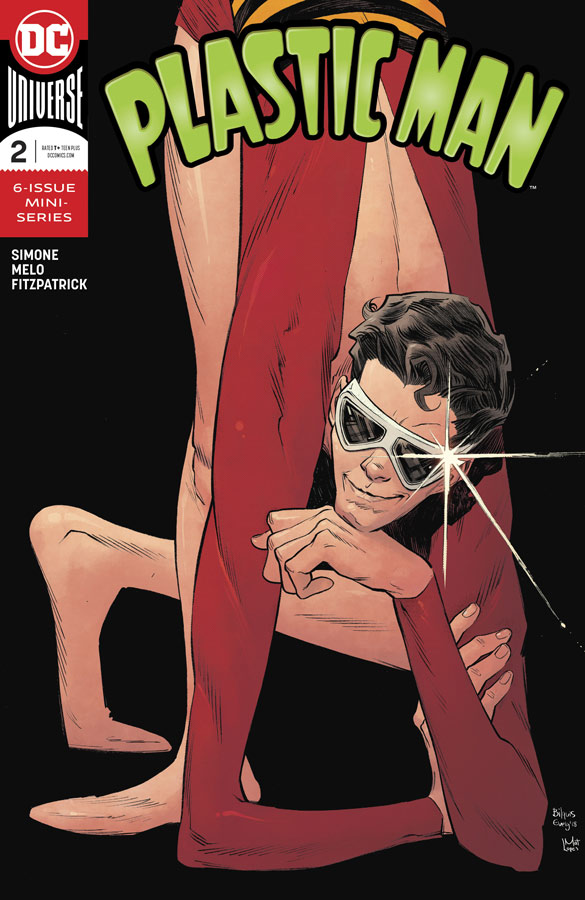
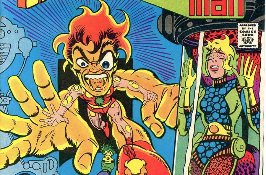
Plastic Man #2
DC Comics Writer Gail Simone, Artist Adriana Melo, Colorist Kelly Fitzpatrick, Letterer Simon Bowland
I want exactly blown away by the first issue of this mini series but my love for Plastic Man gave this book a second chance and while it didn’t blow me away it was a big improvement over the first outing. The first issue seemed to wallow in exposition and was slow going but I will give Simone that she did a good job on capturing the humor of Plaz and the first few pages gives me better hope for this book. I do like how she made him torn as a superhero. Sure he’s goody and there is a lot of humor but that he realizes that he messed up was a nice touch to the story. There is a good mix of humor and action that gives this issue some nice pacing that improved from the first issue. And the cliffhanger at the end of this story gives me a reason to come back again for the third outing. The artwork is a mixed bag this issue. I like Melo’s art but there are some really noticeable inconsistencies and the lack of backgrounds didn’t help things at all. There is more good than bad here but it was a bit disappointing. This is an example of where a good inker could come into play. Not that her art is bad but they could help smooth things out with the consistency and really help with the backgrounds.
Is this book worth your time and money? While I’m not totally sold on this book yet, this issue was a step in the right direction for it. The story was a lot more solid this issue but the artwork a little weaker. Overall it was enjoyable but I wish and hope for a better consistency.


0 Comments