Mage: The Hero Denied #0
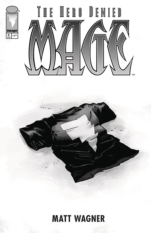
Image Comics Writer and Artist Matt Wagner, Colorist Brennan Wagner, Letterer Dave Lanphear
I’ll be really honest on this one, I never thought that Wagner would ever finish the final chapter in the Mage Trilogy. Over the years he seemed to not really care about the final act of the story and to say that I was shocked to hear of this book is a huge understatement. This issue is pretty much a 12 page side story that will help get readers back in the world of Kevin Matchstick. While the story was short and sweet I was a bit surprised that Wagner didn’t use this as more to get readers up to speed with the story. I mean it’s only been nearly 18 years since the last issue of The Hero Defined and I’m sure that everyone remembers all of the details of the story. At the very least after the short story he should have had a Cliff Notes style catch up pages to explain what the story and character is about. That being said the story is a fun little romp that captures what made Mage so enjoyable in the first place and hits all of the beats quite well. Wagner has not lost his touch with his artwork that has rarely been seen with his concentration on writing comics. The one noticeable visual change is the aging of Kevin and how that will I assume effect the story arc.
Is this book worth your time and money? The story does lack a stronger bite, it was still great to see Mage back and I’m sure that the book will kick into high gear with the first issue of the full book next month. For two bucks it’s hard not to recommend the book but just realize that it’s a short side story that is short and sweet but a bit on the wish there had been more side.
Calexit #1

Black Mask Studios Writer Matteo Pizzolo, Artist Amancay Naheuelpan, Colorist Tyler Boss, Letterer Jim Campbell
There has been a new wave of more political comics coming lately that is not surprising considering both the current political climate of the United States and the sad decline of manners and common sense that has plague social media. Calexit is a grand what if tale of California succeeding from the rest of the United States and Civil War tears both the state and the country apart and falls into a dystopian future that sadly could be our future. Pizzolo script does a great job of setting up the story and having it told through a smuggle Jamil that allows the story to go to different parts of the city so that the players of the story can unfold at a nice natural pace that keep the story moving along briskly and helps the exposition of the story from getting to dry and depressing. Though the story is far from cheery it wasn’t as fucked up as I thought it would be. The way that Pizzolo unfold the set up is very impressive and while it’s not pretty he make some interesting points with the story but also ask the reader to not only pay attention but to ask the questions that you don’t really want to answer. The artwork by Naheuelpan is very good and brings a great visceral and empathetic tone that the story needs to work. A lot of the story is dramatic driven dialog and he does a great job of capturing the emotions on the characters faces that is one of the reasons that the book works so well. There are two other great additions to the book, one is Pizzolo’s editorial that discuss the story and Conversations With People That I Find Interesting are great interviews with people who are on the front lines of the changes in our society. They are excerpts of longer conversations but are fascinating to read and can read them entirely at calexitcomc.com
Is this book worth your time and money? Political and social commentary comics can be a tricky path to follow but Pizzolo and Nahuelpan have crafted a thought-provoking story that while sometimes hard to swallow is a story that needs to be told. Comics can be entertaining but they are also a platform that is able to deliver a visual perspective and allow the lines of fiction and reality to blur in a unique way that can be entertaining as it is thought-provoking. This is comic that needs to be read and digested and makes you think. This comic is a real winner in a different but very good way. HIGHLY RECOMMENDED
American Way: Those Above and Those Below #1
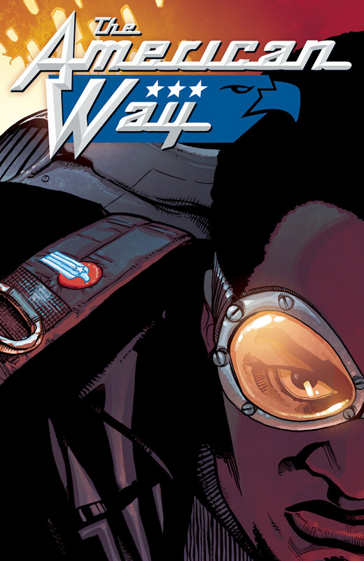
Vertigo Comics Writer John Ridley, Penciller Georges Jeanty, Inker Danny Miki, Colorist Nick Filardi, Letterer Travis Lanham
The original American Way from 2006 was a sort of “elseworld” story of The series represented a skewed parallel history of America, where the United States Government created its own super powered “heroes” and “villains”. In the early 1940s, the United States government hatched a plan to create the Civil Defense Corps: a group of supposed “super-heroes” who could fight alien invasions, evil super-powered beings, and communism, all in front of an adoring public, courtesy of television. Originally published at Wildstorm writer Ridley more known for his film and television writing went on to adapt 12 Years a Slave for which he won an Academy Award. Now he is back to revisit the world that he created and is even more relevant today as it was originally in 2006. While it would benefit you to read the original series, you can pick up this story and get the gist of what is going on. What Ridley does best in the book is he sets the stories in sort of the grey area where right or wrong and good or bad are not always clear. The play on the moral dilemma of being a superhero is quite fascinating here and plays into the scope of the story. It also plays on the what if superheroes existed in the real world but with a more social commentary angle. One thing that I loved about the original series and this new one is that Ridley gives the book a great diversity in the characters that is a great and needed in comics more than when the original series debuted. Jeanty delivers even better artwork than in the original series and that book looked great. He has really grown as an artist and this is his best work to date. He excels at both the action scenes and the subtle dramatic moments of the book with ease and delivers a great looking comic that complements the story perfectly. He along with inker Miki put great detail into each panel of the book that give the world a great gritty look. Along with Filardi’s moody color work this book has a great visual style that brings the story to life.
Is this book worth your time and money? This book blends social and political themes with superheroes quite well and makes for both an entertaining and thought-provoking read. Ridley and Jeanty are perfectly matched to bring this story to life. This first issue sets up things very nicely and it will be great to see where they take it. RECOMMENDED!
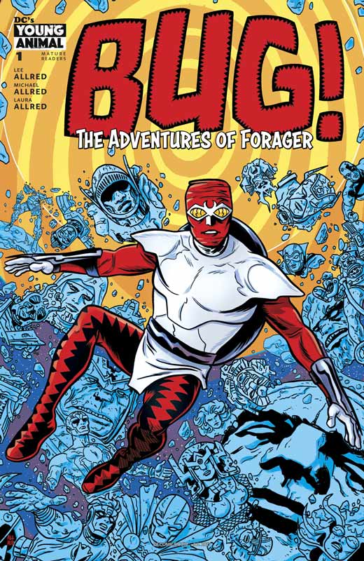
Bug!: The Adventures of Forager #3
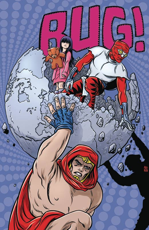
Writers Lee Allred & Michael Allred, Artist Michael Allred, Colorist Laura Allred, Letterer Nate Piekos
The Allred gang is back and keeping it weird and fun just as I like it. What is making this book so fun is not only the grand adventure that Bug is going on but the sly humor that they bring to the story. While there are a lot of obvious ones it the smaller subtle moments in the story that make this comic such a wild and satisfying ride. Both Lee and Michael are having fun playing in the Kirby sandbox and this issue bring the one issue wonder Atlas back and that was a great surprise. While the Atlas storyline is the main crux of the story it was the flashbacks to New Genesis that added great warmth to the story and as with the story so far where the heart of the book lies. It’s amazing that as wild and weird the book gets with jumping around the DC/Kirbyverse they alway make sure that the book is grounded with BUG and his charming and innocent qualities. This issue has a quite shocking ending that changes the game in the story and it will be very interesting to see how they write themselves out of the corner that they have painted themselves into. As always Michael delivers his A+ game in the art department and the over the top scenes with Atlas made me giggle. But as over the top he goes in those scenes he also delivers the perfect tone to the funeral scenes that pull on your heart-strings quite well. And last but certainly not least Laura pulls the visuals all together with her spot on color work that has really made this book pop! I have said it before there are colorist in comics and then there is artist who understand how color can make or break a comic and Laura truly understands color theory and she makes sure that the color pallets match the Kirby look that Michel is drawing.
Is this book worth your time and money? I like that each issue stands on its own but also is telling a grand overall arc. Lee and Michael continue to deliver fun stories that I believe Jack Kirby would have loved. They are pushing many boundaries with this book on every level and each issue just keeps getting better and better. There are a lot of twist and turns so far and it’s going to be quite the ride to the end. HIGHLY RECOMMENDED!
Centipede #1
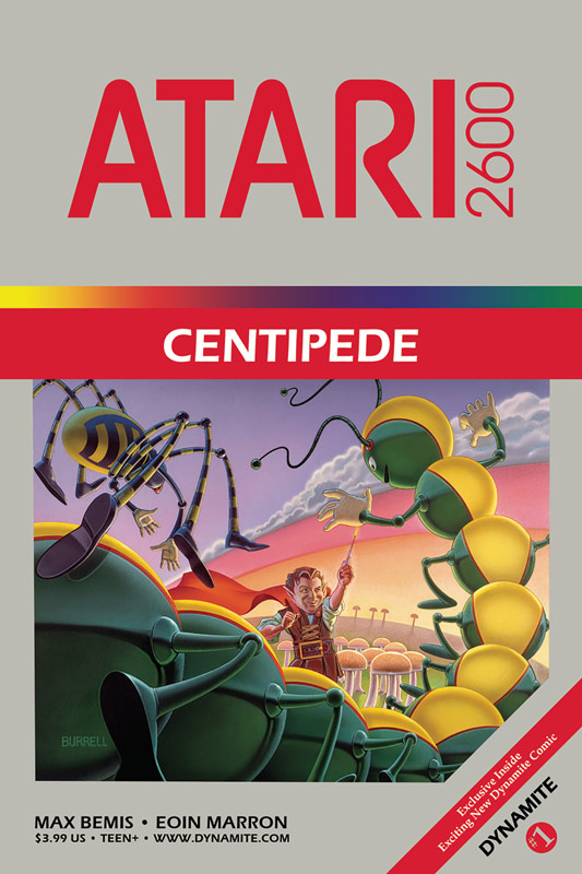
Dynamite Entertainment Writer Max Bemis, Artist Erin Marion, Colorist Chris O’Halloran, Letterer Taylor Esposito
OK I can see Swordquest as a comic but Centipede? When I heard that Dynamite was doing comics based on the old Atari games but I have to hand it to Bemis who has crafted a pretty ingenious story around a pretty basic arcade game. What made the story good was the way that he sets things up with using the limited elements from the game and peppers them into the story was quite a feat. Using the last man on earth angle to the story played quite well in this first issue. While the talking to an imaginary friend got a little weird at times, it was a story trope that was needed to sell it. While this first issue is pure exposition, Bemis keeps things interesting and gives it a nice pace that kept it from dragging and gave the next issue a great set up. I have to say that Marion’s artwork really help sell the story. This is way above average for Dynamite where the artwork bar is not that high but Marion really delivers the mood that the story needed and did a good job on the dialog scenes. He captured both the scope and the intimacy quite nicely here.
Is this book worth your time and money? This is not going to be the greatest comic you have ever read but in a weird way it really works quite well. With limited elements to work with, Bemis comes up with a really great story and nice artwork by Marion pulls it all together. If you’re a videogame fan or just curious then give the book a try, I liked it.
Last Song #1
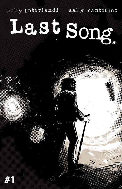
Black Mask Studios Writer Holly Interlandi, Artist Sally Cantirino
The thing that I really loved about this book was that it reminded me of the great independent comic boom of the 1980’s where small press books would tell a wide variety of stories and black and white comics were cheaper to do. The one thing about Interlandi’s script for the book is quite dense and there is a lot to digest on nearly every page of the book. The key ingredient that make the book work so well is the thought and heart that she infused the characters with. Drey and Nick are such well-rounded and well thought out in the story that you are sucked into their lives and from page one your hooked on their story. While I have never played and instrument or been in a band you can totally connect with their story and that is a testament to the careful layout of the script and one of it’s best assets. You really feel every emotion of their journey and hit both the highs and lows. One thing that really was relatable was the outsider element to the story because everyone feels like they don’t fit in and Interlandi really captured that in the story. On the surface some might say that Cantirino’s artwork is rough and simple but I found it to be very raw and personal. She really draws upon the underground feel of comics and really captures the subtle emotions that play so well in the book. You can feel every stroke of the art that takes you deeper and deeper into the story. I love that the artwork is so raw with emotions that gives the book a great visceral feel and look that you sadly don’t see in a mainstream comic today and maybe this book will change that.
Is this book worth your time and money? Last Song is one of those rare labor of love books that works on every level and capture life in a way that we all experience. Life is not a simple thing and trying to fulfill your dream is even harder and Last Song really captures that in a rare comic that is a pure emotional experience. Interlandi and Cantirino simply are delivering a book that is a great read and one that really sticks with you long after you are done and leaves you wanting more. HIGHLY RECOMMENDED!
Dread Gods/Giantkillers #1
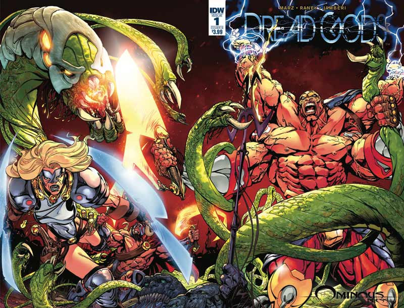
IDW Writer (Dread Gods) Ron Mark, Artist Tom Raney, Colorist Nanjan Jamberi, Letterer Dave Lanphear, (Giantkillers) Writer and Artist Bart Sears, Colorist Nedraj Menon. Letterer Dave Lanphear
If you miss comic books from the 1990’s then you’re in luck because IDW has taken the time machine back to that period and delivered a comic that should have probably stayed there. The first half of the book Dread Gods is simply not that good. Marz throws a lot of stuff into the script but unfortunately it’s an incoherent mess that just keeps throwing things into the story and hoping that it works and ends up just being loud and annoying. The dialog is like a bad low-budget action movie about greek gods and is pretty laughable at times. The only saving grace of the story is Raney’s artwork that looks nice but there is little he can do to save this sad story. The second story by Sears fairs a bit better but the script is filled with such standard story tropes that you have read a million times before that simply ends up being so-so. I will say that I enjoyed it much more than Dread Gods but that wouldn’t sadly take too much. But Sears as least tries to make the story interesting by rehashing the Lone Wolf and Cub idea. His artwork is the best thing it’s got going and it really props up the standard script to at least make it some what entertaining. But in the end it was just OK.
Is this book worth your time and money? Nope this is a book that would have been a huge hit in the 1990’s but we have come too far to be nostalgic for this mediocre of a comic. It’s simply marginal storytelling with flashy artwork that was completely forgettable. It appears that there are other book in the Ominous Press line that are coming but if they are like this one then I would steer clear of them. SKIP IT!
Dark Days: The Casting #1
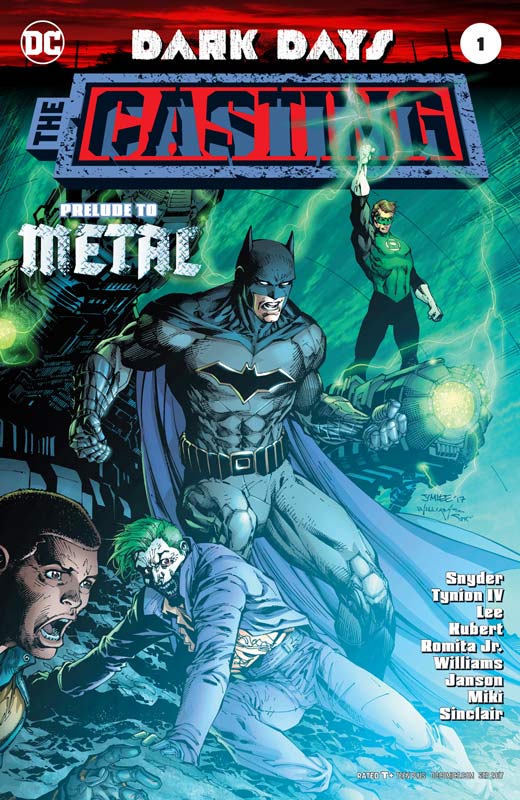
DC Comics Writers Scott Snyder & James Tynion IV, Pencillers Jim Lee, Andy Kubert, & John Romita Jr., Inkers Scott Williams, Klaus Janson, & Danny Miki, Colorist Alex Sinclair & Jeremiah Skipper, Letterer Steve Wands
The followup to the Dark Days book last month and they are still setting thing up with the story and after two 48 page books that have simply drug out the set up story there is not a huge compelling reason to read any more of this event. While the script by Snyder and Tynion is not bad the biggest problem is that the story simply drags along going from moment to moment with little to compel you to care. It didn’t help with the multiple stories jumping around that made reading the book disjointed and flat. There are some good scenes from time to time but overall the story doesn’t really take off. While the artist are good and they at least try to make the book exciting and they somewhat succeed but while the book looks nice as with most event books there is little story to back up the artwork no matter who is drawing the book.
Is this book worth your time and money? With two book with 60 pages of story we should be at least at a point where something has happened but they are both bogged down by scripts that are overstuffed with exposition and frankly pretty forgettable. Both Snyder and Tynion are good writers but they seemed to waste far too much time setting things up instead of giving you a reason to care. Having three good artist can only do so much here and in the end as with most event books there is not a real reason to go any farther than this. SKIP IT!
The Divided States of Hysteria #2

Image Comics Writer & Artist Howard Chaykin, Colorist Jesus Aburtov, Letterer Ken Bruzenak
Unlike most people who flipped out about this book recently who had obviously not read the bok but made a knee jerk reaction to an upcoming cover. Chaykin has been doing bold and controversial stories for a long time and this one while not necessarily my favorite so far is maybe something we need to read now. Doing a comic that shows the world as it is now is a very hard pill to swallow but while it’s shocking it’s also tough to look at it as fiction at this point. American Flagg did the same thing back in the 1980’s with social commentary on the Reagan era and it was controversial too. Chaykin pushes the boundaries and I find that a good thing. While I may not alway agree with his method or point of view, I am willing to at least see what he is trying to say. If you are willing to not be shocked and offended all of the time there is a lot of things to take away from the story so far. The most interesting thing about the story is how most people are on a pretty fine line in their lives and it simply takes a little push to go over the edge. Chaykin story deals with the huge grey area that most people will not acknowledge and that is where this story lies. This issue continues to lay groundwork for the story and gives the story a nice twist at the end that changes the direction of it again. Chaykin always keeps the reader off guard and sometimes it’s a little hard to follow because he zig and zag so much but if you take the time to let the story flow over you then you will be fine. As always Chaykin’s art is always a great draw to his books and this one is packed to the seems with so much detail that is a marvel to look at. The lettering by Bruzenak complements the art and they are a perfect art team because the lettering on the book is artwork.
Is this book worth your time and money? I liked the direction that the book is taking in this issue and there is a lot to digest in this one. Chaykin’s story here is very dense and while I’m still wondering where he is going to go with it, I like that he is willing to tell a story that is very uncomfortable to read. You can’t just read superhero books all of the time. Sometimes you need to be shocked and in this case I’m intrigued and shocked at the same time.
Wonder Woman #26
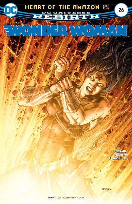
DC Comics Writer Shea Fontana, Artist Mira Andolfo, Colorist Romulo Fajardo Jr., Letterer Saida Temfonte
We knew that whomever followed up the Rucka run of Wonder Woman was going to be a tough act to follow. Fontana script is good but not hugely compelling. The biggest problem with the story is that it’s simply average and doesn’t bring much new to the table. The big problem is while it was nice to read at the end of the issue it was pretty forgettable and that is where the story suffers. There has been great debate about having a Female write Wonder Woman but my concern is that the best writer should write a book not based on gender or skin color. On paper having Fontana write this story arc was a good idea but by going by this first issue I’m not really feeling it. Andolfo’s artwork is good but there are some consistency issue that are noticeable in the book. It gets the job done and is nice but in her defence it’s was going to be difficult to follow Sharpe, Scott and Evely that set a very high bar. Overall the book looks nice but nothing amazing.
Is this book worth your time and money. I’ll probably hang in there on this story till Robinson takes over the book but at this point this story is really just passing the time until then. It’s wasn’t a terrible read but simply just an average one.



0 Comments