Things are back on track this week and there are a lot of comics to get to. I am also going to have a special comic book of the week that will highlight a title that gets my highest recommendation. There may not be one every week but when you do see it, it’s a must buy title.
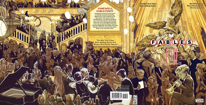
Fables #150
Vertigo Comic Writer Bill Willingham, Penciller Mark Buckingham, Inkers Steve Leialoha, Andrew Pepoy, Dan Green, and Jose Marzan Jr. Colorist Lee Loughridge, Letterer Todd Klein
Sadly all good things must come to an end and we have sadly reached the final Fables story for now. For thirteen years Willingham and a host of artist but mainly Buckingham has been the regular artist on the book along with Leialoha that has worked on every issue of the book. This final issue is so big Vertigo actually turned it into the final trade paperback (volume 22 for those keeping score) to fit all of the final main story and the final installments of the individual characters last stories. The book is a massive 150 pages with the final main story taking up 80 pages. I won’t spoil any of the story here but it’s safe to say that Willingham and company have weaved a very satisfying final story that end in a way that a lot of readers will be surprised at, but is a very natural conclusion to the series. After reading it I was left with a sense of closure and while it’s sad to see such a great comic come to an end, it felt like all of the Fables stories had played to their natural conclusion. I loved that it’s an epic conclusion but not in the way that most stories like this end. Willingham has never missed a beat with the book in terms of quality and this final story is no different.
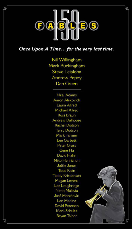
There are so many artists that worked on the final individual stories that below is the credits page.
Most of these stories could not be told in the final story arc because of the final story that takes place first. It’s a who’s who of outstanding artists that Willingham has gathered for these short stories and it says a lot about the impact and the special place that this series holds for fans of the book. You have Neal Adams, Mike Allred, Gene Ha, and Mark Schultz to name a few and they all illustrate the stories beautifully and the book closes with the very appropriately The Snow and Bigby Story by Buckingham doing the full artwork with a stunning 4 page foldout at the end that is the most beautiful way to end this book. There are 14 pages of bonus material with a afterwards by Willingham, a guide to all of the characters on the stunning Nimit Malavia’s stunning cover and miscellaneous artwork and all of the creators bio’s.
Comics today come and go but rarely does a comic done by the same creator last 13 years on a single title that has had the impact that Fables has had. It’s unlikely that we may see another comic of an epic tale like this. And that make the farewell to Fables all that much sadder. Bravo to Willingham and company for giving us a truly satisfying 13 years of stories that I for one can’t wait to go back and read from the beginning again. HIGEST RECOMMENDATION!
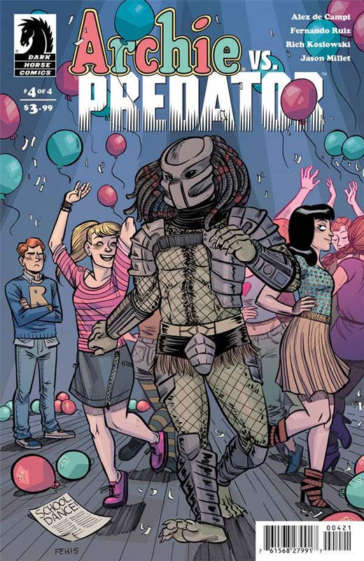
Archie Vs. Predator #4
Dark Horse Comics Writer Alex de Campi, Penciller Fernando Ruiz, Inker Rich Koslowski, Colorist Jason Millet, Letterer John Workman
While one could say that the series was a bit drawn out, in the end it was one of the wildest team-ups that has ever been in comics. I have to give de Campi that I never saw THAT ending coming. This last issue has to be one of the most strangest endings that I have experienced in a long time but in the weirdest way it was satisfying. All’s I have to say it that who knew the Predator could love anybody? I think the reason that the book worked so well is that de Campi did two things perfectly. First he kept the thing that make Archie, well Archie. All of the characters were perfectly to the Archie universe and he just inserted the Predator into that world. Second he didn’t shy away from the blood bath that the Predator brought to Riverdale. The other thing that worked so well was Ruiz and Koslowski keeping the Archie style for the series. This really made the books script work out so well. Had the Archie universe been done in realistic style the book would have never had been so much fun.
Is this book worth your time and money? While the book was not perfect it certainly was a blast to read and in the end was satisfying. If you missed the individual issues there is a hardcover coming in a few months that collects the whole series. I had a blast with the book and it was money well spent.
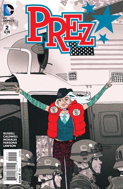
Prez #2
DC Comics Writer Mark Russell, Penciller Ben Caldwell, Inker Mark Morales with Sean Parsons, Colorist Jeremy Lawson, Letterer Travis Lanham
I really have to give DC props for taking a chance on this book because it simply is one of the best book being published by them now. This is a bold and exciting comic that has been sorely missing from the big two recently. This is a bold, entertaining and thought-provoking comic that gives me hope that DC can put out more than superhero books for a change. Russell has crafted not only a great story it’s incredibly timely at the same time. What is even more impressive is that there is a lot of social commentary in the book but takes a tongue in cheek approach to it that gives the book a fresh feel and bitterly dark sense of humor that makes the book such a fun read. The layers that Russell puts into the story is simply amazing. Caldwell, Morales and Parsons artwork gives the book a bold and fresh style that really brings the script perfectly to life. They beautifully capture the insanity of the story and the layouts on the book are fantastic. I also love how there are many times where there are not backgrounds to emphasize the character or the scene.
Is this book worth your time and money. Prez is a book that not only entertains but makes you think at the same time. In todays comics your just don’t see this type of book being publish by DC or even Marvel for that matter. This is one of the best books that DC is publishing now and if you are not reading this great book that is a real shame. HIGHLY RECOMMENDED!
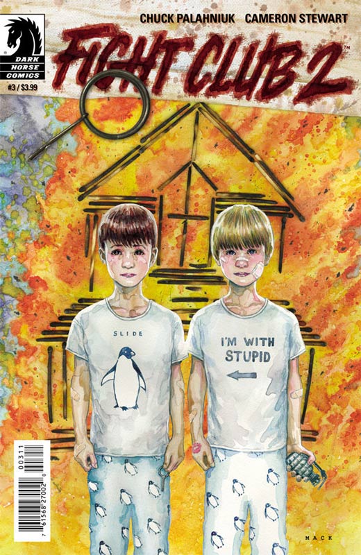
Fight Club 2 #3
Dark Horse Comics Writer Chuck Palahniuk, Artist Cameron Stewart, Colorist Dave Stewart, Letterer Nate Piekos
Fight Club 2 is becoming a book that I look forward to but maybe not as a monthly comic. Don’t get me wrong this a very good comic but it’s becoming more evident with this third issue that it’s meant to be read as a whole story instead of each monthly chunk. Palahniuk is waving a story that is very dense and detailed that there are times where it seems that not much is going on but you can see the structure of a larger story. The mental game that the story plays on both the characters and the readers is very intriguing but at the same time when you are not reading the story as a whole it can get frustrating. Stewart continues to give the book a great visual style that helps keep the story on visual track that can give the reader more visual clues to the mystery that you might have missed in the story.
Is this book worth your time and money? I am enjoying the book but might wait until the story is collected in full form at this point. This is not saying that the book is not worth buying but I think that for a lot of readers might want to consider this with the scope of the story that Palahniuk is telling.
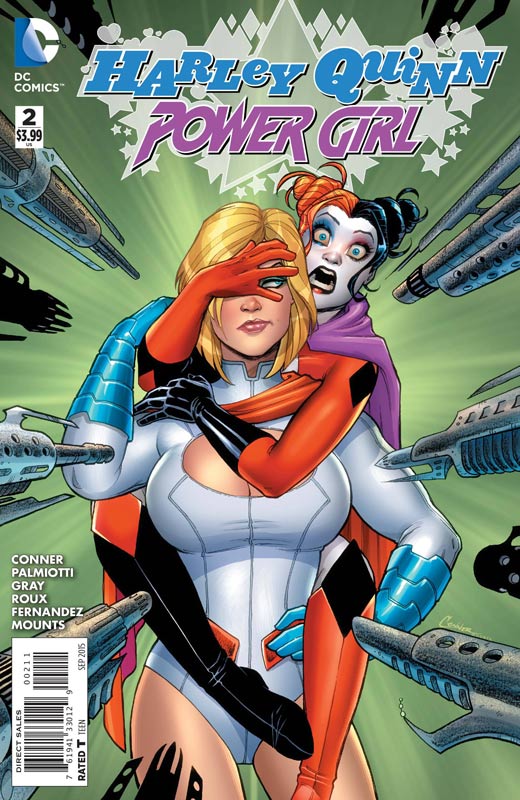
Harley Quinn and Power Girl #2
DC Comics Writers Amanda Conner, Jimmy Palmiotti & Justin Grey, Artist Stephanie Roux with Elliot Fernandez (pgs 19-22), Colorist Paul Mounts and Alex Sinclair (pgs 19-22), Letterer John J. Hill
Being a fan of the regular Harley Quinn book I was a bit disappointed in the first issue of this book. Thankfully after this second issue I am more cautiously optimistic about the book now. It seemed as if the first issue was missing a crucial ingredient, oh yea the fun part. The second issue really puts the book back in the fun zone that one would expect for this book. Conner, Palmiotti and Grey give the script it’s Harley signature humor that missed the mark on the first outing. They have better captured the differences between Harley and Kara and play on that in this story. Roux’s artwork is again very nice and give the book a nice visual flavor but the artwork of Fernandez while not bad was a bit jarring when your reading the story.
Is this book worth your time and money? I’m still a bit on the fence with this book but I will say that this second issue does get the book back on track. I still question the long-term of the story but I will give it a few more issues to see where it’s going to land.
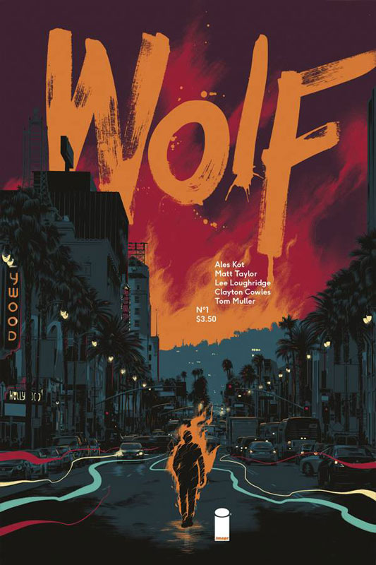
Wolf #1
Image Comics Writer Ales Kot, Artist Matt Taylor, Colorist Lee Loughridge, Letterer Clayton Cowles
In this oversized first issue the book gets off to an interesting start. I like how Kot really under plays the mythical creature aspect of the story and gives it a noir feel that one wouldn’t expect from the horror/monster genre. The first issue has a nice pace to the story and while there is a lot of exposition I never felt board with the story. He rolls out the story in a very methodical way that you get to know the character of Wolfe and the whole mythology play much more subtle in the background that I think makes the story work a lot better. Taylor artwork has a less is more approach that I really enjoyed with the story and it really lets the script breath and really complements it quite well. This is a very good-looking book.
Is this book worth your time and money? I like the first issue of this book and am looking forward to see where Kot is going to take the story. So far I’m very impressed with the take on the genre and the adding of elements that are not the norm for a story like this. It’s worth checking out.
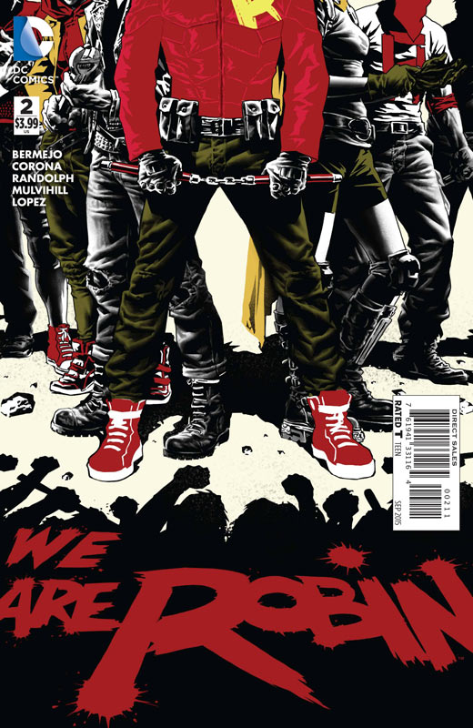
We Are Robin #2
DC Comics Writer Lee Bermejo, Artist Jorge Corona, Breakdowns Rob Haynes, Colorist Trish Mulvihill, Letterer Jared K. Fletcher, Epilogue Artist Khary Randolph, Epilogue Colorist Emilio Lopez
The first issue got off to a good start and I like the concept of the book. The second issue sadly stumbles a bit and could be treading on thin ice. The first issue did a nice job of setting the series up but this second issue seemed to tread too much water and seemed a bit too unfocused. Bermejo script didn’t bring enough character developments to most of the cast and there are a lot of new faces in this issue. I think the problem was that he focused too much on the fight at the beginning and the rest of the story kind of felt like an after thought. It really just kind of sat there for me. Corona stumbles a bit on the artwork compared to the first issue and seemed a bit too rushed and sparse a number of times. I do think that he does some really good layouts for the artwork.
Is this book worth your time and money? After a good first issue I question the long-term for me reading this book. They only have one more issue to get the book back on track or it’s off the pull list.
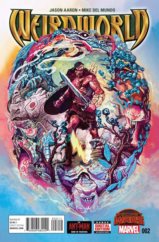
Weirdworld #2
Marvel Writer Jason Aaron, Artist Mike Del Mundo, Colorist Mike Del Mundo & Marco D’Alfonso, Letterer Cory Petit
While the whole Secret Wars thing for me is a big old train wreck I am really digging these oddball spinoff book that have absolutely nothing to do with it. Aaron is having fun spinning a classic sword and sorcerer genre and he keeps it really simple here. The story is simple and to the point and that is why it’s working so well. He wisely lets Del Mundo do most of the heavy lifting on the book. He obviously knows how visually great Del Mundo is so he writes the story to his visual strengths and there are a lot of the time that the story is told from the artwork instead of bogging the story down with unnecessary dialog. Del Mundo is able to capture the scope and depth of Weirdworld and makes this book a great visual treat.
Is this book worth your time and money? This is a very enjoyable book that keeps things simple and fun. This is a great looking book and keeps it fun and enjoyable.
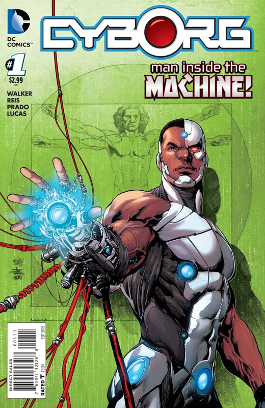
Cyborg #1
DC Comics Writer David Walker, Penciller Ivan Reis, Inker Joe Prado, Colorist Adriano Lucas, Letterer Rob Leigh
Another New Teen Titans spinoff book (the other being Starfire) and this one gets off to a real sluggish start. Walker spend too much time with exposition in this first issue that causes a real lack of focus on the overall story. The story just crawls along and just doesn’t really go anywhere. I understand that Vic’s new armor needs to be explained to new readers but once that is done the story just sits there. The whole alien battle sub plot is more confusing than adding much to the overall story. The only saving grace that thee book has is Reis’s great looking artwork that is sadly wasted on a mediocre script. The book looks great but even his wonderful artwork made reading this first issue that much more disappointing.
Is this book worth your time and money? It’s not the worst book that I have read but it really goes nowhere fast and certainly doesn’t make me want to read the second issue. It’s a real shame because Cyborg is a good character but you wouldn’t know that from reading this book. SKIP IT!
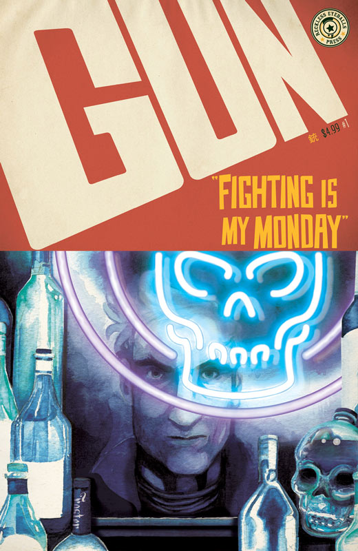
Gun #1
Reckless Eyeball Press Writer and Artist Jack Foster, Letterer Greg Sorkin
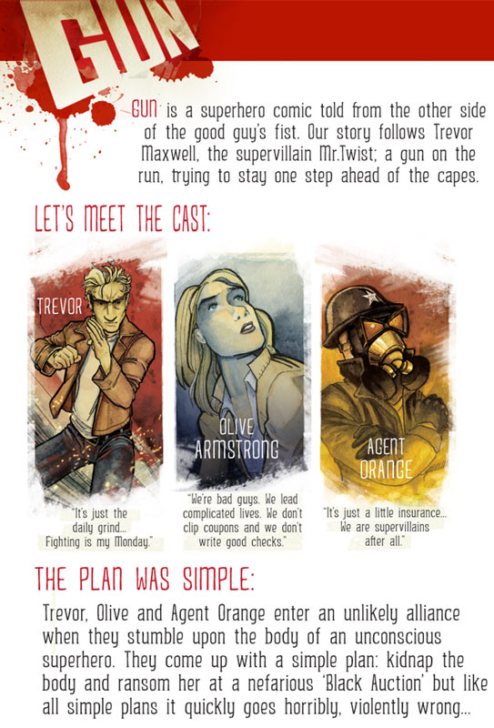
My local comic shop is good about getting new comics from local creators and this week they had this book and it was on sale so I flipped through it and it looked decent so I thought I would give it a try because you never know where the next surprise comic might come from. So here is the basic plot from the original Kickstarter page.
So the concept of the book has promise and the overall story was surprisingly good. The one thing that Foster did drop the ball with is the book really suffers from having too much dialog. He really tends to over explain a lot of the story and there are times where the dialog and narrative really drags down the reading experience. I think that some of these issues could have been tweaked with some better editing of the book. Overall I did enjoy the story and think that there is enough here to check out the second issue. On the artwork side Foster does a decent job on the book. Some of the character work is a little stiff but considering it’s his first published effort the book looks pretty good. There were a few times where his coloring choices were a bit on the dark side and it was a little hard to make things out this could have been a printer issue on the final book.
Is this book worth your time and money? Overall I did enjoy the book. There are a few bumps in the road but considering that this is Foster’s first comic he got more right then wrong. He has a good concept and while I has a few issues with the book I found it to be a good read and would come back to read the next issue to see where his is going to take the story.
Here is the link to the website that has a preview of the book and you can purchase it from him:


0 Comments