Another huge DC Rebirth week with new titles and more.
Harley Quinn #2
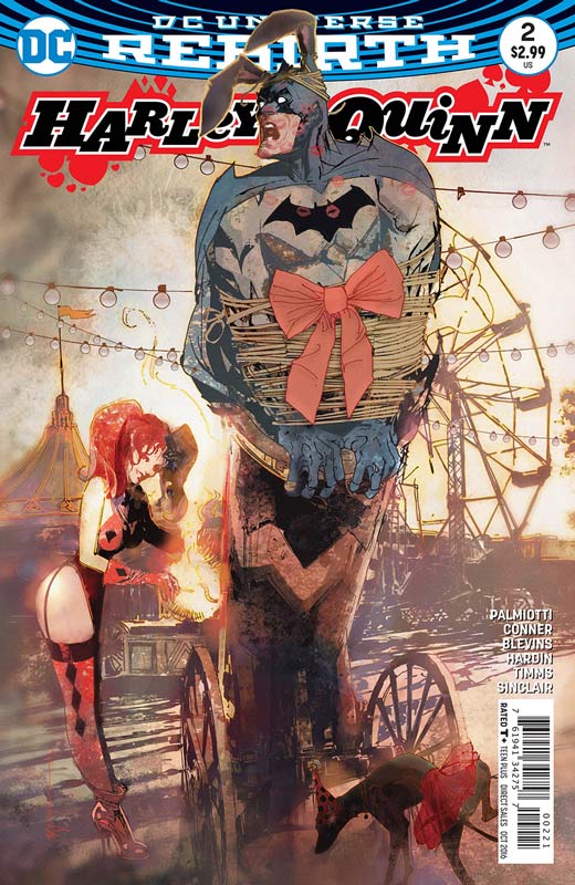
DC Comics Writers Jimmy Palmiotti & Amanda Conner, Layouts Bret Blevins, Finishes Chad Hardin & John Timms, Colorist Alex Sinclair, Letterer Dave Sharpe
While the first issue of Harley Quinn got off to a decent start the second issue doesn’t fair as well. This issues story is really bogged down with the script that tends to just plod along and not really propel the story forward that much. Palmiotti and Conner’s script never really hits that fun zone that Harley is so good at most of the time. It’s played as more of a zombie horror film that ends up not being very surprising or original. On the plus side the artwork is quite nice. You can see the three artist style as the book goes along and while their styles are different, I never found it to be too distracting while reading it. I’m a fan of Blevins artwork and would love to see him do a full issue. They all do their best to try to make the story a bit more exciting but they can only do so much with the weak script.
Is this book worth your time and money? The thing about Harley Quinn books is that there are always up and down issues and sadly this is one of the down ones. While it wasn’t the worst comic that I have read but it’s not that good either. Palmiotti and Conner are good writers and not everything is going to work script wise every time. The art was very nice but that only can go so far on a comic.
Batgirl and the Birds of Prey #1
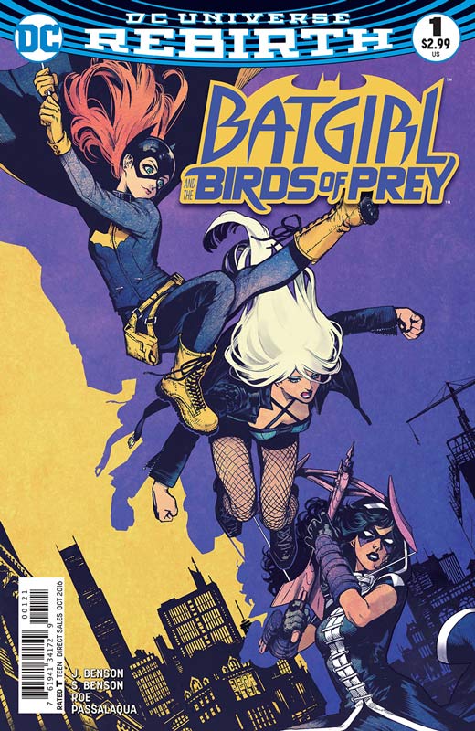
DC Comics Writers Julie Benson & Shawna Benson, Artist Claire Roe, Colorist Allen Passalaqua, Letterer Steve Wands
The #0 issue had some good ideas and was an OK read but the series really fell flat with this issue. Julie and Shawna Benson’s script seems to mostly go through the motions of a story but nothing quite sticks. The story is very disjointed and seems to be all over the place with not only the story but the tone of the book. The story lacked real focus and became a real chore to read as it went along. Things seemed to happen for no reason at times and you also felt as if you were a bit lost in the overall story. The other thing that bothered me was that the characters just seemed off from what we are used to. Huntress just comes off as a bit of an ass, Batgirl seems to juvenile, and Black Canary is the only one that comes off well in the story. As far as Roe’s artwork I liked it but there were times where the perspectives on the characters and the backgrounds seemed just weird. I did like her art and there were a few times where she was a bit inconsistent but overall she has a nice and fresh style that is really refreshing.
Is this book worth your time and money? I really wanted to like this book because I love the three heroines and that it’s a book by female creators but quite honestly it was a real mess with the script and just not very good. The artwork tried to save it but with some minor missteps there is just not enough here to keep going on this book. SKIP IT!
Supergirl #1
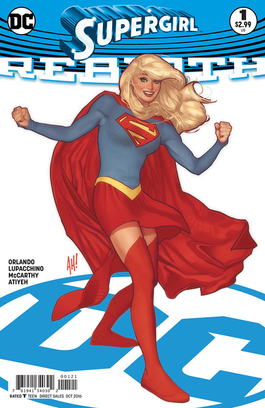
DC Comics Writer Steve Orlando, Penciller Emanuela Lupacchino, Inker Ray McCarthy, Colorist Michael Atiyeh, Letterer Steve Wands
With a hit television show under her belt, Supergirl finally gets her own book again and it’s off to a decent but lacks a bit of a bite for this first issue. Orlando who did a great job on Midnighter book put the book more in line with the current television series and that is fine because the book might attract new readers that are more familiar with that version. Orlando script is good but this first issue is bogged down a little because of the exposition in setting things up. He does plant some good seed that will be developed along the way that has some promise to it. He does keep it light and fun that is a big plus for the book. Lupacchino and McCarthy artwork is a real winner here. This is a really good-looking book and they are able to balance both the action and the dramatic scenes with ease. They also have fun with the layouts and give the script a nice visual flow.
Is this book worth your time and money. While this first issue is a set up story Orlando does his best to keep things moving along with the constraints of that. The key is going to be the next issue to see where they take the story. With very nice artwork on the book this is a promising start.
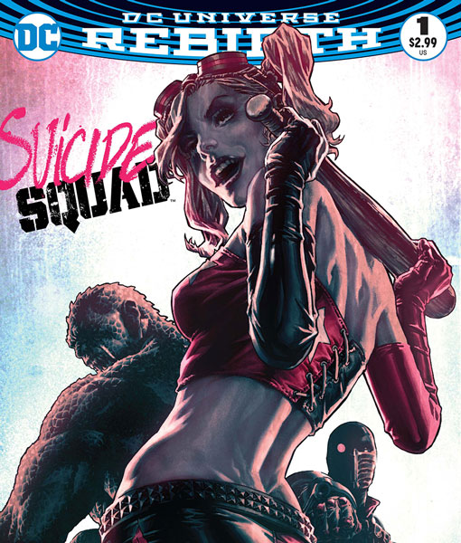
Suicide Squad #1
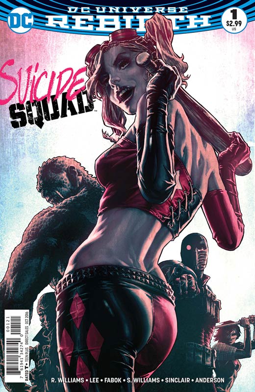
DC Comics Writer Rob Williams, Penciller Jim Lee, Inker Scott Williams, Colorist Alex Sinclair, Letterer Nate Piekos, Back-Up Story Artist Jason Fabok, Colorist Brad Anderson
While the debate about the Suicide Squad movie rages on there is no doubt that there was a lot riding on this new series because of Jim Lee’s artwork on the book. While I have my doubts about how long he will actually stay on the book for considering his track record the bigger question was how was he going to draw a book that was being published twice a month? Well we now have our answer and basically this book is not really a twice a month book but only half of the size of a regular book with only 13 pages on the main story and a 7 page backup story. So your paying $6.00 for the main story that should be all in one issue. Now with that out-of-the-way the book ends up being a real disappointment. Williams is a good writer but the main story is so by the numbers and honestly quite boring. The story not only just sits there it really pales compared to the backup story that is more enjoyable than the main one that is simply half of the story we should have gotten. The back up story is far more enjoyable than the main one. Lee and Williams turn in solid artwork and while the book is pretty it just makes the main story all that more hallow. Fabok does a very nice job on the Deadshot backup story and overall that was more enjoyable than the main story.
Is this book worth your time and money? While never a huge fan of the current Suicide Squad being more of an old school original one, this new book while not terrible is a pretty big miss. It’s obvious that this should have never been a twice a month book due to Lee only being able to draw 26 pages a month and it really ends up hurting the book because the story in 13 pages just doesn’t work when you should be reading 26. The backup story nearly saves the day but can only do so much at a point. The two books a month is a mistake on a lot of the Rebirth books and this one is the proof. Overall I just can’t recommend this one because it really doesn’t deliver anything new or exciting. SKIP IT!
Briggs Land #1
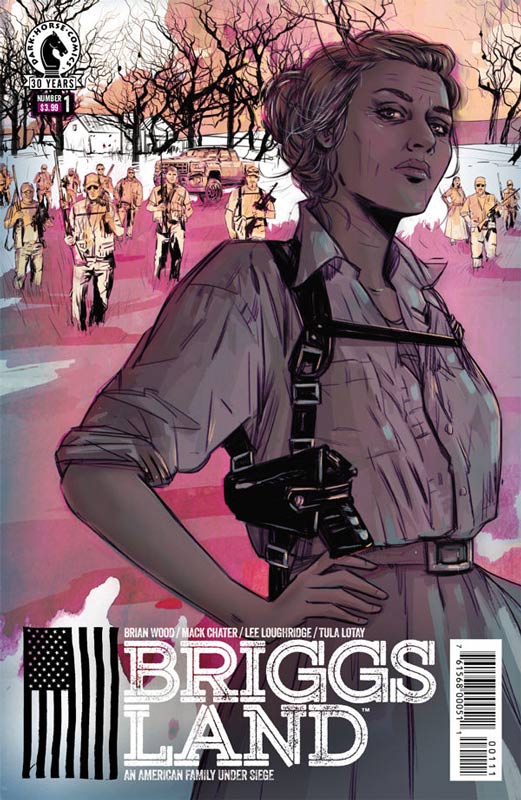
Dark Horse Comics Writer Brian Wood, Artist Mack Chater, Colorist Lee Loughridge, Letter Nate Piekos
Wood continues to bring new and exciting stories to the comics medium and Briggs Land is quite a nice surprise. Wood has a great knack for really setting up a story in the first issue and he does it again here. What I love about this book is that he takes a number of basic story concepts and mixes them together and makes for a very intriguing set up to the series. The key to the book working is that he makes sure that the characters are interesting and that the reader cares about them while your reading it. I also liked the slow burn to the story that had such great pacing and flow by the time you get to he end of the first issue you’re wanting more. While the concept could be call a ripped from the headlines type story, Wood never treats it as such. He is building a world to the story and not for shock value. Chater’s artwork has a nice gritty down to earth look that suits the book very well. This is a tough book for an artist because there are a lot of dramatic dialog scenes that you have to convey the emotions of the characters and Chater does it with ease.
Is this book worth your time and money? I really enjoyed this book and it was a solid read. There is a lot going on and Wood gives you just a taste in this first issue and leaves you wanting more. Along with strong artwork makes this a really good start to the book. RECOMMENDED!
The Backstagers #1
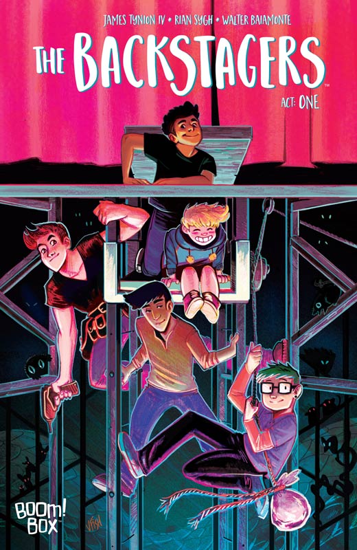
Boom! Box Writer James Tynion IV, Artist Rian Sygh, Colorist Walter Baiamonte, Letterer Jim Campbell
Tynion has been quite the writer lately but his new book is a bit of a departure while there are some good ideas here it was a bit pedestrian for a first issue. There is some promise to the book and a lot of good ideas here. I think the problem with this first issue is that it never quite takes off like it should. I kept waiting for something compelling to happen in the story and it never quite does. It’s one of those books that falls into the average category. I never quite connected with the main character and never seemed to gel together. Sygh’s artwork is a bit too Anime for my taste and a bit stiff at times but does have a pleasant overall look to the book. There are some rough spots in the art but it gets the job done.
Is this book worth your time and money? I think that they idea of the story is good but it never really jumps out and grabs you. The book ends up boing nice but the bigger issue is that there other similar books that are simply better. I will give the second issue a chance because there is a small spark here.
Black Hammer #2
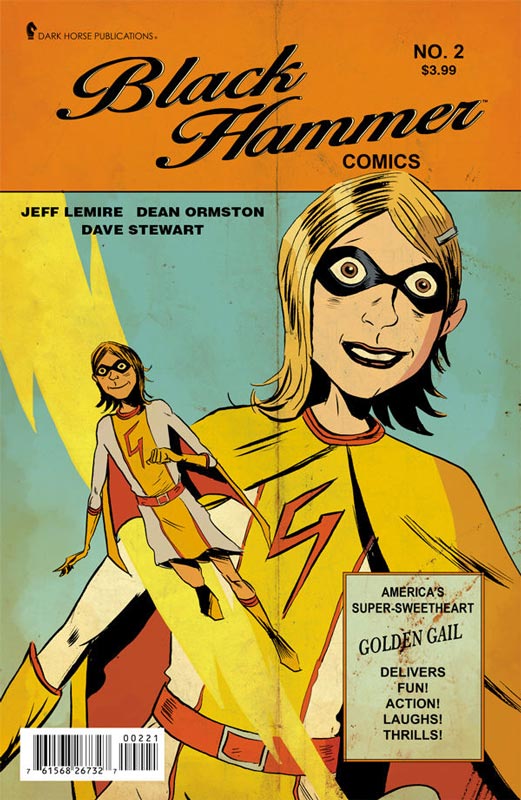
Dark Horse Comics Writer Jeff Lemire, Artist Dean Ormston, Colorist Dave Stewart, Letter Todd Klein
I really loved the first issue of this book and this second issue has me hooked. Lemire has created a world that is familiar but different at the same time. He does a great job of balancing all of the different story elements that one would think that they would not go together but Lemire really nails the story that has a lot of great twist and turns that has me very intrigued. What is making it work so well is the wonderful characters that he has created here and then taking story tropes and molded a great emotional character study and a solid mystery that will keep me coming back to this book. Ormston brings this wonderful script to life with his artwork that captures the period and the tone of Lemire’s world and makes it such an immersive read. Stewart’s colors and Klein’s lettering on the book make this all come together so well.
Is this book worth your time and money? This book is quickly becoming a top of the comic pile must read status. As the mystery unfolds in the story so does the excitement of reading it. This is one of those rare books that all of the elements fit perfectly into place. Every member of the creative team are perfectly in sync and is making this a must read book. HIGHLY RECOMMENDED!


0 Comments