Well the old 9 to 5 paying gig is taking a toll on the reviews but still going to try to bang as many as I can get to. The new website has run into some snags getting everything transferred over from this website so hopefully we can get the new up very soon. So on with the comic book reviews.
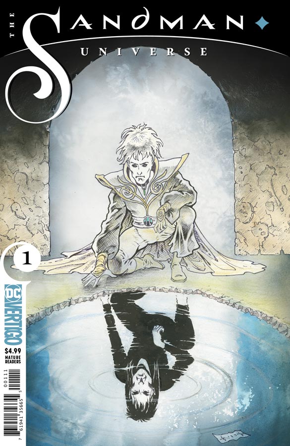
Sandman Universe #1
Vertigo Comics Story Neil Gaiman, Writers Simon Spurrier, Kat Howard, Nalo Hopkinson and Dan Watters, Artist Bilquis Evely, Tom Fowler, Dominike “Domo” Stanton, Max Fiumara and Sebastian Fiumara, Colorist Mat Lopes, Letterer Simon Bowland
In a move to revitalize the Vertigo imprint that has really struggled recently (and not for the lack of some really good titles that nobody read) DC enlist Gaiman to revisit his masterpiece and he wanted a new generation of writers and artist to explore the corners of the Sandman world that had many more story to tell. There have been many other books over the years that have explored these other characters and worlds but none have been over seen by Gaiman until now. The best thing about this set up book is that he lets the new teams tell their own tales but give them a springboard story to help set the tone for them. Whenever you have a book with multiple creative teams they can either flow perfectly well together or be a disjointed mess and thankfully in this case it the first one. While you can see each teams look and feel for their upcoming books the linking of them is the key to it flowing together and making sense. This is where it feel the most influence from Gaiman with the flow of the overall story in this setup. As with any set up story there is only a glimpse of what is to come from the titles over the next few months but what it does well is wet your appetite for the new series. The good news is that none of them stood out from each other and while on the surface it may seem a knock to the creative teams but that is far from it. That is where the book really shines is that they all have a great sense of being in the same universe but each having a distinct voice all their own. Each team got seven pages to introduce their characters or worlds and they all do a good job of it. The writers did a good job of capturing their respective books as much as they are able to do here but each seems to have found the voices of their characters well. On the artwork side all of teams are top-notch but I have to admit that I’m super excited for Bilquis Every on The Dreaming after her wonderful work on the Rucka run of Wonder Woman. Overall they all do a fine job and it will be exciting to see when they are let loose on their own books.
Is this book worth your time and money? There is a lot here for the five bucks cover price considering that you’re getting 40 pages of ad free story and art here is a real bargain in todays comic market. The bigger question is if Vertigo is able to capture a new generation of readers like it did with Sandman over the years. I certainly hope so and with the small sample of the creative teams I think that Gaiman and Executive Editor Mark Doyle have set a great tone for the new Vertigo. For new readers this is a good jumping on point and while you may not know the characters or continuity from the past series, I do believe there is enough intrigue here to entice new readers. I certainly hope that it works to bring not only lapse comic book readers but a whole new generation and hopefully a new beginning for the Vertigo line of books. The best thing about the creative teams is that they are different voices than I would have expected and that is what excites me the most. HIGHLY RECOMMENDED!
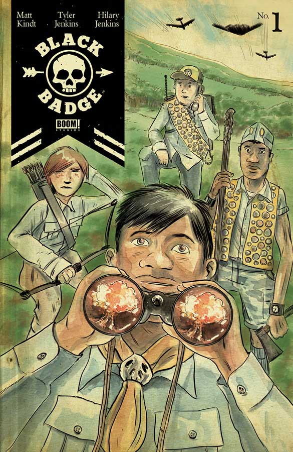
Black Badge #1
Boom! Studios Writer Matt Kindt, Artist Tyler Jenkins with Colors by Hilary Jenkins, Letterer Jim Campbell
From the creative team who brought us the wonderful Grass Kings delivers a unique story here with their new series Black Badge. What makes this book so interesting is that the way that Kindt unfolds the story is it’s best asset. You think that its one thing and then there is a great twist to the story (that I will not spoil here) that not only intrigues but impresses and that is not an easy feat in comics today. Kinda doesn’t overplay the story here and keeps it simple and to the point but gives you a good reason to come back to see where he takes it. In some ways the story has been told many times before but this has a nice spin and twist to it. I really loved Jenkins artwork on Grass Kings and he turns in another fine job here. The one thing that it does really well is the tone and the drama of the script. His line work may look simple on ht surface but there is a lot of detail but he doesn’t over do it and that makes it much more powerful. The only complaint that I had with the book is the coloring. There are times where it works but there are quite a few times where it seem overdone and harsh. I’m not sure if it the coloring or the printing or somewhere in-between. Grass Kings had really wonderful color work so I’m not quite sure what happened here.
Is this book worth your time and money? This is a book that wont necessarily blow you away with this first issue but, what it does do is set up a really great concept that has a lot of ways to go. Kindt has another win here and I love Jenkins line work. Even with the disappointing color work it’s still worth checking out.
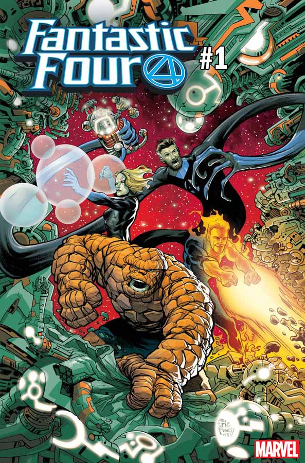
The Fantastic Four #1
Marvel Comics Writer Dan Slott, Artists Penciller Sara Pichelli Inker Pichelli with Elisabetta D’Amico, Simone Bianchi, and Skottie Young, Colorists Marte Gracia, Simone Bianchi & Marco Russo, Jeremy Treece, Letterer Joe Caramagna
The long over due return of the Fantastic Four gets off to a decent start but is a little slow out of the gate. While I understand what Slott is doing in this first issue the thing that is not going to impress some readers is that you don’t actually get to see the Fantastic Four in this first outing. He however does set things up here and in that respect it gets off to a good start. The only issue that I had with the story was that he doesn’t really explain how and why Reed and Sue are missing. He just assumes I guess that everyone read the train wreck Secret Wars mini series and that is not the best way to entice new readers. While I’m glad that the team is coming back and the book is revived you have to assume that there are going to be a lot of new readers who will be lost and a few lines of dialog would have fixed this issue. The overall pacing of this first issue is a bit on the slow side and while it’s not that there is nothing going on it just that a lot of the story seems to be dragged out here just to get you to buy the second issue so you can really find out what happened to Reed and Sue. The artwork on the main story by Pichelli is good but there are too many times where there was a real lack of backgrounds that gave the artwork a bit of a flat look. On the plus side she does a very nice job on the facial expressions. Overall its nice but a little uninspired artwork here but she does show promise and hopefully will grow as the series goes along. The real disappointment of this book is the second story featuring Doctor Doom that is another story that drags and considering that it’s only nine pages makes it even more of a miss. I normally like Bianchi’s artwork but this is not some of his best work and has a stiffness to it that doesn’t help the simple story out at all. The irony is that the one page cartoon by Scott and Young even make fun of the fact that they conned people into buying this first issue and it doesn’t even have the Fantastic Four in it. I wasn’t sure whether to laugh or be insulted that we had been hoodwinked.
Is this book worth your time and money? I do get what Slott was doing here with setting up the story but when you make such a big deal of the return of the Fantastic Four it seems like a bit of bait and switch for six bucks. I think that the thing that Slott missed here was that the thing that made the Fantastic Four was that it was a fun book that was about family and he really missed the mark here. Not actually having the whole team in the book and then joking about it on the last page didn’t help at all. Honestly if you haven’t bought this first issue skip it and just buy the second issue that seems where the story is really going to start and you’ll save the six bucks in the process. Not a total train wreck but certainly disappointing.
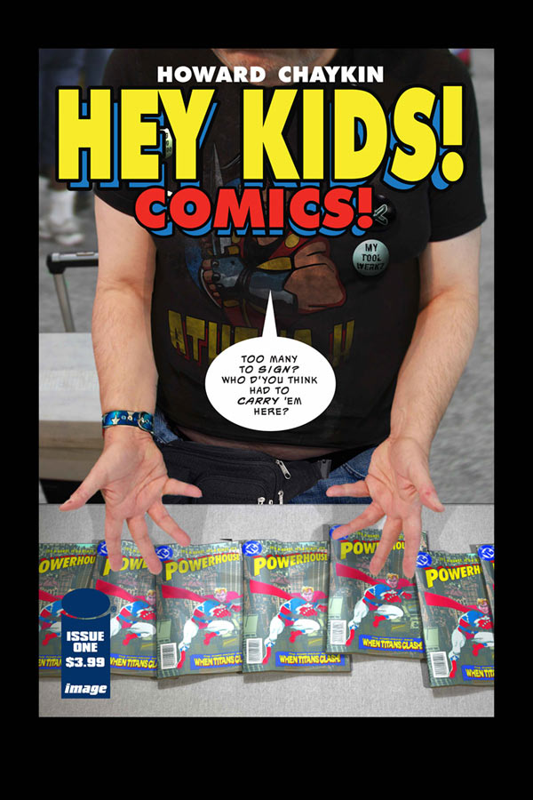
Hey Kids! Comics! #1
Image Comics Writer and Artist Howard Chaykin, Colorist Will Quintana, Letterer Ken Bruzenak
With any new Chaykin comic there is always some fireworks that will go off and love it or hate it there is certainly no other creator in comics that goes after the jugular like he does. What is intriguing about this book is that he is telling the history of the big two publishers but with his spin and flair that makes for a hell of a ride. Lets just say that this book is certainly not for everyone but for those looking for more of an edge with their comics it’s worth a look. What you get here is a fictional take on the beginning of the comic book market but from a more of a behind the scenes kind of like the old VH1 Behind the Music but a lot more seedy and raunchy. If you have never experience Chaykin’s work I can’t say that this would be the best place to start because there is a lot going on between the lines and it has a non linear storytelling aspect that more mainstream readers will simply not understand. This is not to say that if you don’t get it your stupid because it’s a book that you have to take in and honestly I had to go back and re-read it just to make sure that I took it all in. Story wise there is some interesting ideas here and while I’m not sure he hit the mark as well as I would have liked, I did find it an interesting read and willing to give the second issue a chance. I have always been a fan of Chaykin’s artwork and while this book is a bit looser than his more recent work, I still enjoy visually what he delivers and this may not be his best but still enjoyable.
Is this book worth your time and money? I liked the idea that Chaykin has here it’s a mix of The Wolf of Wall Street meets The big two screwing all of the creators of the characters for them. The problem that I had with this first issue was that the time shifting made for a bit of a disjointed read and I wish that he have maybe tried to make this more accessible but that is certainly not his style and for that I sometimes have a love/hate relationship with his work. This is a book that is difficult to review because most reader are simply not going to get of like it but I’m willing to give the second issue a chance because I like the concept a bit better than the execution in this first issue.
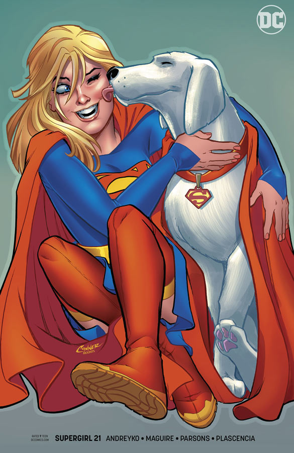
Supergirl #21
DC Comics Writer Marc Andreyko, Penciller Kevin Maguire, Inker Sean Parsons, Colorist FCO Plascencia, Letterer Tom Napolitano
Lets be honest here Supergirl has almost always struggled with her own book over the years and it’s not to say that she can’t have a solo book but similar to Wonder Woman finding the right creative team seems to be where the books fail. Thankfully Andreyko and Maguire have taken over the book and from Brian Michael Bendis story elements from the Man of Steel mini series and have delivers a fresh and exciting book that make you excited for a Supergirl comic book for a change. The one thing that Supergirl has always struggled with is that she mostly has been portrayed as a female Superman and largely has simply been a poor carbon copy. With the Supergirl television series has made great inroads to her character in popular culture DC sadly missed a lot of opportunities but now that Bendis has taken over the regular Superman titles this is a fresh start for Supergirl too. First and foremost Andreyko gives her a great voice in both power and emotions and for the first time in a long time a Supergirl comic has a voice that is all its own. What makes this first outing so good is that there is so much rich character development and he gives her a strong voice but makes sure that she still retains the heart and charm that makes her a solid character in the right hands. In a lot of ways having not a big fight or chase just to get the action going was a very wise idea on Andreyko’s part. He really allows the book to breath with this first issue and that is why it gets off to such a great start with the story. It’s simply been far too long since Maguire has grace a regular comic and he is simply the perfect choice for this book. He is able to capture both the big and small-scale of the story with ease and the way he captures facial emotions is a thing of beauty. And let’s be brutally honest here throwing in Krypto into the mix of the story was pure icing on the cake. Who doesn’t love Krypto and Maguire makes you fall right in love with him.
Is this book worth your time and money? Will this book blow your mind no but it does have the charm and fun that Supergirl needs and Andreyko and Maguire deliver it perfectly in this first outing. What I loved about this book is that it was a real joy to read and that is what makes it work so well. It doesn’t try to be this big epic but just tells a good start of a story that gives you a great reason to come back for more. Throw in Maguire’s gorgeous artwork and you have a worthy companion book to the Bendis Superman titles. HIGHLY RECOMMENDED!
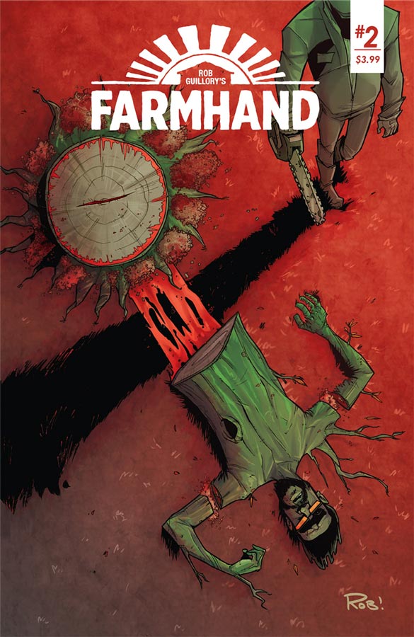
Farmhand #2
Image Comics Writer and Artist Rob Guillory, Colorist Taylor Wells, Letterer Kody Chamberlain
The first issue of Farmhand got off to a really solid start and while this second issue didn’t wow me as much it was quite good in a very different way. Guillory is getting deeper into the mythology that he is setting up here and there is a lot going on here but when your building a story like this some issue are going to seem a bit slow on the surface but it continues to build the story out. That’s whats going on here and there is a lot going on but you can see that its going to pay off down the road. What does work really well here is the building of the characters and that is giving the story a solid foundation and that is why the book is such a treat. We also start to see the good and bad that is happening in the transplants and that is quite intriguing. Where Guillory the artist comes into play is with the cartoony look of the book that may seem all fun on the surface but when it gets dark that is where the mix pays off nicely. Another thing that helps this book is Wells color work on the book that captures the mood that Guillory is going for and complements his line work spot on.
Is this book worth your time and money? Guillory is telling quite a tale here and this shows that there is a lot more to this story than what we saw on the surface of the first issue. He does a great job of balancing both horror and humor in this book and gives it a nice edge for both of them and is making for a good read so far. There is a lot going on here but one thing is for sure he’s going for the long game here so things here will pay off later so you have to be patient with this story and let it unfold.
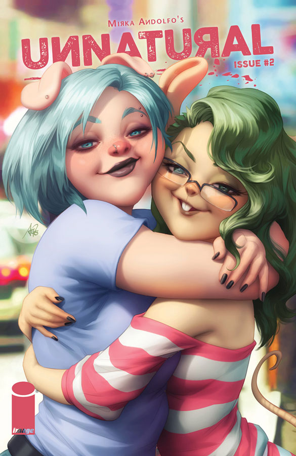
Unnatural #2
Image Comics Writer, Artist and Colorist Mirka Andolfo, Color Assistant Gianluca Papi, Letterer Fabio Amelia
This book was quite the surprise out of the gate and Andolfo builds very nicely from the first issue. There is a lot going on in this story from social commentary to relationships to love and sex and she has found a way to make it blend together quite well here. What give this book a solid footing is that she infuses great emotions into Les so that the reader relates to her so well. A lot of the story has to do with the pressures of society and who we should be but maybe that’s not what we want to be. The first issue wisely got the elephant in the room of sex out-of-the-way and now we start to go in a direction of the story that will surprise and intrigue with the different story threads that Andolfo is weaving with this story. We also get a glimpse into Les’s past that will have a huge impact on the story going forward and adds another great layer to an already good story. Where the book shines is her wonderful artwork that is as beautiful as it is charming. Sure there is a lot of gorgeous female characters in the book Andolfo keeps it classy and tasteful that in lesser hands would not capture the charm that this comic delivers.
Is this book worth your time and money? This is a book that I might have written off as a T&A fiesta but I’m sure glad that I gave it a chance. Andolfo treats the story and characters with class and great emotions that is a lot deeper than I expected and that is whats making it a solid read. There is so much more than I ever expected out of this book and that’s pretty rare for a comic today. Well worth continuing to buy. VERY RECOMMENDED!


0 Comments